


最近朋友做项目有个圆锥图 样式如下 问我怎么写 我就写了一个demo发给他了
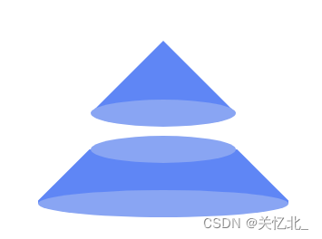
代码如下 考下来可以直接使用的
<!DOCTYPE html>
<html lang="en">

<head>
    <meta charset="UTF-8">
    <meta http-equiv="X-UA-Compatible" content="IE=edge">
    <meta name="viewport" content="width=device-width, initial-scale=1.0">
    <title>Document</title>
    <style>
        body {
            height: 100vh;
            padding: 20px;
            box-sizing: border-box;
        }

        div{
            box-sizing: border-box;
        }

        .incenter {
            width: 80%;
            margin: 0 auto;
            display: flex;
            justify-content: center;
            position: relative;
            margin-bottom: 40px;
        }

        .sj {
            height: 0;
            width: 0;
            border: 80px solid transparent;
            border-bottom: 80px solid #5F86F5;
        }

        .ty {
            position: absolute;
            bottom: -15px;
            left: 0;
            right: 0;
            margin: 0 auto;
            background-color: #89a5f3;
            width: 160px;
            height: 30px;
            border-radius: 50%;
        }

        .sby {
            position: absolute;
            top: -15px;
            left: 0;
            right: 0;
            margin: 0 auto;
            background-color: #89a5f3;
            width: 160px;
            height: 30px;
            border-radius: 50%;
        }
        .xby{
            position: absolute;
            bottom: -15px;
            left: 0;
            right: 0;
            margin: 0 auto;
            background-color: #89a5f3;
            width: 276px;
            height: 30px;
            border-radius: 50%;
        }
        .zj{
            background-color: #5F86F5;
            height: 60px;
            width: 276px;
        }
        .lsj{
            position: absolute;
            border: 40px solid transparent;
            border-bottom: 40px solid #fff;
            transform: translate(138px, -40px) rotate(45deg) ;
            z-index: 100;
        }
        .rsj{
            position: absolute;
            border: 40px solid transparent;
            border-bottom: 40px solid #fff;
            transform: translate(-138px, -40px) rotate(-45deg) ;
            z-index: 100;
        }
    </style>
</head>

<body>
    <div class="incenter">
        <div class="sj"></div>
        <div class="ty"></div>
    </div>
    <div class="incenter">
        <div class="sby"></div>
        <div class="zj"></div>
        <div class="lsj"></div>
        <div class="rsj"></div>
        <div class="xby"></div>
    </div>
</body>

</html>


 扫一扫
扫一扫


 278
278

 被折叠的 条评论
为什么被折叠?
被折叠的 条评论
为什么被折叠?
 到【灌水乐园】发言


