


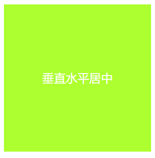
🧐 文字的水平居中
    <style>
        div{
            width: 200px;
            height: 200px;
            background-color: greenyellow;
            color: white;
            /*行高等于盒子的高度,完成垂直居中*/
            line-height: 200px;
            /*元素的水平居中*/
            text-align: center;
        }
    </style>

    <div>垂直水平居中</div>
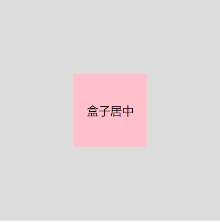
😇 盒子的垂直水平居中
       .outer{
           width: 300px;
           height: 300px;
           background-color: gainsboro;
           text-align: center;
           line-height: 100px;
            /*由于触发了BFC规范,可以解决margin塌陷,完成垂直的居中*/
           overflow: hidden;
           margin: 0 auto;
       }
       .inner{
           width: 100px;
           height: 100px;
           background-color: pink;
           margin: 100px auto;
       }
    <div class="outer">
        <div class="inner">盒子居中</div>
    </div>
🤓 图片在盒子中的居中
	.box{
          width: 300px;
          height: 300px;
          border: 1px dotted blue;
          margin: 0 auto;
          line-height: 400px;
          text-align: center;
      }
     <div class="box">
         <img src="./happy.png" alt="">
     </div>
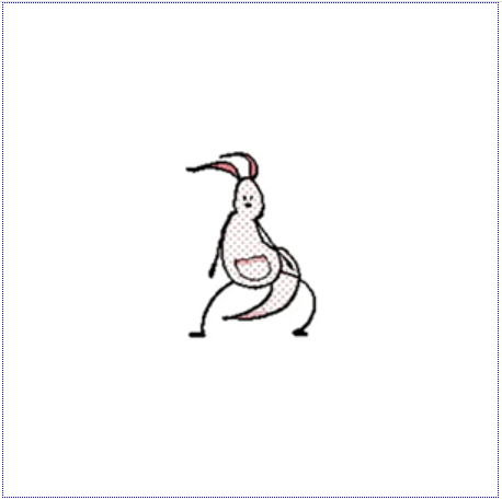
ps:图片是特殊的文本类型,所以使用普通文本的垂直水平居中方法即可完成图片的居中,需要注意图片的大小一定要小于盒子的一半,否则效果不明显。
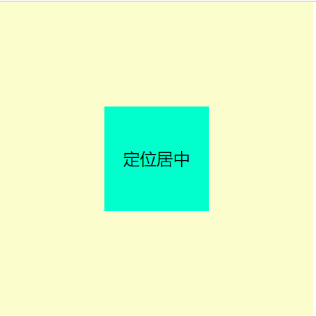
🤩 使用定位实现盒子的居中
    .outer{
        width: 300px;
        height: 300px;
        background-color: #fcfdcd;
        position: relative;
    }
    .inner{
        width: 100px;
        height: 100px;
        background-color: #00ffcd;
        text-align: center;
        line-height: 100px;
        position: absolute;
        top: 50%;
        left: 50%;
        /*由于定位是以元素左上角为起始点,所以此时需要向上向左移动盒子的大小的一半*/
        margin-top: -50px;
        margin-left: -50px;
    }
    <div class="outer">
        <div class="inner">定位居中</div>
    </div>
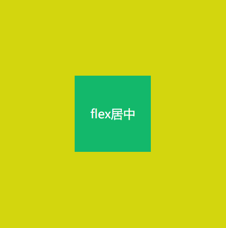
🫣 使用flex布局实现居中
	.outer{
        width: 300px;
        height: 300px;
        background-color: #d3d60e;
        display: flex;
        justify-content: center;
        align-items: center;
    }
    .inner{
        color: #fff;
        width: 100px;
        height: 100px;
        background-color: #13b86b;
        text-align: center;
    }
    <div class="outer">
        <div class="inner">flex居中</div>
    </div>
😜 网格布局实现居中
        .outer {
            width: 300px;
            height: 300px;
            background-color: gainsboro;
            text-align: center;
            line-height: 100px;
            display: grid;
            grid-template-columns: repeat(3,100px);
            grid-template-rows: repeat(3,100px);
        }

        .inner {
            width: 100px;
            height: 100px;
            background-color: pink;

        }
    <div class="outer">
        <div></div>
        <div></div>
        <div></div>
        <div></div>
        <div class="inner">网格居中</div>
        <div></div>
        <div></div>
        <div></div>
        <div></div>
    </div>
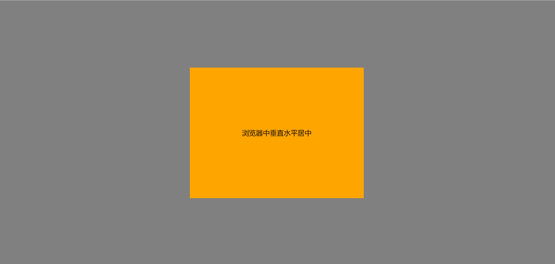
😎 元素在当前浏览器中垂直水平居中
	body{
        background-color:gray;
    }
    .box {
            width: 400px;
            height: 300px;
            line-height: 300px;
            text-align: center;
            background-color: orange;
            position: absolute;
            top: 50%;
            left: 50%;
            margin-left: -200px;
            margin-top: -150px;
     }
<div class="box">浏览器中垂直水平居中</div>


 2713
2713


 被折叠的 条评论
为什么被折叠?
被折叠的 条评论
为什么被折叠?
 到【灌水乐园】发言


