


场景:
在实际项目开发过程中,app底部tabbar常常有每个公司不同项目自己的专属定制,或自定义动画,或自定义样式;然而系统自带的BottomNavigationBarItem和pub.dev中的第三方库限制太死,并不符合实际用途。
本文主要给BottomNavigationBarItem的点击添加了弹簧缩放动画,并调整了BottomNavigationBarItem的主要widget。
各位同学可以参考,添加自己的专属动画,或者将BottomNavigationBarItem的child修改为自己的自定义widget。
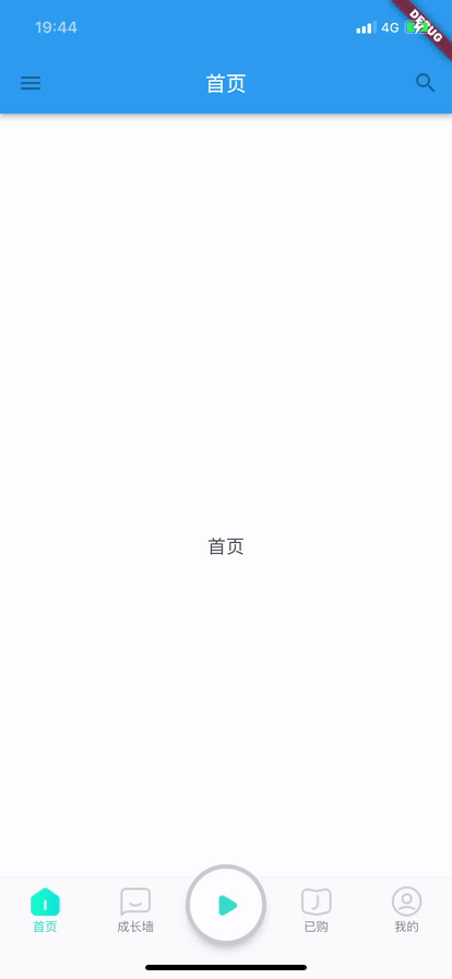
先贴效果图:
之所以贴完整代码,是方便大家懒得下载,直接复制。希望能帮到各位,并给各位提供各种修改flutter原生组件的灵感。
点击下载demo完成源码
正文
1、重写系统的BottomNavigationBarItem
新建lo_bottom_navigation_bar_item.dart, 此处新增了两个属性
animation和index;
import 'package:flutter/cupertino.dart';

class BottomNavigationBarItem {

  BottomNavigationBarItem({
    required this.icon,
    this.label,
    Widget? activeIcon,
    this.backgroundColor,
    this.tooltip,
  }) : activeIcon = activeIcon ?? icon,
        assert(icon != null);

  Animation<double>? animation;

  late int index;

  late Widget icon;

  final Widget activeIcon;

  final String? label;

  final Color? backgroundColor;

  final String? tooltip;
}
2、重写系统的BottomNavigationBar
新建lo_bottom_navigation_bar.dart,, 此处主要改动了
InkResponse中的child,改变结构,并添加动画;
import 'dart:collection' show Queue;
import 'dart:math' as math;

import 'package:flutter/material.dart';
import 'package:vector_math/vector_math_64.dart' show Vector3;
import 'lo_bottom_navigation_bar_item.dart' as MyBarItem;

enum MyBottomNavigationBarType {
  fixed,
  shifting,
}

enum MyBottomNavigationBarLandscapeLayout {
  spread,
  centered,
  linear,
}

class MyBottomNavigationBar extends StatefulWidget {
  MyBottomNavigationBar({
    Key? key,
    required this.items,
    this.onTap,
    this.currentIndex = 0,
    this.elevation,
    this.type,
    Color? fixedColor,
    this.backgroundColor,
    this.iconSize = 24.0,
    Color? selectedItemColor,
    this.unselectedItemColor,
    this.selectedIconTheme,
    this.unselectedIconTheme,
    this.selectedFontSize = 14.0,
    this.unselectedFontSize = 12.0,
    this.selectedLabelStyle,
    this.unselectedLabelStyle,
    this.showSelectedLabels,
    this.showUnselectedLabels,
    this.mouseCursor,
    this.enableFeedback,
    this.landscapeLayout,
  }) : assert(items != null),
        assert(items.length >= 2),
        assert(
        items.every((MyBarItem.BottomNavigationBarItem item) => item.label != null),
        'Every item must have a non-null label',
        ),
        assert(0 <= currentIndex && currentIndex < items.length),
        assert(elevation == null || elevation >= 0.0),
        assert(iconSize != null && iconSize >= 0.0),
        assert(
        selectedItemColor == null || fixedColor == null,
        'Either selectedItemColor or fixedColor can be specified, but not both',
        ),
        assert(selectedFontSize != null && selectedFontSize >= 0.0),
        assert(unselectedFontSize != null && unselectedFontSize >= 0.0),
        selectedItemColor = selectedItemColor ?? fixedColor,
        super(key: key);

  final List<MyBarItem.BottomNavigationBarItem> items;

  final ValueChanged<int>? onTap;

  final int currentIndex;

  final double? elevation;

  final MyBottomNavigationBarType? type;

  Color? get fixedColor => selectedItemColor;

  final Color? backgroundColor;

  final double iconSize;

  final Color? selectedItemColor;

  final Color? unselectedItemColor;

  final IconThemeData? selectedIconTheme;

  final IconThemeData? unselectedIconTheme;

  final TextStyle? selectedLabelStyle;

  final TextStyle? unselectedLabelStyle;

  final double selectedFontSize;

  final double unselectedFontSize;

  final bool? showUnselectedLabels;

  final bool? showSelectedLabels;

  final MouseCursor? mouseCursor;

  final bool? enableFeedback;

  final MyBottomNavigationBarLandscapeLayout? landscapeLayout;

  @override
  State<MyBottomNavigationBar> createState() => _MyBottomNavigationBarState();
}

// This represents a single tile in the bottom navigation bar. It is intended
// to go into a flex container.
class _BottomNavigationTile extends StatelessWidget {
  const _BottomNavigationTile(
      this.type,
      this.item,
      this.animation,
      this.iconSize, {
        this.onTap,
        this.colorTween,
        this.flex,
        this.selected = false,
        required this.selectedLabelStyle,
        required this.unselectedLabelStyle,
        required this.selectedIconTheme,
        required this.unselectedIconTheme,
        required this.showSelectedLabels,
        required this.showUnselectedLabels,
        this.indexLabel,
        required this.mouseCursor,
        required this.enableFeedback,
        required this.layout,
      }) : assert(type != null),
        assert(item != null),
        assert(animation != null),
        assert(selected != null),
        assert(selectedLabelStyle != null),
        assert(unselectedLabelStyle != null),
        assert(mouseCursor != null);

  final MyBottomNavigationBarType type;
  final MyBarItem.BottomNavigationBarItem item;
  final Animation<double> animation;
  final double iconSize;
  final VoidCallback? onTap;
  final ColorTween? colorTween;
  final double? flex;
  final bool selected;
  final IconThemeData? selectedIconTheme;
  final IconThemeData? unselectedIconTheme;
  final TextStyle selectedLabelStyle;
  final TextStyle unselectedLabelStyle;
  final String? indexLabel;
  final bool showSelectedLabels;
  final bool showUnselectedLabels;
  final MouseCursor mouseCursor;
  final bool enableFeedback;
  final MyBottomNavigationBarLandscapeLayout layout;

  @override
  Widget build(BuildContext context) {
    final int size;

    final double selectedFontSize = selectedLabelStyle.fontSize!;

    final double selectedIconSize = selectedIconTheme?.size ?? iconSize;
    final double unselectedIconSize = unselectedIconTheme?.size ?? iconSize;

    final double selectedIconDiff = math.max(selectedIconSize - unselectedIconSize, 0);

    final double unselectedIconDiff = math.max(unselectedIconSize - selectedIconSize, 0);

    final String? effectiveTooltip = item.tooltip == '' ? null : item.tooltip ?? item.label;

    double bottomPadding;
    double topPadding;
    if (showSelectedLabels && !showUnselectedLabels) {
      bottomPadding = Tween<double>(
        begin: selectedIconDiff / 2.0,
        end: selectedFontSize / 2.0 - unselectedIconDiff / 2.0,
      ).evaluate(animation);
      topPadding = Tween<double>(
        begin: selectedFontSize + selectedIconDiff / 2.0,
        end: selectedFontSize / 2.0 - unselectedIconDiff / 2.0,
      ).evaluate(animation);
    } else if (!showSelectedLabels && !showUnselectedLabels) {
      bottomPadding = Tween<double>(
        begin: selectedIconDiff / 2.0,
        end: unselectedIconDiff / 2.0,
      ).evaluate(animation);
      topPadding = Tween<double>(
        begin: selectedFontSize + selectedIconDiff / 2.0,
        end: selectedFontSize + unselectedIconDiff / 2.0,
      ).evaluate(animation);
    } else {
      bottomPadding = Tween<double>(
        begin: selectedFontSize / 2.0 + selectedIconDiff / 2.0,
        end: selectedFontSize / 2.0 + unselectedIconDiff / 2.0,
      ).evaluate(animation);
      topPadding = Tween<double>(
        begin: selectedFontSize / 2.0 + selectedIconDiff / 2.0,
        end: selectedFontSize / 2.0 + unselectedIconDiff / 2.0,
      ).evaluate(animation);
    }

    switch (type) {
      case MyBottomNavigationBarType.fixed:
        size = 1;
        break;
      case MyBottomNavigationBarType.shifting:
        size = (flex! * 1000.0).round();
        break;
    }

    Widget result = InkResponse(
      onTap: onTap,
      mouseCursor: mouseCursor,
      enableFeedback: enableFeedback,
      child: Padding(
        padding: EdgeInsets.only(top: topPadding, bottom: bottomPadding),
        child: ScaleTransition(
          scale: item.animation!,
          child:  _Tile(
            layout: layout,
            icon: _TileIcon(
              colorTween: colorTween!,
              animation: animation,
              iconSize: iconSize,
              selected: selected,
              item: item,
              selectedIconTheme: selectedIconTheme,
              unselectedIconTheme: unselectedIconTheme,
            ),
            label: _Label(
              colorTween: colorTween!,
              animation: animation,
              item: item,
              selectedLabelStyle: selectedLabelStyle,
              unselectedLabelStyle: unselectedLabelStyle,
              showSelectedLabels: showSelectedLabels,
              showUnselectedLabels: showUnselectedLabels,
            ),
          ),
        ),
      ),
    );

    if (effectiveTooltip != null) {
      result = Tooltip(
        message: effectiveTooltip,
        preferBelow: false,
        verticalOffset: selectedIconSize + selectedFontSize,
        excludeFromSemantics: true,
        child: result,
      );
    }

    result = Semantics(
      selected: selected,
      container: true,
      child: Stack(
        children: <Widget>[
          result,
          Semantics(
            label: indexLabel,
          ),
        ],
      ),
    );

    return Expanded(
      flex: size,
      child: result,
    );
  }
}

class _Tile extends StatelessWidget {
  const  _Tile({
    Key? key,
    required this.layout,
    required this.icon,
    required this.label
  }) : super(key: key);

  final MyBottomNavigationBarLandscapeLayout layout;
  final Widget icon;
  final Widget label;

  @override
  Widget build(BuildContext context) {
    final MediaQueryData data = MediaQuery.of(context);
    if (data.orientation == Orientation.landscape && layout == MyBottomNavigationBarLandscapeLayout.linear) {
      return Align(
        heightFactor: 1,
        child: Row(
          mainAxisSize: MainAxisSize.min,
          children: <Widget>[icon, const SizedBox(width: 8), label],
        ),
      );
    }
    return Column(
      mainAxisAlignment: MainAxisAlignment.spaceBetween,
      mainAxisSize: MainAxisSize.min,
      children: <Widget>[icon, label],
    );
  }
}

class _TileIcon extends StatelessWidget {
  const _TileIcon({
    Key? key,
    required this.colorTween,
    required this.animation,
    required this.iconSize,
    required this.selected,
    required this.item,
    required this.selectedIconTheme,
    required this.unselectedIconTheme,
  }) : assert(selected != null),
        assert(item != null),
        super(key: key);

  final ColorTween colorTween;
  final Animation<double> animation;
  final double iconSize;
  final bool selected;
  final MyBarItem.BottomNavigationBarItem item;
  final IconThemeData? selectedIconTheme;
  final IconThemeData? unselectedIconTheme;

  @override
  Widget build(BuildContext context) {
    final Color? iconColor = colorTween.evaluate(animation);
    final IconThemeData defaultIconTheme = IconThemeData(
      color: iconColor,
      size: iconSize,
    );
    final IconThemeData iconThemeData = IconThemeData.lerp(
      defaultIconTheme.merge(unselectedIconTheme),
      defaultIconTheme.merge(selectedIconTheme),
      animation.value,
    );

    return Align(
      alignment: Alignment.topCenter,
      heightFactor: 1.0,
      child: IconTheme(
        data: iconThemeData,
        child: selected ? item.activeIcon : item.icon,
      ),
    );
  }
}

class _Label extends StatelessWidget {
  const _Label({
    Key? key,
    required this.colorTween,
    required this.animation,
    required this.item,
    required this.selectedLabelStyle,
    required this.unselectedLabelStyle,
    required this.showSelectedLabels,
    required this.showUnselectedLabels,
  }) : assert(colorTween != null),
        assert(animation != null),
        assert(item != null),
        assert(selectedLabelStyle != null),
        assert(unselectedLabelStyle != null),
        assert(showSelectedLabels != null),
        assert(showUnselectedLabels != null),
        super(key: key);

  final ColorTween colorTween;
  final Animation<double> animation;
  final MyBarItem.BottomNavigationBarItem item;
  final TextStyle selectedLabelStyle;
  final TextStyle unselectedLabelStyle;
  final bool showSelectedLabels;
  final bool showUnselectedLabels;

  @override
  Widget build(BuildContext context) {
    final double? selectedFontSize = selectedLabelStyle.fontSize;
    final double? unselectedFontSize = unselectedLabelStyle.fontSize;

    final TextStyle customStyle = TextStyle.lerp(
      unselectedLabelStyle,
      selectedLabelStyle,
      animation.value,
    )!;
    Widget text = DefaultTextStyle.merge(
      style: customStyle.copyWith(
        fontSize: selectedFontSize,
        color: colorTween.evaluate(animation),
      ),
      // The font size should grow here when active, but because of the way
      // font rendering works, it doesn't grow smoothly if we just animate
      // the font size, so we use a transform instead.
      child: Transform(
        transform: Matrix4.diagonal3(
          Vector3.all(
            Tween<double>(
              begin: unselectedFontSize! / selectedFontSize!,
              end: 1.0,
            ).evaluate(animation),
          ),
        ),
        alignment: Alignment.bottomCenter,
        child: Text(item.label!),
      ),
    );

    if (!showUnselectedLabels && !showSelectedLabels) {
      // Never show any labels.
      text = Opacity(
        alwaysIncludeSemantics: true,
        opacity: 0.0,
        child: text,
      );
    } else if (!showUnselectedLabels) {
      // Fade selected labels in.
      text = FadeTransition(
        alwaysIncludeSemantics: true,
        opacity: animation,
        child: text,
      );
    } else if (!showSelectedLabels) {
      // Fade selected labels out.
      text = FadeTransition(
        alwaysIncludeSemantics: true,
        opacity: Tween<double>(begin: 1.0, end: 0.0).animate(animation),
        child: text,
      );
    }

    text = Align(
      alignment: Alignment.bottomCenter,
      heightFactor: 1.0,
      child: Container(child: text),
    );

    if (item.label != null) {
      // Do not grow text in bottom navigation bar when we can show a tooltip
      // instead.
      final MediaQueryData mediaQueryData = MediaQuery.of(context);
      text = MediaQuery(
        data: mediaQueryData.copyWith(
          textScaleFactor: math.min(1.0, mediaQueryData.textScaleFactor),
        ),
        child: text,
      );
    }

    return text;
  }
}

class _MyBottomNavigationBarState extends State<MyBottomNavigationBar> with TickerProviderStateMixin {
  List<AnimationController> _controllers = <AnimationController>[];
  late List<CurvedAnimation> _animations;

  // A queue of color splashes currently being animated.
  final Queue<_Circle> _circles = Queue<_Circle>();

  // Last splash circle's color, and the final color of the control after
  // animation is complete.
  Color? _backgroundColor;

  static final Animatable<double> _flexTween = Tween<double>(begin: 1.0, end: 1.5);

  void _resetState() {
    for (final AnimationController controller in _controllers)
      controller.dispose();
    for (final _Circle circle in _circles)
      circle.dispose();
    _circles.clear();

    _controllers = List<AnimationController>.generate(widget.items.length, (int index) {
      return AnimationController(
        duration: kThemeAnimationDuration,
        vsync: this,
      )..addListener(_rebuild);
    });
    _animations = List<CurvedAnimation>.generate(widget.items.length, (int index) {
      return CurvedAnimation(
        parent: _controllers[index],
        curve: Curves.fastOutSlowIn,
        reverseCurve: Curves.fastOutSlowIn.flipped,
      );
    });
    _controllers[widget.currentIndex].value = 1.0;
    _backgroundColor = widget.items[widget.currentIndex].backgroundColor;
  }

  Enum get _effectiveType {
    return widget.type
        ?? BottomNavigationBarTheme.of(context).type
        ?? (widget.items.length <= 3 ? MyBottomNavigationBarType.fixed : MyBottomNavigationBarType.shifting);
  }

  bool get _defaultShowUnselected {
    switch (_effectiveType) {
      case MyBottomNavigationBarType.shifting:
        return false;
      case MyBottomNavigationBarType.fixed:
        return true;
    }
    return true;
  }

  @override
  void initState() {
    super.initState();
    _resetState();
  }

  void _rebuild() {
    setState(() {
    });
  }

  @override
  void dispose() {
    for (final AnimationController controller in _controllers)
      controller.dispose();
    for (final _Circle circle in _circles)
      circle.dispose();
    super.dispose();
  }

  double _evaluateFlex(Animation<double> animation) => _flexTween.evaluate(animation);

  void _pushCircle(int index) {
    if (widget.items[index].backgroundColor != null) {
      _circles.add(
        _Circle(
          state: this,
          index: index,
          color: widget.items[index].backgroundColor!,
          vsync: this,
        )..controller.addStatusListener(
              (AnimationStatus status) {
            switch (status) {
              case AnimationStatus.completed:
                setState(() {
                  final _Circle circle = _circles.removeFirst();
                  _backgroundColor = circle.color;
                  circle.dispose();
                });
                break;
              case AnimationStatus.dismissed:
              case AnimationStatus.forward:
              case AnimationStatus.reverse:
                break;
            }
          },
        ),
      );
    }
  }

  @override
  void didUpdateWidget(MyBottomNavigationBar oldWidget) {
    super.didUpdateWidget(oldWidget);

    // No animated segue if the length of the items list changes.
    if (widget.items.length != oldWidget.items.length) {
      _resetState();
      return;
    }

    if (widget.currentIndex != oldWidget.currentIndex) {
      switch (_effectiveType) {
        case MyBottomNavigationBarType.fixed:
          break;
        case MyBottomNavigationBarType.shifting:
          _pushCircle(widget.currentIndex);
          break;
      }
      _controllers[oldWidget.currentIndex].reverse();
      _controllers[widget.currentIndex].forward();
    } else {
      if (_backgroundColor != widget.items[widget.currentIndex].backgroundColor)
        _backgroundColor = widget.items[widget.currentIndex].backgroundColor;
    }
  }

  static TextStyle _effectiveTextStyle(TextStyle? textStyle, double fontSize) {
    textStyle ??= const TextStyle();
    // Prefer the font size on textStyle if present.
    return textStyle.fontSize == null ? textStyle.copyWith(fontSize: fontSize) : textStyle;
  }

  List<Widget> _createTiles(MyBottomNavigationBarLandscapeLayout layout) {
    final MaterialLocalizations localizations = MaterialLocalizations.of(context);
    assert(localizations != null);

    final ThemeData themeData = Theme.of(context);
    final BottomNavigationBarThemeData bottomTheme = BottomNavigationBarTheme.of(context);

    final TextStyle effectiveSelectedLabelStyle =
    _effectiveTextStyle(
      widget.selectedLabelStyle ?? bottomTheme.selectedLabelStyle,
      widget.selectedFontSize,
    );
    final TextStyle effectiveUnselectedLabelStyle =
    _effectiveTextStyle(
      widget.unselectedLabelStyle ?? bottomTheme.unselectedLabelStyle,
      widget.unselectedFontSize,
    );

    final Color themeColor;
    switch (themeData.brightness) {
      case Brightness.light:
        themeColor = themeData.colorScheme.primary;
        break;
      case Brightness.dark:
        themeColor = themeData.colorScheme.secondary;
        break;
    }

    ColorTween colorTween = ColorTween(
      begin: widget.unselectedItemColor
          ?? bottomTheme.unselectedItemColor
          ?? themeData.unselectedWidgetColor,
      end: widget.selectedItemColor
          ?? bottomTheme.selectedItemColor
          ?? widget.fixedColor
          ?? themeColor,
    );
    switch (_effectiveType) {
      case MyBottomNavigationBarType.fixed:
        colorTween = ColorTween(
          begin: widget.unselectedItemColor
              ?? bottomTheme.unselectedItemColor
              ?? themeData.unselectedWidgetColor,
          end: widget.selectedItemColor
              ?? bottomTheme.selectedItemColor
              ?? widget.fixedColor
              ?? themeColor,
        );
        break;
      case MyBottomNavigationBarType.shifting:
        colorTween = ColorTween(
          begin: widget.unselectedItemColor
              ?? bottomTheme.unselectedItemColor
              ?? themeData.colorScheme.surface,
          end: widget.selectedItemColor
              ?? bottomTheme.selectedItemColor
              ?? themeData.colorScheme.surface,
        );
        break;
    }

    final List<Widget> tiles = <Widget>[];
    for (int i = 0; i < widget.items.length; i++) {
      final Set<MaterialState> states = <MaterialState>{
        if (i == widget.currentIndex) MaterialState.selected,
      };

      final MouseCursor effectiveMouseCursor = MaterialStateProperty.resolveAs<MouseCursor?>(widget.mouseCursor, states)
          ?? bottomTheme.mouseCursor?.resolve(states)
          ?? MaterialStateMouseCursor.clickable.resolve(states);

      tiles.add(_BottomNavigationTile(
        MyBottomNavigationBarType.fixed,
        widget.items[i],
        _animations[i],
        widget.iconSize,
        selectedIconTheme: widget.selectedIconTheme ?? bottomTheme.selectedIconTheme,
        unselectedIconTheme: widget.unselectedIconTheme ?? bottomTheme.unselectedIconTheme,
        selectedLabelStyle: effectiveSelectedLabelStyle,
        unselectedLabelStyle: effectiveUnselectedLabelStyle,
        enableFeedback: widget.enableFeedback ?? bottomTheme.enableFeedback ?? true,
        onTap: () {
          widget.onTap?.call(i);
        },
        colorTween: colorTween,
        flex: _evaluateFlex(_animations[i]),
        selected: i == widget.currentIndex,
        showSelectedLabels: widget.showSelectedLabels ?? bottomTheme.showSelectedLabels ?? true,
        showUnselectedLabels: widget.showUnselectedLabels ?? bottomTheme.showUnselectedLabels ?? _defaultShowUnselected,
        indexLabel: localizations.tabLabel(tabIndex: i + 1, tabCount: widget.items.length),
        mouseCursor: effectiveMouseCursor,
        layout: layout,
      ));
    }
    return tiles;
  }

  @override
  Widget build(BuildContext context) {
    assert(debugCheckHasDirectionality(context));
    assert(debugCheckHasMaterialLocalizations(context));
    assert(debugCheckHasMediaQuery(context));
    assert(Overlay.of(context, debugRequiredFor: widget) != null);

    final BottomNavigationBarThemeData bottomTheme = BottomNavigationBarTheme.of(context);
    final Enum layout = widget.landscapeLayout
        ?? bottomTheme.landscapeLayout
        ?? MyBottomNavigationBarLandscapeLayout.spread;
    final double additionalBottomPadding = MediaQuery.of(context).padding.bottom;

    Color? backgroundColor;
    switch (_effectiveType) {
      case MyBottomNavigationBarType.fixed:
        backgroundColor = widget.backgroundColor ?? bottomTheme.backgroundColor;
        break;
      case MyBottomNavigationBarType.shifting:
        backgroundColor = _backgroundColor;
        break;
    }

    return Semantics(
      explicitChildNodes: true,
      child: _Bar(
        layout: MyBottomNavigationBarLandscapeLayout.spread,
        elevation: widget.elevation ?? bottomTheme.elevation ?? 8.0,
        color: backgroundColor,
        child: ConstrainedBox(
          constraints: BoxConstraints(minHeight: kBottomNavigationBarHeight + additionalBottomPadding),
          child: CustomPaint(
            painter: _RadialPainter(
              circles: _circles.toList(),
              textDirection: Directionality.of(context),
            ),
            child: Material( // Splashes.
              type: MaterialType.transparency,
              child: Padding(
                padding: EdgeInsets.only(bottom: additionalBottomPadding),
                child: MediaQuery.removePadding(
                  context: context,
                  removeBottom: true,
                  child: DefaultTextStyle.merge(
                    overflow: TextOverflow.ellipsis,
                    child:  Row(
                      mainAxisAlignment: MainAxisAlignment.spaceBetween,
                      children: _createTiles(MyBottomNavigationBarLandscapeLayout.spread),
                    ),
                  ),
                ),
              ),
            ),
          ),
        ),
      ),
    );
  }
}

// Optionally center a Material child for landscape layouts when layout is
// MyBottomNavigationBarLandscapeLayout.centered
class _Bar extends StatelessWidget {
  const _Bar({
    Key? key,
    required this.child,
    required this.layout,
    required this.elevation,
    required this.color,
  }) : super(key: key);

  final Widget child;
  final MyBottomNavigationBarLandscapeLayout layout;
  final double elevation;
  final Color? color;

  @override
  Widget build(BuildContext context) {
    final MediaQueryData data = MediaQuery.of(context);
    Widget alignedChild = child;
    if (data.orientation == Orientation.landscape && layout == MyBottomNavigationBarLandscapeLayout.centered) {
      alignedChild = Align(
        alignment: Alignment.bottomCenter,
        heightFactor: 1,
        child: SizedBox(
          width: data.size.height,
          child: child,
        ),
      );
    }
    return Material(
      elevation: elevation,
      color: color,
      child: alignedChild,
    );
  }
}

// Describes an animating color splash circle.
class _Circle {
  _Circle({
    required this.state,
    required this.index,
    required this.color,
    required TickerProvider vsync,
  }) : assert(state != null),
        assert(index != null),
        assert(color != null) {
    controller = AnimationController(
      duration: kThemeAnimationDuration,
      vsync: vsync,
    );
    animation = CurvedAnimation(
      parent: controller,
      curve: Curves.fastOutSlowIn,
    );
    controller.forward();
  }

  final _MyBottomNavigationBarState state;
  final int index;
  final Color color;
  late AnimationController controller;
  late CurvedAnimation animation;

  double get horizontalLeadingOffset {
    double weightSum(Iterable<Animation<double>> animations) {
      // We're adding flex values instead of animation values to produce correct
      // ratios.
      return animations.map<double>(state._evaluateFlex).fold<double>(0.0, (double sum, double value) => sum + value);
    }

    final double allWeights = weightSum(state._animations);
    // These weights sum to the start edge of the indexed item.
    final double leadingWeights = weightSum(state._animations.sublist(0, index));

    // Add half of its flex value in order to get to the center.
    return (leadingWeights + state._evaluateFlex(state._animations[index]) / 2.0) / allWeights;
  }

  void dispose() {
    controller.dispose();
  }
}

// Paints the animating color splash circles.
class _RadialPainter extends CustomPainter {
  _RadialPainter({
    required this.circles,
    required this.textDirection,
  }) : assert(circles != null),
        assert(textDirection != null);

  final List<_Circle> circles;
  final TextDirection textDirection;

  // Computes the maximum radius attainable such that at least one of the
  // bounding rectangle's corners touches the edge of the circle. Drawing a
  // circle larger than this radius is not needed, since there is no perceivable
  // difference within the cropped rectangle.
  static double _maxRadius(Offset center, Size size) {
    final double maxX = math.max(center.dx, size.width - center.dx);
    final double maxY = math.max(center.dy, size.height - center.dy);
    return math.sqrt(maxX * maxX + maxY * maxY);
  }

  @override
  bool shouldRepaint(_RadialPainter oldPainter) {
    if (textDirection != oldPainter.textDirection)
      return true;
    if (circles == oldPainter.circles)
      return false;
    if (circles.length != oldPainter.circles.length)
      return true;
    for (int i = 0; i < circles.length; i += 1)
      if (circles[i] != oldPainter.circles[i])
        return true;
    return false;
  }

  @override
  void paint(Canvas canvas, Size size) {
    for (final _Circle circle in circles) {
      final Paint paint = Paint()..color = circle.color;
      final Rect rect = Rect.fromLTWH(0.0, 0.0, size.width, size.height);
      canvas.clipRect(rect);
      final double leftFraction;
      switch (textDirection) {
        case TextDirection.rtl:
          leftFraction = 1.0 - circle.horizontalLeadingOffset;
          break;
        case TextDirection.ltr:
          leftFraction = circle.horizontalLeadingOffset;
          break;
      }
      final Offset center = Offset(leftFraction * size.width, size.height / 2.0);
      final Tween<double> radiusTween = Tween<double>(
        begin: 0.0,
        end: _maxRadius(center, size),
      );
      canvas.drawCircle(
        center,
        radiusTween.transform(circle.animation.value),
        paint,
      );
    }
  }
}
3、贴一下lo_home_tab_bar.dart文件,包含了动画创建和控制
import 'package:flutter/material.dart';

import 'lo_bottom_navigation_bar.dart';
import 'lo_bottom_navigation_bar_item.dart' as MyBarItem;
import 'lo_player_tab_item.dart';
import 'lo_tab_page.dart';

class HomeTabBar extends StatefulWidget {
  const HomeTabBar({Key? key}) : super(key: key);

  @override
  _HomeTabBarState createState() => _HomeTabBarState();
}

class _Item {
  String name, activeIcon, normalIcon;

  _Item(this.name, this.activeIcon, this.normalIcon);
}

class _HomeTabBarState extends State<HomeTabBar> with TickerProviderStateMixin {
  late List<Widget> pages;

  final defaultItemColor = const Color.fromARGB(255, 125, 125, 125);

  late List<AnimationController> animationControllers = [];

  late List<Animation<double>> animations = [];

  final itemNames = [
    _Item('首页', 'assets/images/tabbar00_h.png', 'assets/images/tabbar00.png'),
    _Item('成长墙', 'assets/images/tabbar01_h.png', 'assets/images/tabbar01.png'),
    _Item('', 'assets/images/tabbar02_h.png', 'assets/images/tabbar02.png'),
    _Item('已购', 'assets/images/tabbar03_h.png', 'assets/images/tabbar03.png'),
    _Item('我的', 'assets/images/tabbar04_h.png', 'assets/images/tabbar04.png')
  ];

  late List<MyBarItem.BottomNavigationBarItem> itemList;

  double progress = 0;

  Image playIcon = Image.asset("assets/images/tabbar02_h.png");
  Image pauseIcon = Image.asset("assets/images/tabbar02.png");
  bool isPlaying = false;

  @override
  void initState() {
    super.initState();
    debugPrint('initState _ContainerPageState');

    /// 刷新进度,演示所用
    reloadProgress(100);

    /// barItem对应的页面
    pages = [
      const MyPage(title: "首页"),
      const MyPage(title: "成长墙"),
      const MyPage(title: ""),
      const MyPage(title: "已购"),
      const MyPage(title: "个人中心"),
    ];

    animationControllers = [];
    itemList = [];
    for (var i = 0; i < itemNames.length; i++) {
      /// 为每个barItem创建单独的动画控制器
      AnimationController controller = _getAnimationController();
      animationControllers.add(controller);

      /// 为每个barItem创建的动画
      Animation<double> animate = _getAnimation(controller);
      animations.add(animate);

      itemList.add(_getBarItem(i, itemNames[i]));
    }
  }

  int _selectIndex = 0;

  final PlayerTabItem _playerItemLocation =
      PlayerTabItem(FloatingActionButtonLocation.centerDocked, 0, 24);

  /// 获取动画控制器
  AnimationController _getAnimationController() {
    AnimationController animationController = AnimationController(
      vsync: this,
      duration: const Duration(milliseconds: 600),
    );
    return animationController;
  }

  /// 获取BarItem
  MyBarItem.BottomNavigationBarItem _getBarItem(int index, _Item item) {
    Animation<double> animation = animations[index];
    MyBarItem.BottomNavigationBarItem barItem =
        MyBarItem.BottomNavigationBarItem(
            icon: Image.asset(
              item.normalIcon,
              width: 30.0,
              height: 30.0,
            ),
            label: item.name,
            activeIcon: Image.asset(
              item.activeIcon,
              width: 30.0,
              height: 30.0,
            ));
    barItem.index = index;
    barItem.animation = animation;
    return barItem;
  }

  /// 多个缩放点的缩放动画
  Animation<double> _getAnimation(AnimationController controller) {
    List values = [1.0, 1.4, 0.9, 1.15, 0.95, 1.02, 1.0];
    double preValue = 1.0;
    List<TweenSequenceItem<double>> tweenItems = [];
    for (int i = 0; i < values.length; i++) {
      if (i != 0) {
        tweenItems.add(TweenSequenceItem<double>(
          tween: Tween(begin: preValue, end: values[i]),
          weight: 1,
        ));
      }
      preValue = values[i];
    }
    return TweenSequence<double>(tweenItems).animate(controller);
  }

  Widget _getPagesWidget(int index) {
    return Offstage(
      offstage: _selectIndex != index,
      child: TickerMode(
        enabled: _selectIndex == index,
        child: pages[index],
      ),
    );
  }

  @override
  void didUpdateWidget(HomeTabBar oldWidget) {
    super.didUpdateWidget(oldWidget);
    debugPrint('didUpdateWidget');
  }

  @override
  Widget build(BuildContext context) {
    debugPrint('build _ContainerPageState');

    Animation<double> animation = animations[2];

    return Scaffold(
      body: Stack(
        children: [
          _getPagesWidget(0),
          _getPagesWidget(1),
          _getPagesWidget(2),
          _getPagesWidget(3),
          _getPagesWidget(4),
        ],
      ),
      backgroundColor: const Color.fromARGB(255, 248, 248, 248),
      bottomNavigationBar: MyBottomNavigationBar(
        items: itemList,
        onTap: (int index) {
          ///这里根据点击的index来显示,非index的page均隐藏
          setState(() {
            _selectIndex = index;
          });

          AnimationController animationController = animationControllers[index];
          animationController.reset();
          animationController.forward();
        },
        //图标大小
        iconSize: 24,
        // selectedItemColor: const Color(0xFF29CCCC),
        //当前选中的索引
        currentIndex: _selectIndex,
        selectedFontSize: 12,
        unselectedFontSize: 12,
        //选中后,底部BottomNavigationBar内容的颜色(选中时,默认为主题色)(仅当type: BottomNavigationBarType.fixed,时生效)
        fixedColor: const Color(0xFF29CCCC),
        type: MyBottomNavigationBarType.fixed,
      ),
      floatingActionButton: SizedBox(
        height: 70,
        width: 70,
        child: ScaleTransition(
            scale: animation,
            child: FloatingActionButton(
              backgroundColor: Colors.white,
              foregroundColor: Colors.white,
              child: Stack(
                children: [
                  SizedBox(
                    height: 70,
                    width: 70,
                    child: CircularProgressIndicator(
                      value: progress,
                      backgroundColor: const Color(0xffcccccc),
                      color: const Color(0xff29cccc),
                    ),
                  ),
                  isPlaying ? playIcon : pauseIcon,
                ],
              ),
              onPressed: () {
                setState(() {
                  isPlaying = !isPlaying;
                });
                AnimationController animationController =
                    animationControllers[2];
                animationController.reset();
                animationController.forward();
              },
            )),
      ),
      floatingActionButtonLocation: _playerItemLocation, //放在中间
    );
  }

  /// 这里简单演示播放圆形进度
  void reloadProgress(int milliseconds) {
    if (isPlaying) {
      setState(() {
        if (progress < 1) {
          progress = progress + 0.01;
        }
      });
    }
    Future.delayed(Duration(milliseconds: milliseconds), () {
      reloadProgress(milliseconds);
    });
  }
}
4、贴一下demo剩余文件
lo_player_tab_item.dart、lo_tab_page.dart、main.dart
lo_player_tab_item.dart
import 'package:flutter/material.dart';

class PlayerTabItem extends FloatingActionButtonLocation {
  FloatingActionButtonLocation location;
  late double offsetX;    // X方向的偏移量
  late double offsetY;    // Y方向的偏移量
  PlayerTabItem(this.location, this.offsetX, this.offsetY);

  @override
  Offset getOffset(ScaffoldPrelayoutGeometry scaffoldGeometry) {
    Offset offset = location.getOffset(scaffoldGeometry);
    return Offset(offset.dx + offsetX, offset.dy + offsetY);
  }
}
lo_tab_page.dart
import 'package:flutter/material.dart';

class MyPage extends StatelessWidget {
  final String title;

  const MyPage({Key? key, required this.title}) : super(key: key);

  @override
  Widget build(BuildContext context) {
    return SingleChildScrollView(
      child: SizedBox(
        height: MediaQuery.of(context).size.height,
        width: MediaQuery.of(context).size.width,
        child: Scaffold(
          appBar: AppBar(
            leading: const IconButton(
              icon: Icon(Icons.menu),
              onPressed: null,
            ),
            title: Text(title),
            actions: const <Widget>[
              IconButton(
                icon: Icon(Icons.search),
                onPressed: null,
              ),
            ],
          ),
          backgroundColor: Colors.white,
          body: Center(
            child: Text(
              title,
              style: const TextStyle(
                  fontSize: 18.0,
                  color: Color(0xFF404856),
                  fontWeight: FontWeight.w500),
            ),
          ),
        ),
      ),
    );
  }
}
main.dart
import 'package:flutter/material.dart';
import 'lo_home_tab_bar.dart';

void main() {
  runApp(const MyApp());
}

class MyApp extends StatelessWidget {
  const MyApp({Key? key}) : super(key: key);

  @override
  Widget build(BuildContext context) {
    return MaterialApp(
      title: 'Bottom Navigation Bar Demo',
      theme: ThemeData(
        primarySwatch: Colors.blue,
      ),
      home: const HomeTabBar(),
    );
  }
}


 4472
4472


 被折叠的 条评论
为什么被折叠?
被折叠的 条评论
为什么被折叠?
 到【灌水乐园】发言


