


本文翻译自:How to make layout with rounded corners..?
How can I make a layout with rounded corners? 如何制作圆角布局? I want to apply rounded corners to my LinearLayout . 我想在我的LinearLayout上应用圆角。
#1楼
参考:https://stackoom.com/question/15oKW/如何制作圆角布局
#2楼
1: Define layout_bg.xml in drawables: 1:在drawables中定义layout_bg.xml :
<?xml version="1.0" encoding="UTF-8"?>
<shape xmlns:android="http://schemas.android.com/apk/res/android">
    <solid android:color="#FFFFFF"/>
    <stroke android:width="3dp" android:color="#B1BCBE" />
    <corners android:radius="10dp"/>
    <padding android:left="0dp" android:top="0dp" android:right="0dp" android:bottom="0dp" />
</shape>
2: Add layout_bg.xml as background to your layout 2:添加layout_bg.xml作为布局的背景
android:background="@drawable/layout_bg"
#3楼
Here's a copy of a XML file to create a drawable with a white background, black border and rounded corners: 这是一个XML文件的副本,用于创建具有白色背景,黑色边框和圆角的drawable:
 <?xml version="1.0" encoding="UTF-8"?>
    <shape xmlns:android="http://schemas.android.com/apk/res/android">
        <solid android:color="#ffffffff"/>

        <stroke android:width="3dp"
                android:color="#ff000000"
                />

        <padding android:left="1dp"
                 android:top="1dp"
                 android:right="1dp"
                 android:bottom="1dp"
                 />

        <corners android:bottomRightRadius="7dp" android:bottomLeftRadius="7dp"
         android:topLeftRadius="7dp" android:topRightRadius="7dp"/>
    </shape>
save it as a xml file in the drawable directory, Use it like you would use any drawable background(icon or resource file) using its resource name (R.drawable.your_xml_name) 将它保存为可绘制目录中的xml文件,使用它就像使用其资源名称(R.drawable.your_xml_name)使用任何可绘制背景(图标或资源文件)一样
#4楼
I have done this way: 我这样做了:
Check Screenshot: 检查截图:
Create drawable file named with custom_rectangle.xml in drawable folder: 创建一个名为绘制文件custom_rectangle.xml在绘制文件夹:
<?xml version="1.0" encoding="utf-8"?>
<shape xmlns:android="http://schemas.android.com/apk/res/android"
    android:shape="rectangle" >

    <solid android:color="@android:color/white" />

    <corners android:radius="10dip" />

    <stroke
        android:width="1dp"
        android:color="@android:color/white" />

</shape>
Now apply Rectangle background on View : 现在在视图上应用矩形背景 :
mView.setBackground(R.drawlable.custom_rectangle);
Done 完成
#5楼
I think a better way to do it is to merge 2 things: 我认为更好的方法是合并两件事:
make a bitmap of the layout, as shown here . 使布局的位图,如图所示这里 。
make a rounded drawable from the bitmap, as shown here 做一个圆形绘制从位图,如图所示这里
set the drawable on an imageView. 在imageView上设置drawable。
This will handle cases that other solutions have failed to solve, such as having content that has corners. 这将处理其他解决方案无法解决的情况,例如具有角落的内容。
I think it's also a bit more GPU-friendly, as it shows a single layer instead of 2 . 我认为它对GPU更友好,因为它显示的是单层而不是2层。
The only better way is to make a totally customized view, but that's a lot of code and might take a lot of time. 唯一更好的方法是制作一个完全自定义的视图,但这是很多代码,可能需要花费很多时间。 I think that what I suggested here is the best of both worlds. 我认为我在这里建议的是两个世界中最好的。
Here's a snippet of how it can be done: 这是一个如何完成它的片段:
RoundedCornersDrawable.java RoundedCornersDrawable.java
/**
 * shows a bitmap as if it had rounded corners. based on :
 * http://rahulswackyworld.blogspot.co.il/2013/04/android-drawables-with-rounded_7.html
 * easy alternative from support library: RoundedBitmapDrawableFactory.create( ...) ;
 */
public class RoundedCornersDrawable extends BitmapDrawable {

    private final BitmapShader bitmapShader;
    private final Paint p;
    private final RectF rect;
    private final float borderRadius;

    public RoundedCornersDrawable(final Resources resources, final Bitmap bitmap, final float borderRadius) {
        super(resources, bitmap);
        bitmapShader = new BitmapShader(getBitmap(), Shader.TileMode.CLAMP, Shader.TileMode.CLAMP);
        final Bitmap b = getBitmap();
        p = getPaint();
        p.setAntiAlias(true);
        p.setShader(bitmapShader);
        final int w = b.getWidth(), h = b.getHeight();
        rect = new RectF(0, 0, w, h);
        this.borderRadius = borderRadius < 0 ? 0.15f * Math.min(w, h) : borderRadius;
    }

    @Override
    public void draw(final Canvas canvas) {
        canvas.drawRoundRect(rect, borderRadius, borderRadius, p);
    }
}
CustomView.java CustomView.java
public class CustomView extends ImageView {
    private View mMainContainer;
    private boolean mIsDirty=false;

    // TODO for each change of views/content, set mIsDirty to true and call invalidate

    @Override
    protected void onDraw(final Canvas canvas) {
        if (mIsDirty) {
            mIsDirty = false;
            drawContent();
            return;
        }
        super.onDraw(canvas);
    }

    /**
     * draws the view's content to a bitmap. code based on :
     * http://nadavfima.com/android-snippet-inflate-a-layout-draw-to-a-bitmap/
     */
    public static Bitmap drawToBitmap(final View viewToDrawFrom, final int width, final int height) {
        // Create a new bitmap and a new canvas using that bitmap
        final Bitmap bmp = Bitmap.createBitmap(width, height, Bitmap.Config.ARGB_8888);
        final Canvas canvas = new Canvas(bmp);
        viewToDrawFrom.setDrawingCacheEnabled(true);
        // Supply measurements
        viewToDrawFrom.measure(MeasureSpec.makeMeasureSpec(canvas.getWidth(), MeasureSpec.EXACTLY),
                MeasureSpec.makeMeasureSpec(canvas.getHeight(), MeasureSpec.EXACTLY));
        // Apply the measures so the layout would resize before drawing.
        viewToDrawFrom.layout(0, 0, viewToDrawFrom.getMeasuredWidth(), viewToDrawFrom.getMeasuredHeight());
        // and now the bmp object will actually contain the requested layout
        canvas.drawBitmap(viewToDrawFrom.getDrawingCache(), 0, 0, new Paint());
        return bmp;
    }

    private void drawContent() {
        if (getMeasuredWidth() <= 0 || getMeasuredHeight() <= 0)
            return;
        final Bitmap bitmap = drawToBitmap(mMainContainer, getMeasuredWidth(), getMeasuredHeight());
        final RoundedCornersDrawable drawable = new RoundedCornersDrawable(getResources(), bitmap, 15);
        setImageDrawable(drawable);
    }

}
EDIT: found a nice alternative, based on "RoundKornersLayouts" library . 编辑:基于“RoundKornersLayouts”库找到了一个不错的选择。 Have a class that will be used for all of the layout classes you wish to extend, to be rounded: 有一个将用于所有要扩展的布局类的类,要进行舍入:
//based on https://github.com/JcMinarro/RoundKornerLayouts
class CanvasRounder(cornerRadius: Float, cornerStrokeColor: Int = 0, cornerStrokeWidth: Float = 0F) {
    private val path = android.graphics.Path()
    private lateinit var rectF: RectF
    private var strokePaint: Paint?
    var cornerRadius: Float = cornerRadius
        set(value) {
            field = value
            resetPath()
        }

    init {
        if (cornerStrokeWidth <= 0)
            strokePaint = null
        else {
            strokePaint = Paint()
            strokePaint!!.style = Paint.Style.STROKE
            strokePaint!!.isAntiAlias = true
            strokePaint!!.color = cornerStrokeColor
            strokePaint!!.strokeWidth = cornerStrokeWidth
        }
    }

    fun round(canvas: Canvas, drawFunction: (Canvas) -> Unit) {
        val save = canvas.save()
        canvas.clipPath(path)
        drawFunction(canvas)
        if (strokePaint != null)
            canvas.drawRoundRect(rectF, cornerRadius, cornerRadius, strokePaint)
        canvas.restoreToCount(save)
    }

    fun updateSize(currentWidth: Int, currentHeight: Int) {
        rectF = android.graphics.RectF(0f, 0f, currentWidth.toFloat(), currentHeight.toFloat())
        resetPath()
    }

    private fun resetPath() {
        path.reset()
        path.addRoundRect(rectF, cornerRadius, cornerRadius, Path.Direction.CW)
        path.close()
    }

}
Then, in each of your customized layout classes, add code similar to this one: 然后,在每个自定义布局类中,添加与此类似的代码:
class RoundedConstraintLayout : ConstraintLayout {
    private lateinit var canvasRounder: CanvasRounder

    constructor(context: Context) : super(context) {
        init(context, null, 0)
    }

    constructor(context: Context, attrs: AttributeSet) : super(context, attrs) {
        init(context, attrs, 0)
    }

    constructor(context: Context, attrs: AttributeSet, defStyle: Int) : super(context, attrs, defStyle) {
        init(context, attrs, defStyle)
    }

    private fun init(context: Context, attrs: AttributeSet?, defStyle: Int) {
        val array = context.obtainStyledAttributes(attrs, R.styleable.RoundedCornersView, 0, 0)
        val cornerRadius = array.getDimension(R.styleable.RoundedCornersView_corner_radius, 0f)
        val cornerStrokeColor = array.getColor(R.styleable.RoundedCornersView_corner_stroke_color, 0)
        val cornerStrokeWidth = array.getDimension(R.styleable.RoundedCornersView_corner_stroke_width, 0f)
        array.recycle()
        canvasRounder = CanvasRounder(cornerRadius,cornerStrokeColor,cornerStrokeWidth)
        if (Build.VERSION.SDK_INT < Build.VERSION_CODES.JELLY_BEAN_MR2) {
            setLayerType(FrameLayout.LAYER_TYPE_SOFTWARE, null)
        }
    }

    override fun onSizeChanged(currentWidth: Int, currentHeight: Int, oldWidth: Int, oldheight: Int) {
        super.onSizeChanged(currentWidth, currentHeight, oldWidth, oldheight)
        canvasRounder.updateSize(currentWidth, currentHeight)
    }

    override fun draw(canvas: Canvas) = canvasRounder.round(canvas) { super.draw(canvas) }

    override fun dispatchDraw(canvas: Canvas) = canvasRounder.round(canvas) { super.dispatchDraw(canvas) }

}
If you wish to support attributes, use this as written on the library: 如果您希望支持属性,请使用库中所写的:
<resources>
  <declare-styleable name="RoundedCornersView">
      <attr name="corner_radius" format="dimension"/>
      <attr name="corner_stroke_width" format="dimension"/>
      <attr name="corner_stroke_color" format="color"/>
  </declare-styleable>
</resources>
Another alternative, which might be easier for most uses: use MaterialCardView . 另一种替代方案,对于大多数用途可能更容易:使用MaterialCardView。 It allows customizing the rounded corners, stroke color and width, and elevation. 它允许自定义圆角,笔触颜色和宽度以及高程。
Example: 例:
<FrameLayout
    xmlns:android="http://schemas.android.com/apk/res/android" xmlns:app="http://schemas.android.com/apk/res-auto"
    xmlns:tools="http://schemas.android.com/tools" android:layout_width="match_parent"
    android:layout_height="match_parent" android:clipChildren="false" android:clipToPadding="false"
    tools:context=".MainActivity">

    <com.google.android.material.card.MaterialCardView
        android:layout_width="100dp" android:layout_height="100dp" android:layout_gravity="center"
        app:cardCornerRadius="8dp" app:cardElevation="8dp" app:strokeColor="#f00" app:strokeWidth="2dp">

        <ImageView
            android:layout_width="match_parent" android:layout_height="match_parent" android:background="#0f0"/>

    </com.google.android.material.card.MaterialCardView>

</FrameLayout>
And the result: 结果如下:
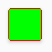
Do note that there is a slight artifacts issue at the edges of the stroke (leaves some pixels of the content there), if you use it. 请注意,如果您使用它,笔划边缘会出现轻微的瑕疵问题(如果内容中有一些像素)。 You can notice it if you zoom in. I've reported about this issue here . 如果你放大,你可以注意到它。我在这里报告了这个问题。
EDIT: seems to be fixed, but not on the IDE. 编辑:似乎是固定的,但不是在IDE上。 Reported here . 在这里报道。
#6楼
Try this... 试试这个...
1.create drawable xml (custom_layout.xml): 1.create drawable xml (custom_layout.xml):
<?xml version="1.0" encoding="utf-8"?>
<shape xmlns:android="http://schemas.android.com/apk/res/android" >

<solid android:color="#FFFFFF" />

<stroke
    android:width="2dp"
    android:color="#FF785C" />

<corners android:radius="10dp" />

</shape>
2.add your view background 2.添加您的视图背景
android:background="@drawable/custom_layout"


 1554
1554

 被折叠的 条评论
为什么被折叠?
被折叠的 条评论
为什么被折叠?
 到【灌水乐园】发言


