


本文翻译自:Bootstrap 3 Navbar with Logo
I want to use the Bootstrap 3 default navbar with an image logo instead of text branding. 我想使用带有图像徽标而不是文本标记的Bootstrap 3默认导航栏。 What's the proper way of doing this without causing any issues with different screen sizes? 在不引起不同屏幕尺寸问题的情况下,这样做的正确方法是什么? I assume this a common requirement, but I haven't yet seen a good code sample. 我认为这是一个常见的要求,但我还没有看到一个好的代码示例。 A key requirement other than having acceptable display on all screen sizes is the menu collapsibility on smaller screens. 除了在所有屏幕尺寸上具有可接受的显示之外的关键要求是较小屏幕上的菜单可折叠性。
I tried just putting an IMG tag inside the A tag that has the navbar-brand class, but that caused the menu not to function properly on my android phone. 我试过把一个IMG标签放在带有navbar-brand类的A标签内,但这导致菜单在我的Android手机上无法正常运行。 I also tried increasing the height of the navbar class, but that screwed things up even more. 我也试过增加导航栏类的高度,但这更加困扰了事情。
By the way, my logo image is larger than the height of the navbar. 顺便说一句,我的徽标图像大于导航栏的高度。
#1楼
参考:https://stackoom.com/question/1FW4q/带徽标的Bootstrap-Navbar
#2楼
Although your question is interesting i don't expect there will be one answer for it. 虽然你的问题很有意思,但我不认为会有一个答案。 Maybe your question is too broad. 也许你的问题太宽泛了。 Your solution should depend on: other content in the navbar (number of items), sizes of your logo, should your logo act responsive, etc. Adding the logo in the a (with navbar-brand) seems a good starting point. 您的解决方案应取决于:导航栏中的其他内容(项目数量),徽标大小,徽标是否响应等等。在a中添加徽标(使用navbar-brand)似乎是一个很好的起点。 I should use the navbar-brand class because this will add a padding (top / bottom) of 15 pixels. 我应该使用navbar-brand类,因为这将添加15像素的填充(顶部/底部)。
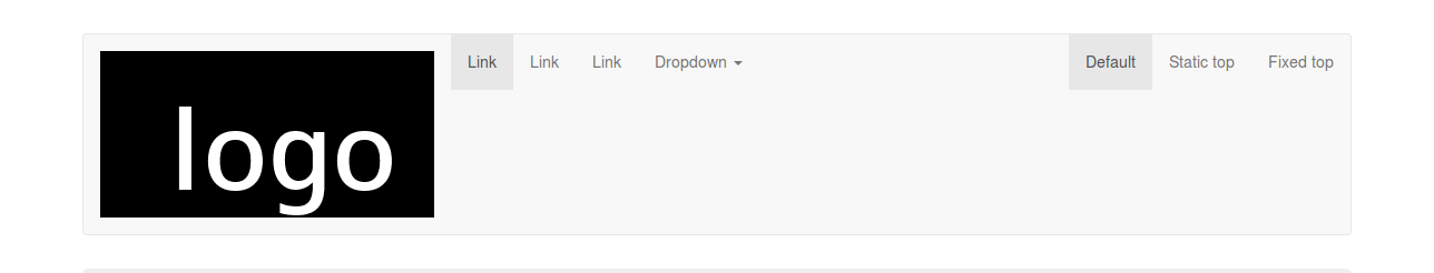
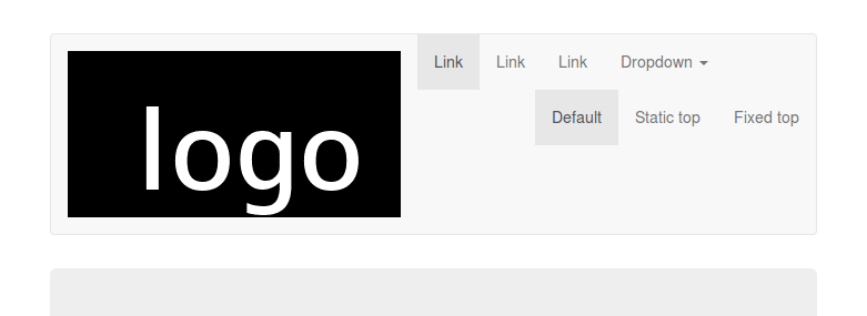
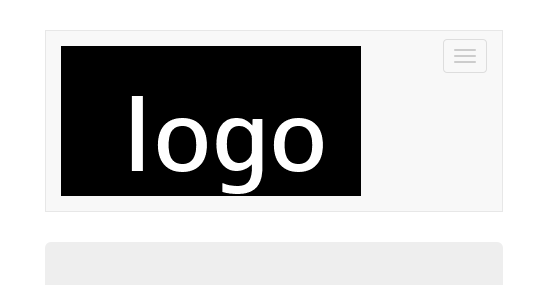
I test this setting on http://getbootstrap.com/examples/navbar/ with a logo of 300x150 pixels. 我在http://getbootstrap.com/examples/navbar/上测试了这个设置,标识为300x150像素。
Full screen > 1200: 全屏> 1200:
between 768 and 992 pixels (menu not collapsed): 在768和992像素之间(菜单未折叠):
<768 (menu collapsed) <768(菜单已折叠)
Beside the aesthetic aspects i did not find any technical problem. 除了审美方面,我没有发现任何技术问题。 On small screens a big logo will overlap or break out the viewport maybe. 在小屏幕上,大徽标可能会重叠或突破视口。 Screens between 768 and 992 pixels also have other problems when the content doesn't fit in a line, see for example: https://github.com/bassjobsen/jamedo-bootstrap-start-theme/issues/18 当内容不符合一行时,768和992像素之间的屏幕也有其他问题,例如: https : //github.com/bassjobsen/jamedo-bootstrap-start-theme/issues/18
The default navbar has
The default navbar example adds a bottom-margin of 30px so the content of your navbar should never overlap the content of your page.
默认导航栏具有
默认导航栏示例添加30px的底部边距,因此导航栏的内容不应与页面内容重叠。 (fixed navbars will have problems when the height of the navbar varies). (当导航栏的高度变化时,固定的导航栏会出现问题)。
You will need some css and media queries to adapt the navbar to your need on different screen sizes. 您将需要一些css和媒体查询来根据不同屏幕尺寸的需要调整导航栏。 Please try to narrow your question. 请尝试缩小您的问题范围。 be describe the problem you found on android. 描述你在android上发现的问题。
update see http://bootply.com/77512 for an example. 更新请参见http://bootply.com/77512以获取示例。
On smaller screens such as a phone, the collapsed menu appears above the logo 在较小的屏幕(如手机)上,折叠的菜单显示在徽标上方
interchange the button and the logo in your code, logo first (set float:left on the logo) 在代码中更换按钮和徽标,首先是徽标(设置浮动:徽标左侧)
There is no way to align the menu items to anything except top 没有办法将菜单项对齐除top之外的任何内容
set the margin-top for .navbar-collapse ul . 设置.navbar-collapse ul的margin-top 。 Use logo height minus navbar height, to align to the bottom or (logo height - navbar height) / 2 to center 使用徽标高度减去导航栏高度,以对齐底部或(徽标高度 - 导航栏高度)/ 2到中心
#3楼
<div class="navbar-header">
    <button type="button" class="navbar-toggle" data-toggle="collapse"
            data-target=".navbar-ex1-collapse">
        <span class="sr-only">Toggle navigation</span>
        <span class="icon-bar"></span>
        <span class="icon-bar"></span>
        <span class="icon-bar"></span>
    </button>
    <a class="navbar-brand" rel="home" href="#" title="Buy Sell Rent Everyting">
        <img style="max-width:100px; margin-top: -7px;"
             src="/img/transparent-white-logo.png">
    </a>
</div>
#4楼
<header class="navbar navbar-inverse header-outer" role="banner">
  <div class="container form-inline">
    <img src="@Url.Content(" ~/Content/img/Logo-Sample.png ")" alt="Image" id="logo" class="img-responsive pull-left" />

    <div class="pull-right padding-top">
      <form class="hidden-xs" role="form">

        <div class="form-group" style="padding-left:10px">
          <input type="email" class="form-control" id="exampleInputEmail2" placeholder="Username">
        </div>

        <div class="form-group">
          <input type="password" class="form-control" id="exampleInputPassword2" placeholder="Password">
        </div>
        <div class="form-group navbar-remember">
          <label class="white-font">
            <input type="checkbox" class="white-font"> Remember me
          </label>
        </div>
        <button type="button" class="btn btn-primary form-group" title="Sign In">Sign In</button>
      </form>
    </div>
  </div>

</header>
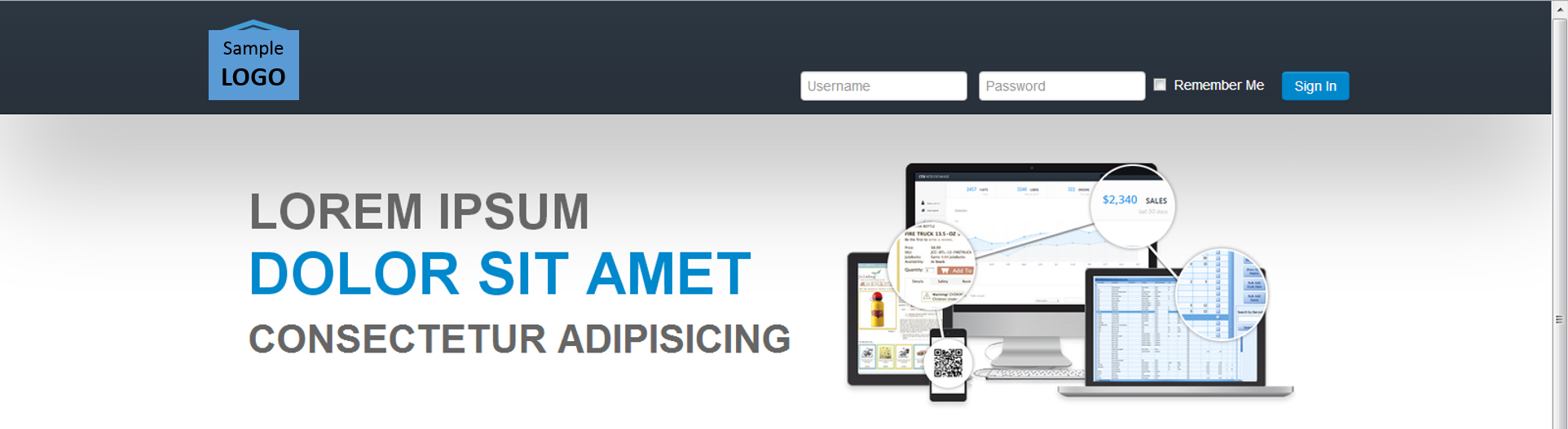
Please understand the code at your own effort :D This is my draft code and its already working :) Here's the screenshot. 请自行理解代码:D这是我的草稿代码,它已经正常工作:)这是截图。
#5楼
My approach is to include FOUR different images of different sizes for phones, tablet, desktop, large desktop but only show ONE using bootstrap's responsive utility classes, as follow: 我的方法是为手机,平板电脑,桌面,大型桌面包含四种不同大小的不同图像,但只使用bootstrap的响应式实用程序类显示ONE,如下所示:
<!--<a class="navbar-brand" href="<?php echo home_url(); ?>/"><?php bloginfo('name'); ?></a>-->

        <a class="navbar-brand visible-xs" href="<?php echo home_url(); ?>/"><img src="/assets/logo-phone.png" alt="<?php bloginfo('name'); ?> Logo" /></a>
        <a class="navbar-brand visible-sm" href="<?php echo home_url(); ?>/"><img src="/assets/logo-tablet.png" alt="<?php bloginfo('name'); ?> Logo" /></a>
        <a class="navbar-brand visible-md" href="<?php echo home_url(); ?>/"><img src="/assets/logo-desktop.png" alt="<?php bloginfo('name'); ?> Logo" /></a>
        <a class="navbar-brand visible-lg" href="<?php echo home_url(); ?>/"><img src="/assets/logo-large.png" alt="<?php bloginfo('name'); ?> Logo" /></a>
Note: You can replace the commented line with the code provided. 注意:您可以使用提供的代码替换注释行。 Replace the php code if you're not using wordpress. 如果你不使用wordpress,请替换php代码。
Edit Note2: Yes, this adds requests to your server when loading the page which might slow down a bit but if you use a background css sprite technique, chances are the logo doesn't get printed when printing a page and the code above should get better SEO. 编辑注意2:是的,这会在加载页面时向服务器添加请求,这可能会减慢一些但是如果使用后台css精灵技术,则打印页面时可能无法打印徽标,上面的代码应该得到更好的SEO。
#6楼
my working code - bootstrap 3.0.3. 我的工作代码 - bootstrap 3.0.3。 when navbar-toggle, hidden-xs original logo image. 当navbar-toggle,hidden-xs原始徽标图像时。
    <a class="navbar-brand hidden-xs" href="<?=$g4['path']?>/">
    <img src="<?=$g4[path]?>/images/logo_opencode.gif" align=absmiddle alt="brand logo">
    </a>

    <a class="navbar-brand navbar-toggle" href="<?=$g4['path']?>/" style="border:0;margin-bottom:0;">
    <img src="<?=$g4[path]?>/images/logo_opencode.gif" alt="brand logo" style="width:120px;">
    </a>


 171
171


 被折叠的 条评论
为什么被折叠?
被折叠的 条评论
为什么被折叠?
 到【灌水乐园】发言


