


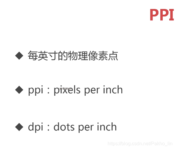
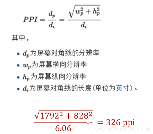
一、物理像素
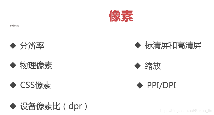
分辨率就是屏幕图像的精密度,是指显示器所能显示的像素的多少。由于屏幕上的点、线和面都是由像素组成的,显示器可显示的像素越多,画面就越精细,同样的屏幕区域内能显示的信息也越多,所以分辨率是个非常重要的性能指标之一
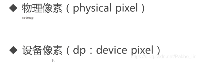
物理像素也可以叫做设备像素
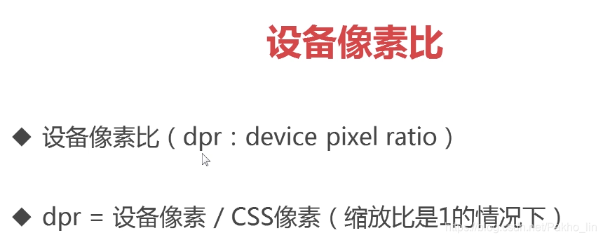
设备像素(物理像素),显示屏是由一个个物理像素点组成的,通过控制每个像素点的颜色,使屏幕显示出不同的图像,屏幕从工厂出来那天起,它上面的物理像素点就固定不变了,单位pt。
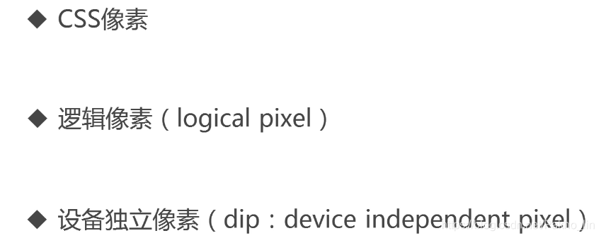
二、CSS像素
CSS像素也可以叫逻辑像素,或者设备独立像素
虚拟像素,可以理解为“直觉”像素,CSS和JS使用的抽象单位,浏览器内的一切长度都是以CSS像素为单位的,CSS像素的单位是px。
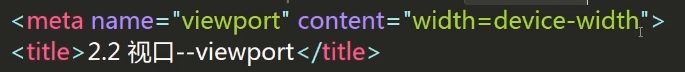
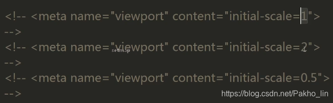
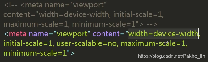
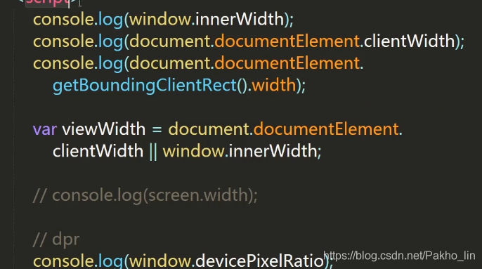
三、视口-viewport
四、box-sizing
<style>
        /*css reset*/
        * {
            box-sizing: border-box;
            padding: 0;
            margin: 0;
        }
        .box {
            display: block;
            width: 150px;
            height: 150px;
            background-color: red;

            width: 50%;
            float: left;

            box-sizing: border-box;

            border: 1px solid #000;
            padding: 5px;
        }
        .box1 {
            /*width/height代表内容的宽高*/
            box-sizing: content-box;
            padding: 10px;
            border: 10px solid #ccc;
        }
        .box2 {
            /*width/height代表整个盒子的宽高*/
            box-sizing: border-box;
            padding: 10px;
            border: 10px solid #ccc;
        }
    </style>
</head>
<body>

    <!--
        content-box
            盒模型宽/高 = width/height + padding + border
        border-box
            盒模型宽/高 = width/height
    -->
    <img src="img/3.1-1.jpg" alt="box-sizing" class="box">
    <img src="img/3.1-2.jpg" alt="box-sizing" class="box">
</body>
五、图标字体
 <link rel="stylesheet" href="css/iconfont.css">
    <style>
        .iconfont {
            font-size: 100px;
            color: red;
        }
        .icon-personal {
            color: green;
            font-size: 50px;
        }
    </style>
</head>
<body>

    <i class="iconfont icon-scan"></i>
    <i class="iconfont icon-backtop"></i>
    <i class="iconfont icon-personal"></i>

</body>
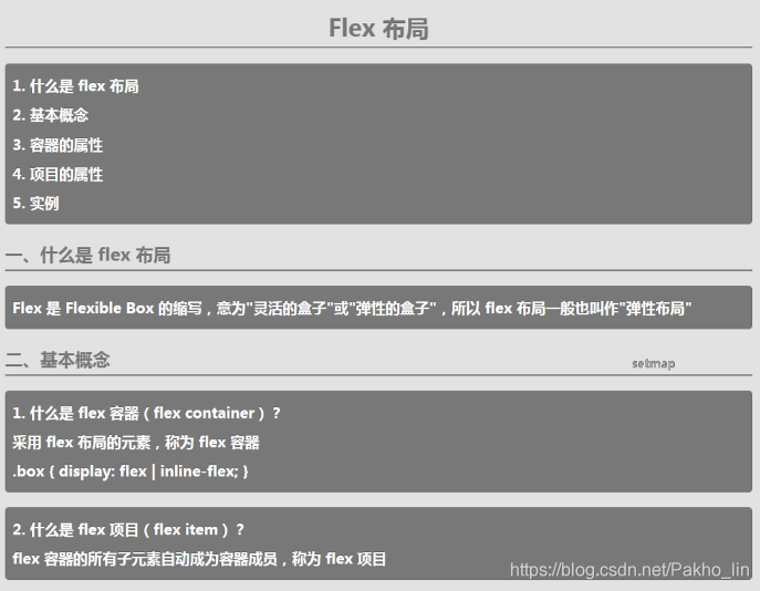
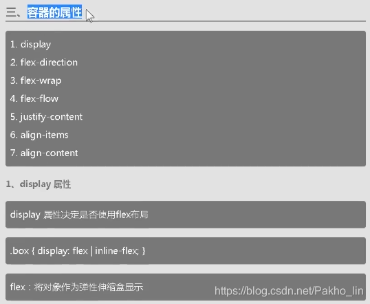
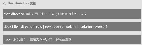
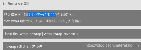
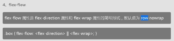
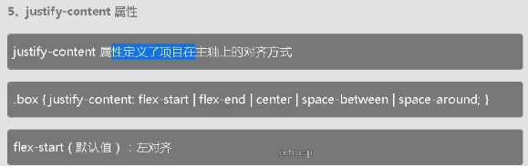
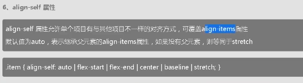
六、flex布局
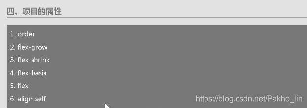
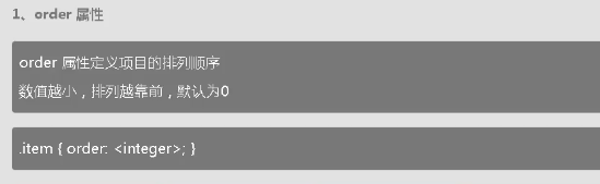
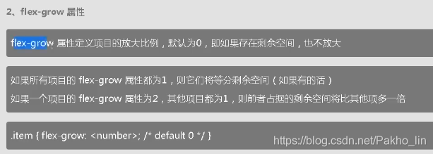
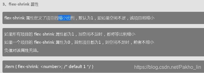
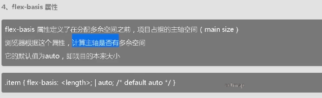
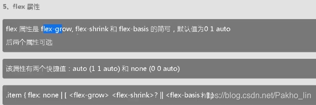
1、flex布局-项目的属性
七、媒体查询
  <style>
        /*1. 什么是媒体查询 media query*/
        /*@media screen and (min-width: 900px) {
            body {
                background-color: red;
            }
        }*/

        /*
            2. 为什么需要媒体查询
                一套样式不可能适应各种大小的屏幕
                针对不同的屏幕大小写样式
                让我们的页面在不同大小的屏幕上都能正常显示
        */


        /*
            3. 媒体类型
                all(default)
                screen / print / speech
        */
        /*@media (min-width: 900px) {
            body {
                background-color: red;
            }
        }*/
        /*@media print and (min-width: 900px) {
            body {
                background-color: red;
            }
        }*/


        /*
            4. 媒体查询中的逻辑
                与( and )
                或( , )
                非( not )
        */
        /*@media screen and (min-width: 900px) and (max-width: 1024px) {
            body {
                background-color: red;
            }
        }*/
        /*@media screen and (min-width: 1024px), (max-width: 900px) {
            body {
                background-color: red;
            }
        }
        @media screen and (min-width: 1024px), screen and (max-width: 900px) {
            body {
                background-color: red;
            }
        }*/

        /*@media not screen and (min-width: 900px) and (max-width: 1024px) {
            body {
                background-color: red;
            }
        }*/
        /*@media not screen and (min-width: 1024px), screen and (max-width: 900px) {
            body {
                background-color: red;
            }
        }*/


        /*
            5. 媒体特征表达式
                width/max-width/min-width
                -webkit-device-pixel-ratio/-webkit-max-device-pixel-ratio/-webkit-min-pixel-ratio
                orientation
                    landscape/portrait

                height
                device-width/device-height
                    screen.width/screen.height
                aspect-ratio 视口的宽高比
        */
        /*@media screen and (min-width: 900px) {
            body {
                background-color: red;
            }
        }*/
        @media (-webkit-max-device-pixel-ratio: 2) and (orientation: landscape) {
            body {
                background-color: red;
            }
        }
    </style>
媒体查询策略
<style>
        /*css reset*/
        * {
            box-sizing: border-box;
            padding: 0;
            margin: 0;
        }
        body {
            padding-top: 200px;
        }
        img {
            width: 100%;
            height: 100%;
        }
        .row {
            width: 100%;
            display: flex;
            flex-wrap: wrap;
        }
        .col {
            padding-top: 10px;
            padding-bottom: 10px;
            background-color: rgba(86, 61, 124, 0.15);
            border: 1px solid rgba(86, 61, 124, 0.2);
        }

        /*
            断点
                xs: < 576px
                sm: 576px ~ 768px
                md: 768px ~ 992px
                lg: 992px ~ 1200px
                xl: > 1200px
            断点怎么来的
                改变屏幕大小,当页面显示不正常的时候,你就需要设置断点了
                经验值
                    预设一些
        */
        /*@media (max-width: 576px) {
            .col {
                width: 100%;
            }
        }
        @media (min-width: 577px) and (max-width: 768px) {
            .col {
                width: 50%;
            }
        }
        @media (min-width: 769px) and (max-width: 992px) {
            .col {
                width: 25%;
            }
        }
        @media (min-width: 993px) and (max-width: 1200px) {
            .col {
                width: 16.6666666667%;
            }
        }
        @media (min-width: 1201px) {
            .col {
                width: 8.333333333%;
            }
        }*/

        /*pc first*/
        /*.col {
            width: 8.333333333%;
        }
        @media (max-width: 1200px) {
            .col {
                width: 16.6666666667%;
            }
        }
        @media (max-width: 992px) {
            .col {
                width: 25%;
            }
        }
        @media (max-width: 768px) {
            .col {
                width: 50%;
            }
        }
        @media (max-width: 576px) {
            .col {
                width: 100%;
            }
        }*/

        /*mobile first*/
        .col {
            width: 100%;
        }
        @media (min-width: 576px) {
            .col {
                width: 50%;
            }
        }
        @media (min-width: 768px) {
            .col {
                width: 25%;
            }
        }
        @media (min-width: 992px) {
            .col {
                width: 16.6666666667%;
            }
        }
        @media (min-width: 1200px) {
            .col {
                width: 8.33333333%;
            }
        }
    </style>
</head>
<body>
    <div class="row">
        <div class="col">
            <img src="img/3.8-1.png" alt="">
        </div>
        <div class="col">
            <img src="img/3.8-1.png" alt="">
        </div>
        <div class="col">
            <img src="img/3.8-1.png" alt="">
        </div>
        <div class="col">
            <img src="img/3.8-1.png" alt="">
        </div>
        <div class="col">
            <img src="img/3.8-1.png" alt="">
        </div>
        <div class="col">
            <img src="img/3.8-1.png" alt="">
        </div>
        <div class="col">
            <img src="img/3.8-1.png" alt="">
        </div>
        <div class="col">
            <img src="img/3.8-1.png" alt="">
        </div>
        <div class="col">
            <img src="img/3.8-1.png" alt="">
        </div>
        <div class="col">
            <img src="img/3.8-1.png" alt="">
        </div>
        <div class="col">
            <img src="img/3.8-1.png" alt="">
        </div>
        <div class="col">
            <img src="img/3.8-1.png" alt="">
        </div>
    </div>
</body>
八、移动端常用单位
<style>
        /*px/%/em/rem/vw/vh*/

        /*css reset*/
            * {
                box-sizing: border-box;
                padding: 0;
                margin: 0;
            }
            body {
                background-color: #e2e2e2;
                color: #595B66;
            }
            a {
                font-size: 12px;
                color: #686868;
                text-decoration: none;
            }
            li {
                list-style: none;
            }

        /*body {
            font-size: 20px;
        }*/

        html {
            font-size: 12px;
        }
        .tabbar-container {
            position: fixed;
            left: 0;
            bottom: 0;
            z-index: 1000;
            width: 100%;

            /*height: 5em;
            font-size: 12px;*/
            /*font-size: 12em;*/

            /*height: 5rem;*/

            /*width: 100vw;
            height: 10vh;*/
            background-color: #fff;
            box-shadow: 0 0 10px 0 rgba(154, 141 ,141, 0.6);

            height: 50px;
            /*
                height
                    375px -> 100%(375px) x 50px
                    750px -> 100%(750px) x 100px
                    ?(视口宽度) -> (? / 750) * 100 px
                    ?(视口宽度) = document.documentElement.clientWidth
                    height = (document.documentElement.clientWidth / 750) * 100 px
                    height = (document.documentElement.clientWidth / 375) * 50 px
            */

            /*
                用px/em做单位,每次都要用js一一修改
                能不能统一修改呢?
                    375px -> 1rem = 20px;
                        height = 50 / 20 = 2.5rem;
                    750px -> 1rem = 40px;
                        height = 100 / 40 = 2.5rem;
                    ?(视口宽度) -> 1rem = (? / 375) * 20 px
                    ?(视口宽度) = document.documentElement.clientWidth
                    1rem = (document.documentElement.clientWidth / 375) * 20 px
                    1rem = (document.documentElement.clientWidth / 750) * 40 px
                    height = 2.5rem;
            */
            /*375px 1rem = 20px;*/
            height: 2.5rem;
        }
        .tabbar-link .iconfont {
            /*font-size: 24px;*/
            font-size: 1.2rem;
            /*font-size: 2em;*/

            /*
                font-size
                    375px -> 24px
                    750px -> 48px
                    ?(视口宽度) -> (? / 750) * 48 px
                    ?(视口宽度) = document.documentElement.clientWidth
                    font-size = (document.documentElement.clientWidth / 750) * 48 px
                    font-size = (document.documentElement.clientWidth / 375) * 24 px
            */
            /*
                用px/em做单位,每次都要用js一一修改
                能不能统一修改呢?
                    375px -> 1rem = 20px;
                        font-size = 24 / 20 = 1.2rem;
                    750px -> 1rem = 40px;
                        font-size = 48 / 40 = 1.2rem;
                    ?(视口宽度) -> 1rem = (? / 375) * 20 px
                    ?(视口宽度) = document.documentElement.clientWidth
                    1rem = (document.documentElement.clientWidth / 375) * 20 px
                    1rem = (document.documentElement.clientWidth / 750) * 40 px
                    font-size = 1.2rem;
            */
        }
        .tabbar,
        .tabbar-item,
        .tabbar-link {
            height: 100%;
        }
        .tabbar {
            display: flex;
        }
        .tabbar-item {
            flex: 1;
        }
        .tabbar-link {
            display: flex;
            flex-direction: column;
            justify-content: center;
            align-items: center;

            font-size: 0.6rem;
        }
        .tabbar-item-active .tabbar-link {
            color: #de181b;
        }
    </style>
</head>
<body>

    <!-- <p style="text-indent: 2em;">
        我是短路
        我是短路
    </p> -->

    <div class="tabbar-container">
        <ul class="tabbar">
            <li class="tabbar-item tabbar-item-active">
                <a href="###" class="tabbar-link">
                    <i class="iconfont icon-home"></i>
                    <span>首页</span>
                </a>
            </li>
            <li class="tabbar-item">
                <a href="###" class="tabbar-link">
                    <i class="iconfont icon-category"></i>
                    <span>分类页</span>
                </a>
            </li>
            <li class="tabbar-item">
                <a href="###" class="tabbar-link">
                    <i class="iconfont icon-cart"></i>
                    <span>购物车</span>
                </a>
            </li>
            <li class="tabbar-item">
                <a href="###" class="tabbar-link">
                    <i class="iconfont icon-personal"></i>
                    <span>个人中心</span>
                </a>
            </li>
        </ul>
    </div>

    <script>
        setRemUnit();

        window.onresize = setRemUnit;

        function setRemUnit() {
            var docEl = document.documentElement;
            var viewWidth = docEl.clientWidth;

            docEl.style.fontSize = viewWidth / 375 * 20 + 'px';
            // docEl.style.fontSize = viewWidth / 750 * 40 + 'px';
            // 1rem = 20px
        }
    </script>
</body>


 6231
6231


 被折叠的 条评论
为什么被折叠?
被折叠的 条评论
为什么被折叠?
 到【灌水乐园】发言


