


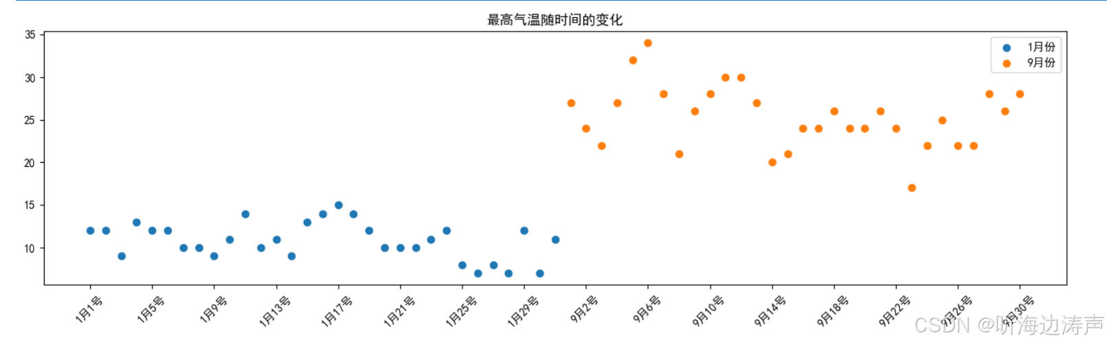
以1月份和9月份的最高气温为例,绘制散点图。
import matplotlib.pyplot as plt

plt.rcParams['font.sans-serif'] = ['SimHei']
plt.rcParams['axes.unicode_minus'] = False
y_1 = [12, 12, 9, 13, 12, 12, 10, 10, 9, 11, 14, 10, 11, 9, 13, 14, 15, 14, 12, 10, 10, 10, 11, 12, 8, 7, 8, 7, 12, 7, 11]
y_9 = [27, 24, 22, 27, 32, 34, 28, 21, 26, 28, 30, 30, 27, 20, 21, 24, 24, 26, 24, 24, 26, 24, 17, 22, 25, 22, 22, 28, 26, 28]

x_1 = range(1, 32)
x_9 = range(32, 62)

plt.figure(figsize=(16, 4))

plt.scatter(x_1, y_1, label='1月份')
plt.scatter(x_9, y_9, label='9月份')

x_ticks = list(x_1) + list(x_9)
x_ticks_labels = [f'1月{i}号' for i in x_1] + [f'9月{i - 31}号' for i in x_9]
plt.xticks(x_ticks[::4], x_ticks_labels[::4], rotation=45)
plt.title('最高气温随时间的变化')

plt.legend()

plt.show()


 被折叠的 条评论
为什么被折叠?
被折叠的 条评论
为什么被折叠?
 到【灌水乐园】发言


