


文章目录
前言
本章节记录常用控件 MessageBox,MessageToast,Illustrated Message,Message Strip,Message View,MessagePopover
其路径分别是:
- sap.m.MessageBox
- sap.m.MessageToast
- sap.m.IllustratedMessage
- sap.m.MessageStrip
- sap.m.MessageView
- sap.m.MessagePopover
1. MessageBox
此控件一般在Controller中使用。
- 用法
MessageBox.confirm("Message Here");
1.1 类型
-
confirm
-
alert
-
error
-
information
-
warning
-
success
-
Custom Action
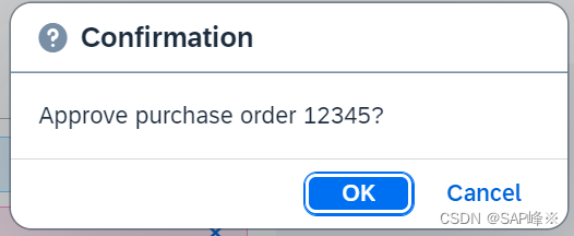
onConfirmationMessageBoxPress: function () {
MessageBox.confirm("Approve purchase order 12345?");
},
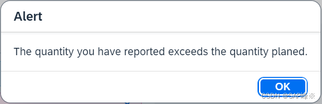
onAlertMessageBoxPress: function () {
MessageBox.alert("The quantity you have reported exceeds the quantity planed.");
},
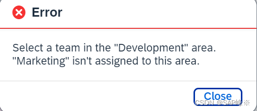
onErrorMessageBoxPress: function () {
MessageBox.error("Select a team in the \"Development\" area.\n\"Marketing\" isn't assigned to this area.");
},
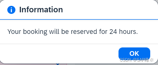
onInfoMessageBoxPress: function () {
MessageBox.information("Your booking will be reserved for 24 hours.");
},
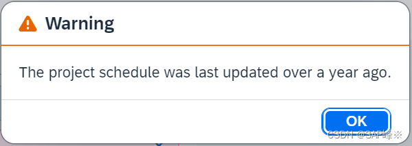
onWarningMessageBoxPress: function () {
MessageBox.warning("The project schedule was last updated over a year ago.");
},
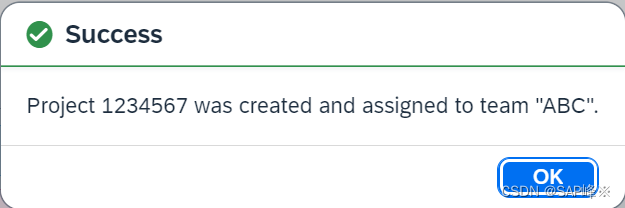
onSuccessMessageBoxPress: function () {
MessageBox.success("Project 1234567 was created and assigned to team \"ABC\".");
},
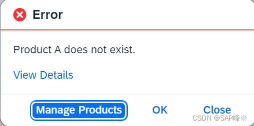
onError2MessageBoxPress: function () {
MessageBox.error("Product A does not exist.", {
actions: ["Manage Products", MessageBox.Action.OK, MessageBox.Action.CLOSE],
emphasizedAction: "Manage Products",
initialFocus: "Manage Products",
details: "<p><strong>This can happen if:</strong></p>" +
"<ul>" +
"<li>You are not connected to the internet</li>" +
"<li>a backend component is not <em>available</em></li>" +
"<li>or an underlying system is down</li>" +
"</ul>" +
"<p>Get more help <a href='//www.sap.com' target='_top'>here</a>.",
onClose: function (sAction) {
sap.m.MessageToast.show("Action selected: " + sAction);
}
});
},
2. MessageToast
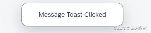
- Code
	onMessageToastPress:function(){
     	MessageToast.show("Message Toast Clicked");
    }
3. IllustratedMessage
IllustratedMessage是一个用于显示带有图标的消息的UI5控件。
它提供了一种可视化的方式来向用户传达信息,并可以帮助用户更好地理解和处理消息。
3.1 enableVerticalResponsiveness
- 排列布局
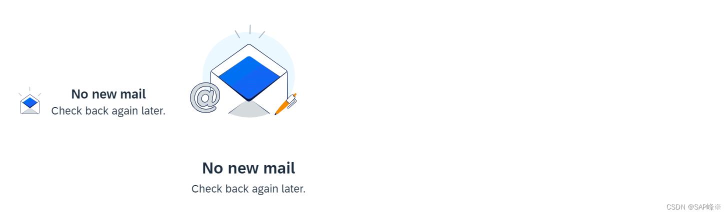
    <HBox>
        <IllustratedMessage
            enableVerticalResponsiveness="true"
            illustrationType="sapIllus-NoMail"
        />
        <IllustratedMessage
            enableVerticalResponsiveness="false"
            illustrationType="sapIllus-NoMail"
        />
    </HBox>
3.2 illustrationType
- 预定义的图标样式及文字
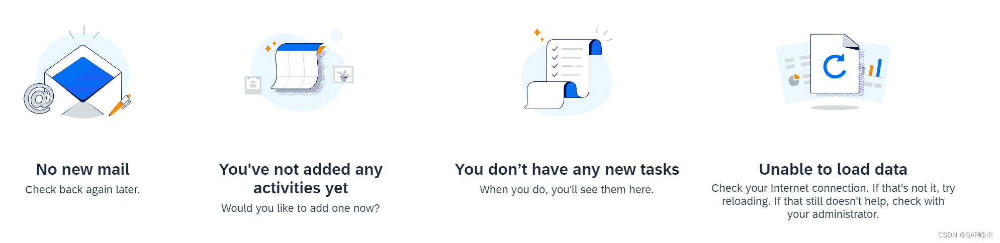
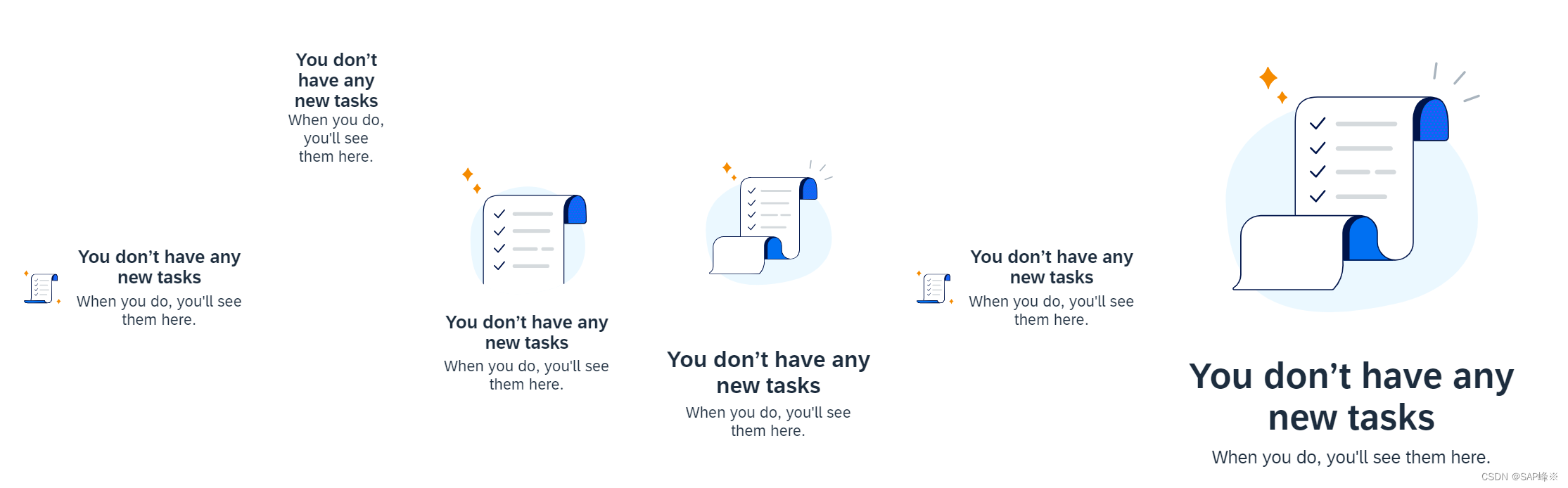
3.3 illustrationSize
属性有:Auto,Base,Spot,Dialog,Dot,Scene
3.4 additionalContent
IllustratedMessage内部创建额外的控件
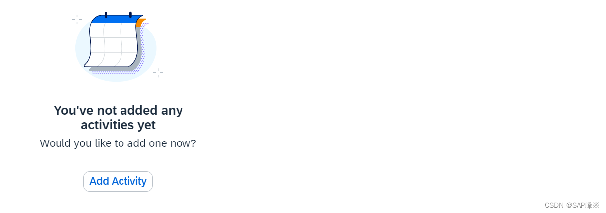
- Code
   <IllustratedMessage
       enableVerticalResponsiveness="true"
       illustrationType="sapIllus-NoActivities"
   >
       <additionalContent>
           <Button text="Add Activity" />
       </additionalContent>
   </IllustratedMessage>
4. MessageStrip
主要使用的属性有showIcon,showCloseButton,text,type,customIcon
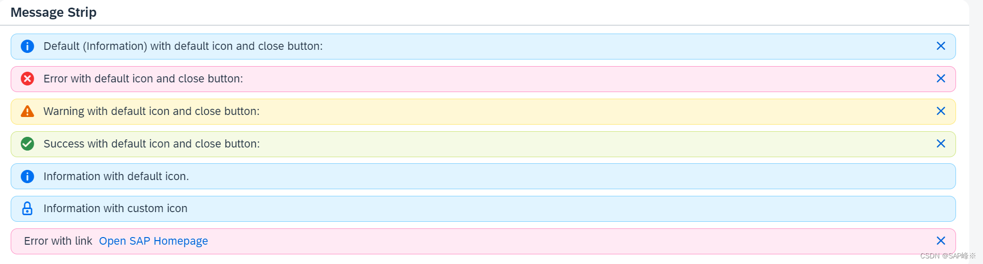
  <Panel
      headerText="Message Strip"
      width="50%"
  >
      <MessageStrip
          text="Default (Information) with default icon and close button:"
          showIcon="true"
          showCloseButton="true"
          class="sapUiTinyMarginBottom"
      />

      <MessageStrip
          text="Error with default icon and close button:"
          type="Error"
          showIcon="true"
          showCloseButton="true"
          class="sapUiTinyMarginBottom"
      />

      <MessageStrip
          text="Warning with default icon and close button:"
          type="Warning"
          showIcon="true"
          showCloseButton="true"
          class="sapUiTinyMarginBottom"
      />

      <MessageStrip
          text="Success with default icon and close button:"
          type="Success"
          showIcon="true"
          showCloseButton="true"
          class="sapUiTinyMarginBottom"
      />

      <MessageStrip
          text="Information with default icon."
          type="Information"
          showIcon="true"
          class="sapUiTinyMarginBottom"
      />

      <MessageStrip
          text="Information with custom icon"
          type="Information"
          showIcon="true"
          customIcon="sap-icon://locked"
          class="sapUiTinyMarginBottom"
      />

      <MessageStrip
          text="Error with link"
          type="Error"
          showCloseButton="true"
          class="sapUiTinyMarginBottom"
      >
          <link>
              <Link
                  text="Open SAP Homepage"
                  target="_blank"
                  href="http://www.sap.com"
              />
          </link>
      </MessageStrip>
  </Panel>
5. MessageView
5.1 视图里直接使用
- Code
  <MessageView items="{msg>/}">
      <MessageItem
          type="{msg>type}"
          title="{msg>title}"
          subtitle="{msg>subtitle}"
          description="{msg>description}"
      />
  </MessageView>
- Controller
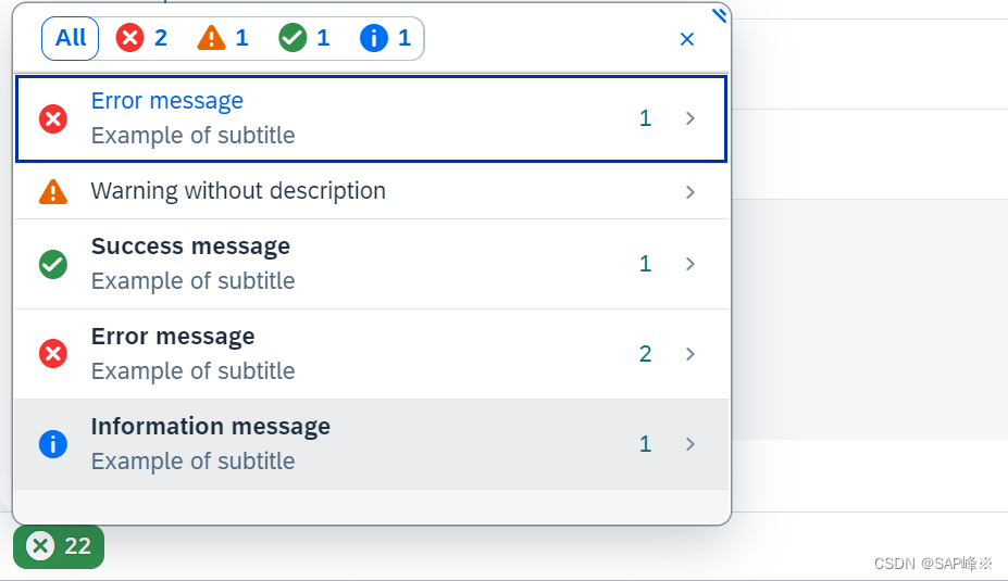
	var aMockMessages = [{
	       type: 'Error',
	       title: 'Error message',
	       active: true,
	       description: sErrorDescription,
	       subtitle: 'Example of subtitle',
	       counter: 1
	   }, {
	       type: 'Warning',
	       title: 'Warning without description',
	       description: ''
	   }, {
	       type: 'Success',
	       title: 'Success message',
	       description: 'First Success message description',
	       subtitle: 'Example of subtitle',
	       counter: 1
	   }, {
	       type: 'Error',
	       title: 'Error message',
	       description: 'Second Error message description',
	       subtitle: 'Example of subtitle',
	       counter: 2
	   }, {
	       type: 'Information',
	       title: 'Information message',
	       description: 'First Information message description',
	       subtitle: 'Example of subtitle',
	       counter: 1
	   }];
	this.getView().setModel(new JSONModel(aMockMessages), "msg");
5.2 与Popover控件一起使用
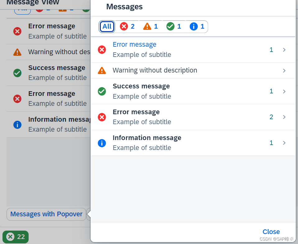
	this.oMessageView = new MessageView({
	    showDetailsPageHeader: false,
	    itemSelect: function () {
	        oBackButton.setVisible(true);
	    },
	    items: {
	        path: "msg>/",
	        template: oMessageTemplate
	    }
	});

	var oBackButton = new sap.m.Button({
		icon: IconPool.getIconURI("nav-back"),
		visible: false,
		press: function () {
			that.oMessageView.navigateBack();
			that._oPopover.focus();
			this.setVisible(false);
	}
	});

	var oCloseButton = new sap.m.Button({
	    text: "Close",
	    press: function () {
	        this._oPopover.close();
	    }.bind(this)
	}).addStyleClass("sapUiTinyMarginEnd"),
	    oPopoverFooter = new sap.m.Bar({
	        contentRight: oCloseButton
	    }),
	    oPopoverBar = new sap.m.Bar({
	        contentLeft: [oBackButton],
	        contentMiddle: [
	            new sap.m.Title({ text: "Messages" })
	        ]
	    });

	this._oPopover = new sap.m.Popover({
	    customHeader: oPopoverBar,
	    contentWidth: "440px",
	    contentHeight: "440px",
	    verticalScrolling: false,
	    modal: true,
	    content: [this.oMessageView],
	    footer: oPopoverFooter
	});

	this.oMessageView.setModel(new JSONModel(aMockMessages), "msg");

	this._oPopover.openBy(oEvent.getSource());
5.3 与Dialog控件一起使用
- Controller
	handleDialogPress: function (oEvent) {

	    var oBackButton = new sap.m.Button({
	icon: IconPool.getIconURI("nav-back"),
	visible: false,
	press: function () {
	that.oMessageView.navigateBack();
	this.setVisible(false);
	}
	});

	    this.oDialog = new sap.m.Dialog({
	        resizable: true,
	        content: this.oMessageView,
	        state: 'Error',
	        beginButton: new sap.m.Button({
	            press: function () {
	                this.getParent().close();
	            },
	            text: "Close"
	        }),
	        customHeader: new sap.m.Bar({
	            contentLeft: [oBackButton],
	            contentMiddle: [
	                new sap.m.Title({
	                    text: "Error",
	                    level: 'H1'
	                })
	            ]
	        }),
	        contentHeight: "50%",
	        contentWidth: "50%",
	        verticalScrolling: false
	    });

	    this.oDialog.open();
	},
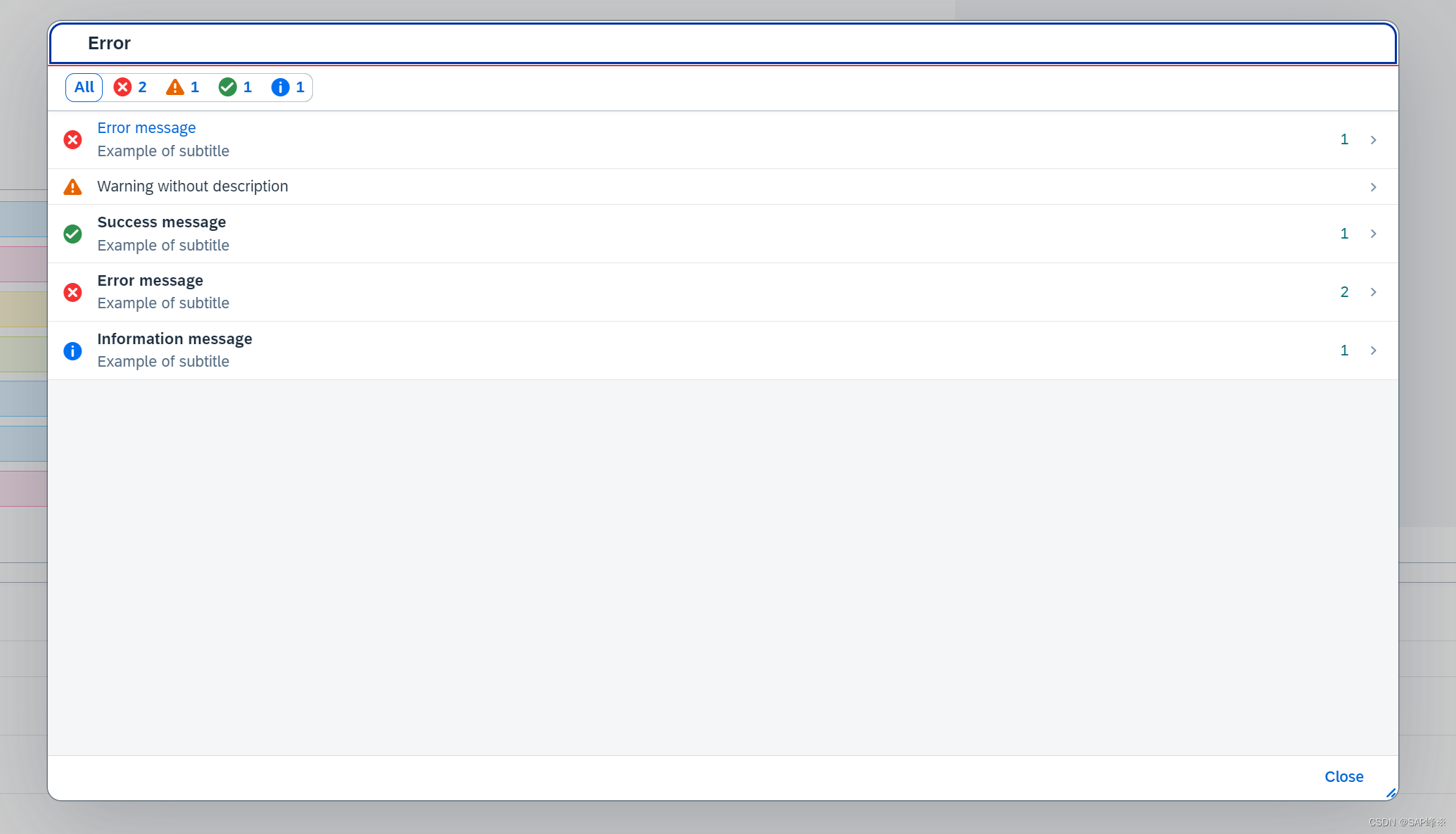
6. MessagePopover
MessagePopover可以看作是MessageView和Popover结合体
- View
   <footer>
       <OverflowToolbar>
           <Button
               id="messagePopoverBtn"
               icon="{ path: 'msg>/', formatter: '.buttonIconFormatter' }"
               type="{ path: 'msg>/', formatter: '.buttonTypeFormatter' }"
               text="{ path: 'msg>/', formatter: '.highestSeverityMessages' }"
               press=".handleMessagePopoverPress"
               ariaHasPopup="Dialog"
           />
           <ToolbarSpacer />

       </OverflowToolbar>
   </footer>
- Controller
	var sErrorDescription = "<h2>Heading h2</h2>" +
	    "<p>Paragraph. At vero eos et accusamus et iusto odio dignissimos ducimus qui ...</p>" +
	    "<ul>" +
	    "	<li>Unordered list item 1 <a href=\"http://sap.com/some/url\">Absolute URL that is disabled after validation.</a></li>" +
	    "	<li>Unordered list item 2</li>" +
	    "</ul>" +
	    "<ol>" +
	    "	<li>Ordered list item 1 <a href=\"#\">Relative URL that is allowed after validation.</a></li>" +
	    "	<li>Ordered list item 2</li>" +
	    "</ol>";

	var oLink = new Link({
	    text: "Show more information",
	    href: "http://sap.com",
	    target: "_blank"
	});

	var oMessageTemplate = new MessageItem({
	    type: '{msg>type}',
	    title: '{msg>title}',
	    activeTitle: "{msg>active}",
	    description: '{msg>description}',
	    subtitle: '{msg>subtitle}',
	    counter: '{msg>counter}',
	    link: oLink,
	    markupDescription: true
	});

	oMessagePopover = new MessagePopover({
	    items: {
	        path: 'msg>/',
	        template: oMessageTemplate
	    },
	    activeTitlePress: function () {
	        MessageToast.show('Active title is pressed');
	    }
	});

	oMessagePopover.toggle(oEvent.getSource(),null,sap.m.PlacementType.Left);


 2025
2025


 被折叠的 条评论
为什么被折叠?
被折叠的 条评论
为什么被折叠?
 到【灌水乐园】发言


