


目录
Flutter 的文档现在虽然是很健全了,但是不知道为什么对于 IOS 风格组件的文档还是那么的欠缺,当打开 CupertionAlertDialog 的官方文档 后竟然没有 demo 代码,但是 AlertDialog 的文档 就有简单的示例,这就非常的尴尬,估计 Google 是想推自己的 Material Design 风格吧。
正好在项目中要使用 IOS 风格的 CupertinoAlertDialog ,所以在这里整理下也方便大家的使用,使用起来也会比较的简单。
1. 先看一个简单的例子
import 'package:flutter/cupertino.dart';
import 'package:flutter/material.dart';

void main() {
  runApp(MyApp());
}

class MyApp extends StatelessWidget {
  @override
  Widget build(BuildContext context) {
    return MaterialApp(
      home: DialogPage(),
    );
  }
}

class DialogPage extends StatelessWidget {
  @override
  Widget build(BuildContext context) {
    return Scaffold(
      appBar: AppBar(
        title: Text('Demo'),
      ),
      body: Center(
        child: RaisedButton(
          onPressed: () {
            _showDialog(context);
          },
          child: Text('点击显示弹窗'),
        ),
      ),
    );
  }
}

void _showDialog(widgetContext) {
  showCupertinoDialog(
    context: widgetContext,
    builder: (context) {
      return CupertinoAlertDialog(
        title: Text('确认删除'),
        actions: [
          CupertinoDialogAction(
            child: Text('确认'),
            onPressed: () {
              Navigator.of(context).pop();
            },
          ),
          CupertinoDialogAction(
            child: Text('取消'),
            isDestructiveAction: true,
            onPressed: () {
              Navigator.of(context).pop();
            },
          ),
        ],
      );
    },
  );
}
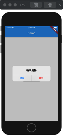
这是一个简单的例子,显示的效果如下:
2. showCupertinoDialog 参数说明:
showCupertinoDialog: 是显示 IOS 风格弹窗必须使用的方法。
CupertinoAlertDialog:表示显示一个警告弹窗,也就是示例中的样式。
CupertinoAlertDialog 源码分析:
class CupertinoAlertDialog extends StatelessWidget {
  const CupertinoAlertDialog({
    Key key, // 组件的唯一标识
    this.title, //组件的标题 (可选)
    this.content, //标题的内容(可选)
    this.actions = const <Widget>[], //组件中包含的操作组件,不能为空
    this.scrollController, // 内容滚动控制器,默认 null,一般不需要
    this.actionScrollController, // 操作组件滚动控制器,默认 null,一般不需要
    this.insetAnimationDuration = const Duration(milliseconds: 100),
    this.insetAnimationCurve = Curves.decelerate,
  }) : assert(actions != null),
       super(key: key);
  ...
}
3. 使用 conent 参数
接下来添加一下 content 属性,在上面的代码 title 下面添加 content 属性:
...
title: Text('确认删除'),
content: Text('这个是个提示内容 content'),
actions: [
...
显示效果如下所示:

4. 调节标题与内容部分间距
上面的标题与内容部分间距太小,可以通过在 content 里面添加 \n 换行符来增加两者之间的间距:
...
title: Text('确认删除'),
content: Text('\n这个是个提示内容 content'),
actions: [
...
显示效果:

5. 使用一个或多个 actions
actions 中的操作组件可以为一个或者是多个。
showCupertinoDialog(
    context: widgetContext,
    builder: (context) {
      return CupertinoAlertDialog(
        title: Text('确认删除'),
        content: Text('\n这个是个提示内容 content'),
        actions: <Widget>[
          CupertinoDialogAction(
            child: Text('确认'),
            onPressed: () {
              Navigator.of(context).pop();
            },
          ),
        ],
      );
    },
  );
界面显示效果:

showCupertinoDialog(
    context: widgetContext,
    builder: (context) {
      return CupertinoAlertDialog(
        title: Text('请评价'),
        content: Text('\n我们很重视您的评价!'),
        actions: <Widget>[
          CupertinoDialogAction(
            child: Text('非常好'),
            onPressed: () {
              Navigator.of(context).pop();
            },
          ),
          CupertinoDialogAction(
            child: Text('一般'),
            onPressed: () {
              Navigator.of(context).pop();
            },
          ),
          CupertinoDialogAction(
            child: Text('非常差'),
            isDestructiveAction: true,
            onPressed: () {
              Navigator.of(context).pop();
            },
          ),
        ],
      );
    },
  );
界面显示效果:

6. CupertinoDialogAction 参数说明
class CupertinoDialogAction extends StatelessWidget {
  const CupertinoDialogAction({
    Key key, // 唯一标识
    this.onPressed, //点击事件
    this.isDefaultAction = false, //默认为false,是否是默认按钮,默认按钮为加粗按钮,非空
    this.isDestructiveAction = false, // 是否是取消按钮(破坏性按钮),默认为false,非空
    this.textStyle, //字体的样式
    @required this.child, // 子组件
  }) : assert(child != null),
       assert(isDefaultAction != null),
       assert(isDestructiveAction != null),
       super(key: key);
  ....
}
简单的示例:
showCupertinoDialog(
    context: widgetContext,
    builder: (context) {
      return CupertinoAlertDialog(
        title: Text('我帅不帅?'),
        content: Text('\n我不关心你的回答,哈哈哈'),
        actions: [
          CupertinoDialogAction(
            child: Text('帅'),
            isDefaultAction: true, //是默认的,所以界面将是加粗样式
            onPressed: () {
              Navigator.of(context).pop();
            },
          ),
          CupertinoDialogAction(
            child: Text('一般'),
            onPressed: () {
              Navigator.of(context).pop();
            },
          ),
          CupertinoDialogAction(
            child: Text('丑'),
            isDestructiveAction: true,
            onPressed: () {
              Navigator.of(context).pop();
            },
          ),
        ],
      );
    },
  );

博客地址: Roc’s Blog


 7647
7647


 被折叠的 条评论
为什么被折叠?
被折叠的 条评论
为什么被折叠?
 到【灌水乐园】发言


