


WPF常用样式总结
1.按钮
<!--标准带圆角的按钮-->
    <Style x:Key="RegularButtonStyle" TargetType="{x:Type Button}">
        <Setter Property="Background" Value="{StaticResource MainBlueColorBrush}"/>
        <Setter Property="BorderBrush" Value="{StaticResource MainBlueColorBrush}"/>
        <Setter Property="Foreground" Value="white"/>
        <Setter Property="BorderThickness" Value="1"/>
        <Setter Property="HorizontalContentAlignment" Value="Center"/>
        <Setter Property="VerticalContentAlignment" Value="Center"/>
        <Setter Property="Padding" Value="50 10 50 10"/>
        <Setter Property="FontSize" Value="18"/>
        <Setter Property="Cursor" Value="Hand"/>
        <Setter Property="local:CornerRadiusProperty.Value" Value="5"/>
        <Setter Property="Template">
            <Setter.Value>
                <ControlTemplate TargetType="{x:Type Button}">
                    <Border x:Name="border"
                            CornerRadius="{TemplateBinding local:CornerRadiusProperty.Value,Converter={local:DoubleToCornerRadiusConverter}}"
                            BorderBrush="{TemplateBinding BorderBrush}"
                            BorderThickness="{TemplateBinding BorderThickness}"
                            Background="{TemplateBinding Background}"
                            SnapsToDevicePixels="true">
                        <ContentPresenter x:Name="contentPresenter"
                                          Focusable="False"
                                          HorizontalAlignment="{TemplateBinding HorizontalContentAlignment}"
                                          Margin="{TemplateBinding Padding}"
                                          RecognizesAccessKey="True"
                                          SnapsToDevicePixels="{TemplateBinding SnapsToDevicePixels}"
                                          VerticalAlignment="{TemplateBinding VerticalContentAlignment}"/>
                    </Border>
                    <ControlTemplate.Triggers>
                        <Trigger Property="IsDefaulted" Value="true">
                            <Setter Property="BorderBrush" TargetName="border" Value="{DynamicResource {x:Static SystemColors.HighlightBrushKey}}"/>
                        </Trigger>
                        <Trigger Property="IsMouseOver" Value="true">
                            <Setter Property="Background" TargetName="border" Value="{StaticResource MainYellowColorBrush}"/>
                            <Setter Property="BorderBrush" TargetName="border" Value="{StaticResource MainYellowColorBrush}"/>
                        </Trigger>
                    </ControlTemplate.Triggers>
                </ControlTemplate>
            </Setter.Value>
        </Setter>
    </Style>

	 <!--设置界面菜单按钮样式-->
    <Style x:Key="MenuButtonStyle" TargetType="{x:Type RadioButton}">
        <Setter Property="Padding" Value="10"/>
        <Setter Property="FontSize" Value="18"/>
        <Setter Property="Background" Value="{StaticResource MainWhiteColorBrush}"/>
        <Setter Property="BorderThickness" Value="0"/>
        <Setter Property="Cursor" Value="Hand"/>
        <Setter Property="Foreground" Value="{StaticResource MainBlueColorBrush}"/>

        <Setter Property="Template">
            <Setter.Value>
                <ControlTemplate TargetType="{x:Type RadioButton}">
                    <Border x:Name="fore"
                            Background="{TemplateBinding Background}"
                            BorderThickness="{TemplateBinding BorderThickness}">
                        <ContentPresenter x:Name="content"
                                          HorizontalAlignment="Center"
                                          VerticalAlignment="Center"
                                          Margin="{TemplateBinding Padding}"
                                          Content="{TemplateBinding Content}"/>
                    </Border>
                    <ControlTemplate.Triggers>
                        <Trigger Property="IsChecked" Value="true">
                            <Setter TargetName="fore" Property="Background" Value="{StaticResource MainBlueColorBrush}"/>
                            <Setter Property="Foreground" Value="White"/>
                        </Trigger>
                        <Trigger Property="IsMouseOver" Value="true">
                            <Setter TargetName="fore" Property="Background" Value="{StaticResource LightBlueColorBrush}"/>
                        </Trigger>
                    </ControlTemplate.Triggers>
                </ControlTemplate>
            </Setter.Value>
        </Setter>
    </Style>
用到的一些附加属性:
public abstract class BaseAttachedProperty<Parent, Property> where Parent : new()
    {
        #region Public Events

        public event Action<DependencyObject, DependencyPropertyChangedEventArgs> ValueChanged = (sender, e) => { };

        public event Action<DependencyObject, object> ValueUpdated = (sender, e) => { };

        #endregion

        #region Public Properties

        public static Parent Instance { get; private set; } = new Parent();

        #endregion

        #region Attached Property Definitions

        public static readonly DependencyProperty ValueProperty =
            DependencyProperty.RegisterAttached("Value", typeof(Property), typeof(BaseAttachedProperty<Parent, Property>),
                new UIPropertyMetadata(default(Property),
                     new PropertyChangedCallback(OnValuePropertyChanged), new CoerceValueCallback(OnValuePropertyUpdated)));

        private static object OnValuePropertyUpdated(DependencyObject d, object baseValue)
        {
            (Instance as BaseAttachedProperty<Parent, Property>)?.OnValueUpdated(d,baseValue);
            (Instance as BaseAttachedProperty<Parent, Property>)?.ValueUpdated(d,baseValue);

            return baseValue;
        }

        private static void OnValuePropertyChanged(DependencyObject d, DependencyPropertyChangedEventArgs e)
        {
            (Instance as BaseAttachedProperty<Parent, Property>)?.OnValueChanged(d, e);
            (Instance as BaseAttachedProperty<Parent, Property>)?.ValueChanged(d, e);
        }

        public static Property GetValue(DependencyObject d)=> (Property)d.GetValue(ValueProperty);

        public static void SetValue(DependencyObject d, Property value) => d.SetValue(ValueProperty,value);

        #endregion

        #region Event Methods

        public virtual void OnValueChanged(DependencyObject sender, DependencyPropertyChangedEventArgs e)
        {

        }

        public virtual void OnValueUpdated(DependencyObject sender,object value)
        {

        }

        #endregion
    }

	public class CornerRadiusProperty:BaseAttachedProperty<CornerRadiusProperty,double>
    {
    }
值转换器
public abstract class BaseValueConverter<T> : MarkupExtension, IValueConverter
        where T : class, new()
    {
        #region Private Members

        /// <summary>
        /// A single static instance of this value converter
        /// </summary>
        private static T Converter = null;

        #endregion

        #region Markup Extension Methods

        /// <summary>
        /// Provides a static instance of the value converter
        /// </summary>
        /// <param name="serviceProvider">The service provider</param>
        /// <returns></returns>
        public override object ProvideValue(IServiceProvider serviceProvider)
        {
            return Converter ?? (Converter = new T());
        }

        #endregion

        #region Value Converter Methods

        /// <summary>
        /// The method to convert one type to another
        /// </summary>
        /// <param name="value"></param>
        /// <param name="targetType"></param>
        /// <param name="parameter"></param>
        /// <param name="culture"></param>
        /// <returns></returns>
        public abstract object Convert(object value, Type targetType, object parameter, CultureInfo culture);

        /// <summary>
        /// The method to convert a value back to it's source type
        /// </summary>
        /// <param name="value"></param>
        /// <param name="targetType"></param>
        /// <param name="parameter"></param>
        /// <param name="culture"></param>
        /// <returns></returns>
        public abstract object ConvertBack(object value, Type targetType, object parameter, CultureInfo culture);

        #endregion
    }
public class DoubleToCornerRadiusConverter : BaseValueConverter<DoubleToCornerRadiusConverter>
    {
        public override object Convert(object value, Type targetType, object parameter, CultureInfo culture)
        {
            if(value is double)
            {
                return new CornerRadius((double)value);
            }

            return new CornerRadius(0);
        }

        public override object ConvertBack(object value, Type targetType, object parameter, CultureInfo culture)
        {
            throw new NotImplementedException();
        }
    }
颜色等资源定义
<ResourceDictionary xmlns="http://schemas.microsoft.com/winfx/2006/xaml/presentation"
                    xmlns:x="http://schemas.microsoft.com/winfx/2006/xaml">
    <Color x:Key="MainBlueColor">#2990dc</Color>
    <Color x:Key="LightBlueColor">#FFBEE6FD</Color>
    <Color x:Key="MainWhiteColor">#F4F4F4</Color>
    <Color x:Key="MainBlackColor">#363636</Color>
    <Color x:Key="MainRedColor">#F15A4A</Color>
    <Color x:Key="MainYellowColor">#F39826</Color>
    <Color x:Key="MainGrayColor">#C4C7CE</Color>

    <SolidColorBrush x:Key="MainBlueColorBrush" Color="{StaticResource MainBlueColor}"/>
    <SolidColorBrush x:Key="LightBlueColorBrush" Color="{StaticResource LightBlueColor}"/>
    <SolidColorBrush x:Key="MainWhiteColorBrush" Color="{StaticResource MainWhiteColor}"/>
    <SolidColorBrush x:Key="MainBlackColorBrush" Color="{StaticResource MainBlackColor}"/>
    <SolidColorBrush x:Key="MainRedColorBrush" Color="{StaticResource MainRedColor}"/>
    <SolidColorBrush x:Key="MainYellowColorBrush" Color="{StaticResource MainYellowColor}"/>
    <SolidColorBrush x:Key="MainGrayColorBrush" Color="{StaticResource MainGrayColor}"/>
</ResourceDictionary>
checkbox
	<Style x:Key="FocusVisual">
        <Setter Property="Control.Template">
            <Setter.Value>
                <ControlTemplate>
                    <Rectangle Margin="2" SnapsToDevicePixels="true" Stroke="{DynamicResource {x:Static SystemColors.ControlTextBrushKey}}" StrokeThickness="1" StrokeDashArray="1 2"/>
                </ControlTemplate>
            </Setter.Value>
        </Setter>
    </Style>
    <SolidColorBrush x:Key="OptionMark.Static.Background" Color="#FFFFFFFF"/>
    <SolidColorBrush x:Key="OptionMark.Static.Border" Color="#FF707070"/>
    <Style x:Key="OptionMarkFocusVisual">
        <Setter Property="Control.Template">
            <Setter.Value>
                <ControlTemplate>
                    <Rectangle Margin="14,0,0,0" SnapsToDevicePixels="true" Stroke="{DynamicResource {x:Static SystemColors.ControlTextBrushKey}}" StrokeThickness="1" StrokeDashArray="1 2"/>
                </ControlTemplate>
            </Setter.Value>
        </Setter>
    </Style>
    <SolidColorBrush x:Key="OptionMark.MouseOver.Background" Color="#FFF3F9FF"/>
    <SolidColorBrush x:Key="OptionMark.MouseOver.Border" Color="#FF5593FF"/>
    <SolidColorBrush x:Key="OptionMark.MouseOver.Glyph" Color="#FF212121"/>
    <SolidColorBrush x:Key="OptionMark.Disabled.Background" Color="#FFE6E6E6"/>
    <SolidColorBrush x:Key="OptionMark.Disabled.Border" Color="#FFBCBCBC"/>
    <SolidColorBrush x:Key="OptionMark.Disabled.Glyph" Color="#FF707070"/>
    <SolidColorBrush x:Key="OptionMark.Pressed.Background" Color="#FFD9ECFF"/>
    <SolidColorBrush x:Key="OptionMark.Pressed.Border" Color="#FF3C77DD"/>
    <SolidColorBrush x:Key="OptionMark.Pressed.Glyph" Color="#FF212121"/>
    <SolidColorBrush x:Key="OptionMark.Static.Glyph" Color="#FF212121"/>
<Style x:Key="BaseCheckBoxStyle" TargetType="{x:Type CheckBox}">
        <Setter Property="FocusVisualStyle" Value="{StaticResource FocusVisual}"/>
        <Setter Property="Background" Value="{StaticResource OptionMark.Static.Background}"/>
        <Setter Property="BorderBrush" Value="{StaticResource MainGrayColorBrush}"/>
        <Setter Property="Foreground" Value="{StaticResource MainBlackColorBrush}"/>
        <Setter Property="BorderThickness" Value="1"/>
        <Setter Property="VerticalContentAlignment" Value="Center"/>
        <Setter Property="Template">
            <Setter.Value>
                <ControlTemplate TargetType="{x:Type CheckBox}">
                    <Grid x:Name="templateRoot" Background="Transparent" SnapsToDevicePixels="True">
                        <Grid.ColumnDefinitions>
                            <ColumnDefinition Width="Auto"/>
                            <ColumnDefinition Width="*"/>
                        </Grid.ColumnDefinitions>
                        <Border x:Name="checkBoxBorder" BorderBrush="{TemplateBinding BorderBrush}"
                                BorderThickness="{TemplateBinding BorderThickness}"
                                Background="{TemplateBinding Background}"
                                HorizontalAlignment="{TemplateBinding HorizontalContentAlignment}"
                                Margin="1 1 5 1"
                                VerticalAlignment="{TemplateBinding VerticalContentAlignment}"
                                CornerRadius="2">
                            <Grid x:Name="markGrid">
                                <Path x:Name="optionMark"
                                      Data="F1 M 9.97498,1.22334L 4.6983,9.09834L 4.52164,9.09834L 0,5.19331L 1.27664,3.52165L 4.255,6.08833L 8.33331,1.52588e-005L 9.97498,2.5 Z "
                                      Fill="White"
                                      Margin="1"
                                      Width="15"
                                      Height="15"
                                      Opacity="0"
                                      Stretch="UniformToFill"/>
                                <Rectangle x:Name="indeterminateMark" Fill="{StaticResource OptionMark.Static.Glyph}"
                                           Margin="2"
                                           Opacity="0"/>
                            </Grid>
                        </Border>
                        <ContentPresenter x:Name="contentPresenter" Grid.Column="1" Focusable="False"
                                          HorizontalAlignment="{TemplateBinding HorizontalContentAlignment}"
                                          Margin="{TemplateBinding Padding}"
                                          RecognizesAccessKey="True"
                                          SnapsToDevicePixels="{TemplateBinding SnapsToDevicePixels}"
                                          VerticalAlignment="{TemplateBinding VerticalContentAlignment}"/>
                    </Grid>
                    <ControlTemplate.Triggers>
                        <Trigger Property="HasContent" Value="true">
                            <Setter Property="FocusVisualStyle" Value="{StaticResource OptionMarkFocusVisual}"/>
                            <Setter Property="Padding" Value="4,-1,0,0"/>
                        </Trigger>
                        <Trigger Property="IsMouseOver" Value="true">
                            <Setter Property="Background" TargetName="checkBoxBorder" Value="{StaticResource OptionMark.MouseOver.Background}"/>
                            <Setter Property="BorderBrush" TargetName="checkBoxBorder" Value="{StaticResource OptionMark.MouseOver.Border}"/>
                            <Setter Property="Fill" TargetName="optionMark" Value="white"/>
                            <Setter Property="Fill" TargetName="indeterminateMark" Value="{StaticResource OptionMark.MouseOver.Glyph}"/>
                        </Trigger>
                        <Trigger Property="IsEnabled" Value="false">
                            <Setter Property="Background" TargetName="checkBoxBorder" Value="{StaticResource OptionMark.Disabled.Background}"/>
                            <Setter Property="BorderBrush" TargetName="checkBoxBorder" Value="{StaticResource OptionMark.Disabled.Border}"/>
                            <Setter Property="Fill" TargetName="optionMark" Value="{StaticResource OptionMark.Disabled.Glyph}"/>
                            <Setter Property="Fill" TargetName="indeterminateMark" Value="{StaticResource OptionMark.Disabled.Glyph}"/>
                        </Trigger>
                        <Trigger Property="IsChecked" Value="true">
                            <Setter Property="Opacity" TargetName="optionMark" Value="1"/>
                            <Setter Property="Opacity" TargetName="indeterminateMark" Value="0"/>
                            <Setter Property="Background" TargetName="checkBoxBorder" Value="{StaticResource MainBlueColorBrush}"/>
                            <Setter Property="BorderBrush" TargetName="checkBoxBorder" Value="{StaticResource MainBlueColorBrush}"/>
                        </Trigger>
                        <Trigger Property="IsChecked" Value="{x:Null}">
                            <Setter Property="Opacity" TargetName="optionMark" Value="0"/>
                            <Setter Property="Opacity" TargetName="indeterminateMark" Value="1"/>
                        </Trigger>
                    </ControlTemplate.Triggers>
                </ControlTemplate>
            </Setter.Value>
        </Setter>
    </Style>
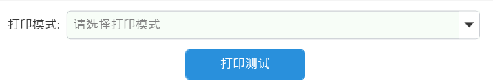
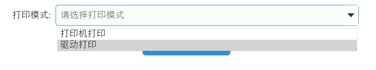
combox
<!--下拉按钮-->
<Style TargetType="ToggleButton" x:Key="ComboxStyleBtn">
<Setter Property="Cursor" Value="Hand"/>
<Setter Property="Template">
<Setter.Value>
<ControlTemplate>
<Border x:Name="Back"
Background="White"
BorderThickness="0"
BorderBrush="Transparent">
<Path Name="PathFill" Fill="{StaticResource MainBlackColorBrush}"
Width="14"
Height="8"
StrokeThickness="0"
Data="M5,0 L10,10 L0,10 z"
RenderTransformOrigin="0.5,0.5"
Stretch="Fill">
<Path.RenderTransform>
<TransformGroup>
<ScaleTransform/>
<SkewTransform/>
<RotateTransform Angle="180"/>
<TranslateTransform/>
</TransformGroup>
</Path.RenderTransform>
</Path>
</Border>
<ControlTemplate.Triggers>
<Trigger Property="IsMouseOver" Value="True">
<Setter TargetName="PathFill" Property="Fill" Value="{StaticResource MainBlackColorBrush}"></Setter>
</Trigger>
</ControlTemplate.Triggers>
</ControlTemplate>
</Setter.Value>
</Setter>
</Style>
<!--Combox-->
<Style TargetType="ComboBox" x:Key="ComboBoxStyle">
<Setter Property="ItemContainerStyle">
<Setter.Value>
<!--ComBoxItem-->
<Style TargetType="ComboBoxItem">
<Setter Property="MinHeight" Value="22"></Setter>
<Setter Property="MinWidth" Value="60"></Setter>
<Setter Property="Foreground" Value="{StaticResource MainBlackColorBrush}"></Setter>
<Setter Property="Template">
<Setter.Value>
<ControlTemplate TargetType="ComboBoxItem">
<Border Name="Back"
Background="Transparent"
BorderThickness="0,0,0,0"
BorderBrush="{StaticResource MainGrayColorBrush}"
>
<ContentPresenter ContentSource="{Binding Source}"
VerticalAlignment="Center"
HorizontalAlignment="Left"
Margin="5,0,0,0"/>
</Border>
<ControlTemplate.Triggers>
<Trigger Property="IsMouseOver" Value="True">
<Setter TargetName="Back" Property="Background" Value="LightGray"></Setter>
</Trigger>
<Trigger Property="IsHighlighted" Value="True">
<Setter TargetName="Back" Property="Background" Value="LightGray"></Setter>
</Trigger>
</ControlTemplate.Triggers>
</ControlTemplate>
</Setter.Value>
</Setter>
</Style>
</Setter.Value>
</Setter>
<Setter Property="Template">
<Setter.Value>
<ControlTemplate TargetType="ComboBox">
<Grid Background="#F7FDF7">
<Grid.ColumnDefinitions>
<ColumnDefinition Width="0.7*"/>
<ColumnDefinition Width="0.3*" MaxWidth="30"/>
</Grid.ColumnDefinitions>
<TextBox Grid.Column="0" IsReadOnly="{TemplateBinding IsReadOnly}"
BorderThickness="0"
Name="TextBoxContainer"
Text="{TemplateBinding Text}"
Foreground="{StaticResource MainBlackColorBrush}"
VerticalContentAlignment="Center"
Padding="10"/>
<TextBlock Grid.Column="0"
Name="MaskTextBlock"
Text="{TemplateBinding Tag}"
Visibility="Collapsed"
VerticalAlignment="Center"
Foreground="Gray"
Padding="10"/>
<Border Grid.Column="0"
BorderThickness="1,1,0,1"
BorderBrush="{StaticResource MainGrayColorBrush}"
Padding="10"
Name="border1"
CornerRadius="5,0,0,5">
</Border>
<Border Grid.Column="1" Name="border2" BorderThickness="0,1,1,1" BorderBrush="{StaticResource MainGrayColorBrush}" CornerRadius="0,5,5,0">
<ToggleButton Style="{StaticResource ComboxStyleBtn}" IsChecked="{Binding Path=IsDropDownOpen, Mode=TwoWay, RelativeSource={RelativeSource TemplatedParent}}" ClickMode="Press"></ToggleButton>
</Border>
<Popup IsOpen="{TemplateBinding IsDropDownOpen}"
Placement="Bottom"
x:Name="Popup"
Focusable="False"
AllowsTransparency="True"
PopupAnimation="Slide">
<Border CornerRadius="5"
MaxHeight="{TemplateBinding MaxDropDownHeight}"
MinWidth="{TemplateBinding ActualWidth}"
x:Name="DropDown" SnapsToDevicePixels="True">
<Border.Effect>
<DropShadowEffect Color="Black" BlurRadius="2" ShadowDepth="0" Opacity="0.5"/>
</Border.Effect>
<ScrollViewer Margin="4,6,4,6" Style="{DynamicResource ScrollViewerStyle}" MaxHeight="{TemplateBinding MaxDropDownHeight}" SnapsToDevicePixels="True" HorizontalScrollBarVisibility="Auto" VerticalScrollBarVisibility="Auto" CanContentScroll="True">
<!-- StackPanel 用于显示子级,方法是将 IsItemsHost 设置为 True -->
<StackPanel IsItemsHost="True" KeyboardNavigation.DirectionalNavigation="Contained" Background="White"/>
</ScrollViewer>
</Border>
</Popup>
</Grid>
<ControlTemplate.Triggers>
<DataTrigger Binding="{Binding RelativeSource={RelativeSource Self},Path=Text}" Value="{x:Null}">
<Setter Property="Visibility" Value="Collapsed" TargetName="TextBoxContainer"/>
<Setter Property="Visibility" Value="Visible" TargetName="MaskTextBlock"/>
</DataTrigger>
<DataTrigger Binding="{Binding RelativeSource={RelativeSource Self},Path=Text}" Value="">
<Setter Property="Visibility" Value="Collapsed" TargetName="TextBoxContainer"/>
<Setter Property="Visibility" Value="Visible" TargetName="MaskTextBlock"/>
</DataTrigger>
<Trigger Property="IsMouseOver" Value="True">
<Setter Property="BorderBrush" TargetName="border1" Value="{StaticResource MainBlueColorBrush}"/>
<Setter Property="BorderBrush" TargetName="border2" Value="{StaticResource MainBlueColorBrush}"/>
</Trigger>
</ControlTemplate.Triggers>
</ControlTemplate>
</Setter.Value>
</Setter>
</Style>
<!--ScrollViewer样式-->
<Style TargetType="ScrollViewer" x:Key="ScrollViewerStyle">
<Setter Property="Template">
<Setter.Value>
<ControlTemplate TargetType="{x:Type ScrollViewer}">
<Grid x:Name="Grid" Background="{TemplateBinding Background}">
<Grid.ColumnDefinitions>
<ColumnDefinition Width="*"/>
<ColumnDefinition Width="Auto"/>
</Grid.ColumnDefinitions>
<Grid.RowDefinitions>
<RowDefinition Height="*"/>
<RowDefinition Height="Auto"/>
</Grid.RowDefinitions>
<!--右下角四方形-->
<Rectangle x:Name="Corner" Grid.Row="1" Grid.Column="1" Fill="{DynamicResource {x:Static SystemColors.ControlBrushKey}}"/>
<!--内容区域-->
<ScrollContentPresenter x:Name="PART_ScrollContentPresenter" Grid.Row="0" Grid.Column="0" Content="{TemplateBinding Content}" CanContentScroll="{TemplateBinding CanContentScroll}" ContentTemplate="{TemplateBinding ContentTemplate}" Margin="{TemplateBinding Padding}" />
<!--竖直滚动条-->
<ScrollBar x:Name="PART_VerticalScrollBar" Grid.Row="0" Grid.Column="1" AutomationProperties.AutomationId="VerticalScrollBar" Cursor="Arrow" Maximum="{TemplateBinding ScrollableHeight}" Minimum="0" Visibility="{TemplateBinding ComputedVerticalScrollBarVisibility}" Value="{Binding VerticalOffset, Mode=OneWay, RelativeSource={RelativeSource TemplatedParent}}" ViewportSize="{TemplateBinding ViewportHeight}" Style="{DynamicResource ScrollBarStyle}"/>
<!--水平滚动条-->
<ScrollBar x:Name="PART_HorizontalScrollBar" Grid.Row="1" Grid.Column="0" AutomationProperties.AutomationId="HorizontalScrollBar" Cursor="Arrow" Maximum="{TemplateBinding ScrollableWidth}" Minimum="0" Visibility="{TemplateBinding ComputedHorizontalScrollBarVisibility}" Value="{Binding HorizontalOffset, Mode=OneWay, RelativeSource={RelativeSource TemplatedParent}}" ViewportSize="{TemplateBinding ViewportWidth}" Style="{DynamicResource ScrollBarStyle}" Orientation="Horizontal"/>
</Grid>
<ControlTemplate.Triggers>
<Trigger Property="HorizontalScrollBarVisibility" Value="Disabled">
</Trigger>
</ControlTemplate.Triggers>
</ControlTemplate>
</Setter.Value>
</Setter>
</Style>
<Style x:Key="VerticalScrollBarPageButton" TargetType="{x:Type RepeatButton}">
<Setter Property="OverridesDefaultStyle" Value="true"/>
<Setter Property="Background" Value="Transparent"/>
<Setter Property="Focusable" Value="false"/>
<Setter Property="IsTabStop" Value="false"/>
<Setter Property="Template">
<Setter.Value>
<ControlTemplate TargetType="{x:Type RepeatButton}">
<Rectangle Fill="{TemplateBinding Background}" Height="{TemplateBinding Height}" Width="{TemplateBinding Width}"/>
</ControlTemplate>
</Setter.Value>
</Setter>
</Style>
<Style x:Key="HorizontalScrollBarPageButton" TargetType="{x:Type RepeatButton}">
<Setter Property="OverridesDefaultStyle" Value="true"/>
<Setter Property="Background" Value="Transparent"/>
<Setter Property="Focusable" Value="false"/>
<Setter Property="IsTabStop" Value="false"/>
<Setter Property="Template">
<Setter.Value>
<ControlTemplate TargetType="{x:Type RepeatButton}">
<Rectangle Fill="{TemplateBinding Background}" Height="{TemplateBinding Height}" Width="{TemplateBinding Width}"/>
</ControlTemplate>
</Setter.Value>
</Setter>
</Style>
<!--Theum-->
<Style x:Key="ScrollBarThumb" TargetType="{x:Type Thumb}">
<Setter Property="OverridesDefaultStyle" Value="true"/>
<Setter Property="IsTabStop" Value="false"/>
<Setter Property="Template">
<Setter.Value>
<ControlTemplate TargetType="{x:Type Thumb}">
<Border x:Name="border" CornerRadius="3" Background="#ACACAC" BorderThickness="0" >
</Border>
<ControlTemplate.Triggers>
<Trigger Property="IsMouseOver" Value="True">
<Setter Property="Background" TargetName="border" Value="#888888"/>
</Trigger>
<Trigger Property="IsDragging" Value="True">
<Setter Property="Background" TargetName="border" Value="#888888"/>
</Trigger>
</ControlTemplate.Triggers>
</ControlTemplate>
</Setter.Value>
</Setter>
</Style>
<!--滚动条样式-->
<Style x:Key="ScrollBarStyle" TargetType="{x:Type ScrollBar}">
<Setter Property="Stylus.IsPressAndHoldEnabled" Value="false"/>
<Setter Property="Stylus.IsFlicksEnabled" Value="false"/>
<Setter Property="Foreground" Value="{DynamicResource {x:Static SystemColors.ControlTextBrushKey}}"/>
<Setter Property="Width" Value="{DynamicResource {x:Static SystemParameters.VerticalScrollBarWidthKey}}"/>
<Setter Property="MinWidth" Value="{DynamicResource {x:Static SystemParameters.VerticalScrollBarWidthKey}}"/>
<Setter Property="Template">
<Setter.Value>
<ControlTemplate TargetType="{x:Type ScrollBar}">
<Grid x:Name="Bg" Background="{TemplateBinding Background}" SnapsToDevicePixels="true">
<Grid.RowDefinitions>
<RowDefinition MaxHeight="{DynamicResource {x:Static SystemParameters.VerticalScrollBarButtonHeightKey}}"/>
<RowDefinition Height="0.00001*"/>
<RowDefinition MaxHeight="{DynamicResource {x:Static SystemParameters.VerticalScrollBarButtonHeightKey}}"/>
</Grid.RowDefinitions>
<!--上箭头-->
<RepeatButton Style="{DynamicResource ArrowDownPathButton}" Command="{x:Static ScrollBar.LineUpCommand}" IsEnabled="{TemplateBinding IsMouseOver}"/>
<!--滑动条 ? 是不是Slider中的滑动条??? -是 -->
<Track x:Name="PART_Track" IsDirectionReversed="true" IsEnabled="{TemplateBinding IsMouseOver}" Grid.Row="1">
<!--滑动条上部区域-->
<Track.DecreaseRepeatButton>
<RepeatButton Command="{x:Static ScrollBar.PageUpCommand}" Style="{StaticResource VerticalScrollBarPageButton}"/>
</Track.DecreaseRepeatButton>
<!--滑动条部分-->
<Track.IncreaseRepeatButton>
<RepeatButton Command="{x:Static ScrollBar.PageDownCommand}" Style="{StaticResource VerticalScrollBarPageButton}"/>
</Track.IncreaseRepeatButton>
<!--滑动条下部区域-->
<Track.Thumb>
<Thumb Style="{StaticResource ScrollBarThumb}" Margin="3,0,3,0"/>
</Track.Thumb>
</Track>
<!--下箭头-->
<RepeatButton Command="{x:Static ScrollBar.LineDownCommand}" IsEnabled="{TemplateBinding IsMouseOver}" Grid.Row="2" Style="{DynamicResource ArrowUpPathButton}"/>
</Grid>
<ControlTemplate.Triggers>
<Trigger Property="IsEnabled" Value="false">
<Setter Property="Background" TargetName="Bg" Value="Gray"/>
</Trigger>
</ControlTemplate.Triggers>
</ControlTemplate>
</Setter.Value>
</Setter>
<Style.Triggers>
<!--水平摆放时-->
<Trigger Property="Orientation" Value="Horizontal">
<Setter Property="Width" Value="Auto"/>
<Setter Property="MinWidth" Value="0"/>
<Setter Property="Height" Value="{DynamicResource {x:Static SystemParameters.HorizontalScrollBarHeightKey}}"/>
<Setter Property="MinHeight" Value="{DynamicResource {x:Static SystemParameters.HorizontalScrollBarHeightKey}}"/>
<Setter Property="Template">
<Setter.Value>
<ControlTemplate TargetType="{x:Type ScrollBar}">
<Grid x:Name="Bg" Background="{TemplateBinding Background}" SnapsToDevicePixels="true">
<Grid.ColumnDefinitions>
<ColumnDefinition MaxWidth="{DynamicResource {x:Static SystemParameters.HorizontalScrollBarButtonWidthKey}}"/>
<ColumnDefinition Width="0.00001*"/>
<ColumnDefinition MaxWidth="{DynamicResource {x:Static SystemParameters.HorizontalScrollBarButtonWidthKey}}"/>
</Grid.ColumnDefinitions>
<RepeatButton Command="{x:Static ScrollBar.LineLeftCommand}" IsEnabled="{TemplateBinding IsMouseOver}" Style="{DynamicResource ArrowLeftPathButton}"/>
<Track x:Name="PART_Track" Grid.Column="1" IsEnabled="{TemplateBinding IsMouseOver}">
<Track.DecreaseRepeatButton>
<RepeatButton Command="{x:Static ScrollBar.PageLeftCommand}" Style="{StaticResource HorizontalScrollBarPageButton}"/>
</Track.DecreaseRepeatButton>
<Track.IncreaseRepeatButton>
<RepeatButton Command="{x:Static ScrollBar.PageRightCommand}" Style="{StaticResource HorizontalScrollBarPageButton}"/>
</Track.IncreaseRepeatButton>
<Track.Thumb>
<Thumb Style="{StaticResource ScrollBarThumb}" Margin="0,3,0,3"/>
</Track.Thumb>
</Track>
<RepeatButton Grid.Column="2" Command="{x:Static ScrollBar.LineRightCommand}" IsEnabled="{TemplateBinding IsMouseOver}" Style="{DynamicResource ArrowRightPathButton}"/>
</Grid>
<ControlTemplate.Triggers>
<Trigger Property="IsEnabled" Value="false">
<Setter Property="Background" TargetName="Bg" Value="Gray"/>
</Trigger>
</ControlTemplate.Triggers>
</ControlTemplate>
</Setter.Value>
</Setter>
</Trigger>
</Style.Triggers>
</Style>
<!--下箭头-->
<Style x:Key="ArrowDownPathButton" TargetType="RepeatButton">
<Setter Property="Template">
<Setter.Value>
<ControlTemplate TargetType="RepeatButton">
<Grid Background="Transparent">
<Path x:Name="PathFill" Fill="#868999" Width="13" Height="8" StrokeThickness="0" Data="M5.0000001,0 L10,10 L-2.0915641E-08,10 z" RenderTransformOrigin="0.500000001045782,0.5" Stretch="Fill">
<Path.RenderTransform>
<TransformGroup>
<ScaleTransform/>
<SkewTransform/>
<RotateTransform Angle="180"/>
<TranslateTransform/>
</TransformGroup>
</Path.RenderTransform>
</Path>
</Grid>
<ControlTemplate.Triggers>
<Trigger Property="IsMouseOver" Value="True">
<Setter Property="Fill" TargetName="PathFill" Value="#1C97EA"></Setter>
</Trigger>
<Trigger Property="IsPressed" Value="True">
<Setter Property="Fill" TargetName="PathFill" Value="#FF4D84AE"></Setter>
</Trigger>
</ControlTemplate.Triggers>
</ControlTemplate>
</Setter.Value>
</Setter>
</Style>
<!--上箭头-->
<Style x:Key="ArrowUpPathButton" TargetType="RepeatButton">
<Setter Property="Template">
<Setter.Value>
<ControlTemplate TargetType="RepeatButton">
<Grid Background="Transparent">
<Path x:Name="PathFill" Fill="#868999" Width="13" Height="8" VerticalAlignment="Center" HorizontalAlignment="Center" StrokeThickness="0" Data="M5.0000001,0 L10,10 L-2.0915641E-08,10 z" RenderTransformOrigin="0.500000001045782,0.5" Stretch="Fill">
<Path.RenderTransform>
<TransformGroup>
<ScaleTransform/>
<SkewTransform/>
<RotateTransform Angle="0"/>
<TranslateTransform/>
</TransformGroup>
</Path.RenderTransform>
</Path>
</Grid>
<ControlTemplate.Triggers>
<Trigger Property="IsMouseOver" Value="True">
<Setter Property="Fill" TargetName="PathFill" Value="#1C97EA"></Setter>
</Trigger>
<Trigger Property="IsPressed" Value="True">
<Setter Property="Fill" TargetName="PathFill" Value="#FF4D84AE"></Setter>
</Trigger>
</ControlTemplate.Triggers>
</ControlTemplate>
</Setter.Value>
</Setter>
</Style>
<!--左箭头-->
<Style x:Key="ArrowLeftPathButton" TargetType="RepeatButton">
<Setter Property="Template">
<Setter.Value>
<ControlTemplate TargetType="RepeatButton">
<Grid Background="Transparent">
<Path x:Name="PathFill" Fill="#868999" Width="13" Height="8" StrokeThickness="0" Data="M5.0000001,0 L10,10 L-2.0915641E-08,10 z" RenderTransformOrigin="0.500000001045782,0.5" Stretch="Fill">
<Path.RenderTransform>
<TransformGroup>
<ScaleTransform/>
<SkewTransform/>
<RotateTransform Angle="-90"/>
<TranslateTransform/>
</TransformGroup>
</Path.RenderTransform>
</Path>
</Grid>
<ControlTemplate.Triggers>
<Trigger Property="IsMouseOver" Value="True">
<Setter Property="Fill" TargetName="PathFill" Value="#1C97EA"></Setter>
</Trigger>
<Trigger Property="IsPressed" Value="True">
<Setter Property="Fill" TargetName="PathFill" Value="#FF4D84AE"></Setter>
</Trigger>
</ControlTemplate.Triggers>
</ControlTemplate>
</Setter.Value>
</Setter>
</Style>
<!--右箭头-->
<Style x:Key="ArrowRightPathButton" TargetType="RepeatButton">
<Setter Property="Template">
<Setter.Value>
<ControlTemplate TargetType="RepeatButton">
<Grid Background="Transparent">
<Path x:Name="PathFill" Fill="#868999" Width="13" Height="8" VerticalAlignment="Center" HorizontalAlignment="Center" StrokeThickness="0" Data="M5.0000001,0 L10,10 L-2.0915641E-08,10 z" RenderTransformOrigin="0.500000001045782,0.5" Stretch="Fill">
<Path.RenderTransform>
<TransformGroup>
<ScaleTransform/>
<SkewTransform/>
<RotateTransform Angle="90"/>
<TranslateTransform/>
</TransformGroup>
</Path.RenderTransform>
</Path>
</Grid>
<ControlTemplate.Triggers>
<Trigger Property="IsMouseOver" Value="True">
<Setter Property="Fill" TargetName="PathFill" Value="#1C97EA"></Setter>
</Trigger>
<Trigger Property="IsPressed" Value="True">
<Setter Property="Fill" TargetName="PathFill" Value="#FF4D84AE"></Setter>
</Trigger>
</ControlTemplate.Triggers>
</ControlTemplate>
</Setter.Value>
</Setter>
</Style>
datagrid
<!--DataGrid样式-->
    <Style TargetType="DataGrid">
        <!--网格线颜色-->
        <Setter Property="CanUserResizeColumns" Value="false"/>
        <Setter Property="Background" Value="{StaticResource MainBlueColorBrush}" />
        <Setter Property="BorderBrush" Value="{StaticResource MainWhiteColorBrush}" />
        <Setter Property="HorizontalGridLinesBrush" Value="{StaticResource MainWhiteColorBrush}"/>
        <Setter Property="VerticalGridLinesBrush">
            <Setter.Value>
                <SolidColorBrush Color="Transparent"/>
            </Setter.Value>
        </Setter>
    </Style>

    <!--标题栏样式-->
    <Style TargetType="DataGridColumnHeader">
        <Setter Property="SnapsToDevicePixels" Value="True" />
        <Setter Property="MinWidth" Value="0" />
        <Setter Property="MinHeight" Value="35" />
        <Setter Property="Foreground" Value="White" />
        <Setter Property="FontSize" Value="18" />
        <Setter Property="Cursor" Value="Hand" />
        <Setter Property="Padding" Value="5"/>
        <Setter Property="Template">
            <Setter.Value>
                <ControlTemplate TargetType="DataGridColumnHeader">
                    <Border x:Name="BackgroundBorder" BorderThickness="0,1,0,1"
                             BorderBrush="{StaticResource MainWhiteColorBrush}"
                              Width="Auto"
                            Padding="{TemplateBinding Padding}">
                        <Grid >
                            <Grid.ColumnDefinitions>
                                <ColumnDefinition Width="*" />
                            </Grid.ColumnDefinitions>
                            <ContentPresenter  Margin="0" VerticalAlignment="Center" HorizontalAlignment="Center"/>
                            <Path x:Name="SortArrow" Visibility="Collapsed" Data="M0,0 L1,0 0.5,1 z" Stretch="Fill"  Grid.Column="2" Width="8" Height="6" Fill="White" Margin="0,0,50,0"
                            VerticalAlignment="Center" RenderTransformOrigin="1,1" />
                        </Grid>
                    </Border>
                </ControlTemplate>
            </Setter.Value>
        </Setter>
    </Style>
    <!--行样式触发-->
    <!--背景色改变必须先设置cellStyle 因为cellStyle会覆盖rowStyle样式-->
    <Style  TargetType="DataGridRow">
        <Setter Property="Background" Value="White" />
        <Setter Property="Height" Value="40"/>
        <Setter Property="FontSize" Value="16"/>
        <Setter Property="Padding" Value="10"/>
        <Setter Property="Foreground" Value="{StaticResource MainBlackColorBrush}" />
        <Style.Triggers>
            <!--隔行换色-->
            <Trigger Property="AlternationIndex" Value="0" >
                <Setter Property="Background" Value="White" />
            </Trigger>
            <Trigger Property="AlternationIndex" Value="1" >
                <Setter Property="Background" Value="White" />
            </Trigger>

            <Trigger Property="IsMouseOver" Value="True">
                <Setter Property="Background" Value="{StaticResource MainWhiteColorBrush}"/>
            </Trigger>

            <Trigger Property="IsSelected" Value="True">
                <Setter Property="Foreground" Value="Black"/>
                <Setter Property="Background" Value="LightGray"/>
            </Trigger>
        </Style.Triggers>
    </Style>

    <!--单元格样式触发-->
    <Style TargetType="DataGridCell">
        <Setter Property="Template">
            <Setter.Value>
                <ControlTemplate TargetType="DataGridCell">
                    <TextBlock TextAlignment="Center" VerticalAlignment="Center"  >
                           <ContentPresenter />
                    </TextBlock>
                </ControlTemplate>
            </Setter.Value>
        </Setter>
        <Style.Triggers>
            <Trigger Property="IsSelected" Value="True">
                <Setter Property="Foreground" Value="Black"/>
            </Trigger>
        </Style.Triggers>
    </Style>
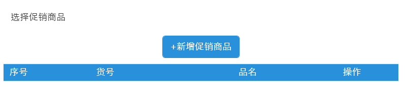
使用datagrid
<DataGrid x:Name="DataGrid"
                                  AutoGenerateColumns="False"
                                  VerticalAlignment="Top"
                                  CanUserSortColumns="False"
                                  FontSize="20"
                                  IsReadOnly="True"
                                  CanUserResizeColumns="False"
                                  CanUserResizeRows="False"
                                  SelectionMode="Single"
                                  CanUserReorderColumns="False"
                                  AlternationCount="2"
                                  RowHeaderWidth="0"
                                  ItemsSource="{Binding PromotionalProductList}"
                                  CanUserAddRows="False" >
                            <DataGrid.Resources>
                                <DataTemplate x:Key="btnCell">
                                    <!--注意此处的设置方式-->
                                    <Button Content="删除" Command="{Binding
                                            Path=DataContext.DeleteItemCommand,
                                            RelativeSource={RelativeSource AncestorType={x:Type DataGrid}}}"
                                            CommandParameter="{Binding yourparam}"
                                            Background="White"
                                            BorderThickness="0"
                                            Cursor="Hand"
                                            Width="130"
                                            Padding="0 5 0 5"
                                            Foreground="{StaticResource MainBlueColorBrush}"/>
                                </DataTemplate>
                            </DataGrid.Resources>

                            <DataGrid.Columns>
                                <DataGridTextColumn Header="序号" Width="60"  Binding="{Binding  Name}"/>
                                <DataGridTextColumn Header="货号"   Width="280"  Binding="{Binding Class}"/>
                                <DataGridTextColumn Header="品名"  Width="280"  Binding="{Binding Sex}"/>
                                <DataGridTemplateColumn Header="操作"  Width="130" CellTemplate="{StaticResource btnCell}"/>
                            </DataGrid.Columns>
                        </DataGrid>
groupbox
<Style  TargetType="{x:Type GroupBox}" x:Key="BaseGroupBoxStyle">
        <Setter Property="Margin" Value="5"/>
        <Setter Property="Template">
            <Setter.Value>
                <ControlTemplate TargetType="{x:Type GroupBox}">
                    <Grid >
                        <Grid.RowDefinitions>
                            <RowDefinition Height="Auto" />
                            <RowDefinition Height="*" />
                        </Grid.RowDefinitions>

                        <Border x:Name="border"
                                Grid.Row="0"
                                SnapsToDevicePixels="True"
                                BorderBrush="{TemplateBinding Background}"
                                Background="{TemplateBinding Background}"
                                HorizontalAlignment="Stretch"
                                BorderThickness="0"
                                CornerRadius="5,5,0,0" >
                            <Grid Margin="10">
                                <ContentPresenter Name="header"
                                                  Visibility="Collapsed"
                                                  ContentSource="Header"
                                                  RecognizesAccessKey="True"
                                                  HorizontalAlignment="Left"
                                                  VerticalAlignment="Center"/>
                                <TextBlock FontSize="{TemplateBinding FontSize}"
                                           Foreground="{TemplateBinding Foreground}"
                                           Text="{Binding ElementName=header, Path=Content}"
                                           HorizontalAlignment="Left"
                                           VerticalAlignment="Center"/>
                            </Grid>
                        </Border>

                        <Border Grid.Row="1"
                                BorderBrush="{TemplateBinding Background}"
                                SnapsToDevicePixels="True"
                                BorderThickness="1,0,1,1"
                                CornerRadius="0,0,5,5" >
                            <ContentPresenter Margin="10" x:Name="cpmdi" />
                        </Border>
                    </Grid>
                    <ControlTemplate.Triggers>
                        <Trigger Property="Header" Value="{x:Null}">
                            <Setter TargetName="cpmdi" Property="Margin" Value="10"/>
                            <Setter TargetName="border" Property="Height" Value="32"/>
                        </Trigger>
                    </ControlTemplate.Triggers>
                </ControlTemplate>
            </Setter.Value>
        </Setter>
    </Style>
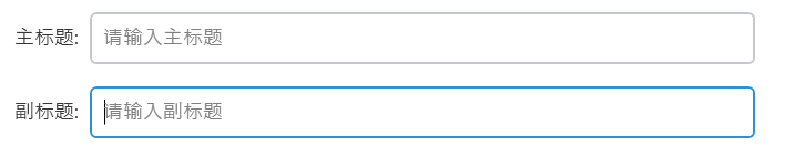
textbox
<Style x:Key="BaseTextBoxStyle" TargetType="{x:Type TextBox}">
<Setter Property="Background" Value="{DynamicResource {x:Static SystemColors.WindowBrushKey}}"/>
<Setter Property="BorderBrush" Value="{StaticResource MainGrayColorBrush}"/>
<Setter Property="Foreground" Value="{StaticResource MainBlackColorBrush}"/>
<Setter Property="BorderThickness" Value="2"/>
<Setter Property="KeyboardNavigation.TabNavigation" Value="None"/>
<Setter Property="HorizontalContentAlignment" Value="Left"/>
<Setter Property="FocusVisualStyle" Value="{x:Null}"/>
<Setter Property="AllowDrop" Value="true"/>
<Setter Property="ScrollViewer.PanningMode" Value="VerticalFirst"/>
<Setter Property="Stylus.IsFlicksEnabled" Value="False"/>
<Setter Property="VerticalContentAlignment" Value="Center"/>
<Setter Property="FontSize" Value="{StaticResource FontSizeRegular}"/>
<Setter Property="Template">
<Setter.Value>
<ControlTemplate TargetType="{x:Type TextBox}">
<Border x:Name="border"
CornerRadius="{TemplateBinding local:CornerRadiusProperty.Value,Converter={local:DoubleToCornerRadiusConverter}}"
Background="{TemplateBinding Background}"
BorderBrush="{TemplateBinding BorderBrush}"
BorderThickness="{TemplateBinding BorderThickness}"
SnapsToDevicePixels="True"
Padding="10">
<Grid>
<ScrollViewer Grid.Column="0"
x:Name="PART_ContentHost"
Focusable="false"
HorizontalScrollBarVisibility="Hidden"
VerticalScrollBarVisibility="Hidden"
/>
<TextBlock Grid.Column="0"
Name="MaskTextBlock"
Text="{TemplateBinding Tag}"
Visibility="Collapsed"
VerticalAlignment="Center"
Foreground="Gray"
/>
</Grid>
</Border>
<ControlTemplate.Triggers>
<Trigger Property="IsEnabled" Value="false">
<Setter Property="Opacity" TargetName="border" Value="0.56"/>
</Trigger>
<Trigger Property="IsMouseOver" Value="true">
<Setter Property="BorderBrush" TargetName="border" Value="{StaticResource MainBlueColorBrush}"/>
</Trigger>
<Trigger Property="IsKeyboardFocused" Value="true">
<Setter Property="BorderBrush" TargetName="border" Value="{StaticResource MainBlueColorBrush}"/>
</Trigger>
<DataTrigger Binding="{Binding RelativeSource={RelativeSource Self},Path=Text}" Value="">
<Setter Property="Visibility" Value="Visible" TargetName="MaskTextBlock"/>
</DataTrigger>
</ControlTemplate.Triggers>
</ControlTemplate>
</Setter.Value>
</Setter>
<Style.Triggers>
<MultiTrigger>
<MultiTrigger.Conditions>
<Condition Property="IsInactiveSelectionHighlightEnabled" Value="true"/>
<Condition Property="IsSelectionActive" Value="false"/>
</MultiTrigger.Conditions>
<Setter Property="SelectionBrush" Value="{DynamicResource {x:Static SystemColors.InactiveSelectionHighlightBrushKey}}"/>
</MultiTrigger>
</Style.Triggers>
</Style>
<Style TargetType="{x:Type TextBlock}" x:Key="SpinningText" BasedOn="{StaticResource BaseTextBlockStyle}">
<Setter Property="FontFamily" Value="{StaticResource FontAwesomeFont}" />
<Setter Property="Text" Value="" />
<Setter Property="RenderTransformOrigin" Value="0.5, 0.5" />
<Setter Property="RenderTransform">
<Setter.Value>
<RotateTransform></RotateTransform>
</Setter.Value>
</Setter>
<Style.Resources>
<Storyboard x:Key="Spin">
<DoubleAnimation
Storyboard.TargetProperty="(UIElement.RenderTransform).(RotateTransform.Angle)"
From="0"
To="360"
Duration="0:0:2"
RepeatBehavior="Forever" />
</Storyboard>
</Style.Resources>
<Style.Triggers>
<DataTrigger Binding="{Binding RelativeSource={x:Static RelativeSource.Self}, Path=IsVisible}" Value="True">
<DataTrigger.EnterActions>
<BeginStoryboard Name="SpinStoryboard" Storyboard="{StaticResource Spin}" />
</DataTrigger.EnterActions>
<DataTrigger.ExitActions>
<RemoveStoryboard BeginStoryboardName="SpinStoryboard" />
</DataTrigger.ExitActions>
</DataTrigger>
</Style.Triggers>
</Style>
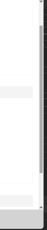
控件截图
checkbox

textbox
button和datagrid
combox
scroll


 8638
8638


 被折叠的 条评论
为什么被折叠?
被折叠的 条评论
为什么被折叠?
 到【灌水乐园】发言


