


 本文介绍了如何使用Flutter进行跨设备UI适配,通过创建静态类WZP并初始化,实现不同机型上UI展示的一致性。WZP类包含了屏幕尺寸的获取、像素转换的方法,并提供了扩展方法方便使用。适配方案考虑了横屏模式,并提供了一种无需上下文关联的初始化方式。
有效搞定不同机型展示不一样UI的问题
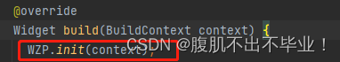
上下文关联,使用时需要在根build下初始化,即
WZP.init(context);
空安全
import 'package:flutter/cupertino.dart';

class WZP {
  static double? screenWidth;
  static double? screenHeight;
  static double? rpx;
  static double? px;

  static void init(BuildContext context, {double standardWidth = 750}) {
    screenWidth = MediaQuery.of(context).size.width;
    screenHeight = MediaQuery.of(context).size.height;
    rpx = (screenWidth! / standardWidth);
    px = screenWidth! / standardWidth * 2;
  }

  // 按照像素来设置
  // static double setPx(double size) {
  //   return WZP.rpx! * size * 2;
  // }

  // 按照rxp来设置
  static double setRpx(dynamic size) {
    return WZP.rpx! * size;
  }
}

extension Rpx on num {
   get rpx => WZP.setRpx(this);
}
// WZP.init(context);
非空
class WZP{
static var screenWidth;
static var screenHeight;
static var rpx;
static void init(BuildContext context, {standardWidth = 750}) {
// 适配横屏
screenWidth = min(MediaQuery.of(context).size.width, MediaQuery.of(context).size.height);
rpx = (screenWidth / standardWidth);
}
static dynamic setRpx(var size) {
return WZP.rpx * size;
}
}
extension Rpx on num {
get rpx => WZP.setRpx(this);
}
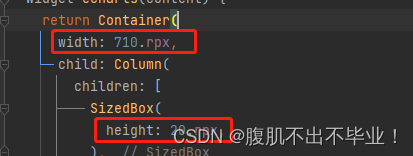
//使用,直接在数值后面加.rpx就行
使用前在根Build下面初始化一下就可以使用了。
摆脱上下文关联关系,不需要初始化便可直接使用
非空
class WZP
  static double screenWidth =
      window.physicalSize.width / window.devicePixelRatio;
  static double screenHeight =
      window.physicalSize.height / window.devicePixelRatio;
  static double rpx = (screenWidth / 750);

  static double setRpx(num size) {
    return TryParse.dynamicToDouble(rpx * size);
  }

  static void initDeviceInfo(
      dynamic width, dynamic height, dynamic pixelRatio) {
    if (width != null && height != null && pixelRatio != null) {
      double doubleWidth = TryParse.dynamicToDouble(width);
      double doubleHeight = TryParse.dynamicToDouble(height);
      double doublePixelRatio = TryParse.dynamicToDouble(pixelRatio);

      screenWidth = doubleWidth / doublePixelRatio;
      screenHeight = doubleHeight / doublePixelRatio;
      rpx = screenWidth / 750;
    }
  }
}


extension Rpx on num {
  get rpx => WZP.setRpx(this);
}
如果用户调手机系统字体大小,想APP字体不受影响。
MaterialApp(
  builder: (context, child) {
    return MediaQuery(
      data: MediaQuery.of(context).copyWith(textScaler: const TextScaler.linear(1)),
      child: child!,
    );
  },
  home: MyHomePage(),
);
适配工具类改进
import 'package:flutter/material.dart';

class WZP {
  static double? screenWidth;
  static double? screenHeight;
  static double? rpx; // 尺寸缩放比例
  static double? fixedFontRpx; // 固定字体缩放比例(不随系统变化)

  static void init(BuildContext context, {double standardWidth = 375}) {
    final mediaQuery = MediaQuery.of(context);
    screenWidth = mediaQuery.size.width;
    screenHeight = mediaQuery.size.height;

    // 计算尺寸缩放比例
    rpx = screenWidth! / standardWidth;

    // 计算固定字体缩放比例(忽略系统字体缩放)
    fixedFontRpx = screenWidth! / standardWidth;
  }

  // 设置普通尺寸
  static double setSize(dynamic size) {
    return rpx! * size;
  }

  // 设置固定字体尺寸(不随系统变化)
  static double setFixedFontSize(dynamic size) {
    return fixedFontRpx! * size;
  }

  // 设置响应式字体尺寸(随系统变化,但有上限控制)
  static double setResponsiveFontSize(dynamic size, {double maxScale = 1.2}) {
    final mediaQuery = MediaQueryData.fromWindow(WidgetsBinding.instance.window);
    final scaleFactor = mediaQuery.textScaleFactor.clamp(1.0, maxScale);
    return fixedFontRpx! * size / scaleFactor;
  }
}

extension Rpx on num {
  double get rpx => WZP.setSize(this);
  double get fixedFont => WZP.setFixedFontSize(this);
  double get responsiveFont => WZP.setResponsiveFontSize(this);
}
完全固定的字体(不随系统变化):
TextStyle(fontSize: 16.fixedFont)
响应式字体(随系统变化,但有最大缩放限制):
TextStyle(fontSize: 16.responsiveFont)
普通尺寸(仍然会受系统字体缩放影响):
TextStyle(fontSize: 16.rpx)


 扫一扫
扫一扫


 被折叠的 条评论
为什么被折叠?
被折叠的 条评论
为什么被折叠?
 到【灌水乐园】发言


