


<!DOCTYPE html>
<html>
  <head>
    <meta charset="utf-8" />
    <title>switch开关按钮</title>
    <link rel="stylesheet" type="text/css" href="css/switch.css" />
    <script src="js/jquery.js"></script>
  </head>
  <body>
    <div style="background-color: #292929; display: flex; justify-content: center; align-items: center; height: 200px">
      <label class="bui-switch-label bui-switch-animbg">
        <input id="changeImageUrl" type="checkbox" name="s" />
        <div class="bui-switch">
          <span style="margin-left: 9px; color: #9e9e9e; font-size: 14px">修复前</span>
          <span style="margin-left: 20px; color: #9e9e9e; font-size: 14px">修复后</span>
        </div>
      </label>
    </div>
    <script>
      $("input").click(function (data) {
        //获取switch的值
        var ck = $("input[name='s']:checked").length > 0 ? true : false;

        if (ck) {
          console.log("true");
        } else {
          console.log("false");
        }
      });
    </script>
  </body>
</html>
css部分:
label.bui-switch-label .bui-switch {
  width: 140px;
  height: 30px;
  padding: 0 10px;
  box-sizing: border-box;
  position: relative;
  border: 1px solid #FFFFFF;
  border-radius: 15px;
  background-clip: content-box;
  display: inline-block;
  -webkit-appearance: none;
  -webkit-user-select: none;
  -moz-user-select: none;
  -ms-user-select: none;
  user-select: none;
  outline: none;
  display: flex;
  align-items: center;
}

/* 滑块样式 */
.bui-switch-animbg {
  position: absolute;
  left: calc(50% + 60px);
}

label.bui-switch-label .bui-switch:before {
  content: '修复前';
  width: 60px;
  height: 24px;
  position: absolute;
  top: 2px;
  left: 10px;
  border-radius: 12px;
  font-size: 14px;
  color: #000;
  background-color: #fff;
  box-shadow: 0 1px 3px rgba(0, 0, 0, 0.4);
  display: flex;
  justify-content: center;
  align-items: center;
}

/* 滑块向右移动距离 */
label.bui-switch-label input:checked+.bui-switch:before {
  content: '修复后';
  left: 70px;
  top: 2px;
}

/* 隐藏原生checkbox */
label.bui-switch-label input {
  position: absolute;
  opacity: 0;
  visibility: hidden;
}

/* 滑块向右移动动画 */
label.bui-switch-label.bui-switch-animbg .bui-switch:before {
  -webkit-transition: left 0.3s;
  transition: left 0.3s;
}

/* 滑块向右移动 开关颜色动画 */
label.bui-switch-label.bui-switch-animbg input:checked+.bui-switch {
  box-shadow: #dfdfdf 0 0 0 0 inset;
  background-color: #292929;
  -webkit-transition: border-color 0.4s, background-color ease 0.4s;
  transition: border-color 0.4s, background-color ease 0.4s;
}
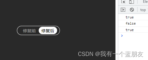
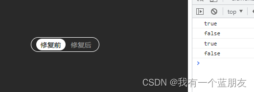
效果图:
如果不想要文字,可直接删掉html和css中的文字即可。
参考文章:https://www.cnblogs.com/1906859953Lucas/p/10838104.html


 687
687


 被折叠的 条评论
为什么被折叠?
被折叠的 条评论
为什么被折叠?
 到【灌水乐园】发言


