


1、在入口文件index.html下引入适配js
    //适配兼容
        (function (n, e) {
            var t = n.documentElement,
                i =
                    "orientationchange" in window
                        ? "orientationchange"
                        : "resize",
                d = function () {
                    var n = t.clientWidth;
                    //console.log(n)
                    //这里我这设置如果屏幕宽度小于等于1024就适配,否则给一个固定宽度750,让它在浏览器打开的尺寸和设计稿一样
                    if (n && n <= 1024) {
                        t.style.fontSize = n / 7.5 + "px";
                    } else {
                        document.body.style.width = 750 + "px";
                        document.body.style.marginTop = 0;
                        document.body.style.marginBottom = 0;
                        document.body.style.marginLeft = 'auto';
                        document.body.style.marginRight = 'auto';
                        t.style.fontSize = 100 + "px";
                    }
                    // n && (t.style.fontSize = n / 7.5 + "px")
                };
            n.addEventListener &&
                (e.addEventListener(i, d, !1),
                    n.addEventListener("DOMContentLoaded", d, !1));
        })(document, window);
2、下载px转rem的插件并进行扩展设置

3、将基准设置为100,这样750的设计稿换算就是7.5rem
100px = 1rem

4、测试代码以及浏览器和移动端效果
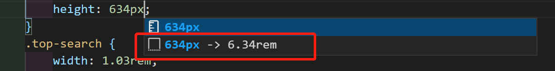
750的设计稿量多少写多少,会出现自动转化rem的
如果是375的设计,100px=2rem,量的尺寸*2,再转化rem
浏览器效果:

移动端也可以自适应了,这里放出几张图


 被折叠的 条评论
为什么被折叠?
被折叠的 条评论
为什么被折叠?
 到【灌水乐园】发言


