


css3效果
同为工具人,编码不易。先赞后看,授人以渔
1、走马灯、弹幕效果

<div class="conbox">
      <div class="conmain">这是一段展示文字,内容可以自定义</div>
</div>
.conbox{
display: flex;
background-color: #000;
height: 100px;
line-height: 100px;
color: #ffffff;
overflow: hidden;
.conmain{
width: 100%;
animation: marqueeAni 5s linear 0s infinite;
overflow: hidden;
}
@keyframes marqueeAni {
0%{
transform: translateX(100%);
}
100%{
transform: translateX(-100%);
}
}
}2、纯css3菜单出现效果
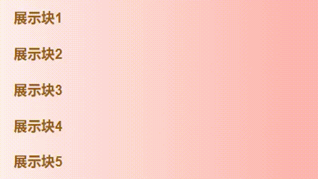
 <div class="menu_con">
      <div class="item">展示块1</div>
      <div class="item">展示块2</div>
      <div class="item">展示块3</div>
      <div class="item">展示块4</div>
      <div class="item">展示块5</div>
    </div>
.menu_con{
width: 100%;
height: 400px;
.item{
width: 100%;
height: 80px;
font-size: 32px;
line-height: 80px;
font-weight: bold;
color: #995d11;
box-sizing: border-box;
padding-left: 32px;
background: linear-gradient(90deg, #FEF4EC -10%,#FFB8B5 90% );
}
.item:nth-child(1){
animation: menuAni .8s ease-in-out 0s 1;
}
@keyframes menuAni {
0%{
transform: translateX(-500px);
}
50%{
transform: translateX(0);
}
75%{
transform: translateX(-20px);
}
100%{
transform: translateX(0);
}
}
.item:nth-child(2){
animation: menuAni .8s ease-in-out 0.2s 1;
}
.item:nth-child(3){
animation: menuAni .8s ease-in-out 0.3s 1;
}
.item:nth-child(4){
animation: menuAni .8s ease-in-out 0.4s 1;
}
.item:nth-child(5){
animation: menuAni .8s ease-in-out 0.5s 1;
}
}3、纯css3手风琴效果
提示:根据需求可以将hover效果更改为动态添加class,这里仅做展示所以用hover效果
也可以用animation但是没有transition效果的丝滑
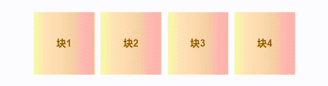
<div class="swiper_con">
      <div class="item">块1</div>
      <div class="item">块2</div>
      <div class="item">块3</div>
      <div class="item">块4</div>
    </div>
.item{
width: 200px;
height: 200px;
font-size: 32px;
line-height: 200px;
text-align: center;
font-weight: bold;
color: #995d11;
box-sizing: border-box;
background: linear-gradient(90deg, #FEF4EC -10%,#FFB8B5 90% );
margin: 0 10px;
transition: width .5s ease-in-out;
cursor: pointer;
}
.item:hover{
width: 400px;
transition: width .5s ease-in-out;
}4、简单的loading效果
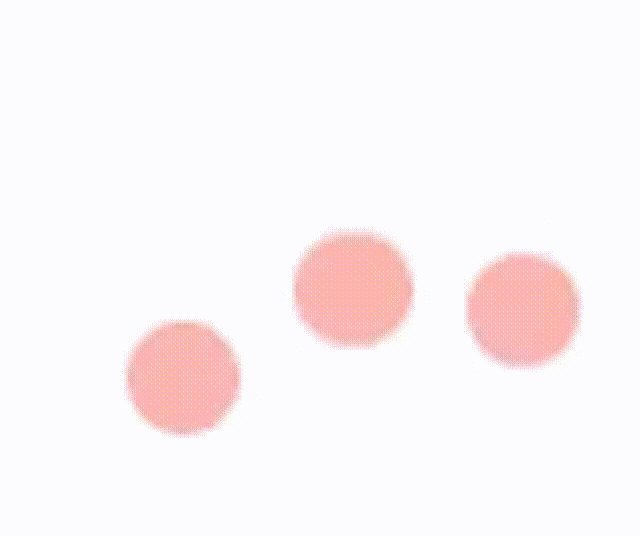
<div class="loading_con">
      <div class="item"></div>
      <div class="item"></div>
      <div class="item"></div>
    </div>
.loading_con{
width: 100%;
height: 400px;
display: flex;
justify-content: center;
.item{
width: 20px;
height: 20px;
background-color:#FFB8B5;
margin-left: 10px;
border-radius: 50%;
}
.item:first-child{
margin-left: 0;
}
.item:nth-child(1){
animation: loadingAni .6s ease-in 0s infinite;
}
.item:nth-child(2){
animation: loadingAni .6s ease-in .2s infinite;
}
.item:nth-child(3){
animation: loadingAni .6s ease-in .4s infinite;
}
@keyframes loadingAni {
0%{
transform: translateY(0);
}
50%{
transform: translateY(20px);
}
100%{
transform: translateY(0);
}
}
}5、菜单展开效果

<div class="menu_con">
      <div class="menu_main">+</div>
      <div class="itemcon itemcon_on">
        <div class="item">首页</div>
        <div class="item">优惠</div>
        <div class="item">会员</div>
        <div class="item">购物车</div>
        <div class="item">我的</div>
      </div>
    </div>
.menu_con{
width: 100px;
height: 100px;
position: relative;
.menu_main{
width: 100px;
height: 100px;
text-align: center;
line-height: 100px;
font-size: 68px;
border-radius: 50%;
color: #ffffff;
background-color: #ff6600;
position: absolute;
left: 0;
top: 0;
z-index: 9;
}
.itemcon{
width: 100px;
height: 100px;
border-radius: 50%;
color: #ffffff;
background-color: #ff6600;
position: absolute;
left: 0;
top: 0;
z-index: 6;
.item{
width: 100px;
height: 100px;
text-align: center;
line-height: 100px;
font-size: 14px;
border-radius: 50%;
color: #ffffff;
background-color: #ff6600;
position: absolute;
left: 0;
top: 0;
z-index: 6;
}
}
}
.menu_con:hover{
.item:first-child{
transform: translate3d(0, -160px, 100px);
animation: moveAni1 .5s ease-in-out 0s 1;
}
@keyframes moveAni1 {
0%{
transform: translate3d(0, 0, 0) scale(0);
}
100%{
transform: translate3d(0, -160px, 100px) scale(1);
}
}
.item:nth-child(2){
transform: translate3d(120px, -100px, 0);
animation: moveAni2 .5s ease-in-out 0s 1;
}
@keyframes moveAni2 {
0%{
transform: translate3d(0, 0, 0) scale(0);
}
100%{
transform: translate3d(120px, -100px, 0) scale(1);
}
}
.item:nth-child(3){
transform: translate3d(180px, 20px, 0);
animation: moveAni3 .5s ease-in-out 0s 1;
}
@keyframes moveAni3 {
0%{
transform: translate3d(0, 0, 0) scale(0);
}
100%{
transform: translate3d(180px, 20px, 0) scale(1);
}
}
.item:nth-child(4){
transform: translate3d(120px, 130px, 0);
animation: moveAni4 .5s ease-in-out 0s 1;
}
@keyframes moveAni4 {
0%{
transform: translate3d(0, 0, 0) scale(0);
}
100%{
transform: translate3d(120px, 130px, 0) scale(1);
}
}
.item:nth-child(5){
transform: translate3d(0, 160px, 0);
animation: moveAni5 .5s ease-in-out 0s 1;
}
@keyframes moveAni5 {
0%{
transform: translate3d(0, 0, 0) scale(0);
}
100%{
transform: translate3d(0, 160px, 0) scale(1);
}
}
}先写到这里吧,后面摸鱼的时候再写
哈哈哈!又摸鱼啦!!!
开整,今天写个3D骰子吧
6、纯css3 3D骰子

<div class="warp">
	<div class="box box1">1</div>
    <div class="box box2">2</div>
    <div class="box box3">3</div>
    <div class="box box4">4</div>
    <div class="box box5">5</div>
    <div class="box box6">6</div>
</div>
.warp {
width: 500px;
height: 500px;
margin: 100px auto;
position: relative;
transform-style: preserve-3d;
transform: rotateX(45deg) rotateY(45deg);
animation: play 5s linear infinite;
.box {
width: 200px;
height: 200px;
border: 2px solid #ccc;
text-align: center;
line-height: 200px;
font-size: 150px;
font-weight: bold;
color: #fff;
position: absolute;
top: 150px;
left: 150px;
}
.box1 {
background: rgba(135,135,135,1);
transform: rotateY(90deg) translateZ(99px);//别问为啥是99,问就是像素偏差
}
.box2 {
background: rgba(135,0,255,1);
transform: rotateY(90deg) translateZ(-99px);
}
.box3 {
background: rgba(255,125,125,1);
transform: rotateX(90deg) translateZ(-99px);
}
.box4 {
background: rgba(125,255,125,1);
transform: rotateX(90deg) translateZ(99px);
}
.box5 {
background: rgba(30,150,189,1);
transform: translateZ(99px);
}
.box6 {
background: rgba(169,150,189,1);
transform: translateZ(-99px);
}
@keyframes play {
from{ transform: rotateX(0) rotateY(0) rotateZ(0);}
to {transform: rotateX(360deg) rotateY(360deg) rotateZ(360deg);}
}
}


 4996
4996

 被折叠的 条评论
为什么被折叠?
被折叠的 条评论
为什么被折叠?
 到【灌水乐园】发言


