


| 例子 |
| 一、使用MATLAB点图工具箱 |
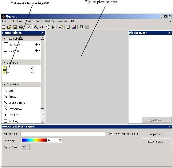
| 假设你想要绘制函数y = x3,x区间为-1到1。第一阶段是产生数据去绘制。< /FONT > 它好像是评价一个函数因为MATLAB能够分配运算操作符,覆盖一个变量的所有元素。 例如,下面语句创建一个变量x,其含有变量范围从-1到1,有0.1的增量(你也能够使用线性空间函数去为x产生数据)。第二个语句提高了在x中每个变量的三次幂并存储在变量y中。 x = -1:.1:1; % 定义x的范围 现在你产生一些数据,你能够使用MATLAB点工具箱绘制它。启动点工具箱,键入 plottools MATLAB显示一个点工具箱附加的图片。
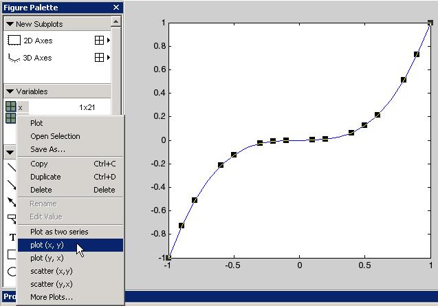
1.点绘两个变量 一个例子线性图形是一个显示x作为独立的变量和y作为独立的变量的合适方式。这样做,选择两个变量(单击选择,然后Shif单击选择另一个),然后右击显示条件菜单。
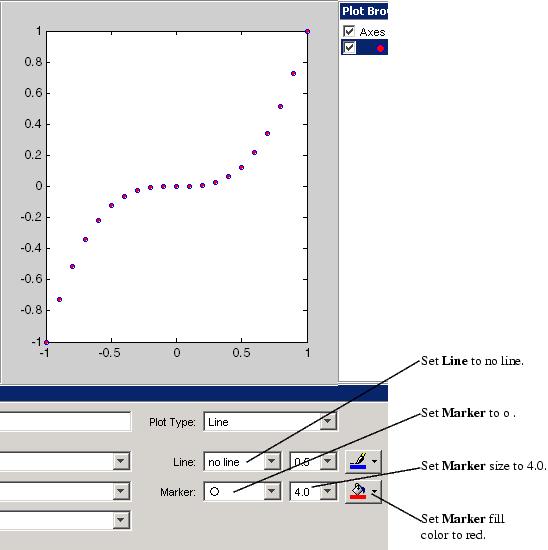
从菜单中选择plot(x,y)。MATLAB在图形区域创建这个线性图形。黑色方块表示线被选择并且你能够使用属性编辑器编辑它的属性。 2.改变外表 下一个改变线的特征因此图形仅仅显示数据点。使用属性编辑器来调整下面的属性: (1)线到线上 (2)标记为o (3)标记尺寸为4.0 (4)标记填充颜色为红色。
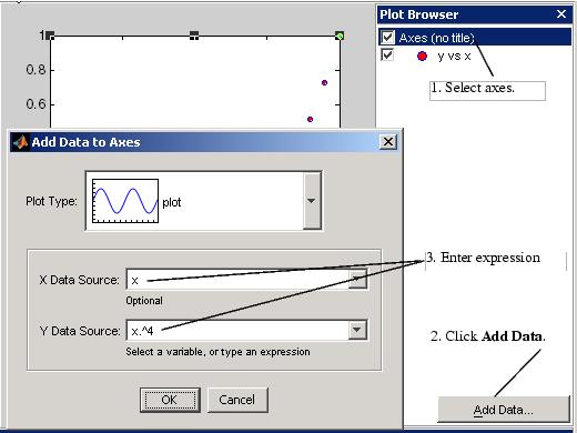
3.添加更多数据到图形 你能够添加更多数据到图形通过定义更多变量或通过指定一个表达式,MATLAB用来为点创建数据。这个第二个途径使它简单去研究已经绘制的数据的变量。 添加数据到图形,在点图浏览器中选择轴和单击添加数据按钮。当你使用点绘制工具箱,MATLAB经常添加数据到现有的图形中,代替的代替图形,作为它可能如果你发布重复点图命令。那是,点绘工具是在hold on 状态中。
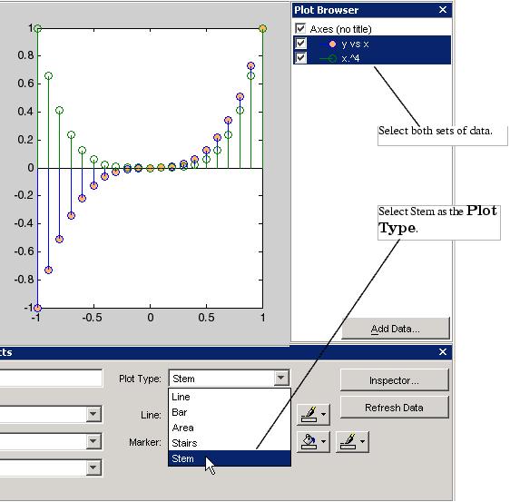
图片超过显示如何去配置添加数据到轴对话去创建一条线绘制 y = x4,添加到现存的点y = x3。 < /FONT > 4.改变图形的类型 点绘工具使你更简单的查看你的数据,一个点类型的变量。下面的图片展示了相同数据作为超过转换到杆点图。改变点图类型。 (1)选择点图数据在点图浏览器中。 (2)在点类型菜单中选择杆。
|
| 二、修改图形数据源 |
| 在你的工作空间中你能够链接图形数据到变量。在变量中当你改变值被含有,你能够修正图形来使用新数据而不用创建新图形(也可以查看refresh函数)。 假设你有下面的数据: x = linspace(-pi,pi,25); % 25个点居于-PI 到PI y = sin(x); 使用点绘工具,创佳你一个y = sin(x)的图形。 < /FONT > plottools
数据源的新值 在基础工作空间中数据定义图形是被x和y变量链接。如果你反对新值到那些变量则单击刷新数据按钮,MATLAB更新图形为使用新数据。 x = linspace(-2*pi,2*pi,25); % 25 个点居于 -2pi 到 2pi
|


Examples
一、Using MATLAB Plotting Tools
Suppose you want to graph the function y = x3 over the x domain -1 to 1. The first step is to generate the data to plot.
It is simple to evaluate a function because MATLAB can distribute arithmetic operations over all elements of a multivalued variable.
For example, the following statement creates a variable x that contains values ranging from -1 to 1 in increments of 0.1 (you could also use the linspace function to generate data for x). The second statement raises each value in x to the third power and stores these values in y.
x = -1:.1:1; % Define the range of x
y = x.^3; % Raise each element in x to the third power
Now that you have generated some data, you can plot it using the MATLAB plotting tools. To start the plotting tools, type
plottools
MATLAB displays a figure with plotting tools attached.
1.Plotting Two Variables
A simple line graph is a suitable way to display x as the independent variable and y as the dependent variable. To do this, select both variables (click to select, then Shift-click to select again), then right-click to display the context menu.
Select plot(x,y) from the menu. MATLAB creates the line graph in the figure area. The black squares indicate that the line is selected and you can edit its properties with the Property Editor.
2.Changing the Appearance
Next change the line properties so that the graph displays only the data point. Use the Property Editor to set following properties:
(1)Line to no line
(2)Marker to o
(3)Marker size to 4.0
(4)Marker fill color to red
3.Adding More Data to the Graph
You can add more data to the graph by defining more variables or by specifying an expression that MATLAB uses to generate data for the plot. This second approach makes it easy to explore variations of the data already plotted.
To add data to the graph, select the axes in the Plot Browser and click the Add Data button. When you are using the plotting tools, MATLAB always adds data to the existing graph, instead of replacing the graph, as it would if you issued repeated plotting commands. That is, the plotting tools are in a hold on state.
The picture above shows how to configure the Add Data to Axes dialog to create a line plot of y = x4, which is added to the existing plot of y = x3.
4.Changing the Type of Graph
The plotting tools enable you to easily view your data with a variety of plot types. The following picture shows the same data as above converted to stem plots. To change the plot type,
1.Select the plotted data in the Plot Browser.
2.Select Stem in the Plot Type menu.
二、Modifying the Graph Data Source
You can link graph data to variables in your workspace. When you change the values contained in the variables, you can then update the graph to use the new data without having to create a new graph. (See also the refresh function.)
Suppose you have the following data:
x = linspace(-pi,pi,25); % 25 points between -PI and PI
y = sin(x);
Using the plotting tools, create a graph of y = sin(x).
plottools
New Values for the Data Source
The data that defines the graph is linked to the x and y variables in the base workspace. If you assign new values to these variables and click the Refresh Data button, MATLAB updates the graph to use the new data.
x = linspace(-2*pi,2*pi,25); % 25 个点居于 -2pi 到 2pi
y = sin(x); % 再次计算的 y 基于新的x 值


 3340
3340


 被折叠的 条评论
为什么被折叠?
被折叠的 条评论
为什么被折叠?
 到【灌水乐园】发言


