目录
一、自定义进度条样式
二、自定义滑块样式
一、自定义进度条样式
1、方式一
我们还可以找到 progress_horizontal.xml的内容,大致如下,我们只需要对该内容进行修改即可以改变进度条的背景颜色以及进度条的颜色了。
<?xml version="1.0" encoding="utf-8"?>

<layer-list xmlns:android="http://schemas.android.com/apk/res/android">

    <item android:id="@android:id/background">
        <shape>
            <corners android:radius="10dip" />
            <gradient
                    android:startColor="#ff9d9e90"
                    android:centerColor="#ff5a5d5a"
                    android:centerY="0.75"
                    android:endColor="#ff747674"
                    android:angle="270"
            />
        </shape>
    </item>

    <item android:id="@android:id/secondaryProgress">
        <clip>
            <shape>
                <corners android:radius="10dip" />
                <gradient
                        android:startColor="#50ff0000"
                        android:centerColor="#50ff0000"
                        android:centerY="0.75"
                        android:endColor="#a0ffcb00"
                        android:angle="270"
                />
            </shape>
        </clip>
    </item>

    <item android:id="@android:id/progress">
        <clip>
            <shape>
                <corners android:radius="5dip" />
                <gradient
                        android:startColor="#ffff0000"
                        android:centerColor="#ffff0000"
                        android:centerY="0.75"
                        android:endColor="#ffffcb00"
                        android:angle="270"
                />
            </shape>
        </clip>
    </item>

</layer-list>
- 1
- 2
- 3
- 4
- 5
- 6
- 7
- 8
- 9
- 10
- 11
- 12
- 13
- 14
- 15
- 16
- 17
- 18
- 19
- 20
- 21
- 22
- 23
- 24
- 25
- 26
- 27
- 28
- 29
- 30
- 31
- 32
- 33
- 34
- 35
- 36
- 37
- 38
- 39
- 40
- 41
- 42
- 43
- 44
- 45
- 46
- 47
- 48
- 1
- 2
- 3
- 4
- 5
- 6
- 7
- 8
- 9
- 10
- 11
- 12
- 13
- 14
- 15
- 16
- 17
- 18
- 19
- 20
- 21
- 22
- 23
- 24
- 25
- 26
- 27
- 28
- 29
- 30
- 31
- 32
- 33
- 34
- 35
- 36
- 37
- 38
- 39
- 40
- 41
- 42
- 43
- 44
- 45
- 46
- 47
- 48
2、方式二
我们也可以自己制作进度条图片,通过seekbar的progressDrable属性进行调用使用即可。
android:progressDrawable="@drawable/color"
二、自定义滑块样式
这里我们新建一个xml文件通过设定它的状态来改变图片即可,再在seekbar中通过thumb属性进行调用即可。
xml文件
<?xml version="1.0" encoding="utf-8"?>
<selector xmlns:android="http://schemas.android.com/apk/res/android" >
    <item android:drawable="@drawable/list_btn_radio_check_on" android:state_focused="true" android:state_window_focused="true"></item>
 <item android:drawable="@drawable/list_btn_radio_check_on" android:state_selected="true" android:state_window_focused="true"></item>
  <item android:drawable="@drawable/list_btn_radio_check_on" android:state_pressed="true" android:state_window_focused="true"></item>
   <item android:drawable="@drawable/list_btn_radio_check_off" ></item>
</selector>
调用
<LinearLayout xmlns:android="http://schemas.android.com/apk/res/android"
xmlns:tools="http://schemas.android.com/tools"
android:layout_width="match_parent"
android:layout_height="match_parent"
tools:context=".MainActivity"
android:orientation="vertical">
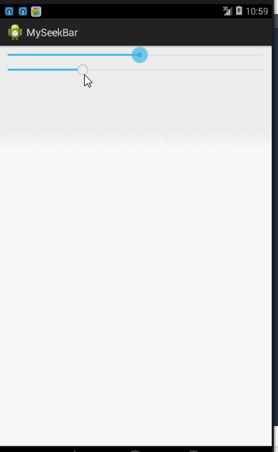
<SeekBar
android:id="@+id/seekbar"
android:layout_width="match_parent"
android:layout_height="wrap_content"
android:max="100"
android:progress="30"
/>
<SeekBar
android:id="@+id/seekbar2"
android:layout_width="match_parent"
android:layout_height="wrap_content"
android:max="100"
android:progress="30"
android:thumb="@drawable/seekbarimg"
/>
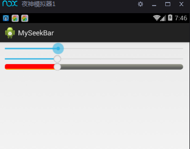
<SeekBar
android:id="@+id/seekbar2"
android:layout_width="match_parent"
android:layout_height="wrap_content"
android:max="100"
android:progress="30"
android:progressDrawable="@drawable/color"
android:thumb="@drawable/seekbarimg"
</LinearLayout>


 扫一扫
扫一扫
 2197
2197

 被折叠的 条评论
为什么被折叠?
被折叠的 条评论
为什么被折叠?
 到【灌水乐园】发言


