


组件介绍
组件(Component)是界面搭建与显示的最小单位,HarmonyOS ArkUI声明式开发范式为开发者提供了丰富多样的UI组件,我们可以使用这些组件轻松的编写出更加丰富、漂亮的界面。
组件根据功能可以分为以下五大类:基础组件、容器组件、媒体组件、绘制组件、画布组件。其中基础组件是视图层的基本组成单元,包括Text、Image、TextInput、Button、LoadingProgress等。
通用属性
在介绍组件之前,我们先来介绍组件最基本的通用属性。
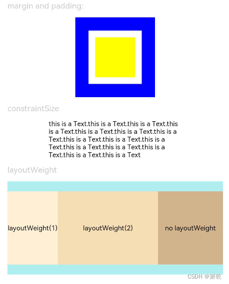
1.尺寸设置
用于设置组件的宽高、边距。
| 名称 | 参数说明 | 描述 |
| width | Length | 设置组件自身的宽度,缺省时使用元素自身内容需要的宽度。若子组件的宽大于父组件的宽,则会画出父组件的范围。 |
| height | Length | 设置组件自身的高度,缺省时使用元素自身内容需要的高度。若子组件的高大于父组件的高,则会画出父组件的范围。 |
| size | { width?: Length, height?: Length } | 设置高宽尺寸。 |
| padding | Padding | Length | 设置内边距属性。 参数为Length类型时,四个方向内边距同时生效。 默认值:0 padding设置百分比时,上下左右内边距均以父容器的width作为基础值。 |
| margin | Margin | Length | 设置外边距属性。 参数为Length类型时,四个方向外边距同时生效。 默认值:0 margin设置百分比时,上下左右外边距均以父容器的width作为基础值。 |
| constraintSize | { minWidth?: Length, maxWidth?: Length, minHeight?: Length, maxHeight?: Length } | 设置约束尺寸,组件布局时,进行尺寸范围限制。constraintSize的优先级高于Width和Height。若设置的minWidth大于maxWidth,则minWidth生效,minHeight与maxHeight同理。 默认值: { minWidth: 0, maxWidth: Infinity, minHeight: 0, maxHeight: Infinity |
示例代码
// xxx.ets
@Entry
@Component
struct SizeExample {
  build() {
    Column({ space: 10 }) {
      Text('margin and padding:').fontSize(12).fontColor(0xCCCCCC).width('90%')
      Row() {
        // 宽度80 ,高度80 ,外边距20(蓝色区域),内边距10(白色区域)
        Row() {
          Row().size({ width: '100%', height: '100%' }).backgroundColor(Color.Yellow)
        }
        .width(80)
        .height(80)
        .padding(10)
        .margin(20)
        .backgroundColor(Color.White)
      }.backgroundColor(Color.Blue)

      Text('constraintSize').fontSize(12).fontColor(0xCCCCCC).width('90%')
      Text('this is a Text.this is a Text.this is a Text.this is a Text.this is a Text.this is a Text.this is a Text.this is a Text.this is a Text.this is a Text.this is a Text.this is a Text.this is a Text.this is a Text.this is a Text')
        .width('90%')
        .constraintSize({ maxWidth: 200 })

      Text('layoutWeight').fontSize(12).fontColor(0xCCCCCC).width('90%')
      // 父容器尺寸确定时,设置了layoutWeight的子元素在主轴布局尺寸按照权重进行分配,忽略本身尺寸设置。
      Row() {
        // 权重1,占主轴剩余空间1/3
        Text('layoutWeight(1)')
          .size({ width: '30%', height: 110 }).backgroundColor(0xFFEFD5).textAlign(TextAlign.Center)
          .layoutWeight(1)
        // 权重2,占主轴剩余空间2/3
        Text('layoutWeight(2)')
          .size({ width: '30%', height: 110 }).backgroundColor(0xF5DEB3).textAlign(TextAlign.Center)
          .layoutWeight(2)
        // 未设置layoutWeight属性,组件按照自身尺寸渲染
        Text('no layoutWeight')
          .size({ width: '30%', height: 110 }).backgroundColor(0xD2B48C).textAlign(TextAlign.Center)
      }.size({ width: '90%', height: 140 }).backgroundColor(0xAFEEEE)
    }.width('100%').margin({ top: 5 })
  }
}
2.位置设置
设置组件的对齐方式、布局方向和显示位置。
| 名称 | 参数类型 | 描述 |
| align | Alignment | 设置元素内容在元素绘制区域内的对齐方式。 默认值:Alignment.Center |
| direction | Direction | 设置元素水平方向的布局。 默认值:Direction.Auto |
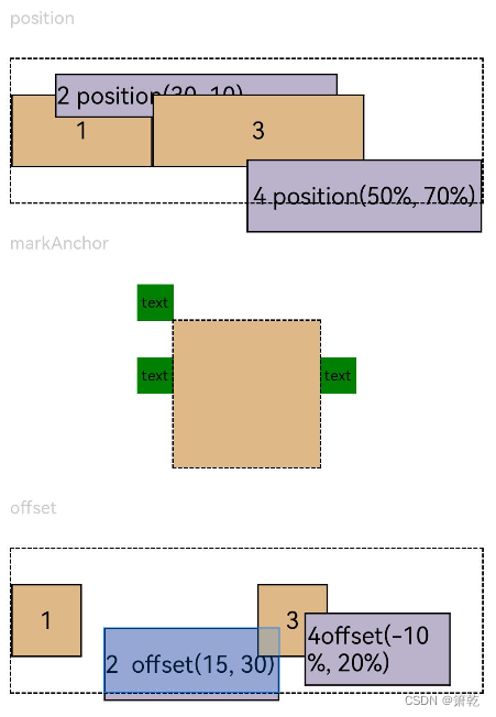
| position | Position | 绝对定位,设置元素左上角相对于父容器左上角偏移位置。在布局容器中,设置该属性不影响父容器布局,仅在绘制时进行位置调整。 适用于置顶显示、悬浮按钮等组件在父容器中位置固定的场景。 |
| markAnchor | Position | 设置元素在位置定位时的锚点,以元素左上角作为基准点进行偏移。通常配合position和offset属性使用,单独使用时,效果类似offset 默认值: { x: 0, y: 0 } |
| offset | Position | 相对定位,设置元素相对于自身的偏移量。设置该属性,不影响父容器布局,仅在绘制时进行位置调整。 默认值: { x: 0, y: 0 } |
| alignRules | { left?: { anchor: string, align: HorizontalAlign }; right?: { anchor: string, align: HorizontalAlign }; middle?: { anchor: string, align: HorizontalAlign }; top?: { anchor: string, align: VerticalAlign }; bottom?: { anchor: string, align: VerticalAlign }; center?: { anchor: string, align: VerticalAlign } } | 指定相对容器的对齐规则。 - left:设置左对齐参数。 - right:设置右对齐参数。 - middle:设置中间对齐的参数。 - top:设置顶部对齐的参数。 - bottom:设置底部对齐的参数。 - center:设置中心对齐的参数。 该接口支持在ArkTS卡片中使用。 说明: - anchor:设置作为锚点的组件的id值。 - align:设置相对于锚点组件的对齐方式。 |
示例代码1
// xxx.ets
@Entry
@Component
struct PositionExample1 {
  build() {
    Column() {
      Column({ space: 10 }) {
        // 元素内容<元素宽高,设置内容在与元素内的对齐方式
        Text('align').fontSize(9).fontColor(0xCCCCCC).width('90%')
        Stack() {
          Text('First show in bottom end').height('65%').backgroundColor(0xD2B48C)
          Text('Second show in bottom end').backgroundColor(0xF5DEB3).opacity(0.9)
        }.width('90%').height(50).margin({ top: 5 }).backgroundColor(0xFFE4C4)
        .align(Alignment.BottomEnd)
        Stack() {
          Text('top start')
        }.width('90%').height(50).margin({ top: 5 }).backgroundColor(0xFFE4C4)
        .align(Alignment.TopStart)

        // 父容器设置direction为Direction.Ltr,子元素从左到右排列
        Text('direction').fontSize(9).fontColor(0xCCCCCC).width('90%')
        Row() {
          Text('1').height(50).width('25%').fontSize(16).backgroundColor(0xF5DEB3)
          Text('2').height(50).width('25%').fontSize(16).backgroundColor(0xD2B48C)
          Text('3').height(50).width('25%').fontSize(16).backgroundColor(0xF5DEB3)
          Text('4').height(50).width('25%').fontSize(16).backgroundColor(0xD2B48C)
        }
        .width('90%')
        .direction(Direction.Ltr)
        // 父容器设置direction为Direction.Rtl,子元素从右到左排列
        Row() {
          Text('1').height(50).width('25%').fontSize(16).backgroundColor(0xF5DEB3).textAlign(TextAlign.End)
          Text('2').height(50).width('25%').fontSize(16).backgroundColor(0xD2B48C).textAlign(TextAlign.End)
          Text('3').height(50).width('25%').fontSize(16).backgroundColor(0xF5DEB3).textAlign(TextAlign.End)
          Text('4').height(50).width('25%').fontSize(16).backgroundColor(0xD2B48C).textAlign(TextAlign.End)
        }
        .width('90%')
        .direction(Direction.Rtl)
      }
    }
    .width('100%').margin({ top: 5 })
  }
}
示例代码2
// xxx.ets
@Entry
@Component
struct PositionExample2 {
  build() {
    Column({ space: 20 }) {
      // 设置子组件左上角相对于父组件左上角的偏移位置
      Text('position').fontSize(12).fontColor(0xCCCCCC).width('90%')
      Row() {
        Text('1').size({ width: '30%', height: '50' }).backgroundColor(0xdeb887).border({ width: 1 }).fontSize(16)
        Text('2 position(30, 10)')
          .size({ width: '60%', height: '30' })
          .backgroundColor(0xbbb2cb)
          .border({ width: 1 })
          .fontSize(16)
          .align(Alignment.Start)
          .position({ x: 30, y: 10 })
        Text('3').size({ width: '45%', height: '50' }).backgroundColor(0xdeb887).border({ width: 1 }).fontSize(16)
        Text('4 position(50%, 70%)')
          .size({ width: '50%', height: '50' })
          .backgroundColor(0xbbb2cb)
          .border({ width: 1 })
          .fontSize(16)
          .position({ x: '50%', y: '70%' })
      }.width('90%').height(100).border({ width: 1, style: BorderStyle.Dashed })

      // 相对于起点偏移,其中x为最终定位点距离起点水平方向间距,x>0往左,反之向右。
      // y为最终定位点距离起点垂直方向间距,y>0向上,反之向下
      Text('markAnchor').fontSize(12).fontColor(0xCCCCCC).width('90%')
      Stack({ alignContent: Alignment.TopStart }) {
        Row()
          .size({ width: '100', height: '100' })
          .backgroundColor(0xdeb887)
        Text('text')
          .size({ width: 25, height: 25 })
          .backgroundColor(Color.Green)
          .markAnchor({ x: 25, y: 25 })
        Text('text')
          .size({ width: 25, height: 25 })
          .backgroundColor(Color.Green)
          .markAnchor({ x: -100, y: -25 })
        Text('text')
          .size({ width: 25, height: 25 })
          .backgroundColor(Color.Green)
          .markAnchor({ x: 25, y: -25 })
      }.margin({ top: 25 }).border({ width: 1, style: BorderStyle.Dashed })

      // 相对定位,x>0向右偏移,反之向左,y>0向下偏移,反之向上
      Text('offset').fontSize(12).fontColor(0xCCCCCC).width('90%')
      Row() {
        Text('1').size({ width: '15%', height: '50' }).backgroundColor(0xdeb887).border({ width: 1 }).fontSize(16)
        Text('2  offset(15, 30)')
          .size({ width: 120, height: '50' })
          .backgroundColor(0xbbb2cb)
          .border({ width: 1 })
          .fontSize(16)
          .align(Alignment.Start)
          .offset({ x: 15, y: 30 })
        Text('3').size({ width: '15%', height: '50' }).backgroundColor(0xdeb887).border({ width: 1 }).fontSize(16)
        Text('4 offset(-10%, 20%)')
          .size({ width: 100, height: '50' })
          .backgroundColor(0xbbb2cb)
          .border({ width: 1 })
          .fontSize(16)
          .offset({ x: '-5%', y: '20%' })
      }.width('90%').height(100).border({ width: 1, style: BorderStyle.Dashed })
    }
    .width('100%').margin({ top: 25 })
  }
}
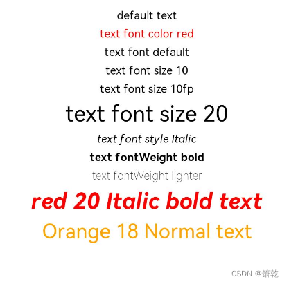
2.文本样式设置
针对包含文本元素的组件,设置文本样式。
| 名称 | 参数类型 | 描述 |
| fontColor | ResourceColor | 设置字体颜色。 |
| fontSize | Length | 设置字体大小,Length为number类型时,使用fp单位。字体默认大小16。不支持设置百分比字符串。 |
| fontStyle | FontStyle | 设置字体样式。 默认值:FontStyle.Normal |
| fontWeight | number | FontWeight | string | 设置文本的字体粗细,number类型取值[100, 900],取值间隔为100,默认为400,取值越大,字体越粗。string类型仅支持number类型取值的字符串形式,例如"400",以及"bold"、"bolder"、"lighter"、"regular"、"medium",分别对应FontWeight中相应的枚举值。 默认值:FontWeight.Normal |
| fontFamily | string | Resource | 设置字体列表。默认字体'HarmonyOS Sans',当前支持'HarmonyOS Sans'字体和注册自定义字体。 |
| lineHeight | string | number | Resource | 设置文本的文本行高,设置值不大于0时,不限制文本行高,自适应字体大小,Length为number类型时单位为fp。 |
| decoration | { type: TextDecorationType, color?: ResourceColor } | 设置文本装饰线样式及其颜色。 默认值:{ type: TextDecorationType.None, color:Color.Black } |
示例代码
// xxx.ets
@Entry
@Component
struct TextStyleExample {
  build() {
    Column({ space: 5 }) {
      Text('default text')

      Text('text font color red').fontColor(Color.Red)

      Text('text font default')
      Text('text font size 10').fontSize(10)
      Text('text font size 10fp').fontSize('10fp')
      Text('text font size 20').fontSize(20)

      Text('text font style Italic').fontStyle(FontStyle.Italic)

      Text('text fontWeight bold').fontWeight(700)
      Text('text fontWeight lighter').fontWeight(FontWeight.Lighter)

      Text('red 20 Italic bold text')
        .fontColor(Color.Red)
        .fontSize(20)
        .fontStyle(FontStyle.Italic)
        .fontWeight(FontWeight.Bold)

      Text('Orange 18 Normal text')
        .fontColor(Color.Orange)
        .fontSize(18)
        .fontStyle(FontStyle.Normal)
    }.width('100%')
  }
}


 1089
1089


 被折叠的 条评论
为什么被折叠?
被折叠的 条评论
为什么被折叠?
 到【灌水乐园】发言


