


Android的界面是有布局和组件协同完成的,布局好比是建筑里的框架,而组件则相当于建筑里的砖瓦。组件按照布局的要求依次排列,就组成了用户所看见的界面。
Android的六大布局分别是
- LinearLayout(线性布局)
- RelativeLayout(相对布局)
- FrameLayout(单帧布局)
- AbsoluteLayout(绝对布局)
- TableLayout(表格布局)
- Android4.0之后新增的GridLayout(网格布局)
线性布局。这个布局简单的说,就是所有控件都依次排序,
谁也不会覆盖谁。线性布局需要定义一个方向,
横向(Android:orientation="horizontal")
或纵向(android:orientation="vertical")。
也就是说,控件要么就并排横向的排列,要么就纵向的笔直排列。
这是一个水平的线性布局
<?xml version="1.0" encoding="utf-8"?>
<LinearLayout xmlns:android="http://schemas.android.com/apk/res/android"
    android:id="@+id/activity_main"
    android:layout_width="match_parent"
    android:orientation="horizontal"
    android:layout_height="match_parent">
    <TextView
        android:background="#da0202"
        android:layout_width="100dp"
        android:layout_height="100dp"
        android:text="Hello World!" />
    <TextView
        android:background="#1aab95"
        android:layout_width="100dp"
        android:layout_height="100dp"
        android:text="Hello World!" />
    <TextView
        android:background="#1f1f99"
        android:layout_width="100dp"
        android:layout_height="100dp"
        android:text="Hello World!" />
    <TextView
        android:background="#121010"
        android:layout_width="100dp"
        android:layout_height="100dp"
        android:text="Hello World!" />
</LinearLayout>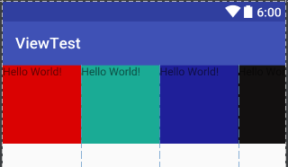
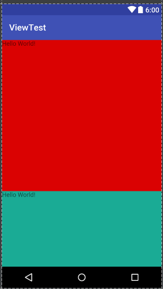
我么可以看到水平线性布局把控件依次水平线性排列不会重叠,但是第四个明显放不下跑到屏幕外面去了。
我们再来看看垂直方向的将android:orientation=”horizontal”改成android:orientation=”vertical”
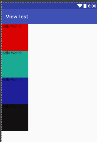
这里变成了垂直排列其中的控件。
从这里我们可以看出线性布局没法直接控制控件的具体位置,以及相对的位置关系。每个控件都依次摆放。不过控件间的间距可以调整,控件也不会相互覆盖。线性布局可以嵌套使用,可以在一个纵向布局中加入一个横向布局。用这种嵌套方式,可以完成一些稍微复杂的页面。不过,当嵌套的情况使用的多了,并且嵌套的层次也多了,就会给维护带来非常大的麻烦。自己回头再看布局那就真是头大了。
下面学习下如何将其中的控件均匀摆放,恩就是权重。android:layout_weight
我们将上面的布局代码更改如下
<?xml version="1.0" encoding="utf-8"?>
<LinearLayout xmlns:android="http://schemas.android.com/apk/res/android"
    android:id="@+id/activity_main"
    android:layout_width="match_parent"
    android:orientation="horizontal"
    android:layout_height="match_parent">
    <TextView
        android:background="#da0202"
        android:layout_width="0dp"
        android:layout_weight="1"
        android:layout_height="100dp"
        android:text="Hello World!" />
    <TextView
        android:background="#1aab95"
        android:layout_width="0dp"
        android:layout_weight="1"
        android:layout_height="100dp"
        android:text="Hello World!" />
    <TextView
        android:background="#1f1f99"
        android:layout_width="0dp"
        android:layout_weight="1"
        android:layout_height="100dp"
        android:text="Hello World!" />
    <TextView
        android:background="#121010"
        android:layout_width="0dp"
        android:layout_weight="1"
        android:layout_height="100dp"
        android:text="Hello World!" />
</LinearLayout>
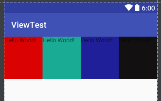
是不是美观许多了? 有读者可能会问 调整宽高不就行了么还弄权重这么麻烦,其实不然安卓机型差异非常大各个型号的分辨率都有,如果固定宽高必然会造成机型显示差异,那样子就很尴尬了。权重也就是按比例来分配控件。谷歌建议水平线性布局的宽度设置成0dp后再设置对应控件的权重,垂直的的高度设置成0再设置权重。为什么这么建议我们来看下一些由权重分配导致的问题:
代码如下:
<?xml version="1.0" encoding="utf-8"?>
<LinearLayout xmlns:android="http://schemas.android.com/apk/res/android"
    android:id="@+id/activity_main"
    android:layout_width="match_parent"
    android:orientation="horizontal"
    android:layout_height="match_parent">
    <TextView
        android:background="#da0202"
        android:layout_width="match_parent"
        android:layout_weight="1"
        android:layout_height="100dp"
        android:text="Hello World!" />
    <TextView
        android:background="#1aab95"
        android:layout_width="match_parent"
        android:layout_weight="2"
        android:layout_height="100dp"
        android:text="Hello World!" />

</LinearLayout>
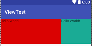
我们发现权重比是1:2 然而这两个控件的比例却反过来了!
再来看看垂直方向的
<?xml version="1.0" encoding="utf-8"?>
<LinearLayout xmlns:android="http://schemas.android.com/apk/res/android"
    android:id="@+id/activity_main"
    android:layout_width="match_parent"
    android:orientation="vertical"
    android:layout_height="match_parent">
    <TextView
        android:background="#da0202"
        android:layout_width="match_parent"
        android:layout_weight="1"
        android:layout_height="match_parent"
        android:text="Hello World!" />
    <TextView
        android:background="#1aab95"
        android:layout_width="match_parent"
        android:layout_weight="2"
        android:layout_height="match_parent"
        android:text="Hello World!" />

</LinearLayout>
不负所望。。。还是倒过来了。
这究竟怎么回事呢?下面请读者理解这句话
权重(layout_weight)对线性布局中水平(垂直)方向的剩余空间进行分配。
那么我们现在假设这个手机横向宽度 480dp 纵向高度480dp 。先分析水平方向的布局。
左边的红色控件占据的的空间为match_parent 也就是320dp 右边绿色的空间占据的空间也是320dp 此时屏幕剩余的空间是多少? 480dp - 480dp - 480dp = -480dp ; 此时屏幕剩余空间是-320dp 那么左右进行比例分配 也就是
左边的空间为 : 480dp + 1/3 * (-480dp ) = 320dp
右边的空间为 :480dp + 2/3 * (-480dp ) = 160dp
现在是不是符合上面的现象了?
垂直方向的分析也是如此 请读者思考下
总结下权重分配有两种情况:
情况1:当线性布局中内部子控件的宽度之和大于线性布局的总宽度时,即权重越大,当前控件所占空间越小。
情况2:当线性布局中内部子控件的宽度之和小于线性布局的总宽度时,即权重越大,当前控件所占空间越小。
所以我们在使用权重的时候一般情况把要布局的一般把width或者height设置为0dp
今天的分享的就到这里~~~


 1542
1542

 被折叠的 条评论
为什么被折叠?
被折叠的 条评论
为什么被折叠?
 到【灌水乐园】发言


