


Android TabLayout总结
TabLayout基本属性:
- background:背景颜色
- tabTextColor:默认文本颜色
- tabSelectedTextColor:选中文本颜色
- tabIndicatorColor:下划线颜色
- tabIndicatorFullWidth:下划线是否填充宽度
- tabIndicator:指示器
- tabMode:滚动模式
- tabTextAppearance:文本样式,如字体大小、粗细、大小写
- tabIndicatorHeight:下划线高度。设置为0时,则不显示
- tabMaxWidth:tab最大宽度
- tabMinWidth:tab最小宽度

TabLayout.Tab基本属性:
- setCustomView:自定义View
- setIcon:设置图标
- setText:设置文本
- getOrCreateBadge:获取badge
- removeBadge:移除badge
- select:选中tab
- isSelected:判断tab是否选中
基本使用
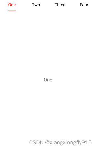
TabLayout样式:
<style name="MyTabLayoutStyle">
    <item name="android:textSize">16sp</item>
    <item name="android:textStyle">normal</item>
    <item name="textAllCaps">false</item>
</style>
XML布局:
<com.google.android.material.tabs.TabLayout
                                            android:id="@+id/tabLayout01"
                                            android:layout_width="match_parent"
                                            android:layout_height="wrap_content"
                                            app:tabIndicatorColor="@color/red"
                                            app:tabIndicatorFullWidth="false"
                                            app:tabMode="fixed"
                                            app:tabSelectedTextColor="@color/red"
                                            app:tabTextAppearance="@style/MyTabLayoutStyle"
                                            app:tabTextColor="@color/black" />

<androidx.viewpager2.widget.ViewPager2
                                       android:id="@+id/viewPager2"
                                       android:layout_width="match_parent"
                                       android:layout_height="match_parent" />
代码:
viewPager2.adapter = object :
        FragmentStateAdapter(this@TabLayoutActivity) {
            override fun getItemCount(): Int {
                return fragments.size
            }

            override fun createFragment(position: Int): Fragment {
                return fragments[position]
            }
        }

TabLayoutMediator(
    tabLayout01,
    viewPager2,
    object : TabLayoutMediator.TabConfigurationStrategy {
        override fun onConfigureTab(tab: TabLayout.Tab, position: Int) {
            tab.text = titles[position]
        }
    }).attach()
添加图标、隐藏下划线
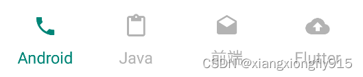
XML布局:
<com.google.android.material.tabs.TabLayout
                                            android:id="@+id/tabLayout02"
                                            android:layout_width="match_parent"
                                            android:layout_height="wrap_content"
                                            android:layout_marginTop="10dp"
                                            app:tabIndicatorHeight="0dp"
                                            app:tabMode="fixed"
                                            app:tabSelectedTextColor="@color/color_main"
                                            app:tabTextAppearance="@style/MyTabLayoutStyle"
                                            app:tabTextColor="@color/grey"
                                            app:tabIconTint="@color/grey"
                                            />
代码:
TabLayoutMediator(
    tabLayout02,
    viewPager2,
    object : TabLayoutMediator.TabConfigurationStrategy {
        override fun onConfigureTab(tab: TabLayout.Tab, position: Int) {
            tab.text = titles[position]
        }
    }).attach()
for (i in 0..tabLayout02.tabCount) {
    tabLayout02.getTabAt(i)?.setIcon(drawables[i])
}
tabLayout02.addOnTabSelectedListener(object : TabLayout.OnTabSelectedListener {
    override fun onTabSelected(tab: TabLayout.Tab?) {
        tab?.icon?.selected()
    }

    override fun onTabUnselected(tab: TabLayout.Tab?) {
        tab?.icon?.unselected()
    }

    override fun onTabReselected(tab: TabLayout.Tab?) {
    }
})
val defaultTab = tabLayout02.getTabAt(defaultIndex)
defaultTab?.select()
defaultTab?.icon?.selected()

//图片选中状态
fun Drawable.selected() {
    this.setTint(ContextCompat.getColor(mContext, R.color.color_main))
}

//图片未选中状态
fun Drawable.unselected() {
    this.setTint(ContextCompat.getColor(mContext, R.color.grey))
}
自定义下划线、添加分割线
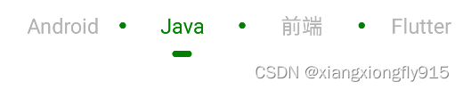
自定义下划线:
<layer-list xmlns:android="http://schemas.android.com/apk/res/android">
    <item
        android:width="15dp"
        android:height="5dp"
        android:gravity="center">
        <shape android:shape="rectangle">
            <corners android:radius="10dp" />
        </shape>
    </item>
</layer-list>
自定义分割线:
<?xml version="1.0" encoding="utf-8"?>
<layer-list xmlns:android="http://schemas.android.com/apk/res/android">
    <item
          android:width="5dp"
          android:height="5dp"
          android:gravity="center">
        <shape android:shape="oval">
            <solid android:color="@color/green" />
        </shape>
    </item>
</layer-list>
XML布局:
<com.google.android.material.tabs.TabLayout
                                            android:id="@+id/tabLayout03"
                                            android:layout_width="match_parent"
                                            android:layout_height="wrap_content"
                                            android:layout_marginTop="10dp"
                                            app:tabIndicator="@drawable/tab_indicator"
                                            app:tabIndicatorColor="@color/green"
                                            app:tabIndicatorFullWidth="false"
                                            app:tabMode="fixed"
                                            app:tabSelectedTextColor="@color/green"
                                            app:tabTextAppearance="@style/MyTabLayoutStyle"
                                            app:tabTextColor="@color/grey" />
代码:
TabLayoutMediator(
    tabLayout03,
    viewPager2,
    object : TabLayoutMediator.TabConfigurationStrategy {
        override fun onConfigureTab(tab: TabLayout.Tab, position: Int) {
            tab.text = titles[position]
        }
    }).attach()

for (i in 0..tabLayout03.tabCount) {
    val linearLayout = tabLayout03.getChildAt(i) as? LinearLayout
    linearLayout?.apply {
        showDividers = LinearLayout.SHOW_DIVIDER_MIDDLE
        dividerDrawable =
        ContextCompat.getDrawable(mContext, R.drawable.tab_divider)
        dividerPadding = 2.dp
    }
}

val defaultTab = tabLayout03.getTabAt(defaultIndex)
defaultTab?.select()
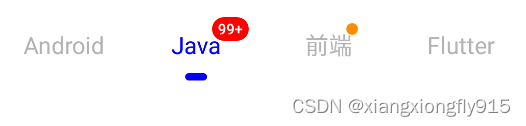
设置角标
XML布局:
<com.google.android.material.tabs.TabLayout
                                            android:id="@+id/tabLayout04"
                                            android:layout_width="match_parent"
                                            android:layout_height="wrap_content"
                                            android:layout_marginTop="10dp"
                                            app:tabIndicator="@drawable/tab_indicator"
                                            app:tabIndicatorColor="@color/blue"
                                            app:tabIndicatorFullWidth="false"
                                            app:tabMode="fixed"
                                            app:tabSelectedTextColor="@color/blue"
                                            app:tabTextAppearance="@style/MyTabLayoutStyle"
                                            app:tabTextColor="@color/grey" />
代码:
TabLayoutMediator(
    tabLayout04,
    viewPager2,
    object : TabLayoutMediator.TabConfigurationStrategy {
        override fun onConfigureTab(tab: TabLayout.Tab, position: Int) {
            tab.text = titles[position]
        }
    }).attach()

//数字角标
tabLayout04.getTabAt(1)?.let {
    it.orCreateBadge.apply {
        backgroundColor = Color.RED
        maxCharacterCount = 3
        number = 99999
        badgeTextColor = Color.WHITE
    }
}

//红点
tabLayout04.getTabAt(2)?.let {
    it.orCreateBadge.backgroundColor = ContextCompat.getColor(this, R.color.orange)
}

val defaultTab = tabLayout04.getTabAt(defaultIndex)
defaultTab?.select()
圆角样式
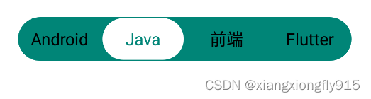
tab_bg_shape
<?xml version="1.0" encoding="utf-8"?>
<shape xmlns:android="http://schemas.android.com/apk/res/android"
    android:shape="rectangle">
    <solid android:color="@color/color_main" />
    <corners android:radius="100dp" />
</shape>
tab_indicator_shape
<?xml version="1.0" encoding="utf-8"?>
<layer-list xmlns:android="http://schemas.android.com/apk/res/android">
    <item
        android:bottom="1dp"
        android:gravity="center"
        android:left="1dp"
        android:right="1dp"
        android:top="1dp">
        <shape android:shape="rectangle">
            <solid android:color="@color/white" />
            <corners android:radius="100dp" />
            <size android:height="40dp" />
        </shape>
    </item>
</layer-list>
XML布局:
    <com.google.android.material.tabs.TabLayout
        android:id="@+id/tabLayout05"
        android:layout_width="wrap_content"
        android:layout_height="42dp"
        android:layout_gravity="center"
        android:layout_marginTop="10dp"
        android:background="@drawable/tab_bg_shape"
        app:tabIndicator="@drawable/tab_indicator_shape"
        app:tabIndicatorColor="@color/white"
        app:tabIndicatorFullWidth="true"
        app:tabMinWidth="80dp"
        app:tabMode="fixed"
        app:tabSelectedTextColor="@color/color_main"
        app:tabTextAppearance="@style/MyTabLayoutStyle"
        app:tabTextColor="@color/black" />
自定义View+Lottile
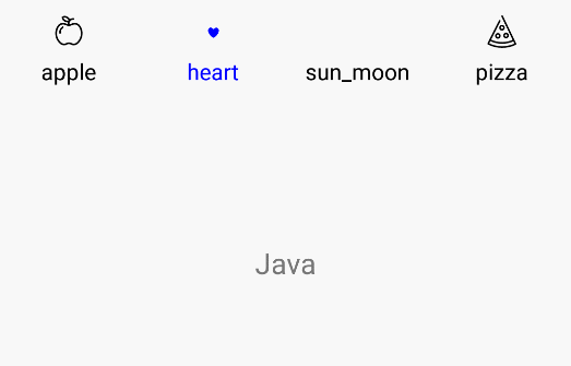
XML布局:
<com.google.android.material.tabs.TabLayout
    android:id="@+id/tabLayout06"
    android:layout_width="match_parent"
    android:layout_height="wrap_content"
    android:layout_marginTop="10dp"
    app:tabIndicatorHeight="0dp"
    app:tabMode="fixed" />
item_tab
<?xml version="1.0" encoding="utf-8"?>
<LinearLayout xmlns:android="http://schemas.android.com/apk/res/android"
    android:layout_width="match_parent"
    android:layout_height="wrap_content"
    android:gravity="center"
    android:orientation="vertical">

    <com.airbnb.lottie.LottieAnimationView
        android:id="@+id/tab_img"
        android:layout_width="30dp"
        android:layout_height="30dp" />

    <TextView
        android:id="@+id/tab_text"
        android:layout_width="wrap_content"
        android:layout_height="wrap_content"
        android:textSize="14sp" />

</LinearLayout>
代码:
viewPager2.registerOnPageChangeCallback(object : ViewPager2.OnPageChangeCallback() {
    override fun onPageSelected(position: Int) {
        super.onPageSelected(position)
        tabLayout06.getTabAt(position)?.select()
    }
})
val layoutInflate = LayoutInflater.from(mContext)
val map = mapOf<String, Int>(
    "apple" to R.raw.apple,
    "heart" to R.raw.heart,
    "sun_moon" to R.raw.sun_moon,
    "pizza" to R.raw.pizza
)
map.keys.forEach { s: String ->
                  val tab = tabLayout06.newTab()
                  val view = layoutInflate.inflate(R.layout.item_tab, null)
                  val image = view.findViewById<LottieAnimationView>(R.id.tab_img).apply {
                      setAnimation(map[s]!!)
                      setColorFilter(Color.BLUE)
                  }
                  val text = view.findViewById<TextView>(R.id.tab_text).apply {
                      text = s
                  }
                  tab.customView = view
                  tabLayout06.addTab(tab)
                 }
tabLayout06.addOnTabSelectedListener(object : TabLayout.OnTabSelectedListener {
    override fun onTabSelected(tab: TabLayout.Tab?) {
        tab?.selected()
        tab?.let {
            viewPager2.currentItem = it.position
        }
    }

    override fun onTabUnselected(tab: TabLayout.Tab?) {
        tab?.unselect()
    }

    override fun onTabReselected(tab: TabLayout.Tab?) {
    }
})
val defaultTab = tabLayout06.getTabAt(defaultIndex)
defaultTab?.select()
defaultTab?.selected()
/**
 * 选中状态
 */
fun TabLayout.Tab.selected() {
    this.customView?.let {
        val image = it.findViewById<LottieAnimationView>(R.id.tab_img)
        val text = it.findViewById<TextView>(R.id.tab_text)
        if (!image.isAnimating) image.playAnimation()
        setLottieColor(image, true)
        text.setTextColor(ContextCompat.getColor(mContext, R.color.blue))
    }
}

/**
 * 未选中状态
 */
fun TabLayout.Tab.unselect() {
    this.customView?.let {
        val image = it.findViewById<LottieAnimationView>(R.id.tab_img)
        val text = it.findViewById<TextView>(R.id.tab_text)
        if (image.isAnimating) image.cancelAnimation()
        image.progress = 0F
        setLottieColor(image, false)
        text.setTextColor(ContextCompat.getColor(mContext, R.color.black))
    }
}

/**
 * set lottie icon color
 */
private fun setLottieColor(imageView: LottieAnimationView?, isSelected: Boolean) {
    imageView?.let {
        val color = if (isSelected) R.color.blue else R.color.black
        val csl = AppCompatResources.getColorStateList(this@TabLayoutActivity, color)
        val filter = SimpleColorFilter(csl.defaultColor)
        val keyPath = KeyPath("**")
        val callback = LottieValueCallback<ColorFilter>(filter)
        it.addValueCallback(keyPath, LottieProperty.COLOR_FILTER, callback)
    }
}


 2401
2401


 被折叠的 条评论
为什么被折叠?
被折叠的 条评论
为什么被折叠?
 到【灌水乐园】发言


