


文章目录
微信小程序-自定义组件
navbar
定义navbar组件
json
{
  "component": true,
  "usingComponents": {}
}
wxml
<view class="wrap">
  <view class="item {{currentIndex===index?'active':''}}" wx:for="{{titleList}}" wx:key="index" bindtap="handleClick" data-index="{{index}}">
    {{item}}
  </view>
</view>
wxss
.wrap {
  display: flex;
  flex-direction: row;
}

.wrap .item {
  flex: 1;
  height: 50px;
  line-height: 50px;
  text-align: center;
}

.active {
  color: red
}
js
Component({
  /**
   * 组件的属性列表
   */
  properties: {
    titleList: {
      type: Array,
      value: []
    },
    currentIndex: {
      type: Number,
      value: 0
    }

  },

  /**
   * 组件的初始数据
   */
  data: {

  },

  /**
   * 组件的方法列表
   */
  methods: {
    handleClick(e) {
      let index = e.currentTarget.dataset.index
      this.setData({
        currentIndex: index
      })
      //触发父组件的事件
      this.triggerEvent("ParentEvent", index)
    }
  },

})
使用navbar组件
在json中引入组件
{
  "usingComponents": {
    "navbar": "../../components/navbar/navbar"
  }
}
在wxml中使用
<view style="display: flex;flex-direction: column;height: 100%;">
  <navbar titleList="{{titleList}}" currentIndex="{{current}}" bindParentEvent="handleEvent"></navbar>
  <swiper style="flex: 1; background-color: honeydew;" bindchange="handleChange" current="{{current}}">
    <swiper-item wx:for="{{infoList}}" wx:key="index">
      {{item}}
    </swiper-item>
  </swiper>
</view>
wxss
page {
  height: 100%;
}
js
Page({
/**
* 页面的初始数据
*/
data: {
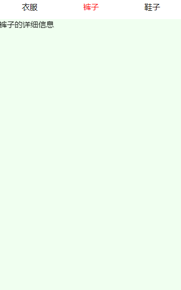
titleList: ["衣服", "裤子", "鞋子"],
infoList: ["衣服的详细信息", "裤子的详细信息", "鞋子的详细信息"],
current: 0
},
handleChange(e) {
this.setData({
current: e.detail.current
})
},
handleEvent(e) {
this.setData({
current: e.detail
})
}
})
slot 插槽
定义top-header组件
json
{
  "component": true,
  "usingComponents": {}
}
wxml
<view class="box">
  <slot name="left"></slot>
  <text>hello</text>
  <slot name="right"></slot>
</view>
wxss
.box {
  display: flex;
  flex-direction: row;
}
js
Component({
  options: {
    multipleSlots: true //开启多slot
  },
  /**
   * 组件的属性列表
   */
  properties: {

  },

  /**
   * 组件的初始数据
   */
  data: {

  },

  /**
   * 组件的方法列表
   */
  methods: {

  }
})
使用top-header组件
引入组件
{
  "usingComponents": {
    "top-header": "../../components/topheader/topheader"
  }
}
使用组件
<top-header>
  <view slot="left">
    左边
  </view>
  <view slot="right">
    右边
  </view>
</top-header>
倒计时
定义count组件
json
{
  "component": true,
  "usingComponents": {}
}
wxml
{{countNumber}}
js
Component({
  /**
   * 组件的属性列表
   */
  properties: {
    countNumber: {
      type: Number,
      value: 0
    }
  },

  /**
   * 组件的初始数据
   */
  data: {

  },

  /**
   * 组件的生命周期
   */
  lifetimes: {
    // 在组件实例进入页面节点树时执行
    attached: function () {
      this.intervalId = setInterval(() => {
        if (this.data.countNumber === 0) {
          clearInterval(this.intervalId)
          this.triggerEvent("Event")
          return
        }
        this.setData({
          countNumber: --this.data.countNumber
        })
      }, 1000)
    },
    // 在组件实例被从页面节点树移除时执行
    detached: function () {
      clearInterval(this.intervalId)
    }
  },

  /**
   * 组件的方法列表
   */
  methods: {

  }
})
使用count组件
引入count组件
{
  "usingComponents": {
    "count": "../../../components/count/count"
  }
}
使用count组件
<view class="container">
  <view>
    倒计时:
  </view>
  <count countNumber="{{5}}" bindEvent="handleEvent" wx:if="{{isShow}}"></count>
</view>
js
Page({
  data: {
    isShow: true
  },
  handleEvent() {
    this.setData({
      isShow: false
    })
  }
})


 被折叠的 条评论
为什么被折叠?
被折叠的 条评论
为什么被折叠?
 到【灌水乐园】发言


