


文章目录
Compose 动画
概述
高级别动画:
高级别API服务于常见业务,设计上力求开箱即用,例如页面转场、UI元素的过渡等,高级别API大多是一个Composable函数,便于与其他Composable组合使用。
| API | 说明 |
|---|---|
| AnimatedVisibiliy | 可见性动画,UI元素进入/退出时的过渡动画 |
| AnimatedContent | 布局内容变化时的动画 |
| animateContentSize | 布局大小变化时的动画 |
| Crossfade | 两个布局切换是的淡入淡出动画 |
低级别动画:
高级别API的底层实际上都是由低级别API支持的。
| API | 说明 |
|---|---|
| animateXXXAsState | 值动画 |
| Animatable | 基于协程的单值动画 |
| updateTransition | 组合多个动画 |
| rememberInfiniteTransition | 创建无限重复的动画 |
| TargetBasedAnimation | 自定义执行时间的低级动画 |
动画选择策略:
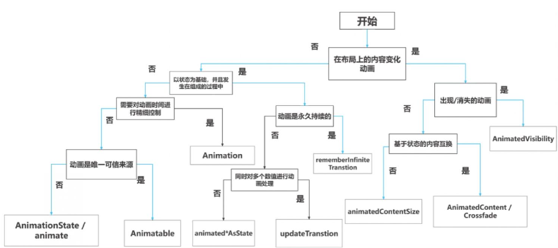
高级别动画
AnimatedVisibility
AnimatedVisibility 可组合项可为内容的出现和消失添加动画效果。
- EnterTransition() 进入动画:
- fadeIn:淡入
- slideIn:滑入
- slideInHorizontally:水平滑入
- slideInVertically:垂直滑入
- expandIn:展开
- expandHorizontally:水平展开
- expandVertically:垂直展开
- ExitTransition() 退出动画:
- fadeOut:淡出
- slideOut:滑出
- slideOutHorizontally:水平滑出
- slideOutVertically:垂直滑出
- shrinkOut:缩小
- shrinkHorizontally:水平缩小
- shrinkVertically:垂直缩小
使用一:
val visible = remember {
    mutableStateOf(true)
}
Column(
    modifier = Modifier
    .size(360.dp)
    .padding(10.dp)
) {
    Button(onClick = { visible.value = !visible.value }) {
        Text("可见性动画")
    }
    AnimatedVisibility(visible = visible.value) {
        Text(text = "床前明月光,疑是地上霜,举头望明月,低头思故乡", modifier = Modifier.size(150.dp))
    }
}
使用二:
val visible = remember {
    mutableStateOf(true)
}
Column(
    modifier = Modifier
    .size(360.dp)
    .padding(10.dp)
) {
    Button(onClick = { visible.value = !visible.value }) {
        Text("可见性动画")
    }
    AnimatedVisibility(visible = visible.value,
                       enter = slideIn { IntOffset(400, 400) } + expandIn(),
                       exit = slideOut { IntOffset(400, 400) } + shrinkOut()) {
        Text(
            text = "床前明月光,疑是地上霜,举头望明月,低头思故乡", modifier = Modifier.size(150.dp)
        )
    }
}
AnimatedContent
AnimatedContent 可组合项会在内容根据目标状态发生变化时,为内容添加动画效果。
Column(horizontalAlignment = Alignment.CenterHorizontally) {
    var count by remember { mutableStateOf(0) }
    Button(onClick = { count++ }) {
        Text("add")
    }
    AnimatedContent(targetState = count) { targetCount ->
        Text("Count: ${targetCount}")
    }
}
animateContentSize
内置动画修饰符。
animateContentSize 在修饰符链中的位置顺序很重要。为使动画流畅,请务必将其放在任何大小修饰符(如 size 或 defaultMinSize)之前,以确保 animateContentSize 向布局报告添加动画效果之后的值更改。
val isExpand = remember {
    mutableStateOf(true)
}
Column(
    modifier = Modifier
        .size(360.dp)
        .padding(10.dp)
) {
    Text(
        text = "床前明月光,疑是地上霜,举头望明月,低头思故乡。床前明月光,疑是地上霜,举头望明月,低头思故乡。床前明月光,疑是地上霜,举头望明月,低头思故乡。",
        fontSize = 16.sp,
        textAlign = TextAlign.Justify,
        overflow = TextOverflow.Ellipsis,
        modifier = Modifier.animateContentSize(),
        maxLines = if (isExpand.value) Int.MAX_VALUE else 2
    )
    Text(if (isExpand.value) "收起" else "全文", color = Color.Blue, modifier = Modifier.clickable {
        isExpand.value = !isExpand.value
    })
}
Crossfade
Crossfade 可使用淡入淡出动画在两个布局之间添加动画效果。
只需要淡入淡出效果,可以使用Crossfade替代AnimatedContent。
var currentState by remember { mutableStateOf("A") }
Column {
    Crossfade(targetState = currentState) { state ->
        when (state) {
            "A" -> Text("hello world")
            "B" -> Text("hello compose")
        }
    }
    Button(onClick = { currentState = if (currentState == "A") "B" else "A" }) {
        Text("切换状态")
    }
}
低级别动画
animateXXXAsState
animate*AsState 函数是 Compose 中最简单的动画 API,用于为单个值添加动画效果。您只需提供目标值(或结束值),该 API 就会从当前值开始向指定值播放动画。
animateXXXAsState() 函数可以使用:Float、Color、Dp、Size、Bounds、Offset、Rect、Int、IntOffset、IntSize。
var isSmall by remember { mutableStateOf(true) }
val size: Dp by animateDpAsState(if (isSmall) 40.dp else 100.dp) {
    Log.e("TAG", "尺寸发生变化:$it")
}
val color: Color by animateColorAsState(if (isSmall) Color.Red else Color.Blue) {
    Log.e("TAG", "颜色发生变化:$it")
}
Column(Modifier.padding(16.dp)) {
    Box(
        Modifier
        .size(size)
        .background(color)
    )
    Button(onClick = { isSmall = !isSmall }, modifier = Modifier.padding(vertical = 16.dp)) {
        Text("修改尺寸颜色")
    }
}
updateTransition
Transition 可管理一个或多个动画作为其子项,并在多个状态之间同时运行这些动画。
方式一:
sealed class BoxState(val color: Color, val size: Dp, val offset: Dp, val angle: Float) {
    operator fun not() = if (this is Small) Large else Small

    object Small : BoxState(Color.Blue, 60.dp, 20.dp, 0f)
    object Large : BoxState(Color.Red, 90.dp, 50.dp, 45f)
}

@Composable
fun TransitionPage() {
    var boxState: BoxState by remember { mutableStateOf(BoxState.Small) }
    val transition = updateTransition(targetState = boxState, label = "box_state")
    val color by transition.animateColor(label = "color") {
        it.color
    }
    val size by transition.animateDp(label = "size") {
        it.size
    }
    val offset by transition.animateDp(label = "offset") {
        it.offset
    }
    val angle by transition.animateFloat(label = "angle") {
        it.angle
    }

    Column {
        Box(
            Modifier
                .padding(top = 20.dp)
                .rotate(angle)
                .size(size)
                .offset(x = offset)
                .background(color)
        )
        Button(
            onClick = { boxState = !boxState }
        ) {
            Text("组合动画")
        }
    }
}
方式二:
var selected by remember { mutableStateOf(false) }
val transition = updateTransition(targetState = selected, label = "selected state")
val borderColor by transition.animateColor(label = "border color") { isSelected ->
                                                                    if (isSelected) Color.Red else Color.Blue
                                                                   }
val elevation by transition.animateDp(label = "elevation") { isSelected ->
                                                            if (isSelected) 10.dp else 2.dp
                                                           }
Surface(
    onClick = { selected = !selected },
    shape = RoundedCornerShape(8.dp),
    border = BorderStroke(2.dp, borderColor),
    elevation = elevation
) {
    Column(
        modifier = Modifier
        .fillMaxWidth()
        .padding(16.dp)
    ) {
        Text("hello")
        transition.AnimatedVisibility(
            visible = { targetSelected -> targetSelected },
            enter = expandVertically(),
            exit = shrinkVertically()
        ) {
            Text(stringResource(id = R.string.poet))
        }
        transition.AnimatedContent { targetState ->
                                    if (targetState) {
                                        Text("选中")
                                    } else {
                                        Icon(Icons.Default.Home, null)
                                    }
                                   }
    }
}
rememberInfiniteTransition
创建无限重复的动画。
val infiniteTransition = rememberInfiniteTransition()
val color by infiniteTransition.animateColor(
    initialValue = Color.Red,
    targetValue = Color.Green,
    animationSpec = infiniteRepeatable(
        animation = tween(1000, easing = LinearEasing),
        repeatMode = RepeatMode.Reverse
    )
)

Box(
    Modifier
    .size(360.dp)
    .background(color)
)
Animatable
基于协程的单值动画。
Animatable 是一个值容器,可以在通过 animateTo 更改值时为值添加动画效果。这是支持 animate*AsState 实现的 API。它可确保一致的连续性和互斥性,这意味着值变化始终是连续的,并且会取消任何正在播放的动画。
val selected = remember { mutableStateOf(false) }
val color = remember { Animatable(Color.Red) }
Column {
    Box(
        Modifier
            .size(360.dp)
            .background(color.value)
    )
    Button(onClick = { selected.value = !selected.value }) {
        Text("点击")
    }
}

LaunchedEffect(selected.value) {
    color.animateTo(if (selected.value) Color.Yellow else Color.Green)
}
Animation
手动控制的动画。
Animation 是可用的最低级别的 Animation API。到目前为止,我们看到的许多动画都是基于 Animation 构建的。Animation 子类型有两种:TargetBasedAnimation 和 DecayAnimation。
Animation 只能用于手动控制动画的时间。Animation 是无状态的,它没有任何生命周期概念。它充当更高级别 API 使用的动画计算引擎。
val anim = remember {
    TargetBasedAnimation(
        animationSpec = tween(20000),
        typeConverter = Int.VectorConverter,
        initialValue = 200,
        targetValue = 1000
    )
}
var playTime by remember { mutableStateOf(0L) }
var count by remember { mutableStateOf(anim.initialValue) }

Column(horizontalAlignment = Alignment.CenterHorizontally) {
    Text("count: ${count}")
}

LaunchedEffect(anim) {
    val startTime = withFrameNanos { it }
    do {
        playTime = withFrameNanos { it } - startTime
        val animationValue = anim.getValueFromNanos(playTime)
        count = animationValue
    } while (anim.targetValue != animationValue)
}
AnimationSpec 动画规格
大部分的Compose动画API都支持通过animationSpec。
spring 阻尼动画
spring 可在起始值和结束值之间创建基于物理特性的动画。
属性:
fun <T> spring(
    // 阻尼系数
    // dampingRatio>1时,会出现过阻尼现象,这会使对象快速地返回到静止位置。
    // dampingRatio=1时,会出现临界阻尼现象,这会使对象在最短时间内返回到静止位置。
    // 0<dampingRatio<1时,会出现欠阻尼现象,这会使对象围绕最终静止位置进行多次反复震动。
    // dampingRatio=0时,会出现无阻尼现象,这会使对象永远振动下去。
    dampingRatio: Float = Spring.DampingRatioNoBouncy,
    // 刚度,刚度值越大,弹簧到静止状态的速度越快。
    stiffness: Float = Spring.StiffnessMedium,
    // 阈值,达到阈值动画停止执行。
    visibilityThreshold: T? = null
)
dampingRatio常用值:
const val DampingRatioHighBouncy = 0.2f
const val DampingRatioMediumBouncy = 0.5f
const val DampingRatioLowBouncy = 0.75f
const val DampingRatioNoBouncy = 1f
stiffness常用值:
const val StiffnessHigh = 10_000f
const val StiffnessMedium = 1500f
const val StiffnessMediumLow = 400f
const val StiffnessLow = 200f
使用:
val selected = remember { mutableStateOf(true) }
val size by animateDpAsState(
    targetValue = if (selected.value) 300.dp else 100.dp,
    animationSpec = spring(
        dampingRatio = Spring.DampingRatioHighBouncy,
        stiffness = Spring.StiffnessMedium
    )
)
val color by animateColorAsState(
    targetValue = if (selected.value) Color.Red else Color.Blue,
    animationSpec = spring()
)
Box(
    Modifier
    .size(size)
    .background(color)
    .clickable {
        selected.value = !selected.value
    }
)
tween 补间动画
tween用来创建使用给定的持续时间、延迟以及缓和曲线配置的tween规范。
属性:
fun <T> tween(
    durationMillis: Int = DefaultDurationMillis, // 动画持续时长
    delayMillis: Int = 0, // 动画延迟执行时间
    easing: Easing = FastOutSlowInEasing // 缓动曲线
)
使用:
val flag = remember {
    mutableStateOf(true)
}
val size by animateDpAsState(
    targetValue = if (flag.value) 300.dp else 100.dp,
    animationSpec = tween(
        durationMillis = 5000, easing = LinearEasing
    )
)
Box(
    Modifier
    .size(size)
    .background(Color.Blue)
    .clickable {
        flag.value = !flag.value
    }
)
keyframes 关键帧动画
相对于tween动画只能在开始和结束两点之间应用动画效果,keyframes可以更精细地控制动画,它允许在开始和结束之间插入关键帧节点,节点与节点之间的动画过渡可以应用不同效果。
val flag = remember { mutableStateOf(true) }
val size by animateDpAsState(
    targetValue = if (flag.value) 300.dp else 100.dp,
    animationSpec = keyframes {
        durationMillis = 5000
        100.dp at 1000 with LinearOutSlowInEasing // for 0-1000 ms
        150.dp at 2000 with FastOutLinearInEasing // for 1000-2000 ms
        200.dp at 3000 // 2000-3000 ms
    }
)
val color by animateColorAsState(
    targetValue = if (flag.value) Color.Red else Color.Blue,
    animationSpec = keyframes {
        durationMillis = 5000
        Color.Yellow at 1000 with LinearOutSlowInEasing // for 0-1000 ms
        Color.Gray at 2000 with FastOutLinearInEasing // for 1000-2000 ms
        Color.Cyan at 3000 // 2000-3000 ms
    }
)
Box(
    Modifier
    .size(size)
    .background(color)
    .clickable {
        flag.value = !flag.value
    }
)
repeatable 循环动画
repeatable是一个可循环播放的动画,可以指定TweenSpec或者KeyFramesSpec以及循环播放的方式。
fun <T> repeatable(
    iterations: Int, // 循环次数
    animation: DurationBasedAnimationSpec<T>, // 执行动画
    repeatMode: RepeatMode = RepeatMode.Restart, // 循环模式
    initialStartOffset: StartOffset = StartOffset(0)
)
val flag = remember { mutableStateOf(false) }
val size by animateDpAsState(
    targetValue = if (flag.value) 300.dp else 100.dp,
    animationSpec = repeatable(
        iterations = 2,
        animation = tween(
            durationMillis = 5000, easing = LinearEasing
        ),
        repeatMode = RepeatMode.Reverse
    )
)
Box(
    Modifier
        .size(size)
        .background(Color.Blue)
        .clickable {
            flag.value = !flag.value
        }
)
infiniteRepeatable 无限循环动画
infiniteRepeatable顾名思义,就是无限执行的RepeatableSpec,因此没有iterations参数。它将创建并返回一个InfiniteRepeatableSpec实例。
fun <T> infiniteRepeatable(
    animation: DurationBasedAnimationSpec<T>,
    repeatMode: RepeatMode = RepeatMode.Restart,
    initialStartOffset: StartOffset = StartOffset(0)
)
val flag = remember { mutableStateOf(false) }
val size by animateDpAsState(
    targetValue = if (flag.value) 300.dp else 100.dp,
    animationSpec = infiniteRepeatable(
        animation = tween(
            durationMillis = 5000, easing = LinearEasing
        ),
        repeatMode = RepeatMode.Reverse
    )
)
Box(
    Modifier
    .size(size)
    .background(Color.Blue)
    .clickable {
        flag.value = !flag.value
    }
)
snap 快闪动画
snap会创建一个SnapSpec实例,这是一种特殊动画,它的targetValue发生变化时,当前值会立即更新为targetValue。由于没有中间过渡,动画会瞬间完成,常用于跳过过场动画的场景。我们也可以设置delayMillis参数来延迟动画的启动时间。
val flag = remember { mutableStateOf(false) }
val size by animateDpAsState(
    targetValue = if (flag.value) 300.dp else 100.dp,
    animationSpec = if (flag.value) tween(
        durationMillis = 5000,
        easing = LinearEasing
    ) else snap()
)
Box(
    Modifier
        .size(size)
        .background(Color.Blue)
        .clickable {
            flag.value = !flag.value
        }
)
案例
骨架屏动画

val barHeight = 10.dp
val spacerPadding = 3.dp
val roundedCornerShape = RoundedCornerShape(3.dp)
val shimmerColors = listOf(
    Color.LightGray.copy(alpha = 0.6F),
    Color.LightGray.copy(alpha = 0.2F),
    Color.LightGray.copy(alpha = 0.6F),
)

@Preview
@Composable
fun ShimmerItem() {
    val transition = rememberInfiniteTransition()
    val transitionAnim = transition.animateFloat(
        initialValue = 0F,
        targetValue = 1000F,
        animationSpec = infiniteRepeatable(
            animation = tween(
                durationMillis = 1000,
                easing = FastOutSlowInEasing
            ),
            repeatMode = RepeatMode.Reverse
        )
    )
    val brush = Brush.linearGradient(
        colors = shimmerColors,
        start = Offset.Zero,
        end = Offset(x = transitionAnim.value, y = transitionAnim.value)
    )

    Column(
        modifier = Modifier
            .fillMaxWidth()
            .padding(10.dp)
    ) {
        Row(verticalAlignment = Alignment.CenterVertically) {
            Column(verticalArrangement = Arrangement.Center) {
                repeat(5) {
                    Spacer(modifier = Modifier.padding(spacerPadding))
                    Spacer(
                        modifier = Modifier
                            .height(barHeight)
                            .clip(roundedCornerShape)
                            .fillMaxWidth(0.7F)
                            .background(brush)
                    )
                    Spacer(modifier = Modifier.padding(spacerPadding))
                }
            }
            Spacer(modifier = Modifier.width(10.dp))
            Spacer(
                modifier = Modifier
                    .size(100.dp)
                    .clip(roundedCornerShape)
                    .background(brush)
            )
        }
        repeat(3) {
            Spacer(modifier = Modifier.padding(spacerPadding))
            Spacer(
                modifier = Modifier
                    .height(barHeight)
                    .clip(roundedCornerShape)
                    .fillMaxWidth()
                    .background(brush)
            )
            Spacer(modifier = Modifier.padding(spacerPadding))
        }
    }
}

@Composable
fun ShimmerList(count: Int) {
    Column(modifier = Modifier.padding(5.dp)) {
        repeat(count) {
            ShimmerItem()
        }
    }
}

@Preview
@Composable
fun ShimmerListPreview() {
    ShimmerList(3)
}
收藏按钮动画

sealed class ButtonState(
    val bgColor: Color,
    val textColor: Color,
    val roundedCorner: Int,
    val buttonWidth: Dp
) {
    // 未收藏
    object NotFavorite : ButtonState(Purple500, Color.White, 50, 60.dp)

    // 已收藏
    object Favorite : ButtonState(Color.White, Purple500, 6, 300.dp)
}

const val animateDuration = 2000

@Composable
fun AnimateFavButton() {
    var buttonState: ButtonState by remember { mutableStateOf(ButtonState.NotFavorite) }
    val transition = updateTransition(targetState = buttonState, label = "fav button state")
    val bgColor by transition.animateColor(
        transitionSpec = { tween(durationMillis = animateDuration) },
        label = "bgColor"
    ) {
        it.bgColor
    }
    val textColor by transition.animateColor(
        transitionSpec = { tween(durationMillis = animateDuration) },
        label = "textColor"
    ) {
        it.textColor
    }
    val roundedCorner by transition.animateInt(
        transitionSpec = { tween(durationMillis = animateDuration) },
        label = "roundedCorner"
    ) {
        it.roundedCorner
    }
    val buttonWidth by transition.animateDp(
        transitionSpec = { tween(durationMillis = animateDuration) },
        label = "buttonWidth"
    ) {
        it.buttonWidth
    }
    FavButton(buttonState = buttonState, bgColor, textColor, roundedCorner, buttonWidth) {
        buttonState =
            if (buttonState == ButtonState.NotFavorite) {
                ButtonState.Favorite
            } else ButtonState.NotFavorite
    }
}

@Composable
fun FavButton(
    buttonState: ButtonState,
    bgColor: Color = buttonState.bgColor,
    textColor: Color = buttonState.textColor,
    roundedCorner: Int = buttonState.roundedCorner,
    buttonWidth: Dp = buttonState.buttonWidth,
    onClick: () -> Unit = {}
) {
    Button(
        onClick = onClick,
        modifier = Modifier.size(width = buttonWidth, height = 60.dp),
        shape = RoundedCornerShape(roundedCorner.coerceIn(0..100)),
        colors = ButtonDefaults.buttonColors(bgColor),
        border = BorderStroke(1.dp, Purple500)
    ) {
        if (buttonState == ButtonState.NotFavorite) {
            Icon(
                imageVector = Icons.Default.Favorite,
                contentDescription = null,
                modifier = Modifier.size(24.dp),
                tint = textColor
            )
        } else if (buttonState == ButtonState.Favorite) {
            Row(verticalAlignment = Alignment.CenterVertically) {
                Icon(
                    imageVector = Icons.Default.FavoriteBorder,
                    contentDescription = null,
                    tint = textColor,
                    modifier = Modifier.size(24.dp)
                )
                Spacer(modifier = Modifier.width(16.dp))
                Text(
                    "已收藏",
                    softWrap = false,
                    color = textColor
                )
            }
        }
    }
}
选中动画


sealed class SwitchState(var textAlpha: Float, var selectBarPadding: Dp) {
    object Open : SwitchState(0F, 0.dp)
    object Close : SwitchState(1F, 40.dp)
}

@Composable
fun SwitchImage() {
    var selectedState: SwitchState by remember { mutableStateOf(SwitchState.Close) }
    val transition = updateTransition(targetState = selectedState, label = "switch")
    val textAlpha by transition.animateFloat(transitionSpec = { tween(1000) }, label = "") {
        it.textAlpha
    }
    val selectBarPadding by transition.animateDp(transitionSpec = { tween(1000) }, label = "") {
        it.selectBarPadding
    }

    SwitchLabel(selectedState, textAlpha, selectBarPadding) {
        selectedState =
            if (selectedState == SwitchState.Open) SwitchState.Close else SwitchState.Open
    }
}

@Composable
fun SwitchLabel(
    selectedState: SwitchState,
    textAlpha: Float = selectedState.textAlpha,
    selectBarPadding: Dp = selectedState.selectBarPadding,
    onClick: () -> Unit = {}
) {
    Box(
        modifier = Modifier
            .size(150.dp)
            .padding(8.dp)
            .clip(RoundedCornerShape(10.dp))
            .clickable(onClick = onClick)
    ) {
        Image(
            painterResource(id = R.drawable.img),
            contentDescription = null,
            contentScale = ContentScale.FillBounds
        )
        Text(
            "点击",
            fontSize = 30.sp,
            fontWeight = FontWeight.Bold,
            color = Color.White,
            modifier = Modifier
                .align(Alignment.Center)
                .alpha(textAlpha)
        )
        Box(
            modifier = Modifier
                .align(Alignment.BottomCenter)
                .fillMaxWidth()
                .height(40.dp)
                .padding(top = selectBarPadding)
                .background(Color(0xFF5FB878))
        ) {
            Row(
                modifier = Modifier
                    .align(Alignment.Center)
                    .alpha(1 - textAlpha)
            ) {
                Icon(
                    imageVector = Icons.Default.Favorite,
                    contentDescription = null,
                    tint = Color.White
                )
                Spacer(modifier = Modifier.width(2.dp))
                Text(
                    "已选择",
                    fontSize = 20.sp,
                    fontWeight = FontWeight.W900,
                    color = Color.White
                )
            }
        }
    }
}


 1923
1923


 被折叠的 条评论
为什么被折叠?
被折叠的 条评论
为什么被折叠?
 到【灌水乐园】发言


