


CSS3渐变分为线性渐变和径向渐变,具体见下代码,可以复制完整代码在浏览器中打开看效果:
<!DOCTYPE html>
<html>
<head>
<meta charset="utf-8" />
<title>渐变</title>
<style>
*{
margin: 0;
padding: 0;
}
.box{
width: 980px;
margin: 100px auto;
}
.box ul{
overflow: hidden;
margin-right: -10px;
}
.box li{
height: 100px;
width: 100px;
margin-right: 10px;
margin-bottom: 10px;
float: left;
list-style: none;
background: red;
}
/*默认渐变方向由上到下*/
.box li:first-child{
background: -webkit-linear-gradient(red,yellow);//safari
background: -ms-linear-gradient(red,yellow);//ie9+
background: -moz-linear-gradient(red,yellow);//firefox
background: -o-linear-gradient(red,yellow);
background: linear-gradient(red,yellow);//standard
}
/*
第一个兼容写法和其他写法不同,需写出起点,其他写法给出终点 方向由左到右
*/
.box li:nth-child(2){//兼容写法类似第一个
background: -webkit-linear-gradient(left,red,yellow);//safari
background: -moz-linear-gradient(right,red,yellow);
background: linear-gradient(to right,red,yellow);
}
/*
同上 由左上到右下
* */
.box li:nth-child(3){
background: -webkit-linear-gradient(left top,red,yellow);
background: -moz-linear-gradient(bottom right,red,yellow);
background: -ms-linear-gradient(bottom right,red,yellow);
background: linear-gradient(to bottom right,red,yellow);
}
/*
设置第一个参数为角度值,角度值为与元素水平方向夹角 90度由左到右,角度算逆时针方向
* */
.box li:nth-child(4)
{
background: -webkit-linear-gradient(90deg,red,yellow);
background: -moz-linear-gradient(90deg,red,yellow);
background: -ms-linear-gradient(90deg,red,yellow);
background: linear-gradient(90deg,red,yellow);
}
/*多种颜色 可依次书写*/
.box li:nth-child(5){
background: -webkit-linear-gradient(left,green,red,yellow,blue,pink);//safari
background: -moz-linear-gradient(left,green,red,yellow,blue,pink);
background: -ms-linear-gradient(left,green,red,yellow,blue,pink);
background: linear-gradient(to right,green,red,yellow,blue,pink);
}
/*使用rbga颜色*/
.box li:nth-child(6){
background: -webkit-linear-gradient(left,rgba(255,0,0,0),rgba(0,0,255,1));
background: -moz-linear-gradient(left,rgba(255,0,0,0),rgba(0,0,255,1));
background: -ms-linear-gradient(left,rgba(255,0,0,0),rgba(0,0,255,1));
background: linear-gradient(to right,rgba(255,0,0,0),rgba(0,0,255,1));
}
/*景象渐变 方向由内向外*/
.box li:nth-child(7)
{
background: -webkit-radial-gradient(red,yellow,green);
background: -moz-radial-gradient(red,yellow,green);
background: radial-gradient(red,yellow,green);
}
</style>
</head>
<body>
<div class="box" id="grad">
<ul>
<li></li>
<li></li>
<li></li>
<li></li>
<li></li>
<li></li>
<li></li>
</ul>
</div>
</body>
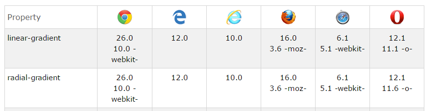
</html>最后附一个w3school兼容性表:


 扫一扫
扫一扫
 405
405

 被折叠的 条评论
为什么被折叠?
被折叠的 条评论
为什么被折叠?
 到【灌水乐园】发言


