


基础知识常备1:盒子垂直水平居中问题
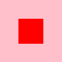
实现效果:
html:公用部分
 <!-- 父元素 -->
    <div class="f">
        <!-- 子元素 -->
        <div class="s">

        </div>
    </div>
方法1:(利用定位方式子绝父相1)
 .f {
            /* 子绝父相 */
            position: relative;
            height: 500px;
            width: 500px;
            background-color: pink;
            margin: 100px auto;
        }

.s {
            /* 子绝父相 */
            position: absolute;
            height: 200px;
            width: 200px;
            background-color: red;
            left: 0;
            right: 0;
            top: 0;
            bottom: 0;
            margin: auto;
        }
此种方法你要掌握,定位的相关特性哦,这里主要用到了绝对定位以及相对定位,设置上下左右属性为0,margin属性为auto 便可实现居中效果
方法2:(利用定位方式子绝父相2)
 .f {
            /* 子绝父相 */
            position: relative;
            height: 500px;
            width: 500px;
            background-color: pink;
            margin: 100px auto;
        }
 .s {
           /* 子绝父相 */
            position: absolute;
            height: 200px;
            width: 200px;
            background-color: red;
            left: 50%;
            top: 50%;
            margin-top: -100px;
            margin-left: -100px;
        }
此种方法也是主要用到“子绝父相”的特性,区别于第一种“子”的巧妙利用负自身宽高的一半进行居中
方法3:(利用定位方式子绝父相3-未指定盒子盒子的宽度和高度)
针对于上面的第二种的方法,有的小伙伴就会想,还要算自身的高度,很麻烦,我我只能算10以内的加减法,没关系我们可以利用位移来解决此计算问题,快来试试吧!
 .f {
            /* 子绝父相 */
            position: relative;
            height: 500px;
            width: 500px;
            background-color: pink;
            margin: 100px auto;
        }
 .s {
         position: absolute;
        	//未指定盒子盒子的宽度和高度
        	//解释一下:并不是不设置盒子的宽高,而是咱们提前不知道盒子的宽高
        	height: 200px;
            width: 200px;
            background-color: red;
            top: 50%;
            left: 50%;
            transform: translate(-50%, -50%);
        }
方法4:(利用flex布局(弹性布局))
.f {
         display: flex;
         justify-content: center;
         align-items: center;
         height: 500px;
         width: 500px;
         background-color: pink;
         margin: 100px auto;
     }
.s {
   		 height: 200px;
         width: 200px;
         background-color: red;
     }
此种方法也是比较方便的一种,巧妙利用弹性盒子, justify-content: center;主轴上居中显现,align-items: center;侧轴上居中显示,这样就能形成一个垂直水平居中的效果。
未完待续,有更好的方法我会及时更新的,欢迎大家前来评论


 162
162


 被折叠的 条评论
为什么被折叠?
被折叠的 条评论
为什么被折叠?
 到【灌水乐园】发言


