


使用 @media 查询,你可以针对不同的媒体类型定义不同的样式。
@media 可以针对不同的屏幕尺寸设置不同的样式,特别是如果你需要设置设计响应式的页面,@media 是非常有用的。
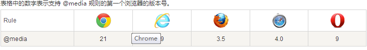
当你重置浏览器大小的过程中,页面也会根据浏览器的宽度和高度重新渲染页面浏览器的支持情况
/**对于不兼容媒体查询的浏览器**/
IE9以下版本不支持HTML5的media,通过js辅助即可。
<script src="https://oss.maxcdn.com/libs/html5shiv/3.7.0/html5shiv.js"></script>
<script src="https://oss.maxcdn.com/libs/respond.js/1.3.0/respond.min.js"></script>
/**css语法**/
@media mediatype and|not|only (media feature) {
CSS-Code;
}
/**根据不同媒体引进不同的样式表**/
<link rel="stylesheet" media="mediatype and|not|only (media feature)" href="mystylesheet.css">
mediatype :媒体设备类型 all(用于所有设备) print(用于打印机和打印预览) speech(应用于屏幕阅读器等发声设备) screen(用于电脑屏幕,平板电脑,智能手机等。)/**查询条件语句**/
@media screen and (max-width: 300px) {
/**当屏幕宽度小于300px时应用**/
}
<link rel="stylesheet" media="screen and (max-width: 300px)" href="mystylesheet.css">
@media screen and (max-device-width:300px){
/**当屏幕宽度等于300px时应用**/
}
<link rel="stylesheet" media="screen and (max-device-width:300px)" href="mystylesheet.css">
@media screen and (min-width:960px){
/**当屏幕宽度大于300px时应用**/
}
<link rel="stylesheet" media="screen and (min-width:960px)" href="mystylesheet.css">
@media screen and (min-width:960px) and (max-width:1200px){
/**当屏幕宽度大于960px小于1200px的时候应用**/
}
<link rel="stylesheet" media="screen and (min-width:960px) and (max-width:1200px)" href="mystylesheet.css">
/**手机屏幕纵向时**/
@media screen and (orientation:portrait){
/**当屏幕手机屏幕纵向时应用**/
}
<link rel="stylesheet" type="text/css" media="screen and (orientation:portrait)" href="style.css">
/**手机屏幕横向时**/
<link rel="stylesheet" type="text/css" media="screen and (orientation : landscape)" href="style.css">
@media screen and (orientation : landscape){
/**当屏幕横向时应用**/
}


 755
755


 被折叠的 条评论
为什么被折叠?
被折叠的 条评论
为什么被折叠?
 到【灌水乐园】发言


