


标题栏一直是使用次数非常多的一个东西,所以把标题栏模块化,更能加快我们的开发效率
本文将自定义一个标题栏,用于复用,只是一个基本的小架子,不过思路很重要,有了这个思路,相信都能做出一个漂亮的模块化的标题栏
首先
在Valus文件夹下面新建一个atts文件,使用styleable来定义我们的需要实现的一些自定义的属性,name中放置属性的名字,frormat设置属性的类型,比如左边的textview的文字大小我们用dimen类型来定义
有的人肯定会问为什么不用button,而用textview呢,因为我觉得textview比button更加灵活,我们在xml中可以通过设置drawleft设置图片,也能设置点击事件,功能比较灵活
定位好我们需要的属性之后,新建一个java文件,去调用我们的属性,并赋值
<?xml version="1.0" encoding="utf-8"?>
<resources>

    <declare-styleable name="CstTopView">
        <attr name="LeftText" format="string" />
        <attr name="LeftTextSize" format="dimension" />
        <attr name="LeftTextColor" format="color|reference" />
        <attr name="RightText" format="string" />
        <attr name="RightTextSize" format="dimension" />
        <attr name="RightTextColor" format="color|reference" />
        <attr name="TitleText" format="string" />
        <attr name="TitleSize" format="dimension" />
        <attr name="TitleColor" format="reference|color" />
        <attr name="leftBG" format="color|reference" />
        <attr name="rightBg" format="reference|color" />
        <attr name="titleBG" format="reference|color" />
    </declare-styleable>

</resources> //3个对应的控件
private TextView LeftTv, RightTv, TitleTv;
//控件相对应的一些属性
private float LeftSize, RightSize, TltleSize;
private String LeftText, RightText, TtleText;
private Drawable TitlebgColor, LeftTextbgColor, RightTexbgtColor;
private ToolListener listener;
private Drawable LeftBg, RightBg, TitleBg;
//控件的位置属性
private LayoutParams LeftParams, RightParams, TitleParams;
public class CstTopView extends RelativeLayout {
代码如下
  public CstTopView(Context context, AttributeSet attrs) {
        super(context, attrs);
        //使用TypedArray来保存我们在atts中设置的属性,通过context获取我们相对应的xml文件的属性数组
        TypedArray ta = context.obtainStyledAttributes(attrs, R.styleable.CstTopView);
        //在TypedArray中,属性是通过键值对的形式存在的,所以我们在取相对应的属性的时候,通过我们在xml中设置的属性类型来获取
        //第一个属性是我们在xml中设置的,第二个是默认属性,就是在第一个属性为空的时候,默认展示出来的,这里我设置为0
        LeftSize = ta.getDimension(R.styleable.CstTopView_LeftTextSize, 0);
        RightSize = ta.getDimension(R.styleable.CstTopView_RightTextSize, 0);
        TltleSize = ta.getDimension(R.styleable.CstTopView_TitleSize, 0);
        LeftText = ta.getString(R.styleable.CstTopView_LeftText);
        RightText = ta.getString(R.styleable.CstTopView_RightText);
        TtleText = ta.getString(R.styleable.CstTopView_TitleText);
        TitlebgColor = ta.getDrawable(R.styleable.CstTopView_TitleColor);
        LeftTextbgColor = ta.getDrawable(R.styleable.CstTopView_RightTextColor);
        RightTexbgtColor = ta.getDrawable(R.styleable.CstTopView_RightTextColor);
        LeftBg = ta.getDrawable(R.styleable.CstTopView_leftBG);
        RightBg = ta.getDrawable(R.styleable.CstTopView_rightBg);
        TitleBg = ta.getDrawable(R.styleable.CstTopView_titleBG);
        //使用完记得回收,放置缓存引起的bug
        ta.recycle();
//获得这些属性之后,把相对应的控件New出来并设置上这些属性;
LeftTv = new TextView(context);
RightTv = new TextView(context);
TitleTv = new TextView(context);
LeftTv.setText(LeftText);
LeftTv.setTextSize(LeftSize);
LeftTv.setBackground(LeftTextbgColor);
LeftTv.setBackground(LeftBg);
RightTv.setText(RightText);
RightTv.setTextSize(RightSize);
RightTv.setBackground(RightTexbgtColor);
RightTv.setBackground(RightBg);
TitleTv.setText(TtleText);
TitleTv.setTextSize(TltleSize);
TitleTv.setBackground(TitlebgColor);
TitleTv.setGravity(Gravity.CENTER);
TitleTv.setBackground(TitleBg);
//给我们的topview设置一个背景,用来区分
setBackgroundResource(R.color.yellow); //设置控件的位置信息,并添加到viewgroup中
LeftParams = new LayoutParams(ViewGroup.LayoutParams.WRAP_CONTENT, ViewGroup.LayoutParams.MATCH_PARENT);
LeftParams.addRule(RelativeLayout.ALIGN_PARENT_LEFT, TRUE);
LeftParams.addRule(RelativeLayout.CENTER_VERTICAL, TRUE);
RightParams = new LayoutParams(ViewGroup.LayoutParams.WRAP_CONTENT, ViewGroup.LayoutParams.MATCH_PARENT);
RightParams.addRule(RelativeLayout.ALIGN_PARENT_RIGHT, TRUE);
RightParams.addRule(RelativeLayout.CENTER_VERTICAL);
TitleParams = new LayoutParams(ViewGroup.LayoutParams.WRAP_CONTENT, ViewGroup.LayoutParams.MATCH_PARENT);
TitleParams.addRule(RelativeLayout.CENTER_HORIZONTAL, TRUE);
addView(LeftTv, LeftParams);
addView(RightTv, RightParams);
addView(TitleTv, TitleParams); //然后我们给这些控件加上监听首先我们定义一个接口,实现俩个方法,左边的监听和右边的监听
public interface ToolListener {
void LeftClick();
void RightClick();
}
//然后对外部暴露一个方法,通过接口回调来调用,这样就连接起来了
public void SetTopListener(ToolListener listener) {
this.listener = listener;
} private ToolListener listener; //通过内部的对象对象,加监听
LeftTv.setOnClickListener(new OnClickListener() {
@Override
public void onClick(View view) {
listener.LeftClick();
}
});
RightTv.setOnClickListener(new OnClickListener() {
@Override
public void onClick(View view) {
listener.RightClick();
}
});这样代码的部分就完成了,接下来在xml中使用我们的自定义控件
<?xml version="1.0" encoding="utf-8"?>
<LinearLayout xmlns:android="http://schemas.android.com/apk/res/android"
    xmlns:app="http://schemas.android.com/apk/res-auto"
    xmlns:tools="http://schemas.android.com/tools"
    android:id="@+id/activity_main"
    android:layout_width="match_parent"
    android:layout_height="match_parent"
    android:orientation="vertical"
    tools:context="com.anlaiye.swt.csttopview.MainActivity">

    <com.anlaiye.swt.csttopview.CstTopView
        android:id="@+id/csttopview"
        android:layout_width="match_parent"
        android:layout_height="40dp"
        app:LeftText="我是左边"
        app:leftBG="@color/colorPrimary"
        app:LeftTextSize="5sp"
        app:RightText="我是右边"
        app:RightTextSize="5sp"
        app:rightBg="@color/colorAccent"
        app:TitleSize="10sp"
        app:TitleText="我是中间">

    </com.anlaiye.swt.csttopview.CstTopView>


</LinearLayout>
xmlns:app="http://schemas.android.com/apk/res-auto"比如app:leftBG,通过这个方式,来为我们的自定义属性赋值,也可以取其他的名字,
比如
xmlns:lll="http://schemas.android.com/apk/res-auto"lll:leftBG
效果图如下
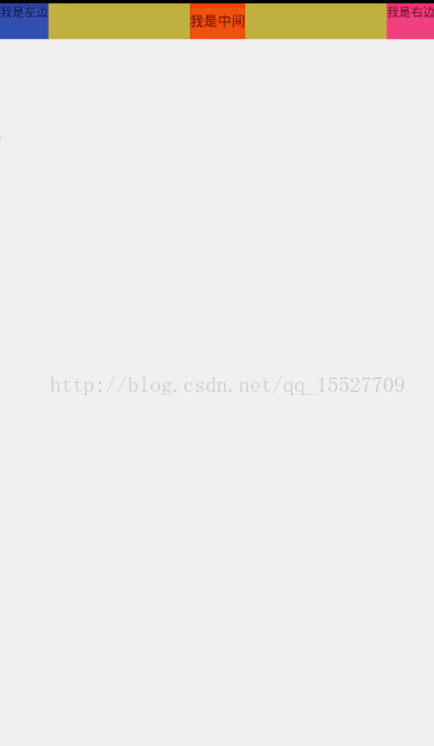
效果很简陋,但是这个模型的方式设计师可以继续深入研究优化的,可以在自定义的这个类中定位更多需要用到的属性
比如设置左边加个图片,左边的隐藏,都是可以的


 373
373


 被折叠的 条评论
为什么被折叠?
被折叠的 条评论
为什么被折叠?
 到【灌水乐园】发言


