


按钮状态——禁用状态
和input等表单控件一样,在Bootstrap框架的按钮中也具有禁用状态的设置。禁用状态与其他状态按钮相比,就是背景颜色的透明度做了一定的处理,opcity的值从100%调整为65%。
在Bootstrap框架中,要禁用按钮有两种实现方式:
方法1:在标签中添加disabled属性
方法2:在元素标签中添加类名“disabled”
两者的主要区别是:
“.disabled”样式不会禁止按钮的默认行为,比如说提交和重置行为等。如果想要让这样的禁用按钮也能禁止按钮的默认行为,则需要通过JavaScript这样的语言来处理。对于<a>标签也存在类似问题,如果通过类名“.disable”来禁用按钮,其链接行为是无法禁止。而在元素标签中添加“disabled”属性的方法是可以禁止元素的默认行为的。
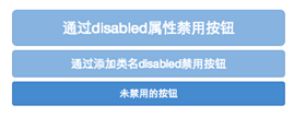
下面是两种方法的举例:
<button class="btnbtn-primary btn-lgbtn-block" type="button" disabled="disabled">通过disabled属性禁用按钮</button>
<button class="btnbtn-primary btn-block disabled" type="button">通过添加类名disabled禁用按钮</button>
<button class="btnbtn-primary btn-smbtn-block" type="button">未禁用的按钮</button>
运行效果如下或查看右侧结果窗口:
对应的样式代码请查阅bootstrap.css文件第2030行~第2039行:
.btn.disabled,
.btn[disabled],
fieldset[disabled] .btn {
pointer-events: none;
cursor: not-allowed;
filter: alpha(opacity=65);
  -webkit-box-shadow: none;
box-shadow: none;
opacity: .65;
}
同样的,其他风格按钮也具有这样的效果,只是颜色做了一定的调整,比如信息按钮(.btn-info)所示:
/*源码请查看bootstrap.css文件第2182行~第2199行*/
.btn-info.disabled,
.btn-info[disabled],
fieldset[disabled] .btn-info,
.btn-info.disabled:hover,
.btn-info[disabled]:hover,
fieldset[disabled] .btn-info:hover,
.btn-info.disabled:focus,
.btn-info[disabled]:focus,
fieldset[disabled] .btn-info:focus,
.btn-info.disabled:active,
.btn-info[disabled]:active,
fieldset[disabled] .btn-info:active,
.btn-info.disabled.active,
.btn-info[disabled].active,
fieldset[disabled] .btn-info.active {
background-color: #5bc0de;
border-color: #46b8da;
}
到此有关于按钮的基础知识就算是介绍完了,同样的,大家可以通过buttons.less或者_buttons.scss来自定义按钮风格。


 549
549

 被折叠的 条评论
为什么被折叠?
被折叠的 条评论
为什么被折叠?
 到【灌水乐园】发言


