


css列表示例
<!DOCTYPE html>
<html lang="en">
<head>
<meta charset="UTF-8">
<meta http-equiv="X-UA-Compatible" content="IE=edge">
<meta name="viewport" content="width=device-width, initial-scale=1.0">
<title>Document</title>
<style>
@import url('//at.alicdn.com/t/c/font_3916097_p205l52oy7.css');
ul,li,body {
margin: 0;
padding: 0;
}
ul li {
display: flex;
justify-content: space-between;
padding: 0 10px;
line-height: 32px;
width: 260px;
background-color: rgb(236, 255, 231);
/* height: 32px; */
box-sizing: border-box;
margin-bottom: 10px;
}
.title {
/* max-width: 250px; */
text-overflow: ellipsis;
white-space: nowrap; /* white-space属性为nowrap时,不会因为超出容器宽度而发生换行 */
overflow: hidden;
cursor: pointer;
}
.num {
flex-shrink: 0;
/* flex-grow: 1; */
margin-left: 15px;
user-select: none;
}
</style>
</head>
<body>
<ul>
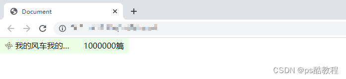
<li>
<div class="title">
<i class="iconfont icon-dongtai"></i>
<span>我的风车我的风车我的风车我的风车我的风车我的风车我的风车我的风车我的风车我的风车我的风车我的风车我的风车我的风车我的风车</span>
</div>
<span class="num">
1000000篇
</span>
</li>
</ul>
</body>
</html>
flex布局子元素超出父容器宽度问题处理
使用flex布局,右边文字过长,子元素直接就超过了父元素的宽度
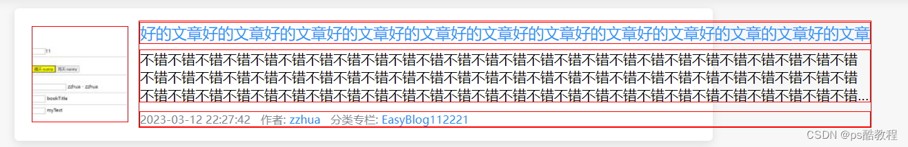
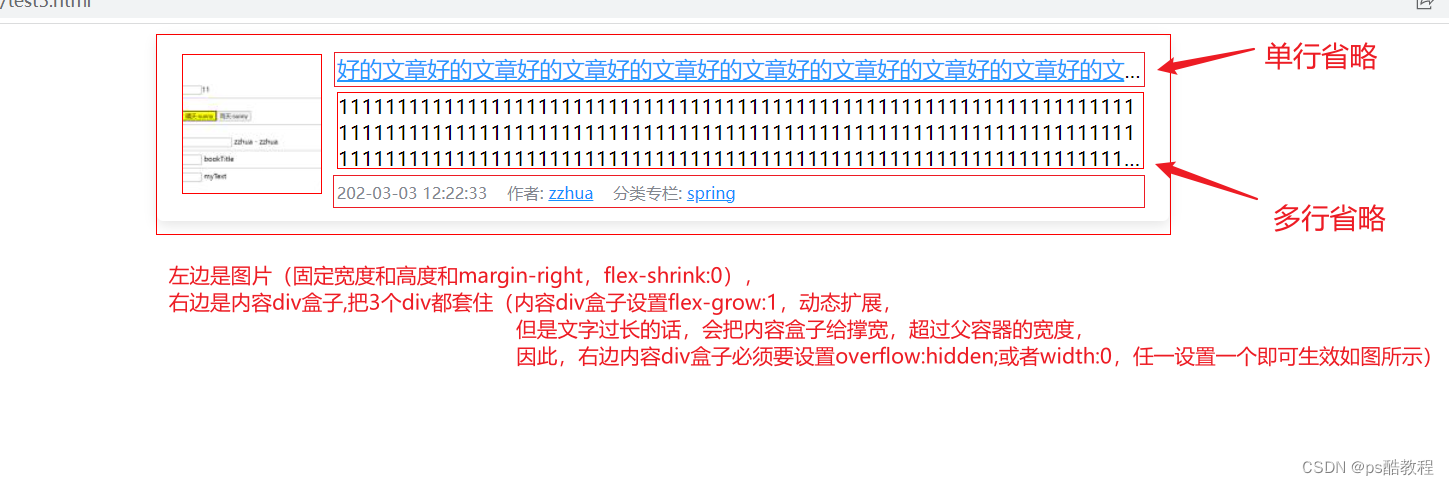
我们希望达到的是下面的效果
<style>
/* 还是用scss的代码看吧, 用原生css不方便看 */
.blog-info {
    display: flex;
    align-items: center;
    padding: 15px 20px;
    border-radius: 5px;
    margin-bottom: 10px;
    background-color: #fff;
    box-shadow: 0 3px 10px 0px rgba(0, 0, 0, .1);

    .cover {
        width: 110px;
        height: 110px;
        margin-right: 12px;

        border: 1px solid red;

        object-fit: cover;

        &>a {
            width: 100%;
            height: 100%;
            overflow: hidden;
            display: inline-flex;
        }

        img {
            width: 100%;
            height: 100%;
            object-fit: cover;
            transition: all .36s;
            &:hover {
                transform: scale(1.2);
            }
        }
    }

    .article {

        border: 1px solid red;

        flex: 1;
        /* 以下任意设置一个都可以 */
        overflow: hidden;
        /* width: 0; */

        .title {
            margin-bottom: 6px;

            border: 1px solid red;


            text-overflow: ellipsis;
            white-space: nowrap;
            overflow: hidden;

            a {
                color: #2498ff;
                font-size: 18px;
            }
        }

        .summary {
            height: 60px;
            margin-bottom: 10px;

            border: 1px solid red;


            display: -webkit-box;
            -webkit-box-orient: vertical;
            -webkit-line-clamp: 3;
            overflow: hidden;
        }

        .article-extra-info {
            font-size: 13px;
            color: #82868e;

            border: 1px solid red;


            span {
                margin-right: 12px;
            }

            a {
                color: #1890ff;
            }
        }
    }
}
</style>

<div style="width:810px;margin: 0 auto;border:1px solid red">

   <div class="blog-info">

    	<!-- 左边图片封面 -->
       <div class="cover">
           <a href="#">
               <img src="http://127.0.0.1:3003/api/file/getImage/202303/wqfqXLDfIbhlhrtKoWMBDuqwQHoOzO.png" alt="">
           </a>
       </div>

        <!-- 右边文章盒子 -->
       <div class="article">

            <div class="title">
                <a href="#">好的文章好的文章好的文章好的文章好的文章好的文章好的文章好的文章好的文章好的文章</a>
            </div>

            <div class="summary">
                111111111111111111111111111111111111111111111111111111111111111111111111111111111111111111111111111111111111111111111111111111111111111111111111111111111111111111111111111111111111111111111111111111111111111111111111111111111111111111111111111111111111111111111111111111111111111111111111111111111111111111111111111111111111111111111111111111111111111111111111
            </div>

            <div class="article-extra-info">
                <span class="time">202-03-03 12:22:33</span>
                <span>作者: <a href="#">zzhua</a></span>
                <span>分类专栏: <a href="#">spring</a></span>
            </div>

        </div>

   </div>
</div>


 603
603


 被折叠的 条评论
为什么被折叠?
被折叠的 条评论
为什么被折叠?
 到【灌水乐园】发言


