


文章目录
学习链接
七分钟搞定CSS自定义变量
CSS中 自定义属性(变量)详解
1.什么是CSS变量?
- 它的官方名称是叫“
自定义属性”,CSS变量是自定义属性的通俗叫法。 - 就是
根据我们自己的需求定义属性的名称和属性值
2.如何定义CSS变量?
- 属性名:
属性名必须使用 --开头- 可以是数字、字母、下划线、中划线
- 属性值:
- css普通属性可以用的,比如:数字、文本、带单位的长度、角度等等都可以作为属性值
- 注意点
- 大小写敏感:大写 和 小写 不同 的2个属性名,将会是2个属性
- 计算时有效性:自定义属性值可以是任何内容,甚至可能不是css的有效数值,但这并不影响定义,只要保证在使用css自定义属性的地方,最终的计算结果是有效的就可以了。
定义CSS变量示例
:root {
	--color: #ff0000;
	--Color: #ff0000; /* 属性名区分大小写 */
	--sz-cm: 100px;
	--num_1: 10; /* 属性名可以包括:字母、数字、下划线、中划线 */
}
3.如何使用CSS变量?
- css提供了一个var()方法,进行自定义属性值的获取。可以在多个地方获取到自定义的属性值。
- css也提供了calc()方法,进行数值的计算。它里面就可以通过var()使用自定属性的值进行计算。
使用示例
:root {
	--size: 100;
}

div {
	width: calc(var(--size) * 2px);
}
4.CSS变量可以干什么用?
1. 提取相同的属性值
第一种,就是用来提取相同的属性值,方便后期的批量修改。这也是最基本的用法,这样的用法经常用来做页面的风格切换,需要结合js实现。
风格切换简单案例

index.html
- 获取到所有颜色切换的按钮,挨个给按钮绑定点击事件
- 当颜色切换按钮发生点击事件时,就会去获取到按钮自身样式的color属性值,将这个值 赋值给 根元素(:root)的自定义变量
--base-color,而样式表中,使用var(--base-color)引用此变量的地方,都会随修改而变化,从而实现颜色风格切换。
<!DOCTYPE html>
<html lang="zh-Hans">

<head>
    <meta charset="UTF-8">
    <meta name="viewport" content="width=device-width, initial-scale=1.0">
    <title>编译中梦见未来</title>

    <link rel="stylesheet" href="style.css">

</head>

<body>
    <div class="container">

        <header>

            <div class="logo">
                logo
            </div>

            <nav>
                <ul>
                    <li><a href="https://space.bilibili.com/432444813/" target="_blank">首页</a></li>
                    <li><a href="https://space.bilibili.com/432444813/" target="_blank">博客</a></li>
                    <li><a href="https://space.bilibili.com/432444813/" target="_blank">代码库</a></li>
                    <li><a href="https://space.bilibili.com/432444813/" target="_blank">关于UP</a></li>
                    <li><a href="https://space.bilibili.com/432444813/" target="_blank">联系</a></li>
                </ul>
            </nav>

        </header>

        <main>
            <section class="left">
                <h1>编译中梦见未来</h1>
                <summary>
                    不会写后台的前端工程师不是好产品
                    <br><br>
                    以下内容抄录自网络。
                </summary>
                <article>
                    <h2>1. 您现在负责的工作是什么呢?</h2>
                    <p>现在在一家叫币信的区块链公司工作,负责产品设计和前端重构。</p>
                    <h2>2. 说说职业生涯重要的转折点?</h2>

                    </p>
                    <p>我真正参加工作的时间跟前辈们比起来,并不算长。过去几年对我改变最大的,应该是3次关键的转折点:</p>

                    <p>第三次是从头条离职加入一家创业公司,也就是现在的公司,做的是区块链比特币方向的创业。我个人在2013年就有投资,觉得这个领域依然有很多事情可以做,就没有犹豫太多,加入初创团队了。</p>
                    <h2>3. 今日头条和币信工作都学到了什么?</h2>
                    <p>每段工作经历带给我的感受都不一样,大公司,小公司,自己创业,各有各的优缺点。如果算上大学期间在新东方兼课,我在从事现在这份工作前,一共换了7份工作。职业身份从讲师到产品经理,从 UI
                        设计师到前端重构工程师,堪比打杂专家,余不一一。职位的变化完全是由公司的业务需求决定,以至于过去长达两年的这段「职业尝试期」,我一直处于一个比较痛苦的学习状态,偶尔因为学习带来的快乐,也会瞬间被现实击垮。
                    </p>
                </article>
            </section>
            <aside class="right">
                <section class="ad">
                    广告
                </section>
                <section class="date">
                    日历
                </section>
                <section class="index">
                    索引
                </section>
            </aside>
        </main>

        <footer>
            <ul>
                <li><a href="https://space.bilibili.com/432444813/" target="_blank">关于</a></li>
                <li><a href="https://space.bilibili.com/432444813/" target="_blank">知识产权</a></li>
                <li><a href="https://space.bilibili.com/432444813/" target="_blank">B站</a></li>
                <li><a href="https://space.bilibili.com/432444813/" target="_blank">赞助</a></li>
            </ul>
            <h4><a href="https://space.bilibili.com/432444813/" target="_blank">Copyright©编译中梦见未来</a></h4>
        </footer>

    </div>

    <div class="toolbar">
        <div class="select red"></div>
        <div class="select blue"></div>
        <div class="select green"></div>
        <div class="select pink"></div>
    </div>

    <script>

        // 获取到所有的样式选择按钮
        let selects = document.querySelectorAll('.select');

        // 获取到根元素的样式
        let rootStyle = document.querySelector(':root').style;

        // (以下返回结果为true,说明document.querySelector(':root')等价于获取html元素,注意::root是个伪类)
        // document.querySelector(':root') == document.getElementsByTagName('html')[0]

        // 循环选择按钮并且绑定点击事件
        selects.forEach(element => {

            element.addEventListener('click', function (e) {

                // 获取到当前按钮的color属性
                let bgStyle = window.getComputedStyle(this, null); // 获取到按钮的样式对象
                let bgColor = bgStyle.getPropertyValue("color");   // 获取到此按钮样式对象中的的color属性样式

                // 将color属性赋值给根元素的自定义变量
                rootStyle.setProperty('--base-color', bgColor);
            })
        });
    </script>
</body>

</html>
index.css
:root {
    --base-color: green;
}

* {
    margin : 0;
    padding: 0;
}

html {
    font-size: 14px;
}

body {
    width: 100vw;

    background-color: #fff;
    font-family     : 'Montserrat', sans-serif, Arial, 'Microsoft Yahei';
    overflow-x      : hidden;
}


.container {
    width           : 100vw;
    background-color: #FFF;
}

/* header */
header {
    position: relative;
    width   : 600px;
    height  : 100px;
    margin  : 0 auto;

    border-bottom: 1px solid var(--base-color);
}

header .logo {
    width           : 80PX;
    height          : 80PX;
    margin          : 10px;
    float           : left;
    background-color: var(--base-color);
    color           : #fff;
    display         : flex;
    justify-content : center;
    align-items     : center;
    font-size       : 20px;
}

header nav {
    position: absolute;
    width   : 380px;
    height  : 40px;
    right   : 0;
    bottom  : 0;
}

header nav ul {
    list-style: none;
}

header nav ul li {
    float : left;
    margin: 0 5px;
}

header nav ul li a {
    display        : block;
    padding        : 5px 15px;
    color          : var(--base-color);
    text-decoration: none;

}

header nav ul li a:hover {
    color           : #FFF;
    background-color: var(--base-color);
}

/* main */
main {
    position: relative;
    width   : 600px;

    margin: 20px auto;

    display        : flex;
    justify-content: space-between;


}

main .left {
    position: relative;
    width   : 400px;
    z-index : 0;
}

main .left::after {
    position: absolute;

    content         : '';
    width           : 100%;
    height          : 100%;
    top             : 0;
    left            : 0;
    background-color: var(--base-color);
    opacity         : 0.2;
    z-index         : -1;
}

main .left h1 {
    font-size    : 20px;
    line-height  : 60px;
    text-align   : center;
    border-bottom: 1px solid var(--base-color);
    color        : var(--base-color);
    font-weight  : bold;
}

main .left summary {
    position : relative;
    margin   : 10px;
    padding  : 20px;
    font-size: 16px;
    color    : var(--base-color);
    z-index  : 0;
}

main .left summary::after {
    position        : absolute;
    content         : '';
    width           : 100%;
    height          : 100%;
    top             : 0;
    left            : 0;
    background-color: #fff;
    opacity         : 0.2;
    z-index         : -1;
}

main article {
    border-top: 1px solid var(--base-color);
    padding   : 0 15px;
}

main .left h2 {
    font-size  : 16px;
    line-height: 40px;
}

main .left p {
    font-size     : 14px;
    line-height   : 25px;
    text-indent   : 2em;
    padding-bottom: 10px;
}

main .right {
    width: 180px;
}

main .right .ad {
    width           : 180px;
    height          : 180px;
    margin-bottom   : 10px;
    background-color: var(--base-color);
    color           : #fff;
    display         : flex;
    justify-content : center;
    align-items     : center;
}

main .right .date {
    width           : 180px;
    height          : 180px;
    margin-bottom   : 10px;
    background-color: var(--base-color);
    color           : #fff;
    display         : flex;
    justify-content : center;
    align-items     : center;
}

main .right .index {
    width           : 180px;
    height          : 180px;
    margin-bottom   : 10px;
    background-color: var(--base-color);
    color           : #fff;
    display         : flex;
    justify-content : center;
    align-items     : center;
}

footer {
    height          : 150px;
    background-color: var(--base-color);
}

footer ul {
    list-style: none;
    width     : 600px;
    height    : 50px;
    margin    : 0 auto;

    display        : flex;
    justify-content: center;
    align-items    : center;
}

footer ul li {
    float : left;
    margin: 0 5px;
}

footer ul li a {
    display        : block;
    padding        : 5px 15px;
    color          : #FFF;
    text-decoration: none;

}


footer ul li a:hover {
    color           : var(--base-color);
    background-color: #FFF;
}

footer h4 {
    text-align: center;
    font-size : 12px;

}

footer h4 a {
    color          : #fff;
    text-decoration: none;
    font-weight    : normal;

    padding: 5px 10px;
}

footer h4 a:hover {
    color           : var(--base-color);
    background-color: #FFF;
}


.toolbar{
    position: fixed;
    left: 0;
    top: 30%;

    width: 60px;
    height: 200px;
    background-color: #fff;

    display: flex;
    flex-direction: column;
    justify-content: space-evenly;
    align-items: center;

    border-top-right-radius: 10px;
    border-bottom-right-radius: 10px;

    border: 1px solid #ddd;

}
.toolbar .select{
    width: 30px;
    height: 30px;

    background-color: #fff;
    cursor: pointer;
}

.toolbar .red{
    color: red;
    border: 1px solid red;
    background-color: #ff000050;
}
.toolbar .blue{
    color: blue;
    border: 1px solid blue;
    background-color: #0000ff50;
}
.toolbar .green{
    color: green;
    border: 1px solid green;
    background-color: #00800050;
}
.toolbar .pink{
    color: pink;
    border: 1px solid pink;
    background-color: #ffc0cb50;
}
2. 简化相似的代码
案例实现1
- 使用了 相对定位 + 绝对定位 居中的用法
- 要先旋转,再位移(因为旋转会改变坐标系方向)
- 引用css自定义变量时,要使用var()方法;当里面需要计算时,要使用calc()方法;引用的自定义变量,会先从当前元素的样式表中的css自定义属性中寻找。
<!DOCTYPE html>
<html lang="en">
<head>
<meta charset="UTF-8">
<meta http-equiv="X-UA-Compatible" content="IE=edge">
<meta name="viewport" content="width=device-width, initial-scale=1.0">
<title>Document</title>
<style>
body {
background-color: #2c3e52;
min-height: 100vh;
display: flex;
align-items: center;
justify-content: center;
color: #fff;
}
.box {
width: 80px;
height: 80px;
border: 6px solid #fff;
border-radius: 50%;
}
h1 {
font-size: 24px;
margin-bottom: 85px;
}
.demo {
display: flex;
flex-direction: column;
align-items: center;
}
.box {
position: relative;
}
.box .item {
width: 5px;
height: 25px;
background-color: #fff;
/* 1. 用来替代下面写的很多重复的代码 (控制旋转)*/
/* 2. 注意要先旋转,然后再移动(因为旋转会改变坐标系方向) */
transform: rotate(calc(var(--i) * 45deg)) translateY(-80px);
/* 相对定位 + 绝对定位 实现水平垂直 居中的代码 */
position: absolute;
left: 0;
right: 0;
top: 0;
bottom: 0;
margin: auto;
}
/* .box .item:nth-child(1) {
transform: rotate(0deg) translateY(-80px);
}
.box .item:nth-child(2) {
transform: rotate(45deg) translateY(-80px);
}
.box .item:nth-child(3) {
transform: rotate(90deg) translateY(-80px);
}
.box .item:nth-child(4) {
transform: rotate(135deg) translateY(-80px);
}
.box .item:nth-child(5) {
transform: rotate(180deg) translateY(-80px);
}
.box .item:nth-child(6) {
transform: rotate(225deg) translateY(-80px);
}
.box .item:nth-child(7) {
transform: rotate(270deg) translateY(-80px);
}
.box .item:nth-child(8) {
transform: rotate(315deg) translateY(-80px);
} */
</style>
</head>
<body>
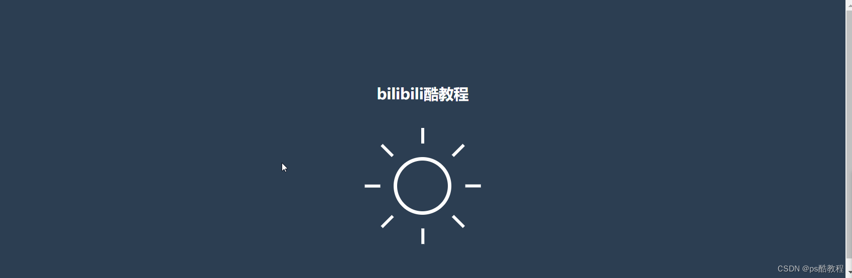
<div class="demo">
<h1>bilibili酷教程</h1>
<div class="box">
<div class="item" style="--i:1"></div>
<div class="item" style="--i:2"></div>
<div class="item" style="--i:3"></div>
<div class="item" style="--i:4"></div>
<div class="item" style="--i:5"></div>
<div class="item" style="--i:6"></div>
<div class="item" style="--i:7"></div>
<div class="item" style="--i:8"></div>
</div>
</div>
</body>
</html>
案例实现2
- display:flex布局中的直接子元素是绝对定位时,将会忽略它,不参与flex布局。但是,如果直接子元素,没有指定任何top、left、right、bottom值的话,直接子元素仍然会按照display:flex布局的特性摆放(在a标签css及前端笔记 中有记录)。以下就属于第二种情况(使用了display:flex居中的写法 + 相对定位 + 绝对定位,且未指定任何top、left、right、bottom的值)
index.html
<!DOCTYPE html>
<html lang="zh-Hans">
<head>
<meta charset="UTF-8">
<meta name="viewport" content="width=device-width, initial-scale=1.0">
<title>编译中梦见未来</title>
<link rel="stylesheet" href="style.css">
</head>
<body>
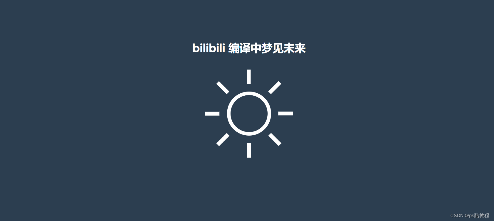
<div class="channel">
bilibili 编译中梦见未来
</div>
<div class="container">
<div class="sun">
<span></span>
<span></span>
<span></span>
<span></span>
<span></span>
<span></span>
<span></span>
<span></span>
</div>
</div>
</body>
</html>
index.css
:root {
    --background-color: #2c3e50;
    --border-color    : #7591AD;
    --text-color      : #34495e;
    --color1          : #EC3E27;
    --color2          : #fd79a8;
    --color3          : #0984e3;
    --color4          : #00b894;
    --color5          : #fdcb6e;
    --color6          : #e056fd;
    --color7          : #F97F51;
    --color8          : #BDC581;
}

* {
    margin : 0;
    padding: 0;
}

html {
    font-size: 14px;
}

body {
    width           : 100vw;
    height          : 100vh;
    background-color: var(--background-color);
    display         : flex;
    justify-content : center;
    align-items     : center;
    font-family     : 'Montserrat', sans-serif, Arial, 'Microsoft Yahei';
}

.channel {
    position   : absolute;
    width      : 80%;
    text-align : center;
    top        : 50%;
    left       : 50%;
    transform  : translate(-50%, -200px);
    font-size  : 30px;
    font-weight: bold;
    color      : #fff;
}


.sun {
    position: relative;
    width   : 100px;
    height  : 100px;

    border: 10px solid #fff;

    border-radius: 50%;

    display        : flex;
    justify-content: center;
    align-items    : center;
}

.sun span {
    position        : absolute;
    display         : block;
    width           : 10px;
    height          : 40px;
    background-color: #fff;
}

.sun span:nth-child(1){
    transform: rotate(45deg) translateY(100px);
}
.sun span:nth-child(2){
    transform: rotate(90deg) translateY(100px);
}
.sun span:nth-child(3){
    transform: rotate(135deg) translateY(100px);
}
.sun span:nth-child(4){
    transform: rotate(180deg) translateY(100px);
}
.sun span:nth-child(5){
    transform: rotate(225deg) translateY(100px);
}
.sun span:nth-child(6){
    transform: rotate(270deg) translateY(100px);
}
.sun span:nth-child(7){
    transform: rotate(315deg) translateY(100px);
}
.sun span:nth-child(8){
    transform: rotate(360deg) translateY(100px);
}
5.作用域问题
自定义属性也是有作用域的。当我们使用var()方法的时候,会首先从当前选择器中进行查找,然后是父元素、祖先元素、直至根元素
案例
通过一个例子,理解自定义属性的继承与作用域。通过这个示例,可以很清楚的看到:优先从当前元素自身去找css自定义变量,当找不到时,才会去父元素中去找。

index.html
<!DOCTYPE html>
<html lang="zh-Hans">

<head>
    <meta charset="UTF-8">
    <meta name="viewport" content="width=device-width, initial-scale=1.0">
    <title>编译中梦见未来</title>
    <link rel="stylesheet" href="style.css">
</head>

<body>

    <div class="container">
        <div class="a">
            <div class="b">
                <div class="c">
                    <div class="d">
                        编译中梦见未来
                    </div>
                </div>
            </div>
        </div>
    </div>
</body>

</html>
index.css
* {
    margin : 0;
    padding: 0;
}

html {
    font-size: 14px;
}

body {
    width           : 100vw;
    height          : 100vh;
    background-color: #333;
    display         : flex;
    justify-content : center;
    align-items     : center;
    font-family     : 'Montserrat', sans-serif, Arial, 'Microsoft Yahei';
    font-size       : 50px;
}
:root {
    --c: violet;
}

.a {
    --c: red;
}

.b {
    --c: blue;
}

.c {
    --c: green;
}

.d {

    --c: yellow;

    color: var(--c);
}
6.扩展一下
- 当使用var()方法引用的自定义变量没有定义时,var()方法获取不到任何值就失效了,会使用默认的样式(继承过来的样式或默认样式)
- var()方法支持多个参数,第二个参数就可以当我们引用的自定义变量未定义时,使用的默认值,如:
var(--color,blue)- 甚至,第二个参数还可以再嵌套一层var,如:
var(--color,var(--c,red))
- 甚至,第二个参数还可以再嵌套一层var,如:


 2098
2098


 被折叠的 条评论
为什么被折叠?
被折叠的 条评论
为什么被折叠?
 到【灌水乐园】发言


