


本文主要介绍一下如何使用CoordinatorLayout
先看看官方是怎么介绍Material Design的
We challenged ourselves to create a visual language for our users that synthesizes the classic principles of good design with the innovation and possibility of technology and science. This is material design. This spec is a living document that will be updated as we continue to develop the tenets and specifics of material design.
通过上面的这段英文相信大家对Material Design或多或少都有一定的认识了吧!大概的意思也就是google努力的帮你设计出一套很好视图设计规范,你按这个规范来咯~~~
我觉得我们需要关注的控件也就下面4个吧~
- SnackBar:一个类似于Toast的控件,下文会提及
- FloatingActionButton:悬浮按钮
- CoordinatorLayout:也就是本篇博文的猪脚咯~~
- Tablayout:本篇不聊
讲了这么多废话,那么我们正式进入今天的主题吧!
CoordinatorLayout 实现了多种Material Design中提到的滚动效果。目前这个框架提供了几种不用写动画代码就能工作的方法,这些效果包括:
当snackbar显示的时候,浮动按钮上移,给snackbar留出位置:效果如下
扩展或者缩小Toolbar或者头部,让主内容区域有更多的空间:效果如下
- 控制哪个view应该扩展还是收缩,以及其显示大小比例,包括视差滚动效果动画。
自行引入Design Support Library,不清楚请自行网补
首先,我们看第一种效果
布局代码
<android.support.design.widget.CoordinatorLayout xmlns:android="http://schemas.android.com/apk/res/android"
                                                 xmlns:app="http://schemas.android.com/apk/res-auto"
                                                 android:id="@+id/main_content"
                                                 android:layout_width="match_parent"
                                                 android:layout_height="match_parent"
                                                 android:fitsSystemWindows="true">

    <android.support.design.widget.AppBarLayout
        android:id="@+id/appbar"
        android:layout_width="match_parent"
        android:layout_height="wrap_content"
        android:theme="@style/ThemeOverlay.AppCompat.Dark.ActionBar"
        >
        <android.support.v7.widget.Toolbar
            android:id="@+id/toolbar"
            app:layout_scrollFlags="scroll|enterAlways"
            android:layout_width="match_parent"
            android:background="?attr/colorPrimary"
            android:layout_height="wrap_content"
            app:popupTheme="@style/ThemeOverlay.AppCompat.Light"
            />
    </android.support.design.widget.AppBarLayout>

    <android.support.v7.widget.RecyclerView
        android:id="@+id/recyclerview"
        app:layout_behavior="@string/appbar_scrolling_view_behavior"
        android:layout_width="match_parent"
        android:layout_height="match_parent" />
    <android.support.design.widget.FloatingActionButton
        android:id="@+id/fab"
        android:layout_width="wrap_content"
        android:layout_height="wrap_content"
        android:layout_gravity="bottom|right"
        android:layout_margin="16dp"
        android:src="@mipmap/ic_launcher"
        app:layout_anchor="@id/recyclerview"
        app:layout_anchorGravity="bottom|right|end"/>

</android.support.design.widget.CoordinatorLayout>
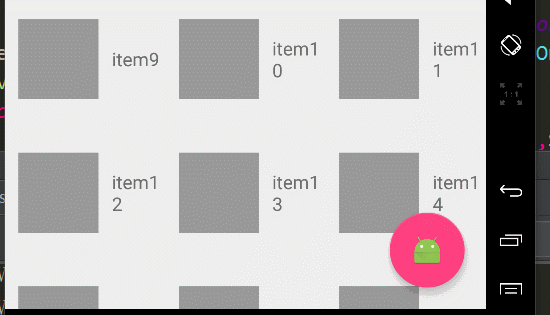
嘻嘻,今天猪脚终于亮相了,首先我们使用了CoordinatorLayout作为根布局,CoordinatorLayout可以用来配合浮动操作按钮的 layout_anchor 和 layout_gravity属性创造出浮动效果,只要使用CoordinatorLayout作为基本布局,将自动产生向上移动的动画。浮动操作按钮有一个 默认的 behavior来检测Snackbar的添加并让其在Snackbar之上呈现上移与Snackbar等高的动画。
咳咳,这个我相信大家都能懂,那么我们来说说FloatingActionButton这个控件。
当我们的项目需要一个圆形的Button, 你可能会想到用自定义Shape的方式去做,但那样文本的显示不好居中,这时估计就想到用自定义控件去解决了。以上都是废话,google给我们提供了FloatingActionButton可以轻松的创建圆形Button,而且更牛x的是FloatingActionButton具有更绚丽的效果。
FloatingActionButton继承自ImageView,所以你懂的,ImageView的属性我们阔以直接拿来用咯,so。。如果我们需要整个圆形的ImageView也当然阔以直接用这个咯~~
FloatingActionButton的属性主要有
- app:backgroundTint是指定默认的背景颜色
- app:rippleColor是指定点击时的背景颜色
- app:borderWidth border的宽度
- app:fabSize是指FloatingActionButton的大小,可选normal|mini
- app:elevation 可以看出该空间有一个海拔的高度
- app:pressedTranslationZ 哈,按下去时的z轴的偏移
<android.support.design.widget.FloatingActionButton
        xmlns:app="http://schemas.android.com/apk/res-auto"
        android:layout_width="wrap_content"
        android:layout_height="wrap_content"
        android:layout_margin="16dp"
        android:src="@mipmap/ic_launcher"
        app:backgroundTint="#FF00FF00"
        app:rippleColor="#FF0000FF"
        app:borderWidth="0dp"
        app:fabSize="normal"
        app:elevation="10dp"
        app:pressedTranslationZ="20dp"/>
传说中的一图胜千言
卡卡的 凑合看吧!!
第二种效果 Toolbar的扩展与收缩
先看效果吧
布局如下
<android.support.design.widget.CoordinatorLayout xmlns:android="http://schemas.android.com/apk/res/android"
                                                 xmlns:app="http://schemas.android.com/apk/res-auto"
                                                 android:id="@+id/main_content"
                                                 android:layout_width="match_parent"
                                                 android:layout_height="match_parent"
                                                 android:fitsSystemWindows="true">

    <android.support.design.widget.AppBarLayout
        android:id="@+id/appbar"
        android:layout_width="match_parent"
        android:layout_height="wrap_content"
        android:theme="@style/ThemeOverlay.AppCompat.Dark.ActionBar"
        >
        <android.support.v7.widget.Toolbar
            android:id="@+id/toolbar"
            app:layout_scrollFlags="scroll|enterAlways"
            android:layout_width="match_parent"
            android:background="?attr/colorPrimary"
            android:layout_height="wrap_content"
            app:popupTheme="@style/ThemeOverlay.AppCompat.Light"
            />
        <android.support.design.widget.TabLayout
            android:id="@+id/tabs"
            app:tabMode="scrollable"
            android:layout_width="wrap_content"
            android:layout_height="wrap_content">

        </android.support.design.widget.TabLayout>
    </android.support.design.widget.AppBarLayout>

    <android.support.v7.widget.RecyclerView
        android:id="@+id/recyclerview"
        app:layout_behavior="@string/appbar_scrolling_view_behavior"
        android:layout_width="match_parent"
        android:layout_height="match_parent" />
    <android.support.design.widget.FloatingActionButton
        android:id="@+id/fab"
        android:layout_width="wrap_content"
        android:layout_height="wrap_content"
        android:layout_margin="16dp"
        android:src="@mipmap/ic_launcher"
        app:backgroundTint="#FF00FF00"
        app:rippleColor="#FF0000FF"
        app:borderWidth="0dp"
        app:fabSize="normal"
        app:elevation="10dp"
        app:pressedTranslationZ="20dp"
        app:layout_anchor="@id/recyclerview"
        app:layout_anchorGravity="bottom|right|end"/>

</android.support.design.widget.CoordinatorLayout>
首先你必须保证用toolbar替代actionbar,至于toolbar的具体使用,也不是本篇的重点,不清楚的童鞋阔以自行网补(话说这博客到底有木有干货~~啥都要网补)
接下来,我们必须使用一个容器布局:AppBarLayout来让Toolbar响应滚动事件。请注意:AppBarLayout必须是CoordinatorLayout的直接子View。
然后,我们需要定义AppBarLayout与滚动视图之间的联系。在RecyclerView或者任意支持嵌套滚动的view(比如NestedScrollView)上添加app:layout_behavior。support library包含了一个特殊的字符串资源@string/appbar_scrolling_view_behavior(此处是反射),它和AppBarLayout.ScrollingViewBehavior相匹配,用来通知AppBarLayout 这个特殊的view何时发生了滚动事件。
这个behavior需要设置在触发事件(滚动)的view之上。(注意上面提到的嵌套滚动~~~~比如我们常用的scrollView、listview都是属于不支持嵌套滚动的)
<android.support.v7.widget.RecyclerView
        android:id="@+id/rvToDoList"
        android:layout_width="match_parent"
        android:layout_height="match_parent"
        app:layout_behavior="@string/appbar_scrolling_view_behavior">
当CoordinatorLayout发现RecyclerView中定义了这个属性,它会搜索自己所包含的其他view,看看是否有view与这个behavior相关联。AppBarLayout.ScrollingViewBehavior描述了RecyclerView与AppBarLayout之间的依赖关系。RecyclerView的任意滚动事件都将触发AppBarLayout或者AppBarLayout里面view的改变。
细心的你不知道是否已经发现~额 toolbar有
app:layout_scrollFlags="scroll|enterAlways"这样一条属性。app:layout_scrollFlags,什么玩意儿,听我慢慢道来。前面我们提到RecyclerView的任意滚动事件都将触发AppBarLayout或者AppBarLayout里面view的改变。那么,AppBarLayout里面的子View到底以怎么样的方式进行滚动呢?此时这个属性就起作用了!!!
那么我们看看这个属性的属性值都用哪些
- scroll 谁要滚出屏幕,谁就设置这个值
- enterAlways 其他向上滑动时,可以立即显示出来
- exitUntilCollapsed 将关闭滚动直到它被折叠起来(有 minHeight) 并且一直保持这样
- enterAlwaysCollapsed 定义了 View 是如何回到屏幕的,当你的 view 已经声明了一个最小高度(minHeight) 并且你使用了这个标志,你的 View 只有在回到这个最小的高度的时候才会展开,只有当 view 已经到达顶部之后它才会重新展开全部高度。
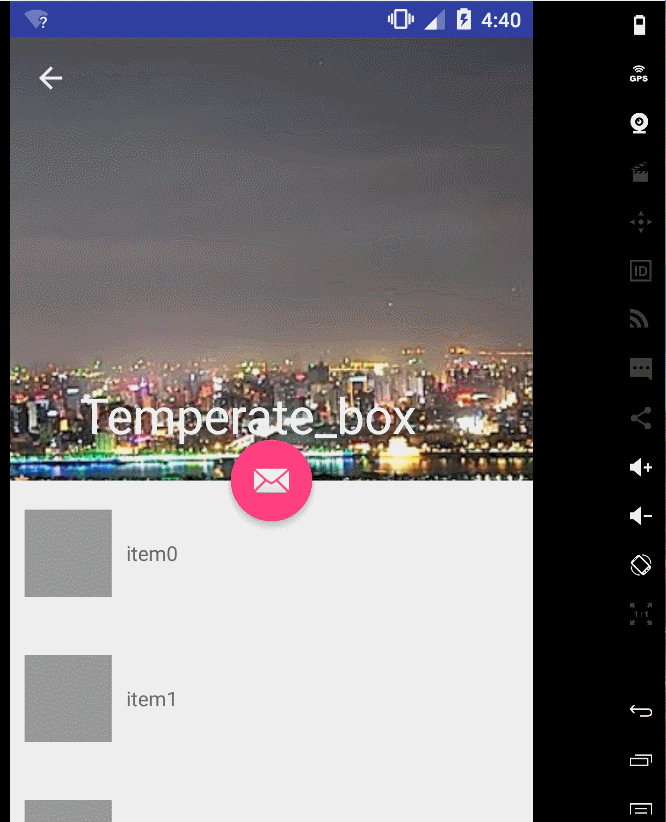
第三种,折叠效果
先上图!
布局如下
<android.support.design.widget.CoordinatorLayout xmlns:android="http://schemas.android.com/apk/res/android"
xmlns:app="http://schemas.android.com/apk/res-auto"
android:id="@+id/main_content"
android:layout_width="match_parent"
android:layout_height="match_parent"
android:fitsSystemWindows="true">
<android.support.design.widget.AppBarLayout
android:id="@+id/appbar"
android:layout_width="match_parent"
android:layout_height="wrap_content"
android:theme="@style/ThemeOverlay.AppCompat.Dark.ActionBar"
android:fitsSystemWindows="true">
<android.support.design.widget.CollapsingToolbarLayout
android:id="@+id/collapsing_toolbar"
android:layout_width="match_parent"
android:layout_height="match_parent"
app:layout_scrollFlags="scroll|exitUntilCollapsed"
android:fitsSystemWindows="true"
app:contentScrim="?attr/colorPrimary"
app:expandedTitleMarginStart="48dp"
app:expandedTitleMarginEnd="64dp">
<ImageView
android:id="@+id/backdrop"
android:layout_width="match_parent"
android:layout_height="match_parent"
android:scaleType="centerCrop"
android:fitsSystemWindows="true"
android:src="@drawable/head"
app:layout_collapseMode="parallax" />
<android.support.v7.widget.Toolbar
android:id="@+id/toolbar"
android:layout_width="match_parent"
android:layout_height="?attr/actionBarSize"
app:popupTheme="@style/ThemeOverlay.AppCompat.Light"
app:layout_collapseMode="pin" />
</android.support.design.widget.CollapsingToolbarLayout>
</android.support.design.widget.AppBarLayout>
<android.support.v7.widget.RecyclerView
android:id="@+id/recyclerview"
app:layout_behavior="@string/appbar_scrolling_view_behavior"
android:layout_width="fill_parent"
android:layout_height="fill_parent" />
<android.support.design.widget.FloatingActionButton
android:id="@+id/fab"
android:layout_width="wrap_content"
android:layout_height="wrap_content"
android:src="@android:drawable/ic_dialog_email"
app:layout_anchor="@id/appbar"
app:layout_anchorGravity="bottom|center"/>
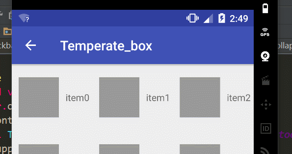
</android.support.design.widget.CoordinatorLayout>可以看到,我们将image和toolbar使用CollapsingToolbarLayout包裹起来了
通常,我们我们都是设置Toolbar的title,而现在,我们需要把title设置在CollapsingToolBarLayout上,而不是Toolbar。
CollapsingToolbarLayout collapsingToolbar =
              (CollapsingToolbarLayout) findViewById(R.id.collapsing_toolbar);
      collapsingToolbar.setTitle("Title");
该控件的的子view必须要有Toolbar,他的作用就是提供一个可折叠的标题栏。通常情况下,该控件会和上面我们说的一些控件搭配使用,达到一种固定的效果。
我们先分析一下上面这段布局,最直观的,可以看到有一个行为上的协作, 那肯定需要CoordinatorLayout这个控件,而且还会有一个滑动的效果,那肯定是AppBarLayout啦,当然,细心的朋友可能还会看出来,那个图片和Toolbar会有一种视差的效果,而且整个banner部分是一种折叠的效果,这就需要CollapsingToolbarLayout这个控件了。
AppBarLayout通过CollapsingToolBarLayout把ImageView和Toolbar作为整个app的标题栏,而且表示滚动标识的app:layout_scrollFlags=”scroll|exitUntilCollapsed”也是赋值给了CollapsingToolbarLayout,mageView有一条属性app:layout_collapseMode=”parallax”表示这个ImageView以视差的形式折叠(效果上看着貌似就是有点小偏移)。 Toolbar的app:layout_collapseMode=”pin”表示Toolbar在折叠的过程中会停靠顶部(pin的意思是钉住)。 这样CollapsingToolBarLayout就没有全部滚出界面。
如果你希望滚动的时候渐变的颜色跟随的是图片而不是蓝色渐变,在java代码中使用如下代码
final CollapsingToolbarLayout ctl = (CollapsingToolbarLayout) findViewById(R.id.ctl);
        ctl.setTitle("Temperate_box");
...
Bitmap bmp = BitmapFactory.decodeResource(getResources(), R.drawable.banner);
        Palette.generateAsync(bmp, new Palette.PaletteAsyncListener() {
            @Override
            public void onGenerated(Palette palette) {
                Palette.Swatch swatch = palette.getDarkMutedSwatch();
                ctl.setContentScrimColor(swatch.getRgb());
            }
        });


 5441
5441

 被折叠的 条评论
为什么被折叠?
被折叠的 条评论
为什么被折叠?
 到【灌水乐园】发言


