


水波纹效果其实也是在Android5.0之后衍生的一种用户交互效果,但是仅支持 5.0/API 21之后的版本,否则无效、且报错 ~
注:个人感觉实则就是一个封装好的shape ~
注:说来惭愧,最早之前写的不全亦不好,故于19年圣诞节即将来临之际查缺补漏 ~
水波纹效果
自嗨式表达 - 可忽略
if (minSdkVersion >= 21){
	can user ripple
}
注意:一般使用此效果的话,我们会在drawable下创建一个xml,以ripple标签为最外层标签( 需留意sdk21之后才可使用ripple标签)来实现水波纹效果
有界 - 水波纹
- 系统自带效果
出现问题:在API 21以上使用,有波纹效果;API 21以下使用只有变色效果,没有波纹效果 (不报错!)
android:background="?android:attr/selectableItemBackground"
- 自定义效果 border_limited
<?xml version="1.0" encoding="utf-8"?>
<ripple xmlns:android="http://schemas.android.com/apk/res/android"
    android:color="#7B68EE">
    <item>
        <shape android:shape="rectangle">
            <solid android:color="#BBFFFF" />
            <corners android:radius="5dp" />
        </shape>
    </item>
</ripple>
无界 - 水波纹
- 系统自带效果
出现问题:在API 21以上能使用,API 21以下会直接报错,导致无法无法编译(提示:最小版本要设置为minSdkVersion 21)
android:background="?android:attr/selectableItemBackgroundBorderless"
- 自定义效果 border_infinite
<?xml version="1.0" encoding="utf-8"?>
<ripple xmlns:android="http://schemas.android.com/apk/res/android"
    android:color="#f00000"> <!--波纹颜色-->
</ripple>
带图 - 水波纹
- 自定义效果 border_img
<?xml version="1.0" encoding="utf-8"?>
<ripple xmlns:android="http://schemas.android.com/apk/res/android"
    android:color="#f00000"> <!--波纹颜色-->
    <item>
        <selector>
            <!-- 未点击背景图-->
            <item
                android:drawable="@drawable/normal_bg"
                android:state_pressed="false" />
            <!-- 点击背景图-->
            <item
                android:drawable="@drawable/select_bg"
                android:state_pressed="true" />
        </selector>
    </item>
</ripple>
使用 - 水波纹
一般在对应的layout布局内设置background属性即可 ~
MainActivity
package nkwl.com.effect;

import android.support.v7.app.AppCompatActivity;
import android.os.Bundle;

public class MainActivity extends AppCompatActivity {

    @Override
    protected void onCreate(Bundle savedInstanceState) {
        super.onCreate(savedInstanceState);
        setContentView(R.layout.activity_main);
    }
}
activity_main
<?xml version="1.0" encoding="utf-8"?>
<LinearLayout xmlns:android="http://schemas.android.com/apk/res/android"
xmlns:app="http://schemas.android.com/apk/res-auto"
xmlns:tools="http://schemas.android.com/tools"
android:layout_width="match_parent"
android:layout_height="match_parent"
android:orientation="vertical"
tools:context=".MainActivity">
<Button
android:layout_width="match_parent"
android:layout_height="wrap_content"
android:layout_marginTop="150dp"
android:background="@drawable/border_limited"
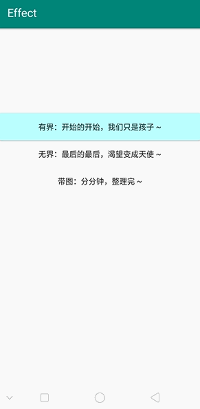
android:text="有界:开始的开始,我们只是孩子 ~" />
<Button
android:layout_width="match_parent"
android:layout_height="wrap_content"
android:background="@drawable/border_infinite"
android:text="无界:最后的最后,渴望变成天使 ~" />
<Button
android:layout_width="match_parent"
android:layout_height="wrap_content"
android:background="@drawable/border_img"
android:text="带图:分分钟,整理完 ~" />
</LinearLayout>
兼容问题
方式一:直接设置build内的minSdkVersion为21
此方式不可取,因为太断章取义了,一点都没有兼容的意义 !
build(app)
  //关键在于设置最低sdk版本
  minSdkVersion 21
  //较全设置
  defaultConfig {
        applicationId "nkwl.com.cardview"
        minSdkVersion 21
        targetSdkVersion 28
        versionCode 1
        versionName "1.0"
        testInstrumentationRunner "android.support.test.runner.AndroidJUnitRunner"
    }
方式二:在res中新建一个drawable-v21文件夹,在此文件夹下新建 水波纹.xml用于实现水波纹效果
此方法可取,Android 5.0以上机型有波纹效果;5.0 以下则无此效果,至于是否会有变色效果,我未尝试过 ~
- 项目结构图

- drawable-v21文件目录图

- 水波纹文件目录图

扩展功能
揭示效果
个人感觉揭示效果与无界水波纹蛮像的,查询之后发现同是Android5.0(API 级别 21)之后的产物,也就意味着只有在满足版本需求后,方可使用此项操作 ~

核心方法
ViewAnimationUtils是Android5.0之后出现的新的动画api,目前为止里面只有一个方法:createCircularReveal() ~
  ViewAnimationUtils.createCircularReveal(
    //视图将被剪辑到动画圈子 - 代表的是你要操作的view
    View view,
    //开始动画的起点x坐标(相对于目标view而言) - 圆的x方向的中点
    int centerX,
    //开始动画的起点y坐标(相对于目标view而言) - 圆的y方向的中点
    int centerY,
    //动画圆的起始半径 - 这个圆开始时候的半径
    float startRadius,
    //动画圆的半径结束 - 结束时候的半径
    float endRadius
  );
揭示方向
 //view为揭示动画所打开的View
 int measuredWidth = view.getMeasuredWidth();
 int measuredHeight = view.getMeasuredHeight();

 //左上 - left_top
 Animator circularReveal = ViewAnimationUtils.createCircularReveal(view, 0, btnHeight, 0, mSceenHeight);
 //右上 - right_top
 Animator circularReveal = ViewAnimationUtils.createCircularReveal(view, mSceenWidth, btnHeight, 0, mSceenHeight);
 //中心 - avau_center
 Animator circularReveal = ViewAnimationUtils.createCircularReveal(view, mSceenWidth / 2, mSceenHeight / 2, mSceenHeight, 80);
 //底部 - avau_bottom
 Animator circularReveal = ViewAnimationUtils.createCircularReveal(view, mSceenWidth / 2, mSceenHeight-3*btnHeight, mSceenHeight, 80);

 //动画持续的时长
 circularReveal.setDuration(1000);
 //动画延时多长时间开始
 circularReveal.setStartDelay(1000);
 //开始动画
 circularReveal.start();
使用方式
看了好几篇文章的代码结构和使用场景,最终决定核心方法借鉴 This boy ~
MainActivity
package nkwl.com.cardview;

import android.animation.Animator;
import android.animation.AnimatorListenerAdapter;
import android.os.Bundle;
import android.support.v7.app.AppCompatActivity;
import android.view.View;
import android.view.ViewAnimationUtils;

public class MainActivity extends AppCompatActivity {
    private View view;

    @Override
    protected void onCreate(Bundle savedInstanceState) {
        super.onCreate(savedInstanceState);
        setContentView(R.layout.activity_main);

        view = findViewById(R.id.iv_reveal_effect);
        findViewById(R.id.btn).setOnClickListener(new View.OnClickListener() {
            @Override
            public void onClick(View v) {
                createAnimation();
            }
        });
    }

    void createAnimation() {
        if (android.os.Build.VERSION.SDK_INT >= android.os.Build.VERSION_CODES.LOLLIPOP) {
            int measuredWidth = view.getMeasuredWidth();
            int measuredHeight = view.getMeasuredHeight();
            int maxRadius = Math.max(measuredWidth, measuredHeight);

            Animator circularReveal = null;
            //判断当前需求界面是否展示、通过展示状态对应的开关揭示效果
            if (view.getVisibility() == View.VISIBLE) {
                circularReveal = ViewAnimationUtils.createCircularReveal(view, measuredWidth, measuredHeight, maxRadius, 0);
                circularReveal.setDuration(1000);
                circularReveal.setStartDelay(1000);
                circularReveal.start();

                circularReveal.addListener(new AnimatorListenerAdapter() {
                    //动画结束的监听
                    @Override
                    public void onAnimationEnd(Animator animation) {
                        super.onAnimationEnd(animation);
                        view.setVisibility(View.GONE);
                    }
                });
            } else {
                circularReveal = ViewAnimationUtils.createCircularReveal(view, 0, 0, 0, maxRadius);
                circularReveal.setDuration(1000);
//                    circularReveal.setInterpolator(new LinearOutSlowInInterpolator());//out到in
                view.setVisibility(View.VISIBLE);
                circularReveal.start();
            }

        } else {
            view.setVisibility(view.isShown() ? View.GONE : View.VISIBLE);
        }
    }
}
activity_main
<?xml version="1.0" encoding="utf-8"?>
<LinearLayout xmlns:android="http://schemas.android.com/apk/res/android"
    xmlns:tools="http://schemas.android.com/tools"
    android:layout_width="match_parent"
    android:layout_height="match_parent"
    android:orientation="vertical"
    tools:context=".MainActivity">

    <TextView
        android:id="@+id/btn"
        android:layout_width="match_parent"
        android:layout_height="35dp"
        android:layout_marginTop="45dp"
        android:background="#ff6"
        android:gravity="center"
        android:text="开启/关闭 揭示动画"
        android:textStyle="bold" />

    <ImageView
        android:id="@+id/iv_reveal_effect"
        android:layout_width="match_parent"
        android:layout_height="match_parent"
        android:src="@drawable/ic_launcher_background"
        android:visibility="invisible" />

</LinearLayout>
揭示类型
此处代码未亲自尝试,仅为方便自我特记录于此,借鉴 This boy ~
斜线展示
Animator animator1 = ViewAnimationUtils.createCircularReveal(cv_img, 0, 0, 0, (float) Math.hypot(cv_img.getWidth(), cv_img.getHeight()));
animator1.setInterpolator(new LinearInterpolator());//插补器有没有不影响
animator1.setDuration(2000);
animator1.start();
由内向外
int cenX = cv_img.getWidth() / 2;
int cenY = cv_img.getHeight() / 2;
Animator an = ViewAnimationUtils.createCircularReveal(cv_img, cenX, cenY, 0, cenX);
an.setDuration(3000);
an.start();
an.addListener(new AnimatorListenerAdapter() {
    @Override
    public void onAnimationEnd(Animator animation) {
        super.onAnimationEnd(animation);
        cv_img.setVisibility(View.VISIBLE);
    }
});
由外向内
int centerX = cv_img.getWidth() / 2;//获取组件的宽的一半
int centerY = cv_img.getHeight() / 2;//获取组件的高的一半
Animator animator = ViewAnimationUtils.createCircularReveal(cv_img, centerX, centerY,cv_img.getWidth(), 0);
animator.setDuration(3000);
animator.setInterpolator(new LinearOutSlowInInterpolator());//out到in
animator.start();
animator.addListener(new AnimatorListenerAdapter() {
    @Override
    public void onAnimationEnd(Animator animation) {
        super.onAnimationEnd(animation);
        cv_img.setVisibility(View.GONE);
    }
});


 扫一扫
扫一扫
 394
394

 被折叠的 条评论
为什么被折叠?
被折叠的 条评论
为什么被折叠?
 到【灌水乐园】发言


