


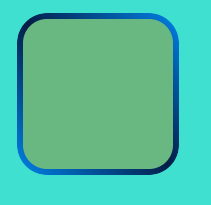
需求要求实现如下效果:
实现方式
<html lang="en">
<head>
    <meta charset="UTF-8">
    <meta http-equiv="X-UA-Compatible" content="IE=edge">
    <meta name="viewport" content="width=device-width, initial-scale=1.0">
    <title>Document</title>
</head>
<style>
       .boxWarp {
            width:50px;
            height: 50px;
            padding: 2px;
            border-radius: 10px;
            background-image: linear-gradient(#6ab881, #6ab881), linear-gradient(45deg, #0083e8, #051d46, #0083e8);
            background-clip: content-box, padding-box;

        }
</style>
<body style="background: turquoise;">
    <div class="boxWarp"></div>
</body>
</html>
核心
- border-img和border-radius是无法共存的,所以如果通过 border-img设置渐变后无法通过border-radius设置圆角
- 通过设置背景颜色和padding的位置来实现渐变核心的两个属性为background-image,background-clip


 3619
3619


 被折叠的 条评论
为什么被折叠?
被折叠的 条评论
为什么被折叠?
 到【灌水乐园】发言


