


网上收集的文章:http://www.bkjia.com/Androidjc/889841.html
1.改变Progress可以通过改写样式的方式,首先看Android自己的进度条样式
样式中的参数介绍
<style name="Widget.ProgressBar.Horizontal">
        <item name="android:indeterminateOnly">false</item>
        <item name="android:progressDrawable">@android:drawable/progress_horizontal</item>
        <item name="android:indeterminateDrawable">@android:drawable/progress_indeterminate_horizontal</item>
        <item name="android:minHeight">20dip</item>
        <item name="android:maxHeight">20dip</item>
    </style>
android:max=”100” 进度条的最大值
android:progress 进度条已经完成的进度值
android:progressDrawable 已经完成的进度条轨道显示的Drawable对象
indeterminateDrawable 设置绘制不显示进度的进度条的Drawable对象
android:indeterminate 设置为true,进度条不精准显示进度
android:indeterminateDuration 设置不精准显示进度的时间
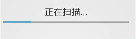
下面来看资源文件@android:drawable/progress_horizontal
background对应进度条灰色的部分,既背景
secondaryProgress:进度条缓冲时,灰色的部分,图片中没有
progress:对应进度条的样子
<layer-list xmlns:android="http://schemas.android.com/apk/res/android">

    <item android:id="@android:id/background">
        <shape>
            <corners android:radius="5dip" />
            <gradient
                    android:startColor="#ff9d9e9d"
                    android:centerColor="#ff5a5d5a"
                    android:centerY="0.75"
                    android:endColor="#ff747674"
                    android:angle="270"
            />
        </shape>
    </item>

    <item android:id="@android:id/secondaryProgress">
        <clip>
            <shape>
                <corners android:radius="5dip" />
                <gradient
                        android:startColor="#80ffd300"
                        android:centerColor="#80ffb600"
                        android:centerY="0.75"
                        android:endColor="#a0ffcb00"
                        android:angle="270"
                />
            </shape>
        </clip>
    </item>

    <item android:id="@android:id/progress">
        <clip>
            <shape>
                <corners android:radius="5dip" />
                <gradient
                        android:startColor="#ffffd300"
                        android:centerColor="#ffffb600"
                        android:centerY="0.75"
                        android:endColor="#ffffcb00"
                        android:angle="270"
                />
            </shape>
        </clip>
    </item>
</layer-list>
所以如果想改变一个进度条的样式,可以通过自定义一个drawable文件,重写里面的drawable资源
<?xml version="1.0" encoding="UTF-8"?>
<layer-list xmlns:android="http://schemas.android.com/apk/res/android" >

    <item
        android:id="@android:id/background"
        android:drawable="@drawable/security_progress_bg"/>
    <item  android:id="@android:id/progress"     android:drawable="@drawable/security_progress"/>
</layer-list>
并且在新的资源上引用到你的样式中
<?xml version="1.0" encoding="UTF-8"?>
<layer-list xmlns:android="http://schemas.android.com/apk/res/android" >

    <item
        android:id="@android:id/background"
        android:drawable="@drawable/security_progress_bg"/>
    <item
        android:id="@android:id/progress"
        android:drawable="@drawable/security_progress"/>
</layer-list>
给你的progressbar引用新的样式
<ProgressBar
                android:id="@+id/progressBar1"
                style="@style/my_pb_style"
                android:layout_width="match_parent"
                android:layout_height="wrap_content"
                android:layout_marginLeft="10dp"
                android:layout_marginRight="10dp" />


 1577
1577

 被折叠的 条评论
为什么被折叠?
被折叠的 条评论
为什么被折叠?
 到【灌水乐园】发言


