


在Android开发中我们经常用到Drawable Resources 例如:shape.xml,layer-list.xml等,它们的主要功能是绘制形状(点,线,圆,矩形,圆环等其他复杂图形),相比UI切图以及自定义View来说,它更简单有效,何为简单?不用麻烦UI切图,没有和自定义View 那样的繁琐代码。何为有效?没有切图那样的大体积,没有自定义View那样的性能消耗。所以说能使用shape完成的功能效果尽量不要去使用切图和自定义View(虽然自定义View更能看出一个开发者的技术,也可以做出更绚丽的效果)。
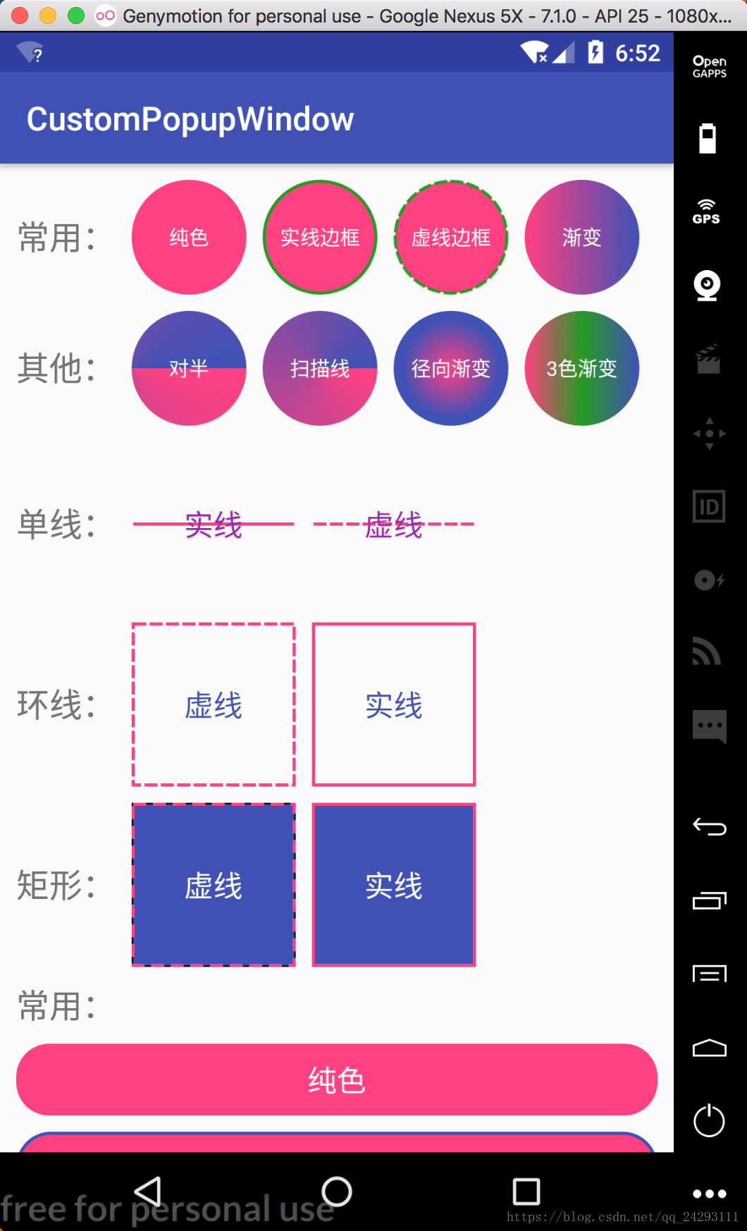
所以我们就来看看shape能实现那些效果呢?如下图:
在实现这些图形之前我们先了解一下shape的一些属性,官方文档给我们展示的属性如下:
<?xml version="1.0" encoding="utf-8"?>
<shape
    xmlns:android="http://schemas.android.com/apk/res/android"
    android:shape=["rectangle" | "oval" | "line" | "ring"] >
    <corners
        android:radius="integer"
        android:topLeftRadius="integer"
        android:topRightRadius="integer"
        android:bottomLeftRadius="integer"
        android:bottomRightRadius="integer" />
    <gradient
        android:angle="integer"
        android:centerX="float"
        android:centerY="float"
        android:centerColor="integer"
        android:endColor="color"
        android:gradientRadius="integer"
        android:startColor="color"
        android:type=["linear" | "radial" | "sweep"]
        android:useLevel=["true" | "false"] />
    <padding
        android:left="integer"
        android:top="integer"
        android:right="integer"
        android:bottom="integer" />
    <size
        android:width="integer"
        android:height="integer" />
    <solid
        android:color="color" />
    <stroke
        android:width="integer"
        android:color="color"
        android:dashWidth="integer"
        android:dashGap="integer" />
</shape>
在shape中还有一部分属性官方文档是没有给出展示的,我们自己加上看一下,接下来按功能不同进行分别查看。
1.shape
<shape
    xmlns:android="http://schemas.android.com/apk/res/android"
    // 绘制形状类型 矩形,这也是默认值 | 椭圆形 | 线形,需要<stroke>属性设置线条宽度 | 环形
    android:shape=["rectangle" | "oval" | "line" | "ring"]
    // 是否抖动 默认是true
    android:dither=["true" | "false"]
    // 内圆半径【只有当android:shape="ring"时使用】
    android:innerRadius="integer"
    // 环的半径:环的宽度比,内圆半径等于环的宽度除以这个值,此值会被innerRadius覆盖,默认值是9【只有当android:shape="ring"时使用】
    android:innerRadiusRatio="float"
    // 环的厚度【只有当android:shape="ring"时使用】
    android:thickness="integer"
    // 环的厚度:环的宽度比,厚度等于环的宽度除以这个值,此值会被thickness覆盖,默认是3【只有当android:shape="ring"时使用】
    android:thicknessRatio="integer"
    // 染色
    android:tint="color"
    // 染色模式
    android:tintMode=["add" | "multiply" | "screen"] | "src_atop" | "src_in" | "src_over"
    // true:这个作为一个 LevelListDrawable使用, 这个值应该是false,【只有当android:shape="ring"时使用】
    android:useLevel=["true" | "false"]
    // 是否显示
    android:visible=["true" | "false"] >
</shape>
2.corners(形状的圆角)
<corners
	// 所有圆角的半径,包含下面4个
    android:radius="integer"
    // 左上角的圆角半径
    android:topLeftRadius="integer"
    // 右上角的圆角半径
    android:topRightRadius="integer"
    // 左下角的圆角半径
    android:bottomLeftRadius="integer"
    // 右下角的圆角半径
    android:bottomRightRadius="integer" />
3.gradient(形状的渐变颜色)
<gradient
	// 渐变的角度,以度为单位。0从左到右,90从下到上。它必须是45的倍数。默认值为0
    android:angle="integer"
    // 渐变中心相对于X轴的坐标(0,1.0)
    android:centerX="float"
    // 渐变中心相对于Y轴的坐标(0,1.0)
    android:centerY="float"
    // 起始颜色和结束颜色中间的16位颜色值
    android:centerColor="integer"
    // 结束的16位的颜色值
    android:endColor="color"
    // 渐变的半径。仅适用于android:type="radial"
    android:gradientRadius="integer"
    // 起始的16位的颜色值
    android:startColor="color"
    // 渐变图案类型 线性渐变,这个是默认值 | 径向渐变,起始颜色是中心颜色 | 扫描线渐变
    android:type=["linear" | "radial" | "sweep"]
    // 如果作为一个LevelListDrawable使用则为true
    android:useLevel=["true" | "false"] />
4.padding(填充View内容的位置,而不是形状)
<padding
	// 左边填充的值
    android:left="integer"
    // 顶部填充的值
    android:top="integer"
    // 右边填充的值
    android:right="integer"
    // 底部填充的值
    android:bottom="integer" />
5.size(形状的大小)
<size
	// 形状的宽度
    android:width="integer"
    // 形状的高度
    android:height="integer" />
6.solid(形状的填充颜色)
<solid
	// 形状的颜色
    android:color="color" />
7.stroke(形状的笔划线)
<stroke
	// 线的粗细
    android:width="integer"
    // 线的颜色
    android:color="color"
    // 线破折号之间的距离,仅在android:dashGap设置时有效
    android:dashWidth="integer"
    // 每个虚线的大小,仅在android:dashWidth设置时有效
    android:dashGap="integer" />
常用的属性我们也都了解了,接下来我们就实现一下常用的形状。由于都是图形,没有啥代码,所以就直接上布局:
<?xml version="1.0" encoding="utf-8"?>
<ScrollView xmlns:android="http://schemas.android.com/apk/res/android"
    xmlns:tools="http://schemas.android.com/tools"
    android:layout_width="match_parent"
    android:layout_height="match_parent"
    android:overScrollMode="never"
    tools:context=".ShapeActivity">
    <LinearLayout
        android:layout_width="match_parent"
        android:layout_height="match_parent"
        android:gravity="center_horizontal"
        android:orientation="vertical"
        android:paddingLeft="10dp"
        android:paddingRight="10dp">
        <!-- 点 -->
        <LinearLayout
            android:layout_width="match_parent"
            android:layout_height="wrap_content"
            android:layout_marginTop="10dp"
            android:gravity="center_vertical"
            android:orientation="horizontal">
            <TextView
                android:layout_width="wrap_content"
                android:layout_height="wrap_content"
                android:text="常用:"
                android:textSize="20dp" />

            <FrameLayout
                android:layout_width="70dp"
                android:layout_height="70dp"
                android:layout_marginLeft="10dp"
                android:background="@drawable/shape_round9">
                <TextView
                    android:layout_width="wrap_content"
                    android:layout_height="wrap_content"
                    android:layout_gravity="center"
                    android:text="纯色"
                    android:textColor="@color/color_FFFFFF"
                    android:textSize="12dp" />
            </FrameLayout>
            <FrameLayout
                android:layout_width="70dp"
                android:layout_height="70dp"
                android:layout_marginLeft="10dp"
                android:background="@drawable/shape_round27">
                <TextView
                    android:layout_width="wrap_content"
                    android:layout_height="wrap_content"
                    android:layout_gravity="center"
                    android:text="实线边框"
                    android:textColor="@color/color_FFFFFF"
                    android:textSize="12dp" />
            </FrameLayout>
            <FrameLayout
                android:layout_width="70dp"
                android:layout_height="70dp"
                android:layout_marginLeft="10dp"
                android:background="@drawable/shape_round33">
                <TextView
                    android:layout_width="wrap_content"
                    android:layout_height="wrap_content"
                    android:layout_gravity="center"
                    android:text="虚线边框"
                    android:textColor="@color/color_FFFFFF"
                    android:textSize="12dp" />
            </FrameLayout>
            <FrameLayout
                android:layout_width="70dp"
                android:layout_height="70dp"
                android:layout_marginLeft="10dp"
                android:background="@drawable/shape_round8"
                android:padding="10dp">
                <TextView
                    android:layout_width="wrap_content"
                    android:layout_height="wrap_content"
                    android:layout_gravity="center"
                    android:text="渐变"
                    android:textColor="@color/color_FFFFFF"
                    android:textSize="12dp" />
            </FrameLayout>
        </LinearLayout>
    </LinearLayout>
</ScrollView>
布局代码挺多的,也挺简单的,我们也不全显示了,只看部分就行。
圆形
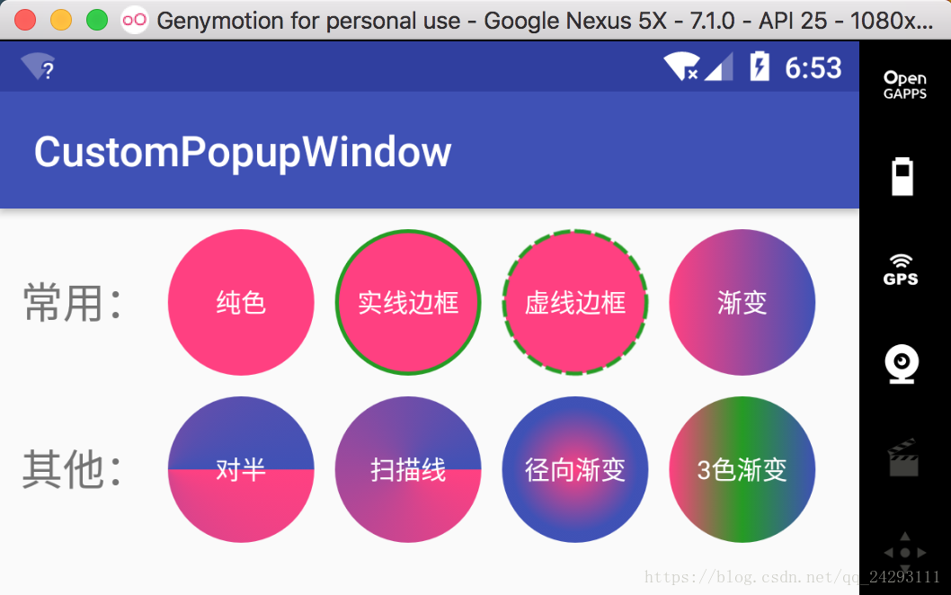
纯色
<?xml version="1.0" encoding="utf-8"?>
<shape xmlns:android="http://schemas.android.com/apk/res/android"
    android:shape="oval">
    <solid android:color="@color/colorAccent" />
</shape>
实线边框
<?xml version="1.0" encoding="utf-8"?>
<shape xmlns:android="http://schemas.android.com/apk/res/android"
    android:shape="oval">
    <solid android:color="@color/colorAccent" />
    <stroke
        android:width="2dp"
        android:color="@color/color_259B24" />
</shape>
虚线边框
<?xml version="1.0" encoding="utf-8"?>
<shape xmlns:android="http://schemas.android.com/apk/res/android"
    android:shape="oval">
    <solid android:color="@color/colorAccent" />
    <stroke
        android:width="2dp"
        android:color="@color/color_259B24"
        android:dashWidth="8dp"
        android:dashGap="2dp"/>
</shape>
渐变
<?xml version="1.0" encoding="utf-8"?>
<shape xmlns:android="http://schemas.android.com/apk/res/android"
    android:shape="oval">
    <gradient
        android:startColor="@color/colorAccent"
        android:endColor="@color/colorPrimary"/>
</shape>
对半
<shape xmlns:android="http://schemas.android.com/apk/res/android"
    android:shape="oval">
    <gradient
        android:startColor="@color/colorAccent"
        android:endColor="@color/colorPrimary"
        android:type="sweep"
        android:centerX="0"/>
</shape>
扫描线
<?xml version="1.0" encoding="utf-8"?>
<shape xmlns:android="http://schemas.android.com/apk/res/android"
    android:shape="oval">
    <gradient
        android:startColor="@color/colorAccent"
        android:endColor="@color/colorPrimary"
        android:type="sweep"/>
</shape>
径向渐变
<?xml version="1.0" encoding="utf-8"?>
<shape xmlns:android="http://schemas.android.com/apk/res/android"
    android:shape="oval">
    <gradient
        android:startColor="@color/colorAccent"
        android:endColor="@color/colorPrimary"
        android:gradientRadius="30dp"
        android:type="radial"/>
</shape>
3色渐变
<?xml version="1.0" encoding="utf-8"?>
<shape xmlns:android="http://schemas.android.com/apk/res/android"
    android:shape="oval">
    <gradient
        android:startColor="@color/colorAccent"
        android:centerColor="@color/color_259B24"
        android:endColor="@color/colorPrimary"/>
</shape>
线相关
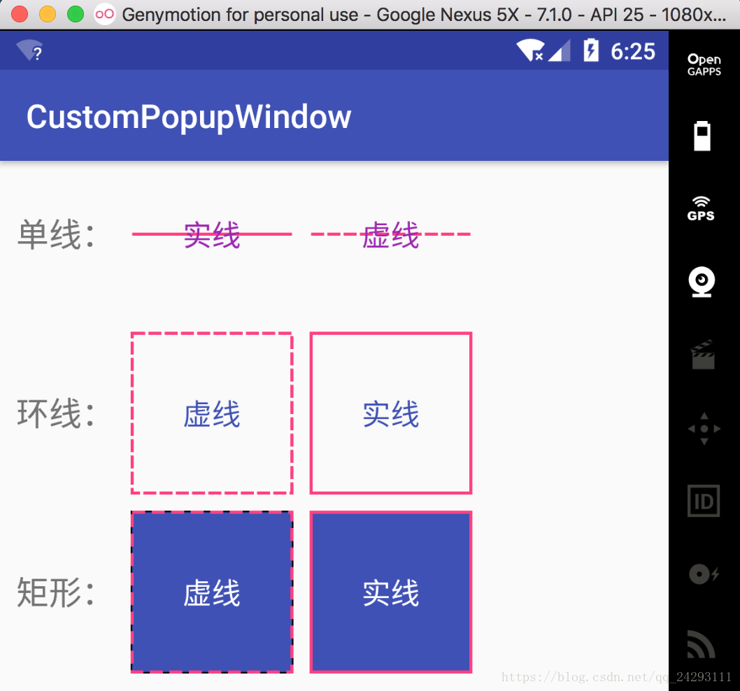
单线-实线
<?xml version="1.0" encoding="utf-8"?>
<shape xmlns:android="http://schemas.android.com/apk/res/android"
    android:shape="line">
    <stroke
        android:width="2dp"
        android:color="@color/colorAccent" />
</shape>
单线-虚线
<?xml version="1.0" encoding="utf-8"?>
<shape xmlns:android="http://schemas.android.com/apk/res/android"
    android:shape="line"
    android:useLevel="true">
    <stroke
        android:width="2dp"
        android:color="@color/colorAccent"
        android:dashWidth="8dp"
        android:dashGap="2dp" />
</shape>
单独画虚线的时候需要注意的是需要在对应的View上面加上属性:android:layerType=“software”,要不然显示的还是实线。
环线-虚线
<?xml version="1.0" encoding="utf-8"?>
<shape xmlns:android="http://schemas.android.com/apk/res/android"
    android:shape="rectangle"
    android:useLevel="true">
    <stroke
        android:width="2dp"
        android:color="@color/colorAccent"
        android:dashWidth="8dp"
        android:dashGap="2dp" />
</shape>
环线-实线
<?xml version="1.0" encoding="utf-8"?>
<shape xmlns:android="http://schemas.android.com/apk/res/android"
    android:shape="rectangle"
    android:useLevel="true">
    <stroke
        android:width="2dp"
        android:color="@color/colorAccent" />
</shape>
矩形-虚线
<?xml version="1.0" encoding="utf-8"?>
<shape xmlns:android="http://schemas.android.com/apk/res/android"
    android:shape="rectangle"
    android:useLevel="true">
    <solid android:color="@color/colorPrimary" />
    <stroke
        android:width="2dp"
        android:color="@color/colorAccent"
        android:dashWidth="8dp"
        android:dashGap="4dp" />
</shape>
矩形-实线
<?xml version="1.0" encoding="utf-8"?>
<shape xmlns:android="http://schemas.android.com/apk/res/android"
    android:shape="rectangle"
    android:useLevel="true">
    <solid android:color="@color/colorPrimary" />
    <stroke
        android:width="2dp"
        android:color="@color/colorAccent" />
</shape>
圆角
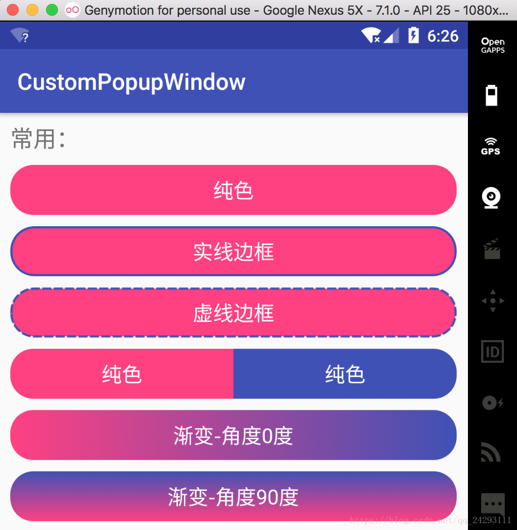
纯色
<?xml version="1.0" encoding="utf-8"?>
<shape xmlns:android="http://schemas.android.com/apk/res/android"
    android:shape="rectangle">
    <solid android:color="@color/colorAccent" />
    <corners android:radius="20dp" />
</shape>
实线边框
<?xml version="1.0" encoding="utf-8"?>
<shape xmlns:android="http://schemas.android.com/apk/res/android"
    android:shape="rectangle">
    <solid android:color="@color/colorAccent" />
    <corners android:radius="20dp" />
    <stroke
        android:width="2dp"
        android:color="@color/colorPrimary" />
</shape>
虚线边框
<?xml version="1.0" encoding="utf-8"?>
<shape xmlns:android="http://schemas.android.com/apk/res/android"
    android:shape="rectangle">
    <solid android:color="@color/colorAccent" />
    <corners android:radius="20dp" />
    <stroke
        android:width="2dp"
        android:color="@color/colorPrimary"
        android:dashGap="2dp"
        android:dashWidth="8dp"/>
</shape>
左右对半纯色
xml代码
<LinearLayout
    android:layout_width="match_parent"
    android:layout_height="wrap_content"
    android:layout_marginTop="10dp"
    android:orientation="horizontal">
    <TextView
        android:layout_width="0dp"
        android:layout_height="wrap_content"
        android:layout_gravity="center"
        android:layout_weight="1"
        android:background="@drawable/shape_round10"
        android:gravity="center"
        android:padding="10dp"
        android:text="纯色"
        android:textColor="@color/color_FFFFFF"
        android:textSize="18dp" />
    <TextView
        android:layout_width="0dp"
        android:layout_height="wrap_content"
        android:layout_gravity="center"
        android:layout_weight="1"
        android:background="@drawable/shape_round11"
        android:gravity="center"
        android:padding="10dp"
        android:text="纯色"
        android:textColor="@color/color_FFFFFF"
        android:textSize="18dp" />
</LinearLayout>
分别对应的shape
<?xml version="1.0" encoding="utf-8"?>
<shape xmlns:android="http://schemas.android.com/apk/res/android"
    android:shape="rectangle">
    <solid android:color="@color/colorAccent" />
    <corners android:topLeftRadius="20dp"
		     android:bottomLeftRadius="20dp"/>
</shape>
<?xml version="1.0" encoding="utf-8"?>
<shape xmlns:android="http://schemas.android.com/apk/res/android"
    android:shape="rectangle">
    <solid android:color="@color/colorPrimary" />
    <corners android:topRightRadius="20dp"
             android:bottomRightRadius="20dp"/>
</shape>
渐变-角度0度
<?xml version="1.0" encoding="utf-8"?>
<shape xmlns:android="http://schemas.android.com/apk/res/android"
    android:shape="rectangle">
    <gradient
        android:startColor="@color/colorAccent"
        android:endColor="@color/colorPrimary"/>
    <corners android:radius="20dp" />
</shape>
渐变-角度90度
<?xml version="1.0" encoding="utf-8"?>
<shape xmlns:android="http://schemas.android.com/apk/res/android"
    android:shape="rectangle">
    <gradient
        android:startColor="@color/colorAccent"
        android:endColor="@color/colorPrimary"
        android:angle="90"/>
    <corners android:radius="20dp" />
</shape>

3色渐变
<?xml version="1.0" encoding="utf-8"?>
<shape xmlns:android="http://schemas.android.com/apk/res/android"
    android:shape="rectangle">
    <gradient
        android:startColor="@color/colorAccent"
        android:endColor="@color/colorPrimary"
        android:centerColor="@color/color_259B24"/>
    <corners android:radius="20dp" />
</shape>
渐变-X轴不同比例
<?xml version="1.0" encoding="utf-8"?>
<shape xmlns:android="http://schemas.android.com/apk/res/android"
    android:shape="rectangle">
    <gradient
        android:startColor="@color/colorAccent"
        android:endColor="@color/colorPrimary"
        android:centerColor="@color/colorPrimary"
        android:centerX="0.1"/>
    <corners android:radius="20dp" />
</shape>
渐变-Y轴不同比例
<?xml version="1.0" encoding="utf-8"?>
<shape xmlns:android="http://schemas.android.com/apk/res/android"
    android:shape="rectangle">
    <gradient
        android:startColor="@color/colorAccent"
        android:endColor="@color/colorPrimary"
        android:centerColor="@color/colorPrimary"
        android:angle="90"
        android:centerY="0.3"/>
    <corners android:radius="20dp" />
</shape>
渐变-径向
<?xml version="1.0" encoding="utf-8"?>
<shape xmlns:android="http://schemas.android.com/apk/res/android"
    android:shape="rectangle">
    <gradient
        android:startColor="@color/colorAccent"
        android:endColor="@color/colorPrimary"
        android:gradientRadius="20dp"
        android:type="radial"/>
    <corners android:radius="20dp" />
</shape>
渐变-扫描线
<?xml version="1.0" encoding="utf-8"?>
<shape xmlns:android="http://schemas.android.com/apk/res/android"
    android:shape="rectangle">
    <gradient
        android:startColor="@color/colorAccent"
        android:endColor="@color/colorPrimary"
        android:type="sweep"/>
    <corners android:radius="20dp" />
</shape>
渐变-对半
<?xml version="1.0" encoding="utf-8"?>
<shape xmlns:android="http://schemas.android.com/apk/res/android"
    android:shape="rectangle">
    <gradient
        android:startColor="@color/colorAccent"
        android:endColor="@color/colorPrimary"
        android:centerX="0"
        android:type="sweep"/>
    <corners android:radius="20dp" />
</shape>
圆环
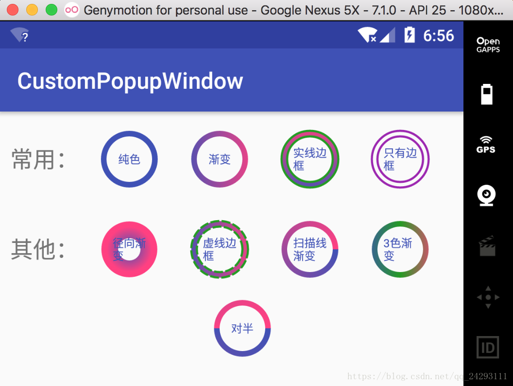
纯色
<?xml version="1.0" encoding="utf-8"?>
<shape xmlns:android="http://schemas.android.com/apk/res/android"
    android:shape="ring"
    android:innerRadius="20dp"
    android:thickness="5dp"
    android:useLevel="false">
    <solid android:color="@color/colorPrimary" />
</shape>
渐变
<?xml version="1.0" encoding="utf-8"?>
<shape xmlns:android="http://schemas.android.com/apk/res/android"
    android:shape="ring"
    android:innerRadius="20dp"
    android:thickness="5dp"
    android:useLevel="false">
    <gradient
        android:startColor="@color/colorPrimary"
        android:endColor="@color/colorAccent" />
</shape>
实线边框
<?xml version="1.0" encoding="utf-8"?>
<shape xmlns:android="http://schemas.android.com/apk/res/android"
    android:shape="ring"
    android:innerRadius="20dp"
    android:thickness="5dp"
    android:useLevel="false">
    <gradient
        android:startColor="@color/colorPrimary"
        android:endColor="@color/colorAccent"
        android:angle="90"/>
    <stroke
        android:width="2dp"
        android:color="@color/color_259B24" />
</shape>
只有边框
<?xml version="1.0" encoding="utf-8"?>
<shape xmlns:android="http://schemas.android.com/apk/res/android"
    android:shape="ring"
    android:innerRadius="20dp"
    android:thickness="5dp"
    android:useLevel="false">
    <stroke
        android:width="2dp"
        android:color="@color/color_9C27B0" />
</shape>
径向渐变
<?xml version="1.0" encoding="utf-8"?>
<shape xmlns:android="http://schemas.android.com/apk/res/android"
    android:shape="ring"
    android:innerRadius="10dp"
    android:thickness="15dp"
    android:useLevel="false">
    <gradient
        android:startColor="@color/colorPrimary"
        android:endColor="@color/colorAccent"
        android:type="radial"
        android:centerX="0.5"
        android:centerY="0.5"
        android:gradientRadius="20dp"/>
</shape>
虚线边框
<?xml version="1.0" encoding="utf-8"?>
<shape xmlns:android="http://schemas.android.com/apk/res/android"
    android:shape="ring"
    android:innerRadius="20dp"
    android:thickness="5dp"
    android:useLevel="false">
    <gradient
        android:startColor="@color/colorPrimary"
        android:endColor="@color/colorAccent"/>
    <stroke
        android:width="2dp"
        android:color="@color/color_259B24"
        android:dashGap="2dp"
        android:dashWidth="8dp"/>
</shape>
扫描线渐变
<?xml version="1.0" encoding="utf-8"?>
<shape xmlns:android="http://schemas.android.com/apk/res/android"
    android:shape="ring"
    android:innerRadius="20dp"
    android:thickness="5dp"
    android:useLevel="false">
    <gradient
        android:startColor="@color/colorPrimary"
        android:endColor="@color/colorAccent"
        android:type="sweep"/>
</shape>
3色渐变
<?xml version="1.0" encoding="utf-8"?>
<shape xmlns:android="http://schemas.android.com/apk/res/android"
    android:shape="ring"
    android:innerRadius="20dp"
    android:thickness="5dp"
    android:useLevel="false">
    <gradient
        android:startColor="@color/colorPrimary"
        android:centerColor="@color/color_259B24"
        android:endColor="@color/colorAccent" />
</shape>
对半
<?xml version="1.0" encoding="utf-8"?>
<shape xmlns:android="http://schemas.android.com/apk/res/android"
    android:shape="ring"
    android:innerRadius="20dp"
    android:thickness="5dp"
    android:useLevel="false">
    <gradient
        android:startColor="@color/colorPrimary"
        android:endColor="@color/colorAccent"
        android:centerX="0"
        android:type="sweep"/>
</shape>


 3285
3285


 被折叠的 条评论
为什么被折叠?
被折叠的 条评论
为什么被折叠?
 到【灌水乐园】发言


