


有时候我们在做 Java Web 小项目开发的时候,可能在设计前端的时候苦于没有好的布局、色彩搭配,跟接地气的说法就是做的界面比较 高大上!
那么平时我们就要注意积累自己的素材了!下面这个HTML网页输入框以及按钮的色彩搭配感觉挺好,可以收藏。我们一起看下:
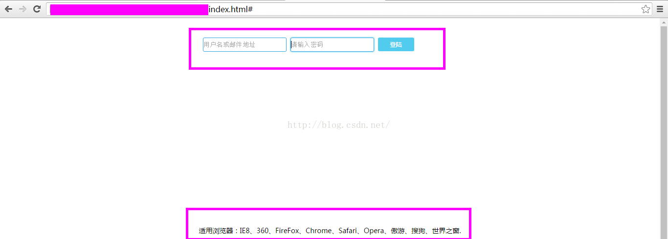
运行结果 :
源代码 :
<!DOCTYPE html PUBLIC "-//W3C//DTD XHTML 1.0 Transitional//EN" "http://www.w3.org/TR/xhtml1/DTD/xhtml1-transitional.dtd">
<html xmlns="http://www.w3.org/1999/xhtml">
<head>
<meta http-equiv="Content-Type" content="text/html; charset=gb2312" />
<title>CSS3 input输入框蓝光特效</title>
<style type="text/css">
input{
	transition:all 0.30s ease-in-out; <!-- -->
	-webkit-transition: all 0.30s ease-in-out;
	-moz-transition: all 0.30s ease-in-out;
	border:#35a5e5 1px solid;
	border-radius:3px;
	outline:none;
}
input:focus{
	box-shadow:0 0 5px rgba(81, 203, 238, 1);
	-webkit-box-shadow:0 0 5px rgba(81, 203, 238, 1);
	-moz-box-shadow:0 0 5px rgba(81, 203, 238, 1);
}
a{
	text-decoration:none;
	background:rgba(81, 203, 238, 1);
	color:white;padding: 6px 25px 6px 25px;
	font:12px '微软雅黑';
	border-radius:3px;
	-webkit-transition:all linear 0.30s;
	-moz-transition:all linear 0.30s;
	transition:all linear 0.30s;
}
a:hover{background:rgba(39, 154, 187, 1);}
</style>
</head>
<body>

<div style="width:520px;height:34px;margin:40px auto 0 auto;">
	<input type="text" placeholder="用户名或邮件地址"  style="height:25px"/>
	<input type="password" placeholder="请输入密码"  style="height:25px"/>
	<a href="#">登陆</a>
</div>
<div style="text-align:center;margin:350px 0; font:normal 14px/24px 'MicroSoft YaHei';">
<p>适用浏览器:IE8、360、FireFox、Chrome、Safari、Opera、傲游、搜狗、世界之窗. </p>
</div>
</body>
</html>- shadow:作用于color、x、y、和blur(模糊)属性,如:text-shadow
- moz-transition:height 2s; /* 兼容老版本 Firefox 4 */
- -webkit-transition:height 2s; /* 兼容 Safari and Chrome */
- -o-transition:width 2s; /* 兼容 Opera */
- 举例:
- 比如你写的transition:width 2s;
- 兼容老版本火狐:-moz-transition:width 2s;
- 兼容Safari、Chrome :-webkit-transition:width 2s;
- 兼容 Opera :-o-transition:width 2s;
- transition-timing-function 的用法
- 允许你根据时间的推进去改变属性值的变换速率,6个可能值:
- ease:(逐渐变慢)默认值,ease函数等同于贝塞尔曲线(0.25, 0.1, 0.25, 1.0);
- linear:(匀速),linear 函数等同于贝塞尔曲线(0.0, 0.0, 1.0, 1.0);
- ease-in:(加速),ease-in 函数等同于贝塞尔曲线(0.42, 0, 1.0, 1.0);
- ease-out:(减速),ease-out 函数等同于贝塞尔曲线(0, 0, 0.58, 1.0);
- ease-in-out:(加速然后减速),ease-in-out 函数等同于贝塞尔曲线(0.42, 0, 0.58, 1.0);
- cubic-bezier:(该值允许你去自定义一个时间曲线)了解。
- border-radius(圆角属性)
- 属性值范围:1 - 4
- 举例 : border-radius : 25px 10px 50px 0; // 025px(左上角)、10px(右上角)、50px(右下角)、0左下角(顺时针顺序)
- outline(轮廓)
- 绘制于元素周围的一条线,位于边框边缘的外围,可起到突出元素的作用。轮廓线不占据空间,也不一定是矩形。
- 可以按以下顺序设置如下属性
- outline-color
- outline-style
- outline-width
- text-decoration
- 所有主流浏览器都支持 text-decoration 属性。
- text-decoration 属性规定添加到文本的修饰。
- 修饰的颜色由 "color" 属性设置。
- rgba
- RGBA是代表Red(红色) Green(绿色) Blue(蓝色)和 Alpha的色彩空间
- R:红色值。正整数 | 百分数
- G:绿色值。正整数 | 百分数
- B:蓝色值。正整数| 百分数
- A:透明度。取值0~1之间
- :hover 选择器
- 用于选择鼠标指针浮动在上面的元素。
- :hover 选择器可用于所有元素,不只是链接。
- :link 选择器设置指向未被访问页面的链接的样式。
- :visited 选择器用于设置指向已被访问的页面的链接,
- :active 选择器用于活动链接。
- 在 CSS 定义中,:hover 必须位于 :link 和 :visited 之后(如果存在的话),这样样式才能生效。


 2万+
2万+


 被折叠的 条评论
为什么被折叠?
被折叠的 条评论
为什么被折叠?
 到【灌水乐园】发言


