


大家好,全套HTML和CSS入门与实战课程正在我的专栏《HTML与CSS入门与进阶》更新中!按知识点循序渐进,按照顺序读下来绝对比搜索网上教程更加紧凑!内容通俗易懂,图文并茂,欢迎订阅!
通过渐变,可以设置一些复杂的背景颜色,可以实现一个颜色向其他颜色过渡的效果。渐变是图片,需要通过background-image来设置
线性渐变
line-gradient颜色沿着一条直线发生变化
.box1{
width:200px;
height:200px;
/*红色在开头,黄色在结尾*/
background-image:linear-gradient(red, yellow);
/* 可以设置线性渐变的开头,可以指定一个渐变的方向
to left,to right, to bottom, to top,
to 45deg 向45度渐变 to top right(向右上角)
*/
/* background-image:linear-gradient(to right, red, yellow);*/
/* 指定多个颜色的时候,默认情况多个颜色平均分配 */
background-image:linear-gradient(red, yellow,#bfa, orange);
/* 也可以指定颜色的分配情况 红色在50px的位置是最浓的位置*/
background-image:linear-gradient(red 50px, yellow,#bfa, orange);
}
repeating-linear-gradient:可以重复的线性渐变
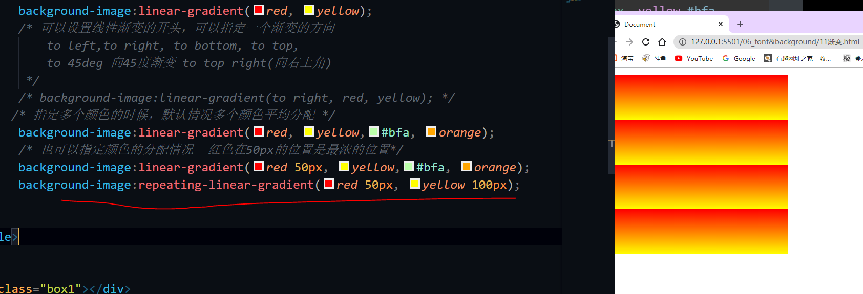
红色在50px的时候最浓,黄色在100px的时候最浓,渐变效果高度就是100-50 然后200 % 50 = 4 就有4个重复渐变出来。
径向渐变
效果是放射性的效果
background-image:radial-gradient(red*, yellow);
<!DOCTYPE html>
<html lang="en">
<head>
<meta charset="UTF-8">
<meta name="viewport" content="width=device-width, initial-scale=1.0">
<title>Document</title>
<style>
.box1{
width:200px;
height:200px;
/* 1.默认情况下,径向渐变圆心的形状根据元素的形状来计算的
正方形- > 圆形
长方形- > 椭圆形
2.也可以自定义中心大小 100px 50px 宽度100px 高度50px
也可以指定给定的形状:
circle,ellipse
3.也可以指定渐变的位置 at 100px 0 圆心在宽度是100px的位置 高度是0
(大小 at 位置,颜色 位置,颜色 位置...)
大小可选值:
1. circle 圆形
2. ellipse椭圆
3. closest-side 贴近近边
4. closest-corner 贴近近角
5. closest-side 贴近远边
6. closest-corner 贴近远角
位置可选值
1. 像素值
2.top / right / left / bottom / center
*/
background-image:radial-gradient(100px 50px at 100px 0 , red, green);
}
</style>
</head>
<body>
<div class="box1"></div>
</body>
</html>
title: 过渡transition、变形translate与旋转ratate
date: 2021-01-21 09:29:37
tags:
- [前端]
- [Html]
- [Css]
过渡transition
<!DOCTYPE html>
<html lang="en">
<head>
<meta charset="UTF-8">
<meta name="viewport" content="width=device-width, initial-scale=1.0">
<title>Document</title>
<style>
*{
margin: 0;
padding: 0;
}
.box1{
width:800px;
height: 800px;
background-color: silver;
overflow: hidden;
}
.box1 div{
width:100px;
height:100px;
margin-bottom:100px;
}
.box2{
background-color:#bfa;
}
.box1:hover .box2{
width:200px;
height:200px;
}
</style>
</head>
<body>
<div class="box1">
<div class="box2"></div>
<div class="box3"></div>
</div>
</body>
</html>
通过过渡可以指定一个属性发生变化时的切换方式 效果,提升用户的体验 transition-property: 指定要执行过渡的属性 多个属性间使用,隔开 如果所有属性都需要过渡,则使用all关键字 大部分属性都支持过渡效果(只要是可以计算的值都可以,比如颜色都可以) 注意过渡时必须是从一个有效数值向另外一个有效数值进行过渡
/* transition-property: height , width; */
/* transition-property: all; */
<!--more-->
其它: transition-duration: 指定过渡效果的持续时间 时间单位:s 和 ms 1s = 1000ms
/* transition-duration: 100ms, 2s; */
/* transition-duration: 2s; */
transition-timing-function: 过渡的时序函数 指定过渡的执行的方式 可选值:
-
ease 默认值,慢速开始,先加速,再减速
-
linear 匀速运动
-
ease-in 加速运动
-
ease-out 减速运动
-
ease-in-out 先加速 后减速
-
cubic-bezier() 来指定时序函数
https://cubic-bezier.com
-
steps() 分步执行过渡效果 可以设置一个第二个值: end , 在时间结束时执行过渡(默认值) start , 在时间开始时执行过渡
/* transition-timing-function: cubic-bezier(.24,.95,.82,-0.88); */
/* transition-timing-function: steps(2, start); */
transition-delay: 过渡效果的延迟,等待一段时间后在执行过渡 /* transition-delay: 2s; */ transition 可以同时设置过渡相关的所有属性,只有一个要求,如果要写延迟,则两个时间中第一个是持续时间,第二个是延迟 */ transition:2s margin-left 1s cubic-bezier(.24,.95,.82,-0.88);
动画
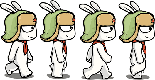
利用上面的过渡,可以实现兔子在鼠标移入后动起来:
<!DOCTYPE html>
<html lang="en">
<head>
    <meta charset="UTF-8">
    <meta name="viewport" content="width=device-width, initial-scale=1.0">
    <title>Document</title>
    <style>
        .box1{
            height:271px;
            width:132px;
            margin:0 auto;
            background-image:url(../exercise/img/11/bigtap-mitu-queue-big.png);
            background-position:0 0;
            transition:0.3s steps(3);
        }
        .box1:hover{
            background-position:-396px 0;
        }
    </style>
</head>
<body>
    <div class="box1">
    </div>
</body>
</html>
那么如何做到兔子一直在动呢?动画
动画和过渡类似,都是可以实现一些动态的效果,
不同的是过渡需要在某个属性发生变化时才会触发
动画可以自动触发动态效果
设置动画效果,必须先要设置一个关键帧,关键帧设置了动画执行每一个步骤(比如一秒钟切换十个帧,连续起来就是动画)
用@keyframes name设置关键帧
        @keyframes test {
            /* from表示动画的开始位置 也可以使用 0% */
            from{
                /*开始位置是margin-left=0 这个值不一定就是元素的真实位置,而是动画的开启位置,动画开启时,这个元素会移动到这个位置,不代表他原来就在这个位置*/
                margin-left: 0;
                background-color: orange;
            }
            /* to动画的结束位置 也可以使用100%*/
            to{
                background-color: red;
                margin-left: 700px;
            }
        }
设置好关键帧后,为某一个选择器设置此关键帧
.box2{
background-color: #bfa;
animation: test 2s 2 1s alternate;
}
animation-name: 要对当前元素生效的关键帧的名字
/* animation-name: test;
animation-duration: 动画的执行时间 animation-duration: 4s;
动画的延时animation-delay: 2s;
animation-timing-function: ease-in-out;:指定过渡时序函数
animation-iteration-count 动画执行的次数 可选值:
1.  次数
2.  infinite 无限执行
animation-iteration-count: 1;// 执行一次
animation-direction:指定动画运行的方向 可选值:
-
normal 默认值 从 from 向 to运行 每次都是这样
-
reverse 从 to 向 from 运行 每次都是这样
-
alternate 从 from 向 to运行 重复执行动画时反向执行
-
alternate-reverse 从 to 向 from运行 重复执行动画时反向执行
animation-direction: alternate-reverse;
animation-play-state: 设置动画的执行状态 ,用来控制动画的开启和暂停 可选值: 1. running 默认值 动画执行 2. paused 动画暂停 animation-play-state: paused;
animation-fill-mode: 动画的填充模式 可选值:
1. none 默认值 动画执行完毕元素回到原来位置
2. forwards 动画执行完毕元素会停止在动画结束的位置
3. backwards 动画延时等待时,元素就会处于开始位置
4. both 结合了forwards 和 backwards
    ` animation-fill-mode: both; `
奔跑的少年
这里关键帧的to可以直接写图片的宽度就可以,因为背景图片默认是平铺的,如果第一个帧位置是 0 0,那么就会被接到后面去。
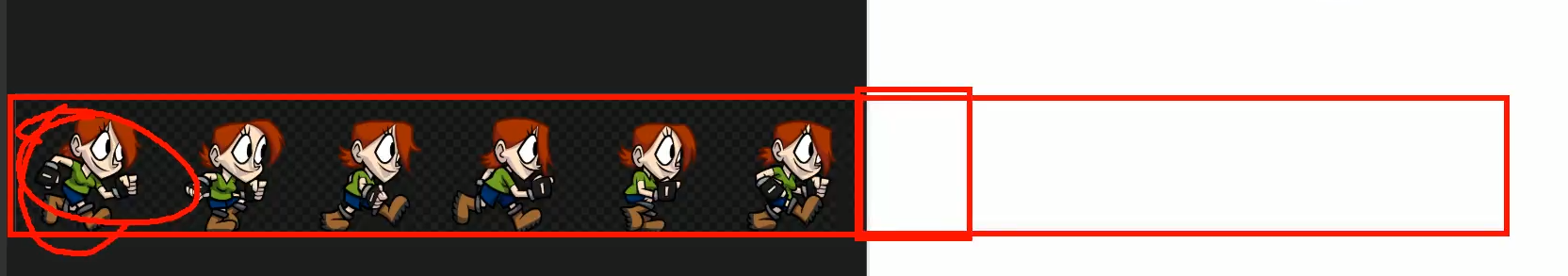
奔跑的米兔:
<!DOCTYPE html>
<html lang="en">
<head>
<meta charset="UTF-8">
<meta name="viewport" content="width=device-width, initial-scale=1.0">
<title>Document</title>
<style>
@keyframes mitu {
from {
background-position: 0 0;
}
to {
background-position: -528px 0;
}
}
.box1 {
height: 271px;
width: 132px;
margin: 0 auto;
background-image: url(../exercise/img/11/bigtap-mitu-queue-big.png);
background-position: 0 0;
animation-name: mitu;
animation-duration: 0.3s;
/*图片宽度就是528,然后有四个兔子,这里直接写4步就可以,不需要减少一个兔子的宽度*/
animation-timing-function: steps(4);
animation-direction: normal;
animation-iteration-count:infinite;
}
</style>
</head>
<body>
<div class="box1"></div>
</body>
</html>
弹力球:
<!DOCTYPE html>
<html lang="en">
<head>
<meta charset="UTF-8">
<meta name="viewport" content="width=device-width, initial-scale=1.0">
<meta http-equiv="X-UA-Compatible" content="ie=edge">
<title>Document</title>
<style>
.outer{
height: 500px;
border-bottom: 10px black solid;
margin: 50px auto;
overflow: hidden;
}
.outer div{
float: left;
width: 100px;
height: 100px;
border-radius: 50%;
background-color: #bfa;
animation: ball .5s forwards linear infinite alternate;
}
div.box2{
background-color: orange;
animation-delay: .1s;
}
div.box3{
background-color: yellow;
animation-delay: .2s;
}
div.box4{
background-color: yellowgreen;
animation-delay: .3s;
}
div.box5{
background-color: blue;
animation-delay: .4s;
}
div.box6{
background-color: pink;
animation-delay: .5s;
}
div.box7{
background-color: tomato;
animation-delay: .6s;
}
div.box8{
background-color: skyblue;
animation-delay: .7s;
}
div.box9{
background-color: chocolate;
animation-delay: .8s;
}
/* 创建小球下落的动画 */
@keyframes ball {
from{
margin-top: 0;
}
to{
margin-top: 400px;
}
/* 2 to{
margin-top: 400px;
animation-timing-function: ease-in;
}
40%{
margin-top: 100px;
}
80%{
margin-top: 200px;
} */
}
</style>
</head>
<body>
<div class="outer">
<div class="box1"></div>
<div class="box2"></div>
<div class="box3"></div>
<div class="box4"></div>
<div class="box5"></div>
<div class="box6"></div>
<div class="box7"></div>
<div class="box8"></div>
<div class="box9"></div>
</div>
</body>
</html>
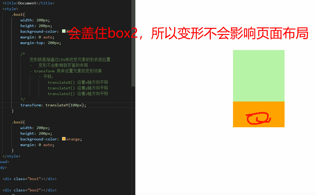
变形transform
存在三个轴:
变形就是通过CSS改变元素形状或者位置,变形不会影响到页面的布局
translateX():沿着X轴方向平移
translateY():沿着Y轴方向平移
translateZ():沿着Z轴方向平移
如果是使用百分比,是相对于自身计算的,比如transform:translateX(50%)往X轴正方向平移元素宽度的50%(向右)
可以用来解决当没有设置元素的宽高度,又想将元素居中的时候,使用绝对定位就不能解决这个问题,比如这里box3有三个字aaa,没有设置宽高,现在想在屏幕中居中,当我们用之前的那个方法的时候,就会失败:
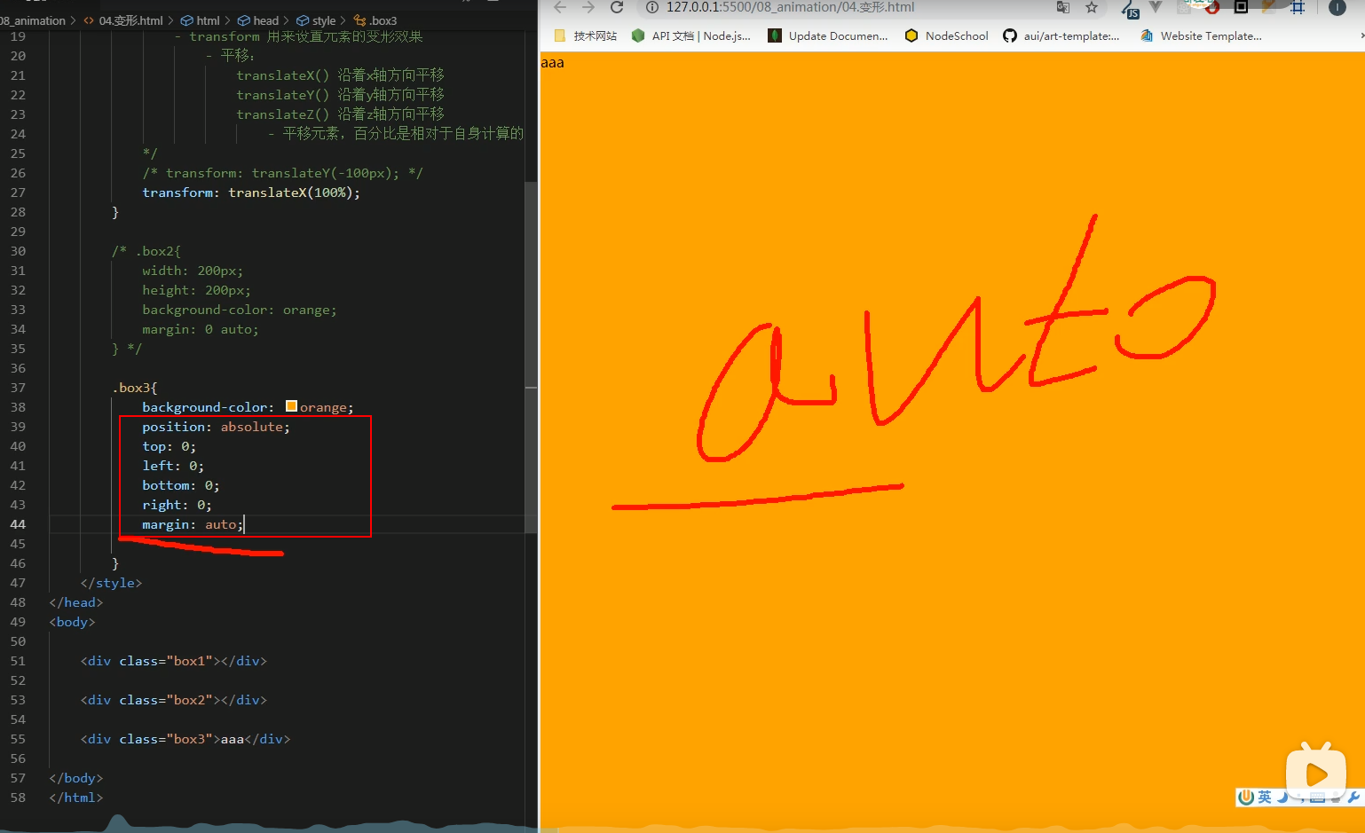
通过translate来使元素居中,即使没有设置宽高
.box3{
    background-color:orange;
    position:absolute;
    left:50%;
    top:50%;
    transform:translateX(-50%), translateY(-50%)
}
<!DOCTYPE html>
<html lang="en">
<head>
    <meta charset="UTF-8">
    <meta name="viewport" content="width=device-width, initial-scale=1.0">
    <title>Document</title>
    <style>
        .box3{
            background-color:orange;
            position:absolute;
            left:50%;
            top:50%;
            transform:translateX(-50%) translateY(-50%);
        }
    </style>
</head>
<body>

    <div class="box3">
        aaadsaaaaaaaaaaaaaadsaaaaaaaaaaaaaaaaaaaaaaaaaaaaaaaaaaa<br>dasdasdasdasd<br>dasdas<br>das<br>
    </div>
</body>
</html>
设置平移飘出效果
<!DOCTYPE html>
<html lang="en">
<head>
<meta charset="UTF-8">
<meta name="viewport" content="width=device-width, initial-scale=1.0">
<title>Document</title>
<style>
body{
background-color:antiquewhite
}
.box1{
width:220px;
height:300px;
background-color:#fff;
transition:transform 0.3s;
margin:0 auto;
}
.box1:hover{
/*鼠标移入后设置平移*/
transform:translateY(-10px) translateX(-10px);
box-shadow:0 0 10px rgba(0,0,0,0.3);
}
</style>
</head>
<body>
<div class="box1"></div>
</body>
</html>
而对于z轴平移,调整的是元素和人眼之间的距离,Z轴属于立体效果,近大远小,默认网页是不支持透视的,所以需要设置网页的视距
html{
perspective:800px;
}
<!DOCTYPE html>
<html lang="en">
<head>
<meta charset="UTF-8">
<meta name="viewport" content="width=device-width, initial-scale=1.0">
<meta http-equiv="X-UA-Compatible" content="ie=edge">
<title>Document</title>
<style>
html{
/* 设置当前网页的视距为800px,人眼距离网页的距离 */
perspective: 800px;
}
body{
border: 1px red solid;
background-color: rgb(241, 241, 241);
}
.box1{
width: 200px;
height: 200px;
background-color: #bfa;
margin: 200px auto;
/*
z轴平移,调整元素在z轴的位置,正常情况就是调整元素和人眼之间的距离,
距离越大,元素离人越近
z轴平移属于立体效果(近大远小),默认情况下网页是不支持透视,如果需要看见效果
必须要设置网页的视距
*/
transition:2s;
}
body:hover .box1{
transform: translateZ(800px);
}
</style>
</head>
<body>
<div class="box1"></div>
</body>
</html>
旋转
通过旋转,可以使元素沿着x y 或者z旋转指定的角度
transform:ratate(90deg)顺时针旋转90度
-
rotateX()
-
rotateY()
-
rotateZ()
transform: rotateZ(45deg);// 顺时针旋转45度
transform: rotateZ(.25turn);
transform: rotateY(180deg) translateZ(400px);
transform: translateZ(400px) rotateY(180deg) ;
backface-visibility:visible/hidden:设置元素旋转的背面是否显示
时钟练习
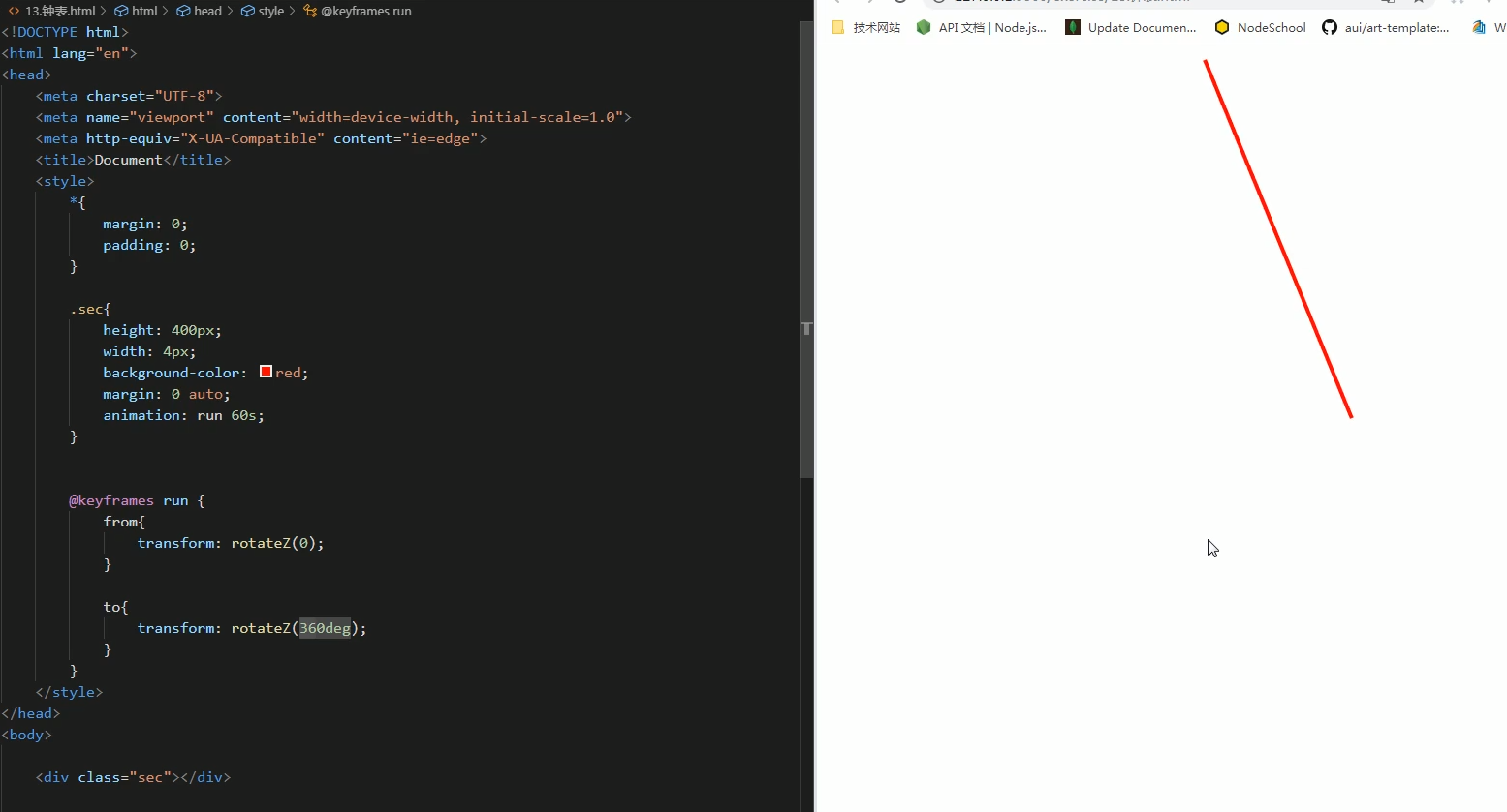
如何让指针固定一个地方来旋转?
<!DOCTYPE html>
<html lang="en">
<head>
    <meta charset="UTF-8">
    <meta name="viewport" content="width=device-width, initial-scale=1.0">
    <title>Document</title>
    <style>
        *{
            margin:0;
            padding:0;
        }
        .sec-wrapper{
            width:500px;
            height:500px;
            animation:run 60s;
        }
        .sec{
            height:250px;
            width:4px;
            background-color:Red;
            margin:0 auto;
        }
        @keyframes run{
            form{
                transform:rotateZ(0);
            }
            to{
                transform:rotateZ(360deg);
            }
        }
    </style>
</head>
<body>
    <!--实际上旋转的是父元素sec-wrapper,指针在父元素里面跟着转-->
    <div class="sec-wrapper">
        <div class="sec"></div>
    </div>
</body>
</html>
完整的时钟,这里设置了10s为一秒:
<!DOCTYPE html>
<html lang="en">
<head>
<meta charset="UTF-8">
<meta name="viewport" content="width=device-width, initial-scale=1.0">
<title>Document</title>
<style>
* {
margin: 0;
padding: 0;
}
.clock {
width: 500px;
height: 500px;
margin: 0 auto;
margin-top: 100px;
border-radius: 50%;
border: 10px solid black;
position: relative;
background-image:url("bg3.jpg");
background-size:cover;
}
.clock>div {
position: absolute;
top: 0;
left: 0;
bottom: 0;
right: 0;
margin: auto;
}
.hour-wrapper {
height: 70%;
width: 70%;
/* background-color:#bfa; */
animation: run 7200s linear infinite;
}
.hour {
height: 50%;
width: 6px;
background-color: red;
margin: 0 auto;
}
/* 设置分针 */
.min-wrapper {
height: 80%;
width: 80%;
animation: run 600s steps(60) infinite;
}
.min {
height: 50%;
width: 4px;
background-color: blue;
margin: 0 auto;
}
/* 设置秒针 */
.sec-wrapper {
height: 90%;
width: 90%;
animation: run 10s steps(60) infinite;
}
.sec {
height: 50%;
width: 2px;
background-color: black;
margin: 0 auto;
}
@keyframes run {
form {
transform: rotateZ(0);
}
to {
transform: rotateZ(360deg);
}
}
</style>
</head>
<body>
<div class="clock">
<div class="hour-wrapper">
<div class="hour"></div>
</div>
<div class="min-wrapper">
<div class="min"></div>
</div>
<div class="sec-wrapper">
<div class="sec"></div>
</div>
</div>
</body>
</html>
缩放scaleX/Y/Z
transform:scale()/scaleX()/scaleY()
对元素进行缩放的函数: scaleX() 水平方向缩放 scaleY() 垂直方向缩放 scale() 双方向的缩放
transform-origin:20px 20px / center; 变形的原点 默认值 center/
transform-origin:left center:容器的左边中间点
<!DOCTYPE html>
<html lang="en">
<head>
<meta charset="UTF-8">
<meta name="viewport" content="width=device-width, initial-scale=1.0">
<meta http-equiv="X-UA-Compatible" content="ie=edge">
<title>Document</title>
<style>
html{
perspective:800px;
}
.box1{
width: 100px;
height: 100px;
background-color: #bfa;
transition:2s;
margin: 100px auto;
}
.box1:hover{
transform:scale(2)
}
.img-wrapper{
width: 200px;
height: 200px;
border: 1px red solid;
overflow: hidden;
}
img{
transition: .2s;
}
.img-wrapper:hover img{
transform:scale(1.2);
}
</style>
</head>
<body>
<div class="box1"></div>
<div class="img-wrapper">
<img src="an.jpg" width="100%">
</div>
</body>
</html>


 2508
2508


 被折叠的 条评论
为什么被折叠?
被折叠的 条评论
为什么被折叠?
 到【灌水乐园】发言


