Android自定义View之组合控件-仿电商app顶部栏
继承LinearLayout实现的类似淘宝等电商项目的头部栏
效果图
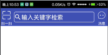
分析:左右两边可以是TextView和Button,设置drawableTop即可,中间的看着像是EditText,但是用过淘宝天猫等类似app的话会发现点击搜索不是在当前Activity进行搜索的,是跳转到另外的页面进行的,所以用TextView然后设置背景即可.
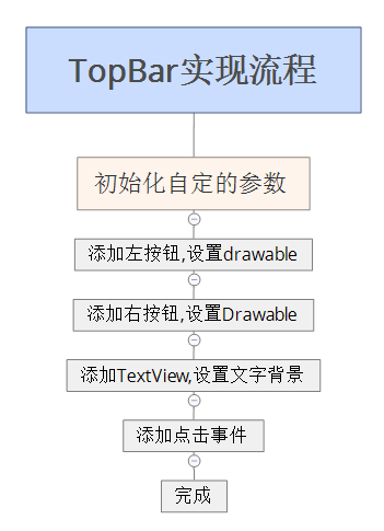
实现流程
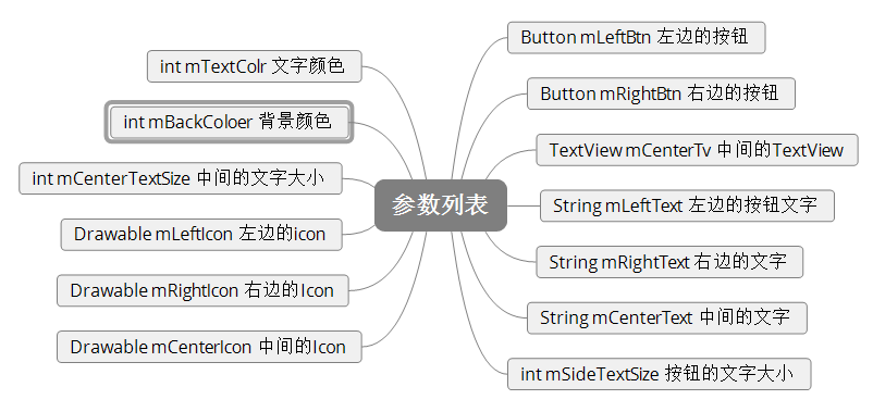
参数列表
设置属性文件:values下建立attrs.xml文件,添加需要自定义的属性.
<?xml version="1.0" encoding="utf-8"?>
<resources>
<declare-styleable name="TopBar">
<attr name="left_text" format="string" /
<attr name="right_text" format="string" />
<attr name="center_text" format="string" /
<attr name="side_text_size" format="dimension" /
<attr name="center_text_size" format="dimension" /
<attr name="text_color" format="color" /
<attr name="back_color" format="color" /
<attr name="left_icon" format="reference" /
<attr name="right_icon" format="reference" /
<attr name="center_icon" format="reference" /
</declare-styleable>
</resources>
代码中获取布局文件中设置的属性:
TypedArray array = getContext().obtainStyledAttributes(attrs, R.styleable.TopBar)
mLeftText = array.getString(R.styleable.TopBar_left_text)
mRightText = array.getString(R.styleable.TopBar_right_text)
mCenterText = array.getString(R.styleable.TopBar_center_text)
side_text_size = (int) array.getDimension(R.styleable.TopBar_side_text_size, 10)
center_text_size = (int) array.getDimension(R.styleable.TopBar_center_text_size, 15)
mLeft_icon = array.getDrawable(R.styleable.TopBar_left_icon)
mRight_icon = array.getDrawable(R.styleable.TopBar_right_icon)
mCenter_icon = array.getDrawable(R.styleable.TopBar_center_icon)
text_color = array.getColor(R.styleable.TopBar_text_color, getResources().getColor(R.color.colorAccent))
back_color = array.getColor(R.styleable.TopBar_back_color, getResources().getColor(R.color.colorPrimary))
array.recycle()
设置背景颜色:
setBackgroundColor(back_color);
添加按钮:
mLeftButton = new Button(getContext());
mLeftButton.setText(mLeftText);
mLeftButton.setTextSize(side_text_size);
mLeftButton.setTextColor(text_color);
mLeftButton.setBackgroundColor(Color.TRANSPARENT);
LayoutParams leftParams = new LayoutParams(80, 150);
mLeft_icon.setBounds(0, 0, 55, 55);
mLeftButton.setCompoundDrawables(null, mLeft_icon, null, null);
mLeftButton.setGravity(Gravity.CENTER);
addView(mLeftButton, leftParams);
mRightButton = new Button(getContext());
mRightButton.setText(mRightText);
mRightButton.setTextSize(side_text_size);
mRightButton.setTextColor(text_color);
mRightButton.setBackgroundColor(Color.TRANSPARENT);
mRight_icon.setBounds(0, 0, 55, 55);
LayoutParams rightParams = new LayoutParams(80, 150);
mRightButton.setCompoundDrawables(null, mRight_icon, null, null);
mRightButton.setGravity(Gravity.CENTER);
addView(mRightButton, rightParams);
添加中间的TextView:(布局的排列是按添加顺序的,所以中间TextVIew的添加应该是在两个按钮中间的):
mCenterTextView = new TextView(getContext());
mCenterTextView.setText(mCenterText);
mCenterTextView.setTextSize(center_text_size);
mCenterTextView.setTextColor(text_color);
mCenterTextView.setGravity(Gravity.CENTER_VERTICAL | Gravity.LEFT);
mCenter_icon.setBounds(0, 0, 50, 50);
mCenterTextView.setCompoundDrawables(mCenter_icon, null, null, null);
LayoutParams params = new LayoutParams(0, 70);
params.weight = 1;
params.gravity = Gravity.CENTER;
params.setMargins(10, 0, 10, 0);
addView(mCenterTextView, params);
处理高度的wrap_content属性
重写onMeasure属性,对wrap_content设置一个指定值
@Override
protected void onMeasure(int widthMeasureSpec, int heightMeasureSpec) {
super.onMeasure(widthMeasureSpec, heightMeasureSpec);
int specWidth = MeasureSpec.getSize(widthMeasureSpec);
int specHeight = MeasureSpec.getSize(heightMeasureSpec);
int heightMode = MeasureSpec.getMode(heightMeasureSpec);
int height = 0;
if (heightMode == MeasureSpec.EXACTLY) {
height = specHeight;
} else {
height = 120;
if (heightMode == MeasureSpec.AT_MOST) {
height = Math.min(specHeight, 120);
}
}
setMeasuredDimension(specWidth, height);
}
添加点击事件
需要自定义一个回调
public interface onClick {
        void onLeftButtonClick();

        void onCenterButtonClick();

        void onRightButtonClick();
    }
创建一个回调并创建setX方法
private onClick onClick;

    public void setOnClick(TopBar.onClick onClick) {
        this.onClick = onClick;
    }
在添加按钮的时候添加点击事件
mLeftButton.setOnClickListener(new OnClickListener() {
            @Override
            public void onClick(View v) {
                if (onClick != null) {
                    onClick.onLeftButtonClick();
                }
            }
        });
mCenterTextView.setOnClickListener(new OnClickListener() {
            @Override
            public void onClick(View v) {
                if (onClick != null) {
                    onClick.onCenterButtonClick();
                }
            }
        });
 mRightButton.setOnClickListener(new OnClickListener() {
            @Override
            public void onClick(View v) {
                if (onClick != null) {
                    onClick.onRightButtonClick();
                }
            }
        });
至此自定义的组合控件就完成了,下面贴一下使用的方法:
布局文件:
    <com.brioa.diyviewtest.view.TopBar xmlns:app="http://schemas.android.com/apk/res-auto"
        android:id="@+id/topBar"
        android:layout_width="match_parent"
        android:layout_height="wrap_content"
        android:layout_alignParentTop="true"
        app:center_icon="@mipmap/ic_search"
        app:center_text="输入关键字检索"
        app:center_text_size="10sp"
        app:left_icon="@mipmap/ic_scan"
        app:left_text="扫一扫"
        app:right_icon="@mipmap/ic_msg"
        app:right_text="消息"
        app:side_text_size="6sp"
        app:text_color="#ffff">

    </com.brioa.diyviewtest.view.TopBar>
代码设置:
mTopBar = (TopBar) findViewById(R.id.topBar);
        mTopBar.setOnClick(new TopBar.onClick() {
            @Override
            public void onLeftButtonClick() {
                Toast.makeText(mContext, "LeftClick", Toast.LENGTH_SHORT).show();
            }

            @Override
            public void onCenterButtonClick() {
                Toast.makeText(mContext, "CenterClick", Toast.LENGTH_SHORT).show();

            }

            @Override
            public void onRightButtonClick() {
                Toast.makeText(mContext, "RightClick", Toast.LENGTH_SHORT).show();

            }
        });
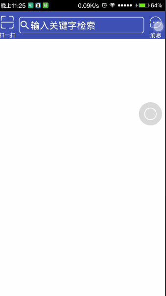
最终效果:
完毕~


 1010
1010

 被折叠的 条评论
为什么被折叠?
被折叠的 条评论
为什么被折叠?
 到【灌水乐园】发言


