


@(Bootstrap)[网页]
##导言 > 关于表单的应用自然不需要多说,只要您的的网站可以用户登录,那么不可能不用到表单!表单主要功能是用来与用户做交流的一个网页控件,JavaScript发明之初最大的作用也就是用来进行表单操作。所以表单是每一个前端开发者必须要熟练掌握的东西。 [toc] ##1.基础表单 表单控件会被自动赋予全局样式,设置了foem-control类的的`input`,textarea,select元素都被默认设置宽度属性width:100%。 将 label 元素和前面提到的控件包裹在 .form-group 中可以获得最好的排列。<form>
<div class="form-group">
<label for="exampleInputEmail1">邮箱:</label>
<input type="email" class="form-control" id="exampleInputEmail1" placeholder="快输入邮箱地址,不然我打你了">
</div>
<div class="form-group">
<label for="exampleInputPassword1">密码:</label>
<input type="password" class="form-control" id="exampleInputPassword1" placeholder="请输入密码,放心我会偷看的">
</div>
<div class="form-group">
<label for="exampleInputFile">File input</label>
<input type="file" id="exampleInputFile">
<p class="help-block">Example block-level help text here.</p>
</div>
<div class="checkbox">
<label>
<input type="checkbox"> Check me out
</label>
</div>
<button type="submit" class="btn btn-default">Submit</button>
</form>Example block-level help text here.
<form class="form-inline">
  <div class="form-group">
    <label for="exampleInputName2">Name</label>
    <input type="text" class="form-control" id="exampleInputName2" placeholder="Jane Doe">
  </div>
  <div class="form-group">
    <label for="exampleInputEmail2">Email</label>
    <input type="email" class="form-control" id="exampleInputEmail2" placeholder="jane.doe@example.com">
  </div>
  <button type="submit" class="btn btn-default">Send invitation</button>
</form><form class="form-horizontal">
<div class="form-group">
<label for="inputEmail3" class="col-sm-2 control-label">邮箱</label>
<div class="col-sm-10">
<input type="email" class="form-control" id="inputEmail3" placeholder="Email">
</div>
</div>
<div class="form-group">
<label for="inputPassword3" class="col-sm-2 control-label">我是密码</label>
<div class="col-sm-10">
<input type="password" class="form-control" id="inputPassword3" placeholder="Password">
</div>
</div>
<div class="form-group">
<div class="col-sm-offset-2 col-sm-10">
<div class="checkbox">
<label>
<`input` type="checkbox"> 不记住我你就死定了
</label>
</div>
</div>
</div>
<div class="form-group">
<div class="col-sm-offset-2 col-sm-10">
<button type="submit" class="btn btn-default">登陆</button>
</div>
</div>
</form><input type="text" class="form-control" placeholder="Text input"><textarea class="form-control" rows="3"></textarea>元素添加.form-control-static即可。
<form class="form-horizontal" role="form">
  <div class="form-group">
    <label class="col-sm-2 control-label">Email</label>
    <div class="col-sm-10">
      <p class="form-control-static">email@example.com</p>
    </div>
  </div>
  <div class="form-group">
    <label for="inputPassword" class="col-sm-2 control-label">Password</label>
    <div class="col-sm-10">
      <input type="password" class="form-control" id="inputPassword" placeholder="Password">
    </div>
  </div>
</form>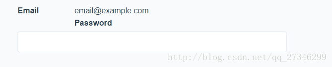
<input class="form-control" id="disabledInput" type="text" placeholder="Disabled input here..." disabled><div class="form-group has-success">
<label class="control-label" for="inputSuccess">Input with success</label>
<input type="text" class="form-control" id="inputSuccess">
</div>
<div class="form-group has-warning">
<label class="control-label" for="inputWarning">Input with warning</label>
<input type="text" class="form-control" id="inputWarning">
</div>
<div class="form-group has-error">
<label class="control-label" for="inputError">Input with error</label>
<input type="text" class="form-control" id="inputError">
</div>10.高度尺寸
通过.input-lg之类的class可以为控件设置高度,通过.col-lg-*之类的class可以为控件设置宽度。
创建大一些或小一些的表单控件以匹配按钮尺寸。
<input class="form-control input-lg" type="text" placeholder=".input-lg">
<input class="form-control" type="text" placeholder="Default input">
<input class="form-control input-sm" type="text" placeholder=".input-sm">

<select class="form-control input-lg">...</select>
<select class="form-control">...</select>
<select class="form-control input-sm">...</select>
…
…
…
参考:
Bootstrap官方文档
推酷文章


 扫一扫
扫一扫
 111
111

 被折叠的 条评论
为什么被折叠?
被折叠的 条评论
为什么被折叠?
 到【灌水乐园】发言


