


基本使用:
onClick:点击事件
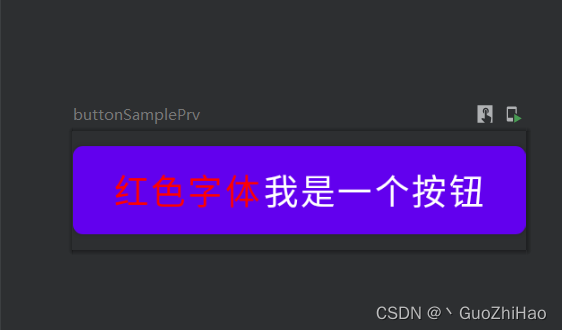
content:Button布局(默认是一个横向布局)
    Button(
        onClick = {
            //点击监听
            Log.i(TAG,"点击了文字Button")
        }) {
        /**
         * content:Button布局内容
         * 这里只设置了一个Text() 文本
         */
        Text(
            text = "红色字体",
            color = Color.Red
        )

        Text(
            text = "我是一个按钮",
            color = colorResource(id = R.color.white)
        )
    }
其他属性:
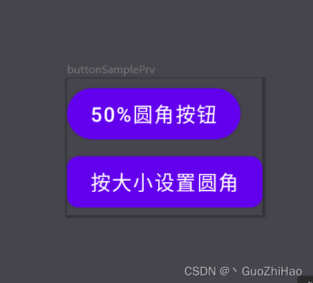
1、shape 设置按钮形状
设置圆角根据大小设置 shape = RoundedCornerShape(8.dp,8.dp,8.dp,8.dp))
        Button(
            onClick = {
                //点击监听
                Log.i(TAG,"点击了文字Button")
            },
            shape = RoundedCornerShape(8.dp,8.dp,8.dp,8.dp)) {
            /**
             * content:Button布局内容
             * 这里只设置了一个Text() 文本
             */
            Text(
                text = "我是一个按钮",
                color = colorResource(id = R.color.white)
            )
        }
设置圆角 根据百分比设置(取值范围0-100) shape = RoundedCornerShape(50,50,50,50)
 Button(
            onClick = {
                //点击监听
                Log.i(TAG,"点击了文字Button")
            },
            shape = RoundedCornerShape(50,50,50,50)) {
            /**
             * content:Button布局内容
             * 这里只设置了一个Text() 文本
             */
            Text(
                text = "我是一个按钮",
                color = colorResource(id = R.color.white)
            )
        }
CutCornerShape 裁减背景 shape = CutCornerShape(8.dp,8.dp,8.dp,8.dp)
2、border 设置按钮边框
        Button(
            onClick = {
                //点击监听
                Log.i(TAG,"点击了文字Button")
            },
            shape = RoundedCornerShape(8.dp,8.dp,8.dp,8.dp),
            border = BorderStroke(3.dp,Color.Red)
        ) {
            /**
             * content:Button布局内容
             * 这里只设置了一个Text() 文本
             */
            Text(
                text = "边框按钮",
                color = colorResource(id = R.color.white)
            )
        }
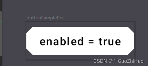
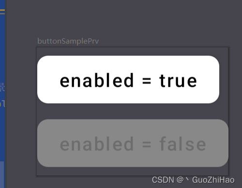
3、colors 设置Button在不同状态下时的颜色,既 enabled = false和enabled = true(默认) 时的颜色
        Button(
            enabled = false,
            onClick = {
                //点击监听
                Log.i(TAG,"点击了文字Button")
            },
            shape = RoundedCornerShape(8.dp,8.dp,8.dp,8.dp),
            colors = ButtonDefaults.buttonColors(
                backgroundColor = Color.White,//设置enabled = true是 按钮背景颜色
                contentColor = Color.Black,//设置enabled = true是 按钮内容颜色
                disabledBackgroundColor = Color.Gray,//设置enabled = false 按钮背景颜色
                disabledContentColor = Color.Black.copy(alpha = 0.2f)) //设置enabled = false 按钮背景颜色
                //Color.Black.copy(alpha = 0.2f) 设置颜色透明度
                //注意:当按钮内容自己设置了颜色时,disabledContentColor 属性无效果,如:Text 设置了color,将会显示文本自己设置的颜色
        ) {
            /**
             * content:Button布局内容
             * 这里只设置了一个Text() 文本
             */
            Text(
                text = "enabled = false"
            )
        }
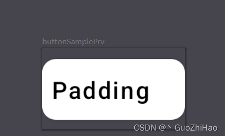
4、contentPadding 设置内边距
contentPadding = PaddingValues(start = 5.dp, end = 20.dp)
        Button(
            enabled = true,
            onClick = {
                //点击监听
                Log.i(TAG,"点击了文字Button")
            },
            shape = RoundedCornerShape(8.dp,8.dp,8.dp,8.dp),
            colors = ButtonDefaults.buttonColors(backgroundColor = Color.White,
                contentColor = Color.Black),
            contentPadding = PaddingValues(start = 5.dp, end = 20.dp)
        ) {
            /**
             * content:Button布局内容
             * 这里只设置了一个Text() 文本
             */
            Text(
                text = "Padding"
            )
        }


 520
520


 被折叠的 条评论
为什么被折叠?
被折叠的 条评论
为什么被折叠?
 到【灌水乐园】发言


