


一、CSS Positioning(定位)
1、Positioning(定位)
CSS定位属性允许你为一个元素定位。它也可以将一个元素放在另一个元素后面,并指定一个元素的内容太大时,应该发生什么。元素可以使用的顶部,底部,左侧和右侧属性定位。然而,这些属性无法工作,除非是先设定position属性。他们也有不同的工作方式,这取决于定位方法.有四种不同的定位方法。
2、Static 定位
HTML元素的默认值,即没有定位,元素出现在正常的流中。静态定位的元素不会受到top, bottom, left, right影响。
3、Fixed 定位
元素的位置相对于浏览器窗口是固定位置。即使窗口是滚动的它也不会移动:
<!DOCTYPE html>
<html>
<head>
<style>
p.pos_fixed
{
position:fixed;
top:30px;
right:5px;
}
</style>
</head>
<body>
<p class="pos_fixed">Some more text</p>
<p><b>Note:</b> IE7 and IE8 supports the fixed value only if a
!DOCTYPE is specified.</p>
<p>Some text</p><p>Some text</p><p>Some text</p><p>Some text</p><p>Some text</p><p>Some text</p><p>Some text</p><p>Some text</p><p>Some text</p><p>Some text</p><p>Some text</p><p>Some text</p><p>Some text</p><p>Some text</p><p>Some text</p><p>Some text</p>
</body>
</html>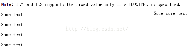

注意: Fixed 定位在 IE7 和 IE8 下需要描述 !DOCTYPE 才能支持.Fixed定位使元素的位置与文档流无关,因此不占据空间。Fixed定位的元素和其他元素重叠。
4、Relative 定位
相对定位元素的定位是相对其正常位置。特点:
(1)、相对于自身原有位置进行偏移
(2)、仍处于标准文档流中
(3)、随即拥有偏移属性和z-index属性
<!DOCTYPE html>
<html>
<head>
<style>
h2.pos_left
{
position:relative;
left:-20px;
}
h2.pos_right
{
position:relative;
left:20px;
}
</style>
</head>
<body>
<h2>This is a heading with no position</h2>
<h2 class="pos_left">This heading is moved left according to its normal position</h2>
<h2 class="pos_right">This heading is moved right according to its normal position</h2>
<p>Relative positioning moves an element RELATIVE to its original position.</p>
<p>The style "left:-20px" subtracts 20 pixels from the element's original left position.</p>
<p>The style "left:20px" adds 20 pixels to the element's original left position.</p>
</body>
</html>
可以移动的相对定位元素的内容和相互重叠的元素,它原本所占的空间不会改变。
<!DOCTYPE html>
<html>
<head>
<style>
h2.pos_top
{
position:relative;
top:-50px;
}
</style>
</head>
<body>
<h2>This is a heading with no position</h2>
<h2 class="pos_top">This heading is moved upwards according to its normal position</h2>
<p><b>Note:</b> Even if the content of the relatively positioned element is moved, the reserved space for the element is still preserved in the normal flow.</p>
</body>
</html>
相对定位元素经常被用来作为绝对定位元素的容器块。
5、Absolute 定位
绝对定位的元素的位置相对于最近的已定位父元素,如果元素没有已定位的父元素,那么它的位置相对于<html>。特点:
(1)、建立了以包含块为基准的定位
(2)、完全脱离了标准文档流
(3)、随即拥有偏移属性和z-index属性
<!DOCTYPE html>
<html>
<head>
<style>
h2
{
position:absolute;
left:100px;
top:150px;
}
</style>
</head>
<body>
<h2>This is a heading with an absolute position</h2>
<p>With absolute positioning, an element can be placed anywhere on a page. The heading below is placed 100px from the left of the page and 150px from the top of the page.</p>
</body>
</html>
Absolutely定位使元素的位置与文档流无关,因此不占据空间。Absolutely定位的元素和其他元素重叠。
absolute与fixed的区别:
(1)、偏移参照基准
absolute
无已定位祖先元素,以<html>为 偏移参照基准
有已定位祖先元素,以距其最近的已定位祖先元素为偏移参照基准
fixed
有、无已定位祖先元素,均以浏览器可视窗口为偏移参照基准
(2)、表现形式(产生滚动条时)
absolute
位置会随滚动条变化
fixed
位置固定,不会随滚动条变化
被他遮盖的元素,可以从其下穿过
6、重叠的元素
元素的定位与文档流无关,所以它们可以覆盖页面上的其它元素z-index属性指定了一个元素的堆叠顺序(哪个元素应该放在前面,或后面)一个元素可以有正数或负数的堆叠顺序:
<!DOCTYPE html>
<html>
<head>
<style>
img
{
position:absolute;
left:0px;
top:0px;
z-index:-1;
}
</style>
</head>
<body>
<h1>This is a heading</h1>
<img src="w3css.gif" width="100" height="140" />
<p>因为图像元素设置了 z-index 属性值为 -1, 所以它会显示在文字之后。</p>
</body>
</html>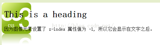
具有更高堆叠顺序的元素总是在较低的堆叠顺序元素的前面。注意: 如果两个定位元素重叠,没有指定z - index,最后定位在HTML代码中的元素将被显示在最前面。
二、CSS Float(浮动)
1、什么是 CSS Float(浮动)?
CSS 的 Float(浮动),会使元素向左或向右移动,其周围的元素也会重新排列。Float(浮动),往往是用于图像,但它在布局时一样非常有用。
2、元素怎样浮动
元素的水平方向浮动,意味着元素只能左右移动而不能上下移动。一个浮动元素会尽量向左或向右移动,直到它的外边缘碰到包含框或另一个浮动框的边框为止。浮动元素之后的元素将围绕它。浮动元素之前的元素将不会受到影响。
如果图像是右浮动,下面的文本流将环绕在它左边:
<!DOCTYPE html>
<html>
<head>
<style>
img
{
float:right;
}
</style>
</head>
<body>
<p>In the paragraph below, we have added an image with style <b>float:right</b>. The result is that the image will float to the right in the paragraph.</p>
<p>
<img src="logocss.gif" width="95" height="84" />
This is some text. This is some text. This is some text.
This is some text. This is some text. This is some text.
This is some text. This is some text. This is some text.
This is some text. This is some text. This is some text.
This is some text. This is some text. This is some text.
This is some text. This is some text. This is some text.
This is some text. This is some text. This is some text.
This is some text. This is some text. This is some text.
This is some text. This is some text. This is some text.
This is some text. This is some text. This is some text.
</p>
</body>
</html>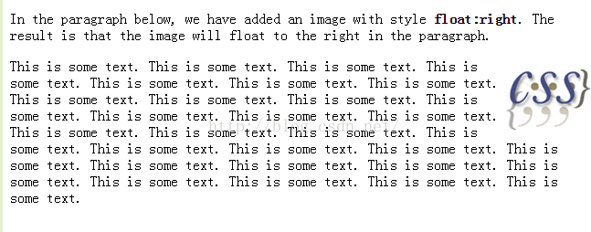
3、彼此相邻的浮动元素
如果你把几个浮动的元素放到一起,如果有空间的话,它们将彼此相邻。在这里,我们对图片廊使用 float 属性:
<!DOCTYPE html>
<html>
<head>
<style>
.thumbnail
{
float:left;
width:110px;
height:90px;
margin:5px;
}
</style>
</head>
<body>
<h3>Image Gallery</h3>
<p>Try resizing the window to see what happens when the images does not have enough room.</p>
<img class="thumbnail" src="/images/klematis_small.jpg" width="107" height="90">
<img class="thumbnail" src="/images/klematis2_small.jpg" width="107" height="80">
<img class="thumbnail" src="/images/klematis3_small.jpg" width="116" height="90">
<img class="thumbnail" src="/images/klematis4_small.jpg" width="120" height="90">
</body>
</html>
4、清除浮动 - 使用 clear
元素浮动之后,周围的元素会重新排列,为了避免这种情况,使用 clear 属性。clear 属性指定元素两侧不能出现浮动元素,也可以利用width:100%;overflow:hidden来清除。使用 clear 属性往文本中添加图片廊:
<!DOCTYPE html>
<html>
<head>
<style>
.thumbnail
{
float:left;
width:110px;
height:90px;
margin:5px;
}
.text_line
{
clear:both;
margin-bottom:2px;
}
</style>
</head>
<body>
<h3>Image Gallery</h3>
<p>Try resizing the window to see what happens when the images does not have enough room.</p>
<img class="thumbnail" src="/images/klematis_small.jpg" width="107" height="90">
<img class="thumbnail" src="/images/klematis2_small.jpg" width="107" height="80">
<img class="thumbnail" src="/images/klematis3_small.jpg" width="116" height="90">
<img class="thumbnail" src="/images/klematis4_small.jpg" width="120" height="90">
<h3 class="text_line">Second row</h3>
<img class="thumbnail" src="/images/klematis_small.jpg" width="107" height="90">
<img class="thumbnail" src="/images/klematis2_small.jpg" width="107" height="80">
<img class="thumbnail" src="/images/klematis3_small.jpg" width="116" height="90">
<img class="thumbnail" src="/images/klematis4_small.jpg" width="120" height="90">
</body>
</html>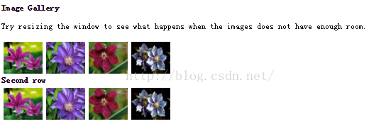
5、CSS 中所有的浮动属性
"CSS" 列中的数字表示不同的 CSS 版本(CSS1 或 CSS2)定义了该属性。
clear:指定不允许元素周围有浮动元素。 left、right、both、none、inherit
float:指定一个盒子(元素)是否可以浮动。 left、right、none、inherit
三、CSS 水平对齐(Horizontal Align)
1、块元素对齐
块元素是一个元素,占用了全宽,前后都是换行符。块元素的例子:<h1>、<p>、<div>
2、中心对齐,使用margin属性
块元素可以把左,右页边距设置为"自动"对齐。Note: 在IE8中使用margin:auto属性无法正常工作,除非声明 !DOCTYPEmargin属性可任意拆分为左,右页边距设置自动指定,结果都是出现居中元素:
<!DOCTYPE html>
<html>
<head>
<style>
.center
{
margin:auto;
width:70%;
background-color:#b0e0e6;
}
</style>
</head>
<body>
<div class="center">
<p>In my younger and more vulnerable years my father gave me some advice that I've been turning over in my mind ever since.</p>
<p>'Whenever you feel like criticizing anyone,' he told me, 'just remember that all the people in this world haven't had the advantages that you've had.'</p>
</div>
<p><b>Note: </b>Using margin:auto will not work in IE8, unless a !DOCTYPE is declared.</p>
</body>
</html>
提示: 如果宽度是100%,对齐是没有效果的。注意:IE5中块元素有一个margin处理BUG。为了使上述例子能工作,在IE5中,需要添加一些额外的代码。
3、使用position属性设置左,右对齐
元素对齐的方法之一是使用绝对定位:
<!DOCTYPE html>
<html>
<head>
<style>
.right
{
position:absolute;
right:0px;
width:300px;
background-color:#b0e0e6;
}
</style>
</head>
<body>
<div class="right">
<p>In my younger and more vulnerable years my father gave me some advice that I've been turning over in my mind ever since.</p>
<p>'Whenever you feel like criticizing anyone,' he told me, 'just remember that all the people in this world haven't had the advantages that you've had.'</p>
</div>
</body>
</html>
注意:绝对定位与文档流无关,所以它们可以覆盖页面上的其它元素。
4、Crossbrowser 兼容性问题
元素的填充,始终是一个好主意。这是为了避免在不同的浏览器中的可视化差异。IE8和早期有一个问题,当使用position属性时。如果一个容器元素(在本例中<div class="container">)指定的宽度,!DOCTYPE声明是缺失,IE8和早期版本会在右边增添17px的margin。这似乎是一个滚动的预留空间。使用position属性时始终设置在DOCTYPE声明中!
<!DOCTYPE html>
<html>
<head>
<style>
body
{
margin:0;
padding:0;
}
.container
{
position:relative;
width:100%;
}
.right
{
position:absolute;
right:0px;
width:300px;
background-color:#b0e0e6;
}
</style>
</head>
<body>
<div class="container">
<div class="right">
<p><b>Note: </b>When aligning using the position property, always include the !DOCTYPE declaration! If missing, it can produce strange results in IE browsers.</p>
</div>
</div>
</body>
</html>
5、使用float属性设置左,右对齐
使用float属性是对齐元素的方法之一:
<!DOCTYPE html>
<html>
<head>
<style>
.right
{
float:right;
width:300px;
background-color:#b0e0e6;
}
</style>
</head>
<body>
<div class="right">
<p>In my younger and more vulnerable years my father gave me some advice that I've been turning over in my mind ever since.</p>
<p>'Whenever you feel like criticizing anyone,' he told me, 'just remember that all the people in this world haven't had the advantages that you've had.'</p>
</div>
</body>
</html>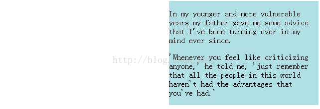
6、Crossbrowser兼容性问题
类似这样的元素对齐时,预先确定margin和元素的填充,始终是一个好主意。这是为了避免在不同的浏览器中的可视化差异。IE8和早期有一个问题,当使用float属性时。如果一个容器元素(在本例中<div class="container">)指定的宽度,!DOCTYPE声明是缺失,IE8和早期版本会在右边增添17px的margin。这似乎是一个滚动的预留空间。使用float属性时始终设置在DOCTYPE声明中!


 扫一扫
扫一扫
 1602
1602

 被折叠的 条评论
为什么被折叠?
被折叠的 条评论
为什么被折叠?
 到【灌水乐园】发言


