


转自:Android5.0之CoordinatorLayout的使用
CoordinatorLayout,中文译作协调者布局,光听这名字你可能很难判断出协调者布局有什么特点,那么我们来看看下面一张图片:
由于CSDN对图片大小的要求,我只能录制一个快速播放的动画,请大家见谅。但是显示效果大家应该都看到了,就是当在页面的上方有一个图片,当底部的控件向上滑动时,上方的图片慢慢的折叠起来,最终变成一个Toolbar,显示在页面的最上方。就这样一个简单的效果,如果自己用动画写也不是不可以,但是太麻烦,我们今天就来看看Google提供的CoordinatorLayout控件,只需要在布局文件中简单折腾两下,Java代码几乎不用写任何东西,就能实现这样的效果。
OK,那就开始吧。
1.整体概述
1.添加依赖
很明显这些都是design包中的,因此我们需要添加依赖:
- compile 'com.android.support:design:23.1.1'
2.页面分析
使用CoordinatorLayout时,我们的页面整体上分为两部分,一部分是上面折叠的东东,还有一部分是下面的滚动控件。上面折叠的这一部分我们需要写在一个AppBarLayout中,下面的滚动控件你有两种选择,要么使用NestedScrollView,要么使用RecyclerView。其他的滚动控件都是不可以实现的哦。
2.具体实现方式
1.AppBarLayout中的写法
整个头部我们都写在AppBarLayout中,但是要实现折叠效果还需要CollapsingToolbarLayout布局,事实上,我们在AppBarLayout中放一个CollapsingToolbarLayout,头部的ImageView和Toolbar都写在CollapsingToolbarLayout中,一个简单的示例如下:
- <android.support.design.widget.AppBarLayout
- android:layout_width="match_parent"
- android:layout_height="200dp">
- <android.support.design.widget.CollapsingToolbarLayout
- android:layout_width="match_parent"
- android:layout_height="200dp"
- app:contentScrim="@color/colorPrimary"
- app:layout_scrollFlags="scroll|enterAlwaysCollapsed|exitUntilCollapsed">
- <ImageView
- android:layout_width="match_parent"
- android:layout_height="match_parent"
- android:scaleType="centerCrop"
- android:src="@drawable/p1"/>
- <android.support.v7.widget.Toolbar
- android:id="@+id/tool_bar"
- android:layout_width="match_parent"
- android:layout_height="?attr/actionBarSize"></android.support.v7.widget.Toolbar>
- </android.support.design.widget.CollapsingToolbarLayout>
- </android.support.design.widget.AppBarLayout>
博客开始图片头部的显示效果就是这几行代码实现的。那么这里有几个属性我需要介绍一下:
app:contentScrim="@color/colorPrimary"表示当ImageView折叠后Toolbar的颜色,这里的颜色我们不可以直接在Toolbar中设置,因为Toolbar一开始是透明的,只有当ImageView折叠到Toolbar的高度时Toolbar才变为蓝色的。
app:layout_scrollFlags是一个非常重要的属性,它里边的取值主要有五种,下面我分别来解释:
1.scroll 表示CollapsingToolbarLayout可以滚动(不设置的话头部的ImageView将不能折叠)
2.enterAlways 表示底部的滚动控件只要向下滚动,头部就显示出来
3.enterAlwaysCollapsed 表示当底部滚动控件滚动见顶时,头部显示出来
4.exitUntilCollapsed 表示头部折叠到最小高度时(Toolbar的高度),就不再折叠
5.snap 表示在滑动过程中如果停止滑动,则头部会就近折叠(要么恢复原状,要么折叠成一个Toolbar)
OK,大家看博客开始时的gif图,当图片折叠时,其实是图片的顶部一直在慢慢的隐藏,底部并没有动,那么如果你想要修改这个效果,可以使用下面的属性:
app:layout_collapseMode="parallax"表示ImageView的折叠和CollapsingToolbarLayout的折叠不同步,那么这个不同步到底是怎样一个不同步法呢?还有另外一个参数来设置不同步的参数,如下:
app:layout_collapseParallaxMultiplier="0.5"表示视觉乘数,该数值的取值为0~1,数值越大,视觉差越大(如果这里的值为0,则在头部折叠的过程中,ImageView的顶部在慢慢隐藏,底部不动,如果这里的值为1,ImageView的顶部不懂,底部慢慢隐藏,如果这里的取值为0~1之间,则在折叠的过程中,ImageView的顶部和底部都会隐藏,但是头部和底部隐藏的快慢是不一样的,具体速度和视觉乘数有关)
app:layout_collapseMode这个属性还有一个取值,是pin,该属性表示当折叠完成时将该控件放在页面的头部.
OK ,配合上上面这几种属性,我们的一个较完整的头部应该是这样的:
- <android.support.design.widget.AppBarLayout
- android:layout_width="match_parent"
- android:layout_height="200dp">
- <android.support.design.widget.CollapsingToolbarLayout
- android:layout_width="match_parent"
- android:layout_height="200dp"
- app:contentScrim="@color/colorPrimary"
- app:layout_scrollFlags="scroll|enterAlwaysCollapsed|exitUntilCollapsed">
- <ImageView
- android:layout_width="match_parent"
- android:layout_height="match_parent"
- android:scaleType="centerCrop"
- android:src="@drawable/p1"
- app:layout_collapseMode="parallax"
- app:layout_collapseParallaxMultiplier="0.5"/>
- <android.support.v7.widget.Toolbar
- android:id="@+id/tool_bar"
- android:layout_width="match_parent"
- android:layout_height="?attr/actionBarSize"
- app:layout_collapseMode="pin"></android.support.v7.widget.Toolbar>
- </android.support.design.widget.CollapsingToolbarLayout>
- </android.support.design.widget.AppBarLayout>
另一方面,当我们在使用CollapsingToolbarLayout的时候,我们一般也不再是通过Toolbar来给页面设置title了,因为这个title能够实现的效果非常有限,那么我们怎么给页面设置Title呢?我们可以通过给CollapsingToolbarLayout设置如下属性来解决Title的问题:
app:title="MyToolBar" 表示给页面设置一个Toolbar
app:collapsedTitleGravity="right" 表示折叠之后Title显示的位置
app:expandedTitleGravity="left|bottom" 表示展开时Title显示的位置
如此设置之后我们来看一下头部显示的效果:
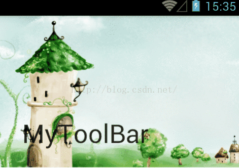
大家看到,当头部折叠之后,Title显示在了头部的右边。
OK,最后我们在来看一遍头部的完整代码:
- <android.support.design.widget.AppBarLayout
- android:layout_width="match_parent"
- android:layout_height="200dp">
- <android.support.design.widget.CollapsingToolbarLayout
- android:layout_width="match_parent"
- android:layout_height="200dp"
- app:title="MyToolBar"
- app:collapsedTitleGravity="right"
- app:expandedTitleGravity="left|bottom"
- app:contentScrim="@color/colorPrimary"
- app:layout_scrollFlags="scroll|enterAlwaysCollapsed|exitUntilCollapsed">
- <ImageView
- android:layout_width="match_parent"
- android:layout_height="match_parent"
- android:scaleType="centerCrop"
- android:src="@drawable/p1"
- app:layout_collapseMode="parallax"
- app:layout_collapseParallaxMultiplier="0.5"/>
- <android.support.v7.widget.Toolbar
- android:id="@+id/tool_bar"
- android:layout_width="match_parent"
- android:layout_height="?attr/actionBarSize"
- app:layout_collapseMode="pin"></android.support.v7.widget.Toolbar>
- </android.support.design.widget.CollapsingToolbarLayout>
- </android.support.design.widget.AppBarLayout>
2.底部滚动控件的写法
底部控件你有两种选择,一中是直接用RecyclerView,还有一种是用NestedScrollView,这里我选用NestedScrollView来做底部的滚动控件,如下:
- <android.support.v4.widget.NestedScrollView
- android:layout_width="match_parent"
- android:layout_height="match_parent"
- app:layout_behavior="@string/appbar_scrolling_view_behavior">
- <TextView
- android:layout_width="match_parent"
- android:layout_height="match_parent"
- android:text="@string/book_content"/>
- </android.support.v4.widget.NestedScrollView>
整体上来说还是很简单的,TextView要能够滚动,用一个NestedScrollView包裹起来即可,但是这里多了一个app:layout_behavior属性,这个属性的值是一个字符串,追踪字符串的值发现字符串的值如下:
android.support.design.widget.AppBarLayout$ScrollingViewBehavior这其实是一个类的地址,该类就是就是CoordinatorLayout中上下两部分配合工作的具体实现代码。
OK,整体上就是这样,最后大家要记得在使用CoordinatorLayout时一定要先将ActionBar隐藏起来,修改styles.xml文件,如下:
- <!-- Base application theme. -->
- <style name="AppTheme" parent="Theme.AppCompat.Light.DarkActionBar">
- <!-- Customize your theme here. -->
- <item name="colorPrimary">@color/colorPrimary</item>
- <item name="colorPrimaryDark">@color/colorPrimaryDark</item>
- <item name="colorAccent">@color/colorAccent</item>
- <item name="windowActionBar">false</item>
- <item name="windowNoTitle">true</item>
- </style>
OK,最后,我们再来看一眼完整的代码:
- <?xml version="1.0" encoding="utf-8"?>
- <android.support.design.widget.CoordinatorLayout
- xmlns:android="http://schemas.android.com/apk/res/android"
- xmlns:app="http://schemas.android.com/apk/res-auto"
- xmlns:tools="http://schemas.android.com/tools"
- android:layout_width="match_parent"
- android:layout_height="match_parent"
- tools:context="org.mobiletrain.coordinatorlayout.MainActivity">
- <android.support.design.widget.AppBarLayout
- android:layout_width="match_parent"
- android:layout_height="200dp">
- <android.support.design.widget.CollapsingToolbarLayout
- android:layout_width="match_parent"
- android:layout_height="200dp"
- app:title="MyToolBar"
- app:collapsedTitleGravity="right"
- app:expandedTitleGravity="left|bottom"
- app:contentScrim="@color/colorPrimary"
- app:layout_scrollFlags="scroll|enterAlwaysCollapsed|exitUntilCollapsed">
- <ImageView
- android:layout_width="match_parent"
- android:layout_height="match_parent"
- android:scaleType="centerCrop"
- android:src="@drawable/p1"
- app:layout_collapseMode="parallax"
- app:layout_collapseParallaxMultiplier="0.5"/>
- <android.support.v7.widget.Toolbar
- android:id="@+id/tool_bar"
- android:layout_width="match_parent"
- android:layout_height="?attr/actionBarSize"
- app:layout_collapseMode="pin"></android.support.v7.widget.Toolbar>
- </android.support.design.widget.CollapsingToolbarLayout>
- </android.support.design.widget.AppBarLayout>
- <android.support.v4.widget.NestedScrollView
- android:layout_width="match_parent"
- android:layout_height="match_parent"
- app:layout_behavior="@string/appbar_scrolling_view_behavior">
- <TextView
- android:layout_width="match_parent"
- android:layout_height="match_parent"
- android:text="@string/book_content"/>
- </android.support.v4.widget.NestedScrollView>
- </android.support.design.widget.CoordinatorLayout>
以上。


 1万+
1万+


 被折叠的 条评论
为什么被折叠?
被折叠的 条评论
为什么被折叠?
 到【灌水乐园】发言


