


- 文章信息 - Author: 李俊才 (jcLee95)
Visit me at CSDN: https://jclee95.blog.csdn.net
My WebSite:http://thispage.tech/
Email: 291148484@163.com.
Shenzhen China
Address of this article:https://blog.csdn.net/qq_28550263/article/details/138342846
HuaWei:https://bbs.huaweicloud.com/blogs/426721
组件库地址:
- Pub.Dev:https://pub.dev/packages/widgets_easier
- GitHub:https://github.com/jacklee1995/widgets_easier
- 国内访问(更新延迟):https://pub-web.flutter-io.cn/packages/widgets_easier
【介绍】:本文介绍Flutter Widgets Easier组件库中按钮组的使用方法。
目 录
1. 概述
1.1 关于Widgets Easier
本库是一个 Flutter 组件库,旨在提供用于Flutter开发的组件,使得开发者能够更简单地构建出更丰富地界面效果。项目地址为:
1.2 模块安装
在你的Flutter项目中,运行下面的命令:
flutter pub add widgets_easier
即可安装最新版本的 Widgets Easier 库。
2. 基本用法
Widgets Easier组件库中的按钮组是多个SemanticButton的集合,他们具有统一的语义,并且以紧密的方式进行排列。
2.1 在ButtonGroup中组合SemanticButton
ButtonGroup(
  buttons: [
    SemanticButton(
        text: 'Button 1', onTap: () => print('Button 1 pressed')),
    SemanticButton(
        text: 'Button 2', onTap: () => print('Button 2 pressed')),
    SemanticButton(
        text: 'Button 3', onTap: () => print('Button 3 pressed')),
    SemanticButton(
        text: 'Button 4', onTap: () => print('Button 4 pressed')),
  ],
  type: SemanticEnum.primary,
  size: SizeEnum.defaultSize,
)
其中,ButtonGroup的每一个按钮的事件回调函数是在 SemanticButton 的onTap属性上直接指定的。与之类似的是单个按钮的文本,是通过每一个SemanticButton的text参数直接指定。
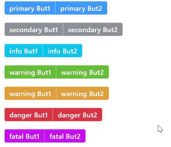
2.2 使用语义类型
类似于SemanticButton,你也可以为ButtonGroup指定不同的type属性获得具有不同含义颜色象征的按钮组。例如:
ButtonGroup(
  buttons: [
    SemanticButton(
        text: 'primary But1',
        onTap: () => print('primary But1 pressed')),
    SemanticButton(
        text: 'primary But2',
        onTap: () => print('primary But2 pressed')),
  ],
  type: SemanticEnum.primary,
),
const Gap(20),
ButtonGroup(
  buttons: [
    SemanticButton(
        text: 'secondary But1',
        onTap: () => print('secondary But1 pressed')),
    SemanticButton(
        text: 'secondary But2',
        onTap: () => print('secondary But2 pressed')),
  ],
  type: SemanticEnum.secondary,
),
const Gap(20),
ButtonGroup(
  buttons: [
    SemanticButton(
        text: 'info But1', onTap: () => print('info But1 pressed')),
    SemanticButton(
        text: 'info But2', onTap: () => print('info But2 pressed')),
  ],
  type: SemanticEnum.info,
),
const Gap(20),
ButtonGroup(
  buttons: [
    SemanticButton(
        text: 'warning But1',
        onTap: () => print('warning But1 pressed')),
    SemanticButton(
        text: 'warning But2',
        onTap: () => print('warning But2 pressed')),
  ],
  type: SemanticEnum.success,
),
const Gap(20),
ButtonGroup(
  buttons: [
    SemanticButton(
        text: 'warning But1',
        onTap: () => print('warning But1 pressed')),
    SemanticButton(
        text: 'warning But2',
        onTap: () => print('warning But2 pressed')),
  ],
  type: SemanticEnum.warning,
),
const Gap(20),
ButtonGroup(
  buttons: [
    SemanticButton(
        text: 'danger But1', onTap: () => print('danger But1 pressed')),
    SemanticButton(
        text: 'danger But2', onTap: () => print('danger But2 pressed')),
  ],
  type: SemanticEnum.danger,
),
const Gap(20),
ButtonGroup(
  buttons: [
    SemanticButton(
        text: 'fatal But1', onTap: () => print('fatal But1 pressed')),
    SemanticButton(
        text: 'fatal But2', onTap: () => print('fatal But2 pressed')),
  ],
  type: SemanticEnum.fatal,
),
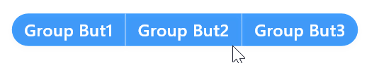
3. 按钮组圆角
通过为按钮组指定 radius 属性可以手动修改按钮组圆角。若不指定,默认圆角大小为4。一个手动指定按钮组圆角的示例如下:
ButtonGroup(
  radius: 20,
  buttons: [
    SemanticButton(text: 'Group But1', onTap: () {}),
    SemanticButton(text: 'Group But2', onTap: () => {}),
    SemanticButton(text: 'Group But3', onTap: () => {}),
  ],
)
4. 按钮组尺寸
类似于SemanticButton,ButtonGroup也可以使用枚举尺寸和数值尺寸两种方式来指定尺寸。
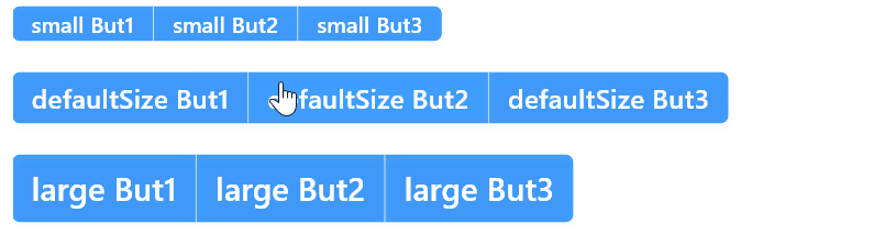
4.1 枚举尺寸
可以使用尺寸枚举值为按钮组指定尺寸。例如:
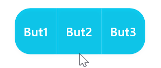
4.2 数值尺寸
数值尺寸是更加灵活的大小指定方式。一旦使用数值尺寸,则指定的枚举尺寸将自动失效。你可以通过height属性来指定数值尺寸,例如:
ButtonGroup(
  radius: 20,
  type: SemanticEnum.info,
  height: 60,
  buttons: [
    SemanticButton(text: 'But1', onTap: () {}),
    SemanticButton(text: 'But2', onTap: () => {}),
    SemanticButton(text: 'But3', onTap: () => {}),
  ],
)
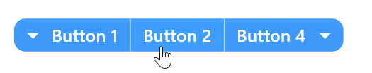
5. 使用前后缀图标
虽然ButtonGroup中可以有多个SemanticButton,但是在ButtonGroup上只能为第一个按钮添加前缀图标以及最后一个按钮添加后缀图标。这用起来十分简单,只需要为ButtonGroup指定prefixIcon参数或者suffixIcon参数。例如:
ButtonGroup(
  radius: 10,
  prefixIcon: const Icon(
    Icons.arrow_drop_down,
    color: Colors.white,
  ),
  suffixIcon: const Icon(
    Icons.arrow_drop_down,
    color: Colors.white,
  ),
  buttons: [
    SemanticButton(
      text: 'Button 1',
      onTap: () {},
    ),
    SemanticButton(
      text: 'Button 2',
      onTap: () {},
    ),
    SemanticButton(
      text: 'Button 4',
      onTap: () {},
    ),
  ],
  type: SemanticEnum.primary,
  size: SizeEnum.defaultSize,
)
6. 收缩行为
类似于SemanticButton,你可以为ButtonGroup指定收缩行为。这在类似于需要单个按钮组占满容器宽度的时候特别有用。例如,指定shrink参数值为false使按钮组占满整行:
ButtonGroup(
  shrink: false,
  radius: 10,
  prefixIcon: const Icon(
    Icons.arrow_drop_down,
    color: Colors.white,
  ),
  suffixIcon: const Icon(
    Icons.arrow_drop_down,
    color: Colors.white,
  ),
  buttons: [
    SemanticButton(
      text: 'Button 1',
      onTap: () {},
    ),
    SemanticButton(
      text: 'Button 2',
      onTap: () {},
    ),
    SemanticButton(
      text: 'Button 4',
      onTap: () {},
    ),
  ],
  type: SemanticEnum.primary,
  size: SizeEnum.defaultSize,
),

7. 有用的提示
按钮组ButtonGroup是由多个SemanticButton按照一定方式组织的整体。你可以为在ButtonGroup中的SemanticButton指定更多参数——语法这上没有错误。但是并不是每一个SemanticButton的参数在ButtonGroup中都会生效,因为在按钮组中需要按照自己的方式去进行管理。可以指定的主要是每一个按钮的文本、回调事件等,因为这些参数不属于整体,是单元特有的。


 934
934


 被折叠的 条评论
为什么被折叠?
被折叠的 条评论
为什么被折叠?
 到【灌水乐园】发言


