


制作动画有两种方法:1、animation+@keyframes,2、通过transition
animation+@keyframes
先看一个列子:

@keyframes moveX {
  50% {
    transform: translateX(200px);
  }
  100% {
    background-color: rgb(92, 19, 228);
  }
}
#test {
  width: 100px;
  height: 100px;
  background-color: brown;
  animation: moveX 2s linear both;
}
@keyframes:
CSS动画,也称关键帧动画。通过 @keyframes 来定义关键帧, @keyframes后面定义动画的名字。开发者不需要给出每一帧的定义。只需要定义一些关键的帧即可。因为其余的帧,浏览器会根据计时函数插值计算出来。可以通过百分比定义多个关键帧。
animation:
animation属性是以下8个属性的简写:
| animation-name | 规定需要绑定到选择器的 keyframe 名称。 |
| animation-duration | 规定完成动画所花费的时间,以秒或毫秒计。 |
| animation-timing-function | 规定动画的速度曲线。默认是ease。
|
| animation-delay | 规定在动画开始之前的延迟。 |
| animation-iteration-count | 规定动画应该播放的次数。无限播放时使用infinite |
| animation-direction | 指定动画播放的方向,默认为normal。 normal:默认值。 reverse: 表示动画反向播放。 alternate: 表示正向和反向交叉进行。 alternate-reverse: 表示反向和正向交叉进行。 |
| animation-play-state | 指定动画播放状态。 running:表示播放 paused:表示暂停
|
| animation-fill-mode | 指定动画填充模式,规定元素开始前和结束后处于什么状态。默认值为none none:动画完成后回到第一帧的状态 forwards:动画完成后元素状态保持为最后一帧的状态 backwards:有动画延迟时,动画开始前,元素状态保持为第一帧的状态 both:上述两者效果都有 |
在同一个元素上可以应用多个动画,中间用逗号隔开
@keyframes rotate {
  100% {
    transform: rotate(360deg);
  }
}
@keyframes color {
  50% {
    background: #06c;
  }
}
@keyframes width {
  100% {
    width: 300px;
  }
}
#test {
  width: 100px;
  height: 10px;
  background: brown;
  animation: rotate infinite, color infinite, width infinite;
  animation-duration: 2s;
  animation-direction: normal, normal, alternate;
}
例子:用动画实现的进度条效果
@keyframes moveX {
  100% {
    background-size: 100%;
  }
}
/* background-size和 background-repeat要放在background的后面*/
#test {
  width: 300px;
  height: 20px;
  border: solid 1px;
  background: linear-gradient(to right, #f60, rgb(149, 60, 1));
  background-repeat: no-repeat;
  background-size: 0;
  animation: moveX 5s linear forwards;
}
transition

#test {
  height: 20px;
  background: red;
  /* all表示所有的属性都需要应用动画,此处只有width才需要应用,所以可以写成width */
  /* transition: all linear 1s; */
  transition: width linear 1s;
  width: 100px;
}
#test:hover {
  width: 300px;
}
transition是以下四个属性的简写
| transition-property | 指定需要应用动画的css属性名,如果是all,则表示所有的属性都可以应用 |
| transition-duration | 需要指定多少秒或毫秒才能完成 |
| transition-timing-function | 规定动画的速度曲线。默认是ease。
跟animation-timing-function的值一样 |
| transition-delay | 规定在动画开始之前的延迟。 |
变形:transform属性
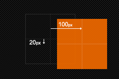
| 移动translate | translate(x,y):在x轴和y轴上同时移动 | transform: translate(100,200);
|
| translateX(x):在x轴上移动 | ||
| translateY(y):在y轴上移动 | ||
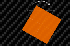
| 旋转rotate | rotate(<angle>) :通过指定的角度参数对原元素进行2D 旋转 | transform:rotate(30deg);
|
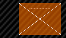
| 缩放scale | scale(x,y):在x轴和y轴上同时缩放 | transform: scale(0.5, 0.5);
|
| scaleX(x) :在x轴上缩放 | ||
| scaleY(y) :在y轴上缩放 | ||
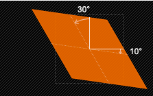
| 扭曲skew | skew(x,y):在x轴和y轴上同时扭曲 | transform:skew(30deg,10deg);
|
| skewX(<angle>) :在x轴上扭曲 | ||
| skewY(<angle>) :在y轴上扭曲 | ||
| 矩阵变形matrix | matrix(<number>, <number>, <number>, <number>, <number>, <number>) : 以一个含六值的(a,b,c,d,e,f)变换矩阵的形式指定一个2D变换,相当于直接应用一个[a b c d e f]变换矩阵。就是基于水平方向(X轴)和垂直方向(Y轴)重新定位元素,此属性值使用涉及到数学中的矩阵。 |
默认情况下,变形是以元素的中心点为基准的,可以通过transform-origin来改变基准点,下面看看其使用规则:
transform-origin(X,Y):用来设置元素运动的基准点。默认点是元素的中心点。其中X和Y的值可以是百分值,em,px,其中X也可以是字符参数值left,center,right;Y和X一样除了百分值外还可以设置字符值top,center,bottom。
/* 以左上角为基准点进行缩放 */
#test {
  height: 200px;
  background: red;
  transition: all linear 1s;
  width: 200px;
  transform-origin: left top;
}
#test:hover {
  transform: scale(0.5, 0.5);
}


 扫一扫
扫一扫


 1346
1346

 被折叠的 条评论
为什么被折叠?
被折叠的 条评论
为什么被折叠?
 到【灌水乐园】发言


