


1.首先在项目里面main.js全局引入echarts,或者在index.html里面自定义引入外部的echarts定制包文件,可以根据自己项目需求定制打包文件。
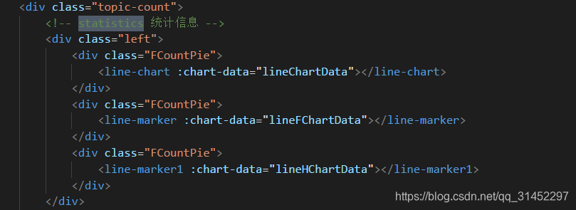
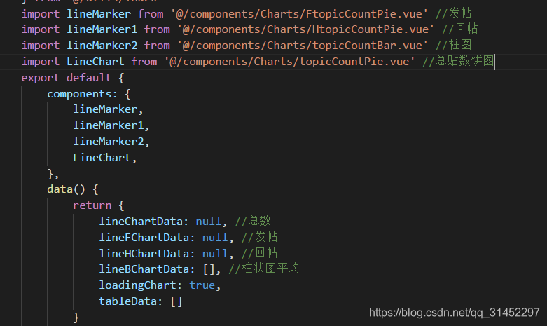
import echarts from 'echarts' //我这边是在项目图表组件中引入(贴饼图演示文件),如图
2.对数据进行处理之后

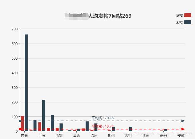
2.条形统计图
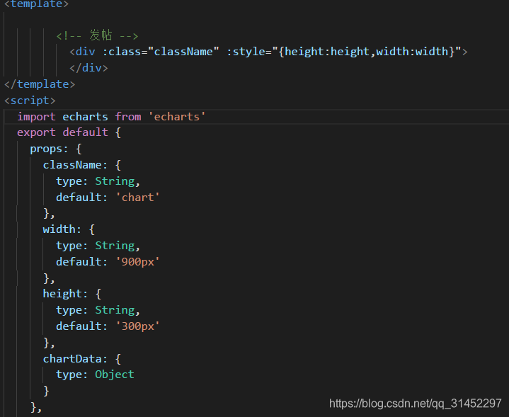
引入之后数据处理根据自己组件传过来的值进行操作,处理完成之后,进行图标操作
我这里显示了平均线,代码里面有注释
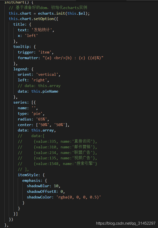
initChart() {
// 基于准备好的dom,初始化echarts实例
this.chart = echarts.init(this.$el)
this.chart.setOption({
title: {
text: '人均发帖'+this.myavPost+"回帖"+this.myavRep, //这个的显示我是特定显示,表示的是图表的标题文字
x: 'center'
},
symbol: 'triangle',
symbolSize: 8,
// color: ['#3398DB'],
// color: function(params) {
// var colorList = [
// '#C1232B', '#3398DB', '#FCCE10', '#E87C25', '#27727B',
// '#FE8463', '#9BCA63', '#FAD860', '#F3A43B', '#60C0DD',
// '#D7504B', '#C6E579', '#F4E001', '#F0805A', '#26C0C0'
// ];
// return colorList[params.dataIndex]
// },
tooltip: {
trigger: 'axis',
axisPointer: { // 坐标轴指示器,坐标轴触发有效
type: 'shadow' // 默认为直线,可选为:'line' | 'shadow'
},
},
legend: {
orient: 'vertical',
left: 'right',
// data: this.barname
data: ['发帖', '回帖']
},
grid: {
left: '3%',
right: '4%',
bottom: '3%',
containLabel: true
},
xAxis: [{
type: 'category',
data: this.barname,
axisTick: {
alignWithLabel: true
}
}],
yAxis: [{
type: 'value'
}],
series: [{
name: '发帖',
type: 'bar',
markLine: {
data: [{
name: '平均线',
// 支持 'average', 'min', 'max'
type: 'average',
}, ],
// 标签的样式在这里设置
lineStyle: {
color: 'red',
width: 2,
// type: "solid",
},
label: {
normal: {
position: 'middle',
show: true,
formatter: '{b} : {c}' // 平均线的文字描述 b名称 c值
}
},
// formatter: '{b}: {d}'
},
data: this.barPost
}, {
name: '回帖',
type: 'bar',
markLine: {
data: [{
name: '平均线',
// 支持 'average', 'min', 'max'
type: 'average',
}, ],
// 标签的样式在这里设置
lineStyle: {
color: '#334B5C',
width: 2,
// type: "solid",
},
label: {
normal: {
position: 'middle',
show: true,
formatter: '{b} : {c}' // 平均线的文字描述 b名称 c值
}
},
// formatter: '{b}: {d}'
},
data: this.barRep
},
],
barMaxWidth: '60',
barCateGoryGap: '10%',
// dataZoom: [{
// // 这个dataZoom组件,默认 控制x轴。
// type: "slider", // 这个 dataZoom 组件是 slider 型 dataZoom 组件
// start: 0, // 左边在 10% 的位置。
// end: 100 // 右边在 60% 的位置。
// }],
})
}
接下来上图


 2060
2060


 被折叠的 条评论
为什么被折叠?
被折叠的 条评论
为什么被折叠?
 到【灌水乐园】发言


