


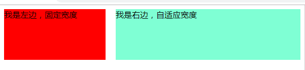
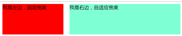
方式一,利用浮动+margin
<style>
   .left{
        background: red;
        float: left;
        width: 200px;
        height: 100px;
        margin-right: 20px;
    }

   .right{
        background: aquamarine;
        height: 100px;
        margin-left: 220px;
    }


</style>
    <div class="content">
        <div class="left">我是左边,固定宽度</div>
        <div class="right">我是右边,自适应宽度</div>
    </div>
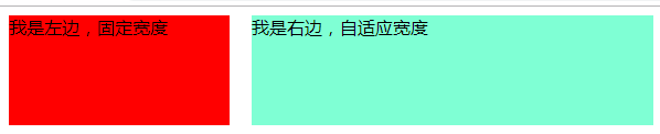
方式二 利用bfc模式,右侧盒子bfc
  .left{
        background: red;
        float: left;
        width: 200px;
        height: 100px;
        margin-right: 20px;
    }
 .right{
        background: aquamarine;
        height: 100px;
        overflow: hidden;
} 
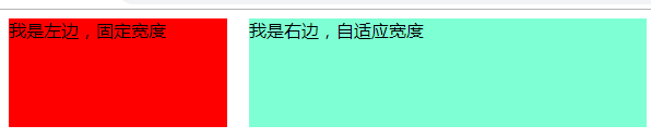
方式三 利用bfc模式 右侧盒子bfc
 .left{
        background: red;
        float: left;
        width: 200px;
        height: 100px;
        margin-right: 20px;
    }
  .right{
        background: aquamarine;
        height: 100px;
        overflow: auto;
} 
方式四 利用flex布局
<style>
            .content{
                display: flex;
            }
            .left {
                width: 100px;
                height: 200px;
                background-color: red;
            }
            .right {
                flex: 1;
                height: 200px;
                background-color: yellow;
            }
	    </style>
<div class="content">
            <div class="left">
                1111111
            </div>
            <div class="right">
                333333
            </div>
        </div>
方式五 利用绝对定位
   .content{
        overflow: auto
    }
    .left{
        background: red;
        width: 200px;
        height: 100px;
    }
    .right{
       position: absolute;
       left: 220px;
       right: 0px;
       height: 100px;
       background: aquamarine;
    }

<div class="content">
        <div class="left">我是左边,固定宽度</div>
        <div class="right">我是右边,自适应宽度</div>
</div>
方式六:利用calc进行计算
 .content{overflow:hidden}
.left{
        background: red;
        float: left;
        width: 200px;
        height: 100px;
        margin-right: 20px;
 }
 .right{
        float: left;
        height: 100px;
        width:calc(100% - 220px); // "-"号两侧一定要有空格
        background:aquamarine;
    }


 301
301


 被折叠的 条评论
为什么被折叠?
被折叠的 条评论
为什么被折叠?
 到【灌水乐园】发言


