


使用H5搭建webapp主页面
主页面搭建
思路分析:
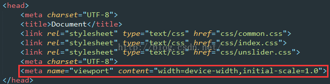
Meta标签中的ViewPort属性:ViewPort是承载代码层的一个View视图,而手机浏览器看到网页是承载ViewPort视图。因此,手机看到的层级关系,从上到下:代码View视图->ViewPort视图->浏览器视图。
所以我们只需要修改ViewPort这一层的属性,比如缩放等,即可对手机进行响应式布局,即安卓的自适应布局。
实现的效果图:(左右拖拽即可实现自动调整大小)
步骤一:搭建工程目录结构
步骤二:在index.html中声明ViewPort,输入meta:vp按下tab键自动生成,规定宽度为手机宽度,缩放比例为1
步骤三:由于每个浏览器的默认边距,默认属性的不同,我们需要全部初始化一遍,达到适应不同浏览器。
编写我们的common.css文件,记得在index.html中导入
- *,
- ::after,
- ::before{
- margin: 0;
- padding: 0;
- /*当用户点击iOS的Safari浏览器中的链接或JavaScript的可点击的元素时,覆盖显示的高亮颜色*/
- -webkit-tap-highlight-color: transparent;
- /*设置所有是以边框开始计算宽度 百分比*/
- -webkit-box-sizing:border-box;
- box-sizing: border-box;
- }
- body{
- font-size: 14px;
- font-family: "Microsoft YaHei","sans-serif";
- color: #333;
- }
- a{
- color: #333;
- text-decoration: none;
- }
- a:hover{
- text-decoration: none;
- }
- input{
- border: none;
- outline: none;
- /*清除移动端默认的表单样式*/
- -webkit-appearance:none;
- }
- li{
- list-style: none;
- }
步骤四:编写index.html文件
- <body>
- <div class="layout">
- </div>
- </body>
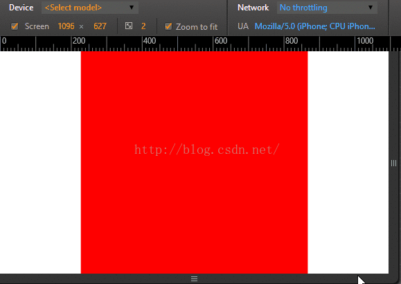
步骤五:编写index.css,来对这个layout类进行布局
- .layout{
- width: 100%;
- max-width: 640px;
- min-width: 320px;
- height: 1000px;
- margin: 0 auto;
- background: #ff0000;
- }
实现效果图:
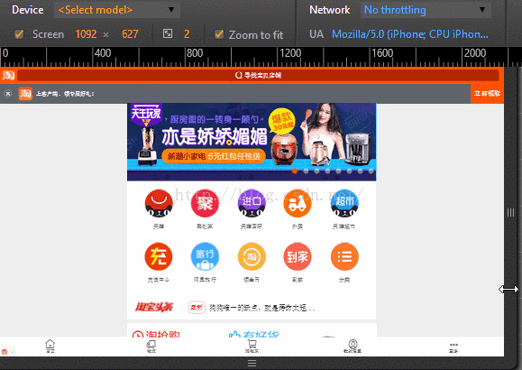
轮播图和导航栏的搭建
思路分析:
1、导航栏实现:导航栏使用css的position=fixed和z-index=1000,使它固定在顶部并在网页的最上层,左边的icon和右边登陆按钮使用绝对位置来调整距离左边右边上边的距离,而中间的form表单只要Padding-Left和Padding-Right就可以随屏幕伸缩。
2、自动轮播效果实现:这里使用了jQuery的一个js开源库unslider。
3、十个选项按钮实现:使用一个列表,设置每一个li为块元素,宽度为20%,并且让10个选项左浮动,就可以自动排好两行。
实现的效果图:
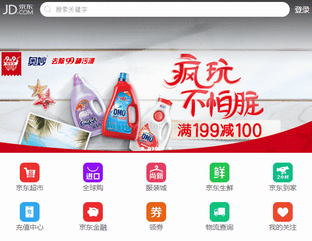
导航栏实现
步骤一:编写html文件,将导航栏做成一个盒子,并放置需要的组件,并为它们取好类名,方便css的编写
- <!--搜索头部-->
- <header class="nav_header">
- <div class="nav">
- <a href="#" class="nav_logo"></a>
- <!-- 小键盘 enter 改变成 搜索 按钮 -->
- <form action="#">
- <span class="nav_search_icon"></span>
- <input type="search" placeholder="搜索关键字"/>
- </form>
- <a href="#" class="nav_login">登录</a>
- </div>
- </header>
步骤二:编写css文件,将放置的东西设置好宽高,宽用百分比可以自适应,高度则是自己测量
- /*nav*/
- .nav_header{
- position: fixed;
- height: 40px;
- width: 100%;
- top: 0;
- left: 0;
- z-index: 1000;
- }
- .nav_header> .nav{
- width: 100%;
- height: 40px;
- max-width: 640px;
- min-width: 320px;
- margin: 0 auto;
- background:rgba(201,21,35,0.00);
- position: relative;
- }
- .nav_header> .nav> .nav_logo{
- width: 80px;
- height: 30px;
- position: absolute;
- background: url("../img/top_logo.png") no-repeat;
- background-size: 80px 20px;
- top: 10px;
- left: 0;
- }
- .nav_header> .nav> .nav_login{
- width: 50px;
- height: 40px;
- line-height: 40px;
- text-align: center;
- position: absolute;
- right: 0;
- top: 0;
- color: white;
- font-size: 15px;
- }
- .nav_header> .nav> form{
- width: 100%;
- padding-left: 85px;
- padding-right: 50px;
- height: 40px;
- }
- .nav_header> .nav> form> input{
- width: 100%;
- height: 30px;
- border-radius: 15px;
- margin-top: 5px;
- padding-left: 30px;
- }
- .nav_header> .nav >form >.nav_search_icon{
- height: 20px;
- width: 20px;
- background:url("../img/top_search.png");
- background-size: 20px 20px;
- position: absolute;
- left: 90px;
- top: 10px;
- }
自动轮播实现
步骤一:根据官网编写自动轮播html文件
- <!--轮播图-->
- <div class="banner">
- <div>
- <ul>
- <li><a><img src="img/banner_01.jpg"></a></li>
- <li><a><img src="img/banner_02.jpg"></a></li>
- <li><a><img src="img/banner_03.jpg"></a></li>
- <li><a><img src="img/banner_04.jpg"></a></li>
- <li><a><img src="img/banner_05.jpg"></a></li>
- </ul>
- </div>
- </div>
步骤二:根据官网导入js文件,需要下载unslider.js,它是基于JQuery.js的,所以需要下载2个,导入到项目中
- <script type="text/javascript" src="js/jquery-2.1.4.min.js"></script>
- <script type="text/javascript" src="js/unslider.js"></script>
- <script>
- $(function() {
- $('.banner').unslider({
- speed : 500,
- delay : 3000,
- nav : true,//是否启动导航图标
- dots: true,//是否出先圆点点
- arrows : false,
- autoplay : true //自动轮播
- });
- })
- </script>
步骤三:为了使图片能让我们手动滑动,还需要导入2个JQuery的库,导入之后就能手动滑动了
- <script type="text/javascript" src="js/jquery.event.move.js"></script>
- <script type="text/javascript" src="js/jquery.event.swipe.js"></script>
步骤四:为了让图片能刚好100%显示出来,并且实现自动轮播导航圆点,需要在css中加入实现
- /*banner*/
- .banner ul li a img{
- width: 100%;
- }
- .unslider {
- overflow: auto;
- margin: 0;
- padding: 0;
- /*Added*/
- position: relative;
- }
- .unslider-nav{
- position: absolute;
- width: 100%;
- bottom: 2%;
- }
十个选项按钮实现
步骤一:编写html文件
- <!--导航栏-->
- <nav class="item">
- <ul class="clearfix">
- <li>
- <a href="#">
- <img src="img/nav_01.png" alt=""/>
- <p>京东超市</p>
- </a>
- </li>
- <li>
- <a href="#">
- <img src="img/nav_02.png" alt=""/>
- <p>全球购</p>
- </a>
- </li>
- <li>
- <a href="#">
- <img src="img/nav_03.png" alt=""/>
- <p>服装城</p>
- </a>
- </li>
- <li>
- <a href="#">
- <img src="img/nav_04.png" alt=""/>
- <p>京东生鲜</p>
- </a>
- </li>
- <li>
- <a href="#">
- <img src="img/nav_05.png" alt=""/>
- <p>京东到家</p>
- </a>
- </li>
- <li>
- <a href="#">
- <img src="img/nav_06.png" alt=""/>
- <p>充值中心</p>
- </a>
- </li>
- <li>
- <a href="#">
- <img src="img/nav_07.png" alt=""/>
- <p>京东金融</p>
- </a>
- </li>
- <li>
- <a href="#">
- <img src="img/nav_08.png" alt=""/>
- <p>领券</p>
- </a>
- </li>
- <li>
- <a href="#">
- <img src="img/nav_09.png" alt=""/>
- <p>物流查询</p>
- </a>
- </li>
- <li>
- <a href="#">
- <img src="img/nav_10.png" alt=""/>
- <p>我的关注</p>
- </a>
- </li>
- </ul>
- </nav>
步骤二:编写css文件
- /*item*/
- .item{
- width: 100%;
- height: 180px;
- background: #fff;
- margin-top: -4px;
- border-bottom: 1px solid #e0e0e0;
- }
- .item> ul{
- width: 100%;
- }
- .item> ul> li{
- width: 20%;
- float: left;
- }
- .item> ul> li> a{
- width: 100%;
- display: block;
- padding-top: 20px;
- }
- .item> ul> li> a> img{
- width: 40px;
- height: 40px;
- display: block;
- margin: 0 auto;
- }
- .item> ul> li> a> p{
- text-align: center;
- color: #666;
- }
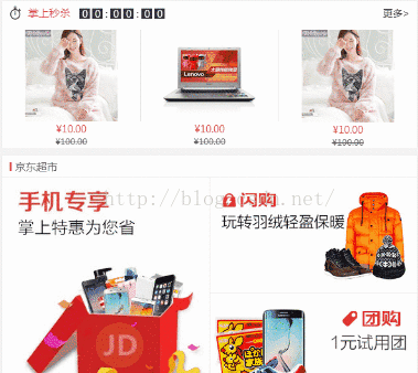
商品区块的搭建
思路分析:
1、秒杀模块:可以分为头部的倒计时和内容部分三个li存放三个图,并且右边界为1px。
2、左一大图、右两小图:这里使用模块化开发,在css写好width=50%、左右两边1px的border和左浮动右浮动的类,直接在html创建好后使用即可。左大图采用左浮动,右小图采用右浮动,大小都为50%。
3、左两小图、右一大图:左小图采用左浮动,右大图采用有浮动。
实现的效果图:
准备工作
编写common.css,用于模块化开发,只要在class里面放置需要的类名即可:
- .fl{
- float: left;
- }
- .fr{
- float: right;
- }
- .m_l10{
- margin-left: 10px;
- }
- .m_r10{
- margin-right: 10px;
- }
- .m_b10{
- margin-bottom: 10px;
- }
- .m_t10{
- margin-top: 10px;
- }
- .b_l1{
- border-left: 1px solid #e0e0e0;
- }
- .b_r1{
- border-right: 1px solid #e0e0e0;
- }
- .b_b1{
- border-bottom: 1px solid #e0e0e0;
- }
- .w_50{
- width: 50%;
- display: block;
- }
- .w_50 >img{
- width: 100%;
- display: block;
- }
- .clearfix::before,
- .clearfix::after{
- content: "";
- height: 0;
- line-height: 0;
- display: block;
- visibility: hidden;
- clear: both;
- }
秒杀区块、左大图右小图、左小图右大图
步骤一:编写html文件
- <!--商品-->
- <main class="shopItem">
- <!--秒杀区块-->
- <section class="shop_box">
- <!--头部-->
- <div class="shop_box_tit no_border">
- <div class="fl m_l10 sk_l">
- <span class="sk_l_icon"></span>
- <span class="sk_l_name m_l10">掌上秒杀</span>
- <div class="sk_l_time m_l10">
- <span>0</span>
- <span>0</span>
- <span>:</span>
- <span>0</span>
- <span>0</span>
- <span>:</span>
- <span>0</span>
- <span>0</span>
- </div>
- </div>
- <div class="fr m_r10"><a href="#">更多></a></div>
- </div>
- <!--内容-->
- <div class="sk_con">
- <ul class="clearfix">
- <li>
- <a href="#"><img src="img/detail01.jpg" alt=""/></a>
- <p>¥10.00</p>
- <p>¥100.00</p>
- </li>
- <li>
- <a href="#"><img src="img/detail02.jpg" alt=""/></a>
- <p>¥10.00</p>
- <p>¥100.00</p>
- </li>
- <li>
- <a href="#"><img src="img/detail01.jpg" alt=""/></a>
- <p>¥10.00</p>
- <p>¥100.00</p>
- </li>
- </ul>
- </div>
- </section>
- <!--左大图、右小图-->
- <section class="shop_box">
- <!--头部-->
- <div class="shop_box_tit"><h3>京东超市</h3></div>
- <!--内容-->
- <div class="clearfix">
- <a href="#" class="fl w_50 b_r1"><img src="img/cp1.jpg" alt=""/></a>
- <a href="#" class="fr w_50 b_b1"><img src="img/cp2.jpg" alt=""/></a>
- <a href="#" class="fr w_50 "><img src="img/cp3.jpg" alt=""/></a>
- </div>
- </section>
- <!--左小图、右大图-->
- <section class="shop_box">
- <!--头部-->
- <div class="shop_box_tit"><h3>京东超市</h3></div>
- <!--内容-->
- <div class="clearfix">
- <a href="#" class="fr w_50 b_l1"><img src="img/cp4.jpg" alt=""/></a>
- <a href="#" class="fl w_50 b_b1"><img src="img/cp5.jpg" alt=""/></a>
- <a href="#" class="fl w_50"><img src="img/cp6.jpg" alt=""/></a>
- </div>
- </section>
- <!--左大图、右小图-->
- <section class="shop_box">
- <!--头部-->
- <div class="shop_box_tit"><h3>京东超市</h3></div>
- <!--内容-->
- <!--内容-->
- <div class="clearfix">
- <a href="#" class="fl w_50 b_r1"><img src="img/cp1.jpg" alt=""/></a>
- <a href="#" class="fr w_50 b_b1"><img src="img/cp2.jpg" alt=""/></a>
- <a href="#" class="fr w_50 "><img src="img/cp3.jpg" alt=""/></a>
- </div>
- </section>
- </main>
步骤二:编写css文件
- /*shopItem*/
- .shopItem{
- padding: 0 5px;
- }
- .shopItem> .shop_box{
- width: 100%;
- margin-top: 10px;
- background: #fff;
- box-shadow: 0 0 1px #e0e0e0;
- }
- .shopItem> .shop_box> .shop_box_tit{
- width: 100%;
- height: 32px;
- line-height: 32px;
- border-bottom: 1px solid #e0e0e0;
- }
- .shopItem> .shop_box> .shop_box_tit.no_border{
- border-bottom: none;
- }
- .shopItem> .shop_box> .shop_box_tit> h3{
- padding-left: 18px;
- font-size: 15px;
- color: #666;
- font-weight: normal;
- position: relative;
- }
- .shopItem> .shop_box> .shop_box_tit> h3::before{
- content: "";
- width: 3px;
- position: absolute;
- top: 10px;
- left: 10px;
- height: 12px;
- background: #d8505c;
- }
- .shop_box_sk{
- }
- /*秒殺*/
- .sk_l> .sk_l_icon{
- background: url("../img/sk_icon.png") no-repeat;
- background-size: 16px 20px;
- float: left;
- width: 16px;
- height: 20px;
- margin-top: 6px;
- }
- .sk_l> .sk_l_name{
- font-size: 15px;
- color: #d8505c;
- float: left;
- }
- .sk_l> .sk_l_time{
- margin-top: 10px;
- float: left;
- }
- .sk_l> .sk_l_time> span{
- float: left;
- width: 15px;
- line-height: 15px;
- height: 15px;
- text-align: center;
- background: #333;
- color: #fff;
- margin-left: 3px;
- }
- .sk_l> .sk_l_time> span:nth-child(3n){
- color: #333;
- background: #fff;
- width: 5px;
- }
- .sk_con> ul{
- width: 100%;
- margin: 8px 0;
- }
- .sk_con> ul> li{
- width: 33.33%;
- float: left;
- }
- .sk_con> ul> li> a{
- display: block;
- width: 100%;
- margin: 0 auto;
- border-right: 1px solid #e0e0e0;
- }
- .sk_con> ul> li:last-child> a{
- border-right:0;
- }
- .sk_con> ul> li> a> img{
- width: 67%;
- margin: 0 auto;
- display: block;
- }
- .sk_con> ul> li> p{
- text-align: center;
- }
- .sk_con> ul> li> p:first-of-type{
- color: #d8505c;
- }
- .sk_con> ul> li> p:last-of-type{
- font-size: 12px;
- color: #666;
- text-decoration:line-through;
- }
源码下载:http://download.csdn.net/detail/qq_30379689/9640215
文章来源:http://blog.csdn.net/qq_30379689/article/details/52648978


 扫一扫
扫一扫
 873
873

 被折叠的 条评论
为什么被折叠?
被折叠的 条评论
为什么被折叠?
 到【灌水乐园】发言


