


圣杯布局与双飞翼布局实现
圣杯布局和双飞翼布局基本上是一致的,都是两边固定宽度,中间自适应的三栏布局,其中,中间栏放到文档流前面,保证先行渲染。解决方案大体相同,都是三栏全部float:left浮动,区别在于解决中间栏div的内容不被遮挡上,圣杯布局是中间栏在添加相对定位,并配合left和right属性,效果上表现为三栏是单独分开的(如果可以看到空隙的话),而双飞翼布局是在中间栏的div中嵌套一个div,内容写在嵌套的div里,然后对嵌套的div设置margin-left和margin-right,效果上表现为左右两栏在中间栏的上面,中间栏还是100%宽度,只不过中间栏的内容通过margin的值显示在中间。
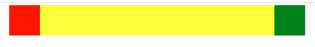
- 圣杯布局实现代码如下
//dom结构
<div class="main">
        <div class="center"></div>
        <div class="left"></div>

        <div class="right"></div>
    </div>
然后css样式
<style>
    .main{
        padding: 0 100px;
    }
    .left,.right{
        width:100px;
        height: 100px;

    }
    .center{
        width: 100%;
        height: 100px;
        background: yellow;
        float: left;
    }
    .left{
        float: left;
        background: red;
        margin-left: -100%;
        position: relative;
        left: -100px;
    }
    .right{
        float: left;
        background: green;
        margin-left: -100px;
        position: relative;
        left: 100px;
    }
</style>
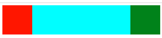
- 双飞翼布局实现代码如下
//dom结构
<div class="main">
    <div class="center">
        <div class="child"></div>
    </div>
    <div class="left"></div>
    <div class="right"></div>
</div>
css代码
<style>
    .center{
        width: 100%;
        height: 100px;
        float: left;
        background: yellow;
    }
    .left{
        float: left;
        height: 100px;
        width: 100px;
        background: red;
        margin-left: -100%;
    }
    .right{
        float: left;
        height: 100px;
        width: 100px;
        background: green;
        margin-left: -100px;
    }
    .child{
        margin: 0 100px;
        background: aqua;
        height: 100%;
    }
</style>


 1960
1960


 被折叠的 条评论
为什么被折叠?
被折叠的 条评论
为什么被折叠?
 到【灌水乐园】发言


