


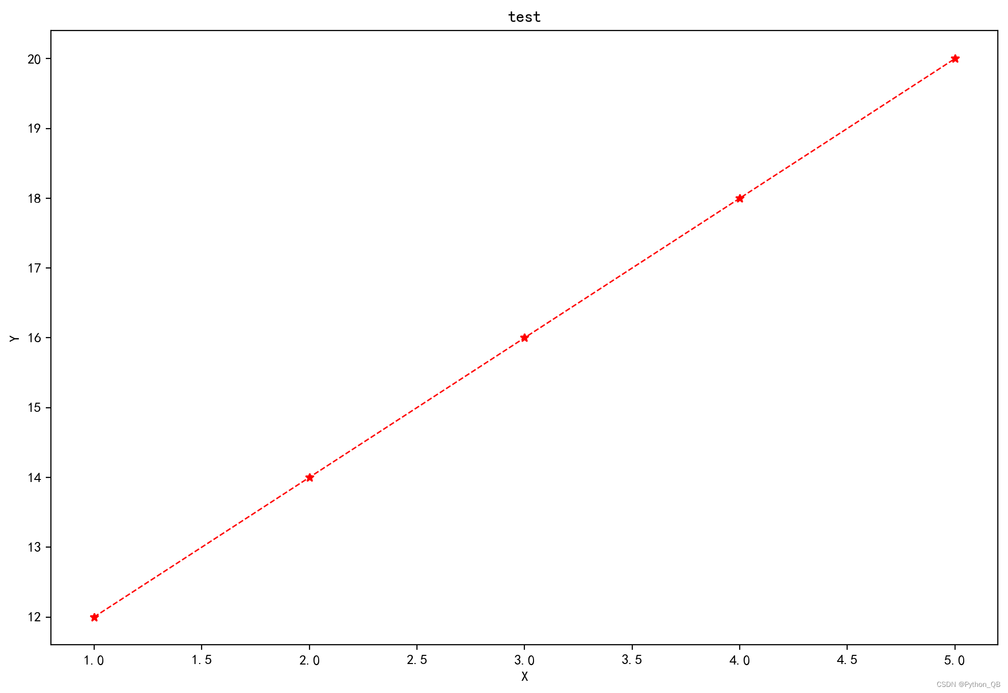
1、线型图
import matplotlib.pyplot as plt
plt.rcParams['font.sans-serif'] = ['SimHei'] #显示中文
plt.rcParams['axes.unicode_minus'] = False  #坐标轴显示正负号
plt.figure(figsize=(12, 8), dpi=200) #创建画布
x = [1,2,3,4,5]
y = [12,14,16,18,20]
plt.xlabel('X')
plt.ylabel('Y')
plt.title("test")   # 添加标题
plt.plot(x,y,color='r',linestyle='--',linewidth=1,marker='*')
plt.show()
color线的颜色,linestyle线的类型,linewidth线的宽度,marker点标记,marker='*'还可以marker='o'、marker='s'、marker='d'等;
1.1绘制双y
import matplotlib.pyplot as plt
plt.rcParams['font.sans-serif'] = ['SimHei'] #显示中文
plt.rcParams['axes.unicode_minus'] = False  #坐标轴显示正负号
plt.figure(figsize=(12, 8), dpi=200) #创建画布
x = [1,2,3,4,5]
y = [12,14,16,18,20]
y1 = [10,12,9,15,23]
plt.xlabel('X')
plt.ylabel('Y')
plt.xlim(0, 5)# 设置x轴的取值范围
plt.ylim(8, 24)# 设置y轴的取值范围
plt.xticks(rotation=90)
plt.title("test")   # 添加标题
plt.plot(x,y,color='r',linestyle='--',linewidth=1,marker='*',label = 'y1')
plt.plot(x,y1,color='blue',linestyle='-',linewidth=1,marker='*',label = 'y2')
plt.legend()
plt.show()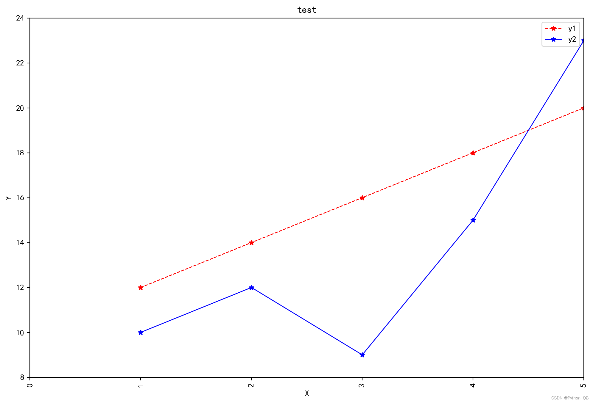
1.2 绘制双y轴
import matplotlib.pyplot as plt
plt.rcParams['font.sans-serif'] = ['SimHei'] #显示中文
plt.rcParams['axes.unicode_minus'] = False  #坐标轴显示正负号
fig = plt.figure(figsize=(12, 8), dpi=200) #创建画布
x = [1,2,3,4,5]
y = [12,14,16,18,20]
y1 = [10,12,9,15,23]
# 添加axes坐标轴实例,创建画板
ax0 = fig.add_subplot(111)
#绘制第一条线
line0 = ax0.plot(x, y,label='one',color = 'r')
#X轴坐标标题
ax0.set_xlabel('x')
#设置y轴名称
ax0.set_ylabel('y1')
# 添加标题
ax0.set_title('test')
# 使用twinx()函数实现共用一个x轴,很重要
ax1 = ax0.twinx()
#绘制折线
line1 = ax1.plot(x, y1, label='two',color = 'b')
#设置第二条y轴名称
ax1.set_ylabel('y2')
#合并图例
lines = line0+line1
#获取label
labelss = [line.get_label() for line in lines]
#显示图例
ax1.legend(lines,labelss)
plt.show() 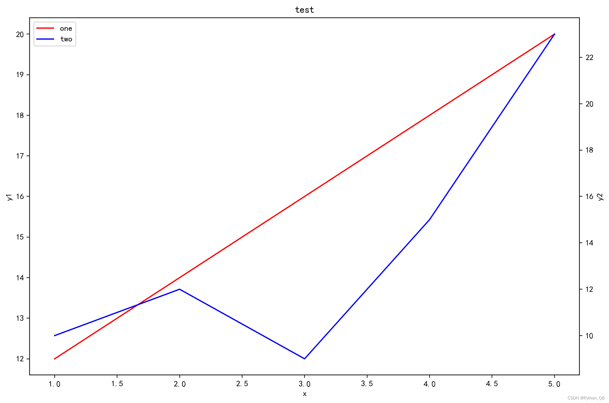
2、柱状图
普通柱状图
import matplotlib.pyplot as plt
plt.rcParams['font.sans-serif'] = ['SimHei'] #显示中文
plt.rcParams['axes.unicode_minus'] = False  #坐标轴显示正负号
plt.figure(figsize=(14, 8), dpi=200) #创建画布
x = ['鸡','鸭','鱼','鹅','猪']
y = [16,10,6,18,26]
plt.xlabel('X')
plt.ylabel('Y')
plt.title("test")   # 添加标题
plt.bar(x,y,color='r',alpha=0.6)  #alpha透明度
plt.show()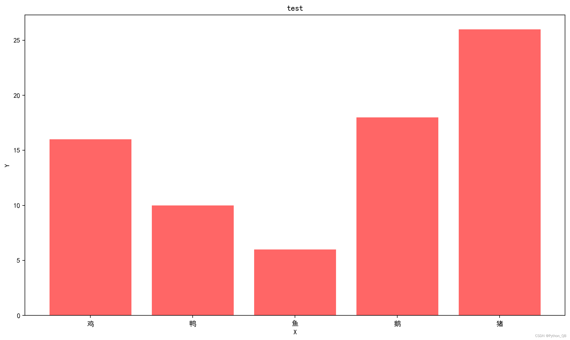
改变不同的颜色
import matplotlib.pyplot as plt
plt.rcParams['font.sans-serif'] = ['SimHei'] #显示中文
plt.rcParams['axes.unicode_minus'] = False  #坐标轴显示正负号
plt.figure(figsize=(14, 8), dpi=200) #创建画布
x = ['鸡','鸭','鱼','鹅','猪']
y = [16,10,6,18,26]
for i in range(len(x)):
    plt.bar(x[i],y[i])

#设置数字
for a,b in zip(x,y):   #柱子上的数字显示
    print(a,b)
    plt.text(a,b,b,ha='center',va='bottom',fontsize=20) #其中第二个b是字符串,相当于在那个位置添加的说明文字
plt.xlabel('X')
plt.ylabel('Y')
plt.title("test")   # 添加标题
#plt.bar(x,y,color='r',alpha=0.6)  #alpha透明度
plt.show()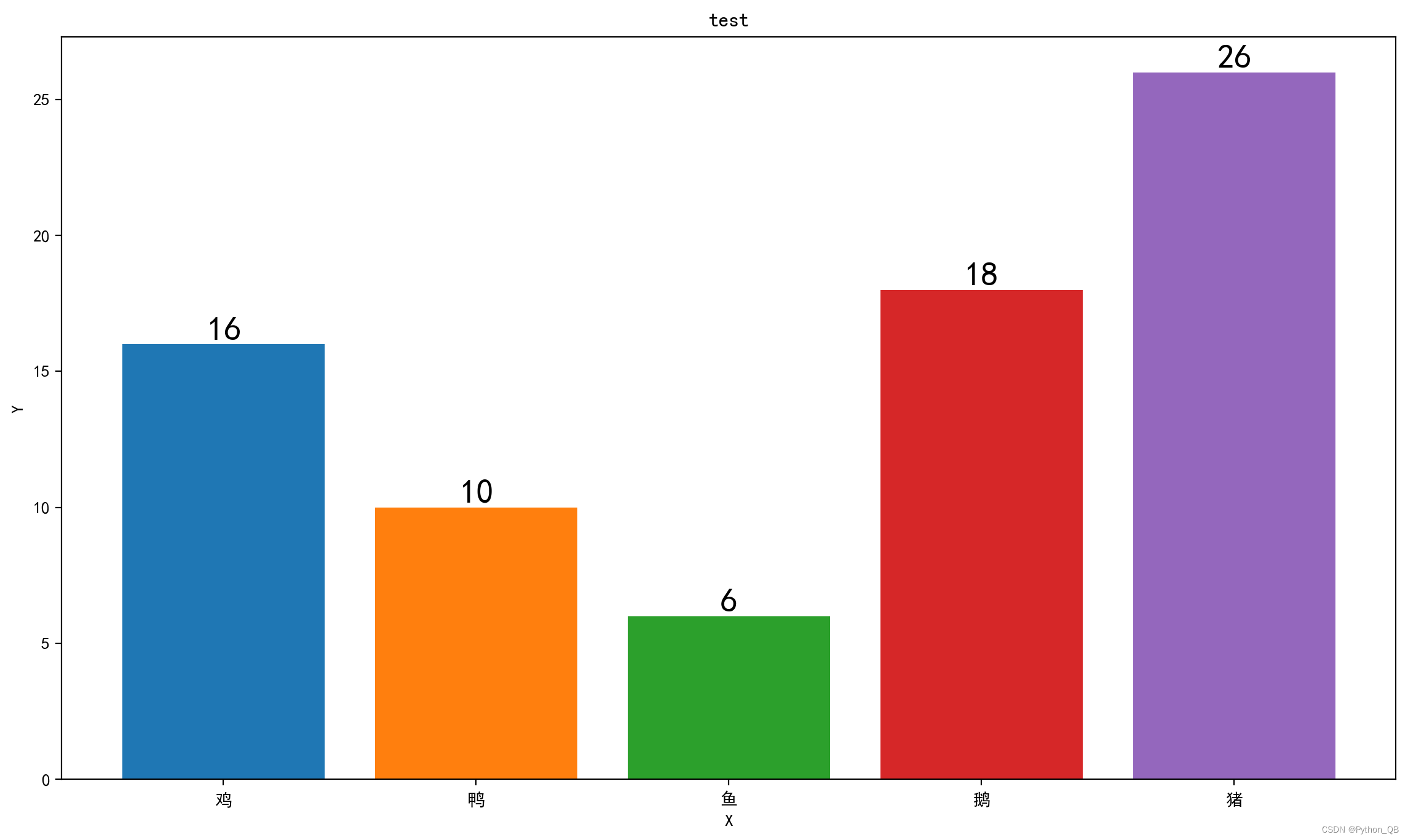
网格图
import matplotlib.pyplot as plt
plt.rcParams['font.sans-serif'] = ['SimHei'] #显示中文
plt.rcParams['axes.unicode_minus'] = False  #坐标轴显示正负号
plt.figure(figsize=(14, 8), dpi=200) #创建画布
x = ['鸡','鸭','鱼','鹅','猪']
y = [16,10,6,18,26]
for i in range(len(x)):
    plt.bar(x[i],y[i])
plt.grid(axis='y',color='black',linestyle='--',linewidth=1,alpha=0.5)
plt.xlabel('X')
plt.ylabel('Y')
plt.title("test")   # 添加标题
plt.show()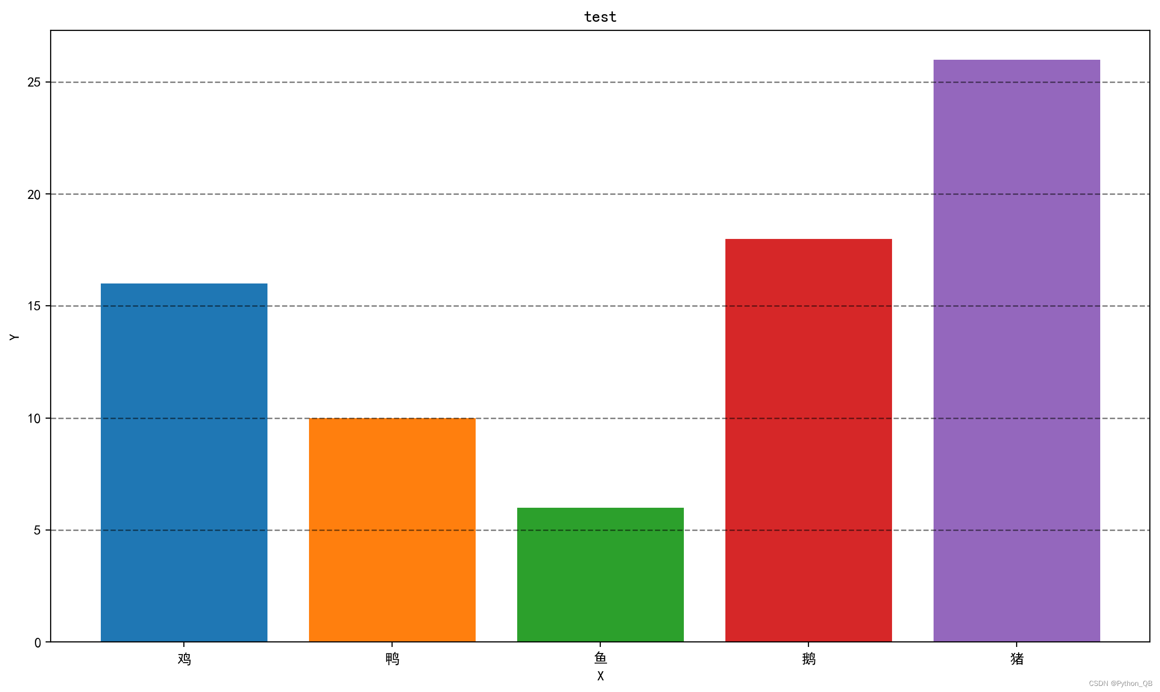
堆积柱状图
import matplotlib.pyplot as plt
plt.rcParams['font.sans-serif'] = ['SimHei'] #显示中文
plt.rcParams['axes.unicode_minus'] = False  #坐标轴显示正负号
plt.figure(figsize=(14, 8), dpi=200) #创建画布
x = ['鸡','鸭','鱼','鹅','猪']
y = [16,10,6,18,26]
y1 = [23,16,12,25,46]
for i in range(len(x)):
    plt.bar(x[i],y[i])
    plt.bar(x[i],y1[i],bottom=y[i])
# plt.bar(x,y)  #alpha透明度
# plt.bar(x,y1,bottom=y)
plt.xlabel('X')
plt.ylabel('Y')
plt.title("test")   # 添加标题
plt.show()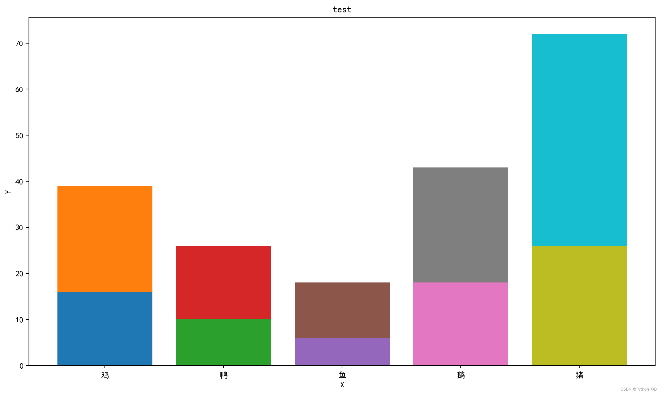
并列柱状图 1
import matplotlib.pyplot as plt
plt.rcParams['font.sans-serif'] = ['SimHei'] #显示中文
plt.rcParams['axes.unicode_minus'] = False #坐标轴显示正负号
plt.figure(figsize=(14, 8), dpi=200) #创建画布
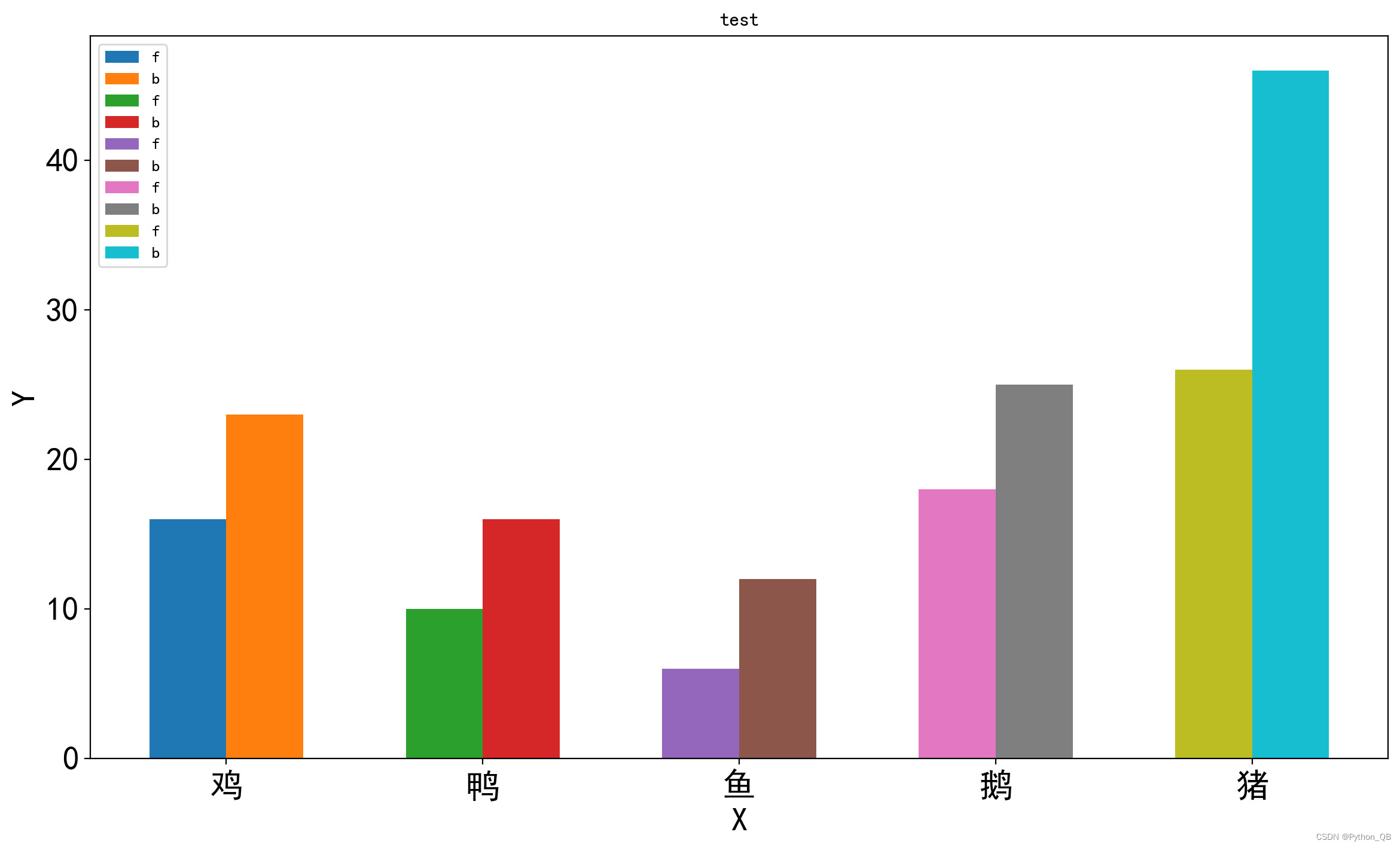
x = ['鸡','鸭','鱼','鹅','猪']
y = [16,10,6,18,26]
y1 = [23,16,12,25,46]
width=0.3
for i in range(len(x)):
plt.bar(i-width/2,y[i],width=width,label='f')
plt.bar(i+width/2,y1[i],width=width,label='b')
plt.xticks(range(len(x)), x,fontsize=20) #将原来的0,1,2,3,4换成x中的数据
plt.yticks(fontsize=20)#设置刻度标签大小
plt.legend() #显示图例
plt.xlabel('X',fontsize=20)
plt.ylabel('Y',fontsize=20)
plt.title("test") # 添加标题
plt.show()
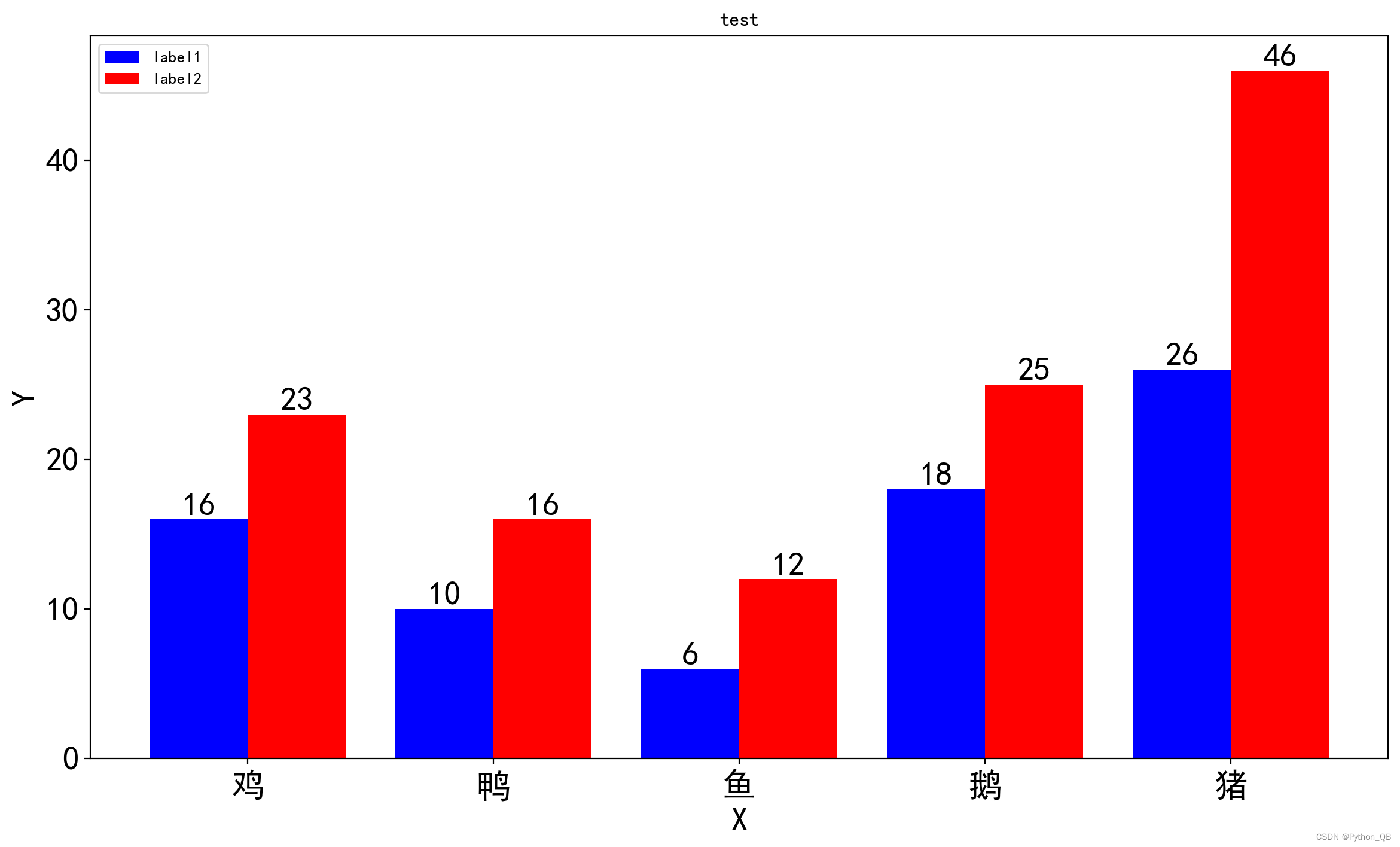
并列柱状图 2
import matplotlib.pyplot as plt
import numpy as np

plt.rcParams['font.sans-serif'] = ['SimHei'] #显示中文
plt.rcParams['axes.unicode_minus'] = False  #坐标轴显示正负号
plt.figure(figsize=(14, 8), dpi=200) #创建画布
x_label = ['鸡','鸭','鱼','鹅','猪']
y = [16,10,6,18,26]
y1 = [23,16,12,25,46]
x = np.arange(len(y))
width = 0.4
plt.bar(x=x,height=y,width=width,color = 'blue',label='label1')
plt.bar(x=x+width,height=y1,width=width,color = 'red',label='label2')

#设置数字
for a,b in zip(x,y):   #柱子上的数字显示
    print(a,b)
    plt.text(a,b,b,ha='center',va='bottom',fontsize=20) #其中第二个b是字符串,相当于在那个位置
for a,b in zip(x,y1):   #柱子上的数字显示
    print(a,b)
    plt.text(a+width,b,b,ha='center',va='bottom',fontsize=20) #其中第二个b是字符串,相当于在那个位置
plt.xticks(x+width/2, x_label,fontsize=20)  #将原来的0,1,2,3,4换成x中的数据
plt.yticks(fontsize=20)#设置刻度标签大小
plt.legend(loc=0)   #显示图例
"""
显示图例有很多选线
loc=0, best,最佳位置
loc=1, upper right,(右上角)
loc=2, upper left (左上角)
loc=3, lower left (左下角)
loc=4, lower right (右下角)
loc=5, right (右,等同于center right)
loc=6, center left (中间偏左)
loc=7, center right (中间偏右)
loc=8, lower center(中间偏下)
loc=9, upper center(中间偏上)
loc=10, center(正中间)

"""


plt.xlabel('X',fontsize=20)
plt.ylabel('Y',fontsize=20)
plt.title("test")   # 添加标题
plt.show()
组合图
import matplotlib.pyplot as plt
import numpy as np

x_label = ['鸡','鸭','鱼','鹅','猪']
y = [16,10,6,18,26]
y1 = [23,16,12,25,46]
y2 = [20,12,8,28,32]
x = np.arange(len(y))

plt.rcParams['font.sans-serif'] = ['SimHei'] #显示中文
plt.rcParams['axes.unicode_minus'] = False  #坐标轴显示正负号

fig, ax = plt.subplots(figsize=(20, 8), dpi=200)

width = 0.4
ax.bar(x=x,height=y1,width=width,color = 'blue',label='label1')
ax.bar(x=x+width,height=y2,width=width,color = 'red',label='label2')
ax.set_xticks(x+width,x_label)  #设置横坐标
#ax.set_yticklabels([i for i in range(0,51,10)],fontsize=20)  #设置坐标
ax.set_ylim(0, 50) #设置y轴范围
ax.grid(axis = 'y',color='black') #只显示y轴网格
# 添加标题

ax.set_xlabel('X',fontsize=20)
ax.set_ylabel('Y',fontsize=20)
ax.set_title("test",fontsize=30)   # 添加标题

# 使用twinx()函数实现共用一个x轴,很重要
ax1 = ax.twinx()

ax1.plot(x_label, y2, color='black',linestyle='--',linewidth=3,marker='*',label='折线')
#设置y轴的刻度范围
axy = range(51)
ax1.set_yticks(axy[::10])

ax1.set_ylabel('Y1',fontsize=20)  #设置坐标
ax.legend(loc=2,fontsize=20)  #根据位置显示图例
ax1.legend(loc=0,fontsize=20)
plt.savefig('test.png')
plt.show() 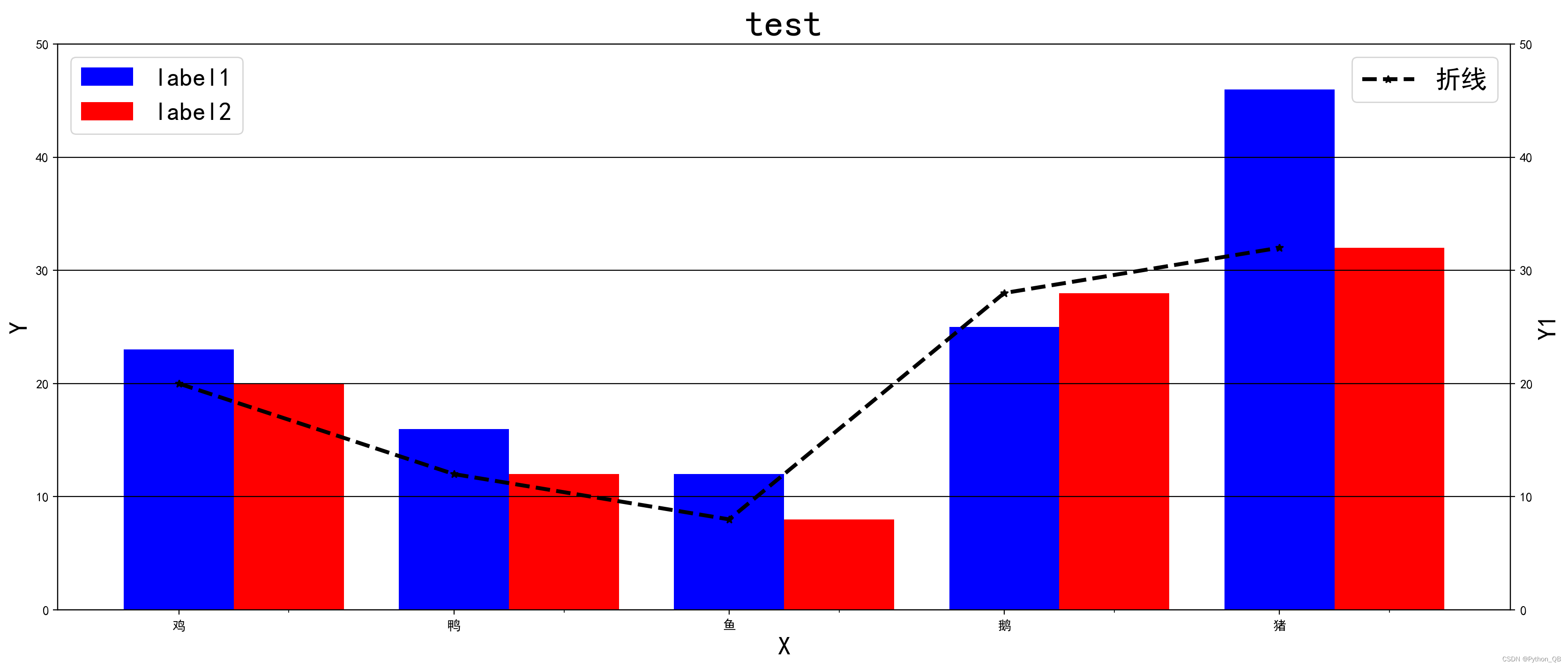
水平柱状图
import matplotlib.pyplot as plt
plt.rcParams['font.sans-serif'] = ['SimHei'] #显示中文
plt.rcParams['axes.unicode_minus'] = False  #坐标轴显示正负号
plt.figure(figsize=(14, 8), dpi=200) #创建画布
x = ['鸡','鸭','鱼','鹅','猪']
y = [16,10,6,18,26]
for i in range(len(x)):
    plt.barh(x[i],y[i])
plt.yticks(fontsize=20)
plt.xticks(fontsize=20)#设置刻度标签大小
plt.xlabel('X',fontsize=20)
plt.ylabel('Y',fontsize=20)
plt.title("test")   # 添加标题
plt.show()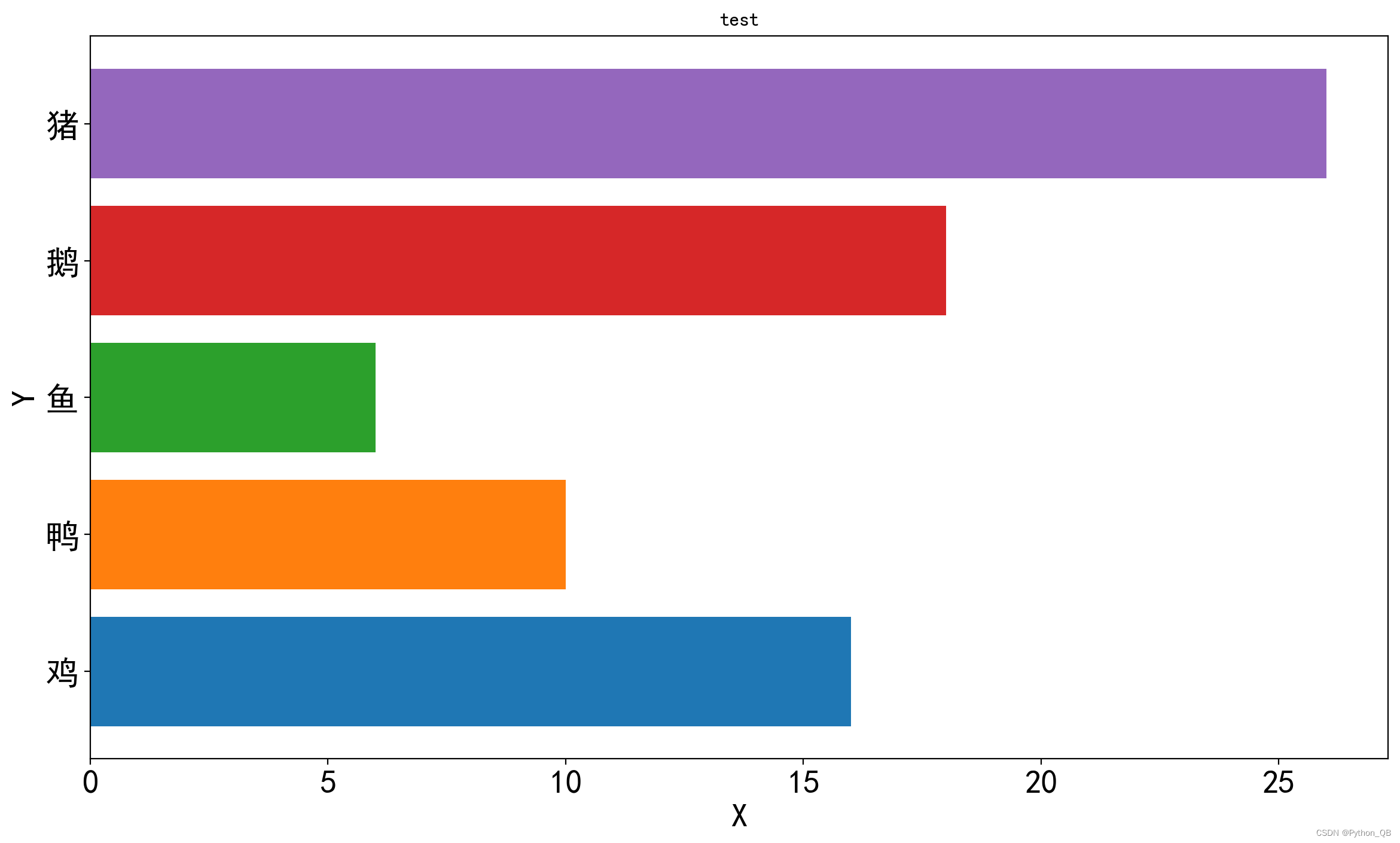
3、散点图
import numpy as np
import matplotlib.pyplot as plt
plt.rcParams['font.sans-serif'] = ['SimHei'] #显示中文
plt.rcParams['axes.unicode_minus'] = False  #坐标轴显示正负号
plt.figure(figsize=(14, 8), dpi=200) #创建画布
x = np.arange(100)
y = np.random.rand(100)
plt.scatter(x, y, color='red',marker='*')
plt.yticks(fontsize=20)
plt.xticks(fontsize=20)#设置刻度标签大小
plt.xlabel('X',fontsize=20)
plt.ylabel('Y',fontsize=20)
plt.title("test")   # 添加标题
plt.show() 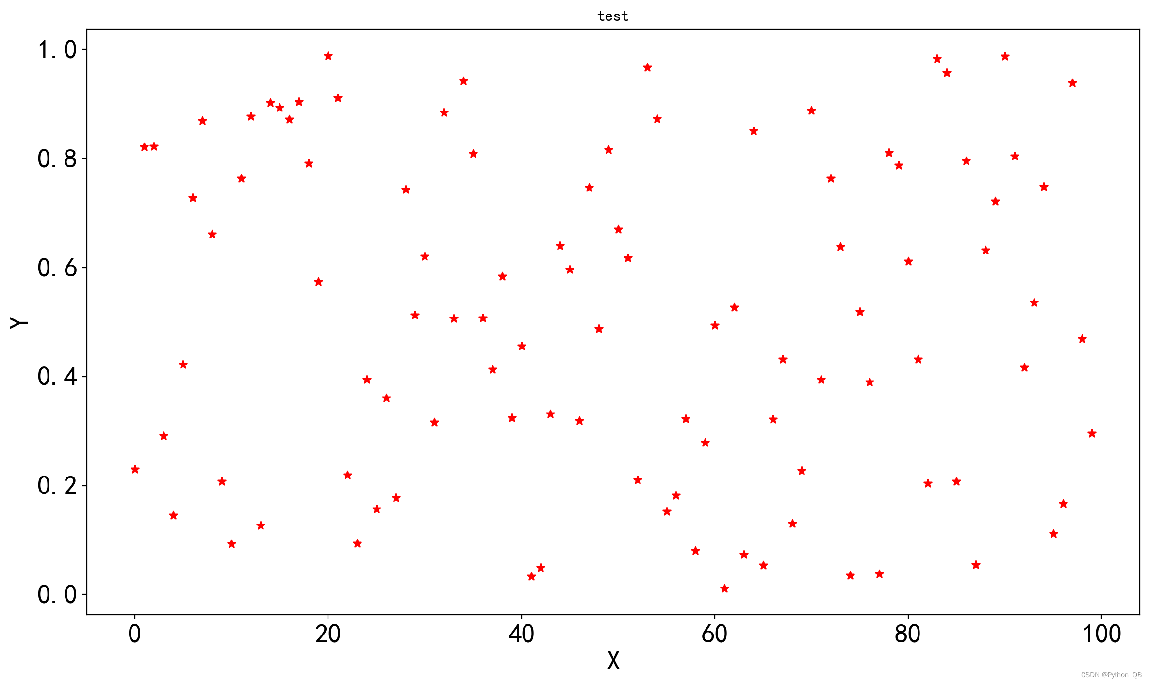
4、直方图
import numpy as np
import matplotlib.pyplot as plt
plt.rcParams['font.sans-serif'] = ['SimHei'] #显示中文
plt.rcParams['axes.unicode_minus'] = False  #坐标轴显示正负号
plt.figure(figsize=(14, 8), dpi=200) #创建画布
x = np.random.randn(100)
plt.hist(x,color='red',bins=30)  #bins指定直方图条形的个数
plt.yticks(fontsize=20)
plt.xticks(fontsize=20)#设置刻度标签大小
plt.xlabel('X',fontsize=20)
plt.ylabel('Y',fontsize=20)
plt.title("test")   # 添加标题
plt.show()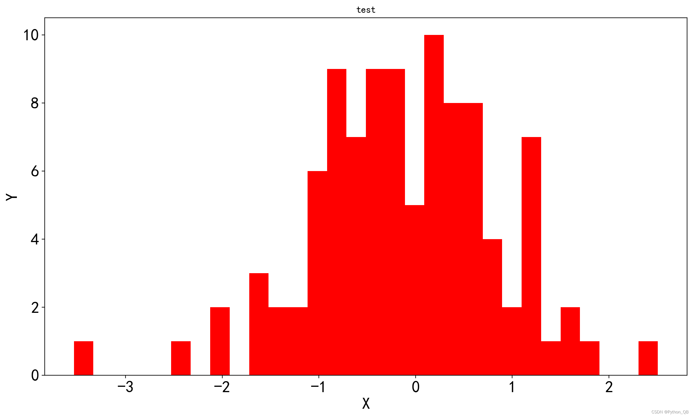
5.绘制多图1
import matplotlib.pyplot as plt

x = ['鸡','鸭','鱼','鹅','猪']
y = [16,10,6,18,26]
#下面进行绘图
fig,axes = plt.subplots(nrows=2,ncols=2,figsize=(20, 12), dpi=200)   #定义2行2列的数据
#显示中文字符
plt.rcParams['font.sans-serif']=['Simhei']
#设置图之间的间距

axes[0,0].bar(x,y,width = 0.5,label = '柱状图')
axes[0,1].pie(y,labels=x, autopct='%0.2f%%')
axes[1,0].plot(x,y,color='r',linestyle='--',linewidth=1,marker='*',label = '线形图')
axes[1,1].scatter(x,y, label = '散点图')


#设置横纵坐标及标题名
axes[0,0].set_xlabel('x')
axes[0,0].set_ylabel('y')
axes[0,0].set_title('柱状图')
axes[0,1].set_title('饼图')

axes[1,0].set_xlabel('x')
axes[1,0].set_ylabel('y')
axes[1,0].set_title('线形图')
axes[1,1].set_xlabel('x')
axes[1,1].set_ylabel('y')
axes[1,1].set_title('散点图')

#添加网格
axes[0,0].grid(True,linestyle = '--',alpha=0.7)
axes[1,0].grid(True,linestyle = '--',alpha=0.7)
axes[1,1].grid(True,linestyle = '--',alpha=0.7)
#显示图例
axes[0,0].legend()
axes[1,0].legend()
axes[1,1].legend()

plt.savefig('数据可视化.png')
plt.show()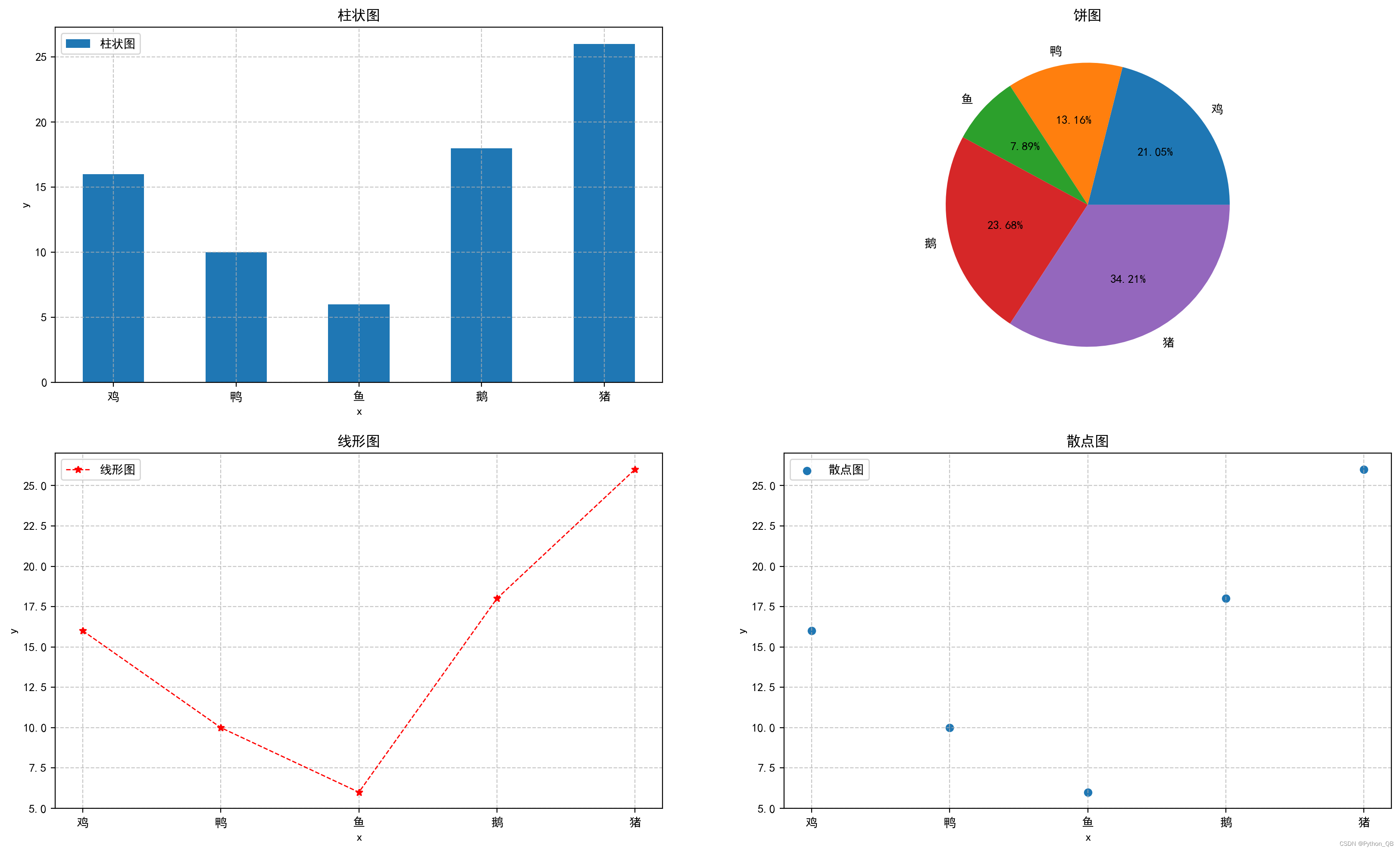
5.绘制多图2
绘制2,行2列,其中一个图占据一行或一列,用到matplotlib.gridspec
占据一行
import matplotlib.pyplot as plt
import matplotlib.gridspec as gridspec

x = ['鸡','鸭','鱼','鹅','猪']
y = [16,10,6,18,26]

# 显示图像
plt.rcParams['font.sans-serif'] = ['SimHei'] # 中文
plt.figure(figsize=(20, 12), dpi=200)
gs = gridspec.GridSpec(2, 2)
gs.update(wspace=0.8)

ax1 = plt.subplot(gs[0, :])
ax1.bar(x,y,width = 0.5,label = '柱状图')
ax1.set_title("柱状图")

ax2 = plt.subplot(gs[1, 0])
ax2.plot(x,y,color='r',linestyle='--',linewidth=1,marker='*',label = '线形图')
ax2.set_title("线形图")

ax3 = plt.subplot(gs[1, 1])
ax3.pie(y,labels=x, autopct='%0.2f%%')
ax3.set_title("饼图")
plt.savefig('可视化.png')
plt.show()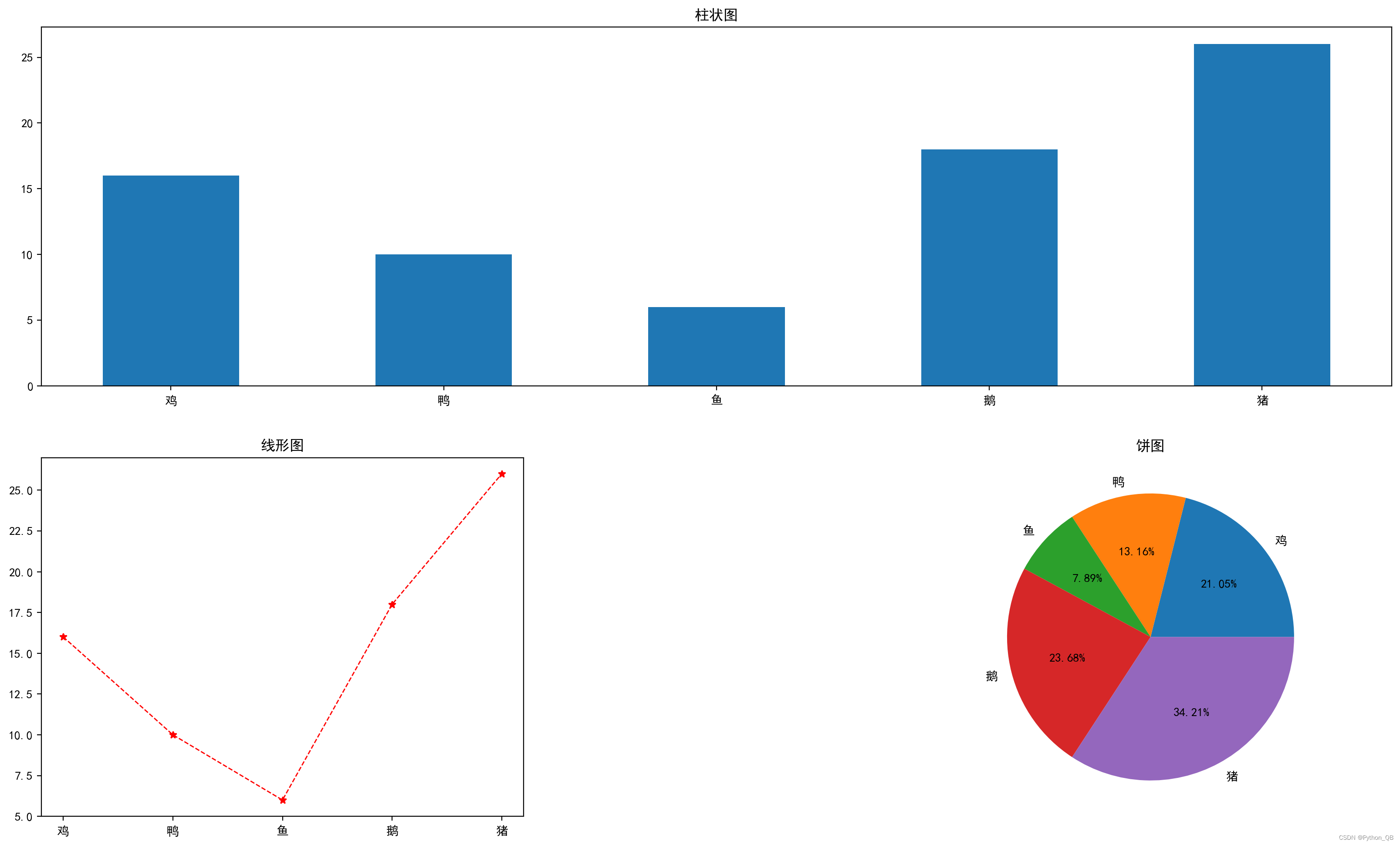
占据一列
import matplotlib.pyplot as plt
import matplotlib.gridspec as gridspec

x = ['鸡','鸭','鱼','鹅','猪']
y = [16,10,6,18,26]

# 显示图像
plt.rcParams['font.sans-serif'] = ['SimHei'] # 中文
plt.figure(figsize=(20, 12), dpi=200)
gs = gridspec.GridSpec(2, 2)
gs.update(wspace=0.8)

ax1 = plt.subplot(gs[:,0])
ax1.bar(x,y,width = 0.5,label = '柱状图')
ax1.set_title("柱状图")

ax2 = plt.subplot(gs[0, 1])
ax2.plot(x,y,color='r',linestyle='--',linewidth=1,marker='*',label = '线形图')
ax2.set_title("线形图")

ax3 = plt.subplot(gs[1, 1])
ax3.pie(y,labels=x, autopct='%0.2f%%')
ax3.set_title("饼图")
plt.savefig('可视化.png')
plt.show()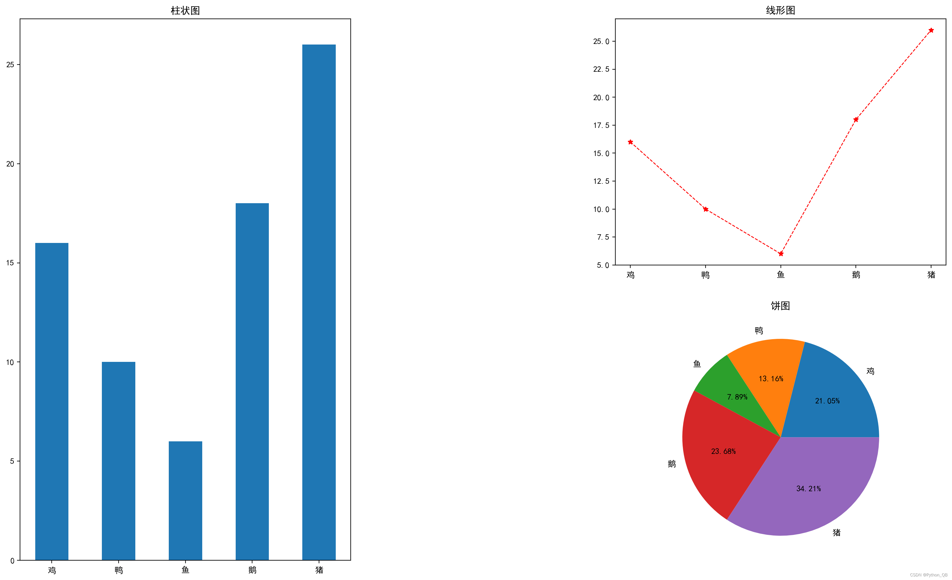
#占据一行存在并列柱状图
import matplotlib.pyplot as plt
import matplotlib.gridspec as gridspec
import numpy as np

x = ['鸡','鸭','鱼','鹅','猪']
y = [16,10,6,18,26]
y1 = [6,15,16,11,20]
# 显示图像
plt.rcParams['font.sans-serif'] = ['SimHei'] # 中文
plt.figure(figsize=(20, 12), dpi=200)
gs = gridspec.GridSpec(2, 2)
#wspace左右距离,hspace上下距离
gs.update(wspace=0.2,hspace=0.3)

ax1 = plt.subplot(gs[0, :])

xx = np.arange(len(x))
width = 0.4
ax1.bar(x=xx,height=y,width=width,color = 'blue',label='x1')
ax1.bar(x=xx+width,height=y,width=width,color = 'red',label='x2')
#设置横坐标
ax1.set_xticks(xx+width/2)
ax1.set_xticklabels(labels=x,rotation=45,fontsize=20)
ax1.set_title("柱状图")

ax2 = plt.subplot(gs[1, 0])
ax2.plot(x,y,color='r',linestyle='--',linewidth=1,marker='*',label = '线形图')
ax2.set_xticklabels(labels=x,rotation=45,fontsize=20)
ax2.set_title("线形图")


ax3 = plt.subplot(gs[1, 1])
ax3.pie(y,labels=x, autopct='%0.2f%%')
ax3.set_title("饼图")
plt.savefig('可视化.png')
plt.show()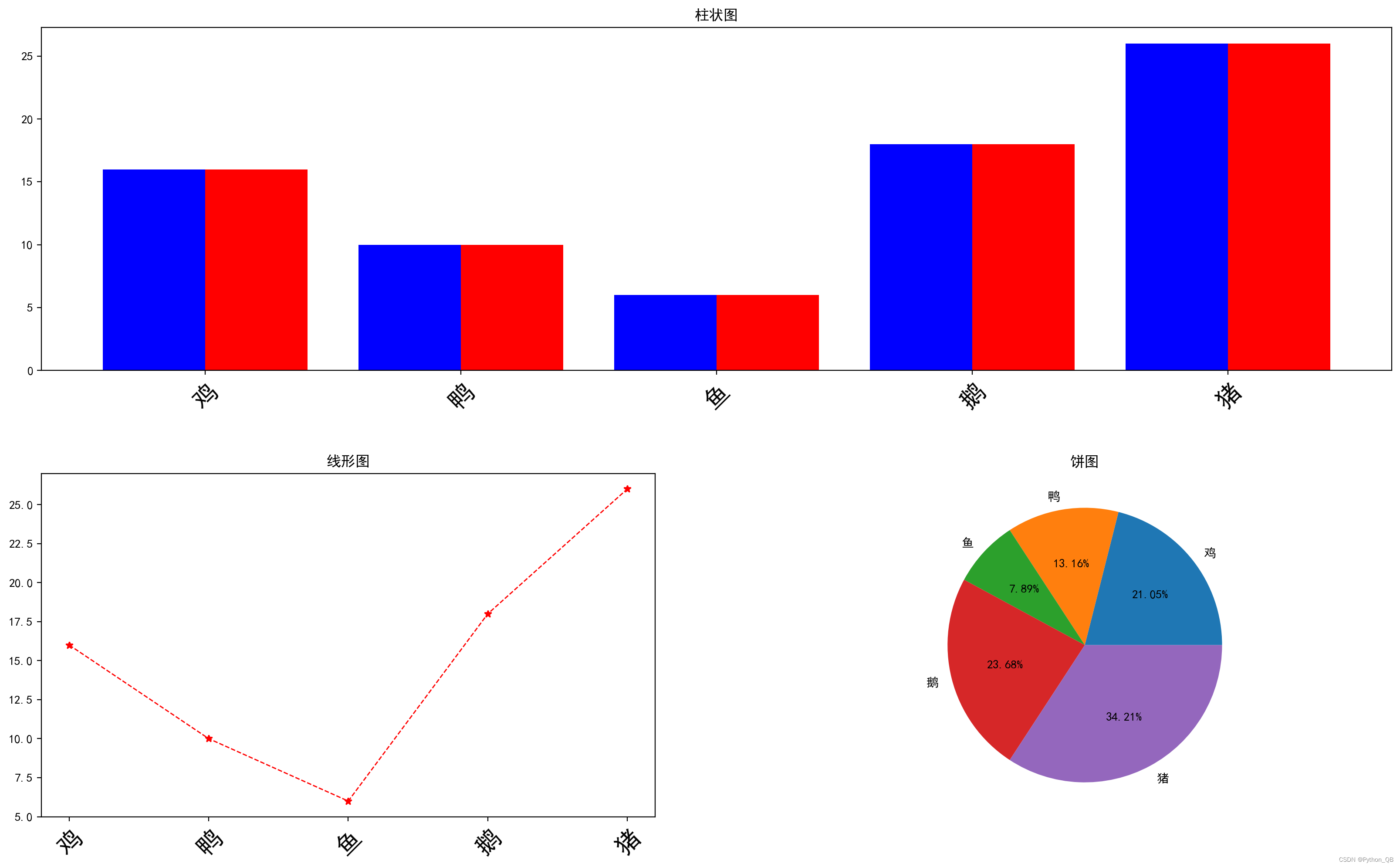


 7311
7311


 被折叠的 条评论
为什么被折叠?
被折叠的 条评论
为什么被折叠?
 到【灌水乐园】发言


