


第一种结合 el-table 的 height属性 高度调样式:

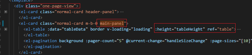
html布局:
js:
tableHeight: null,
mounted() {
this.tableHeight = window.innerHeight - this.
r
e
f
s
.
t
a
b
l
e
.
refs.table.
refs.table.el.offsetTop - 70; // 这个减 70 是调节范围 可以随意调,来达到下边框里的内容自适应下边整个框
}
css样式:
.one-page-view {
background: #f3f3f3;
padding: 10px;
margin: 0;
min-height: calc(100vh - 20px);
.main-panel {
height: calc(100vh - 180px); // -180px 也是可以调的主要调 这个高度 让下面的el-card 适应剩下的高度 达到能在一屏显示
}
// table 的 滚动条
/deep/ .el-table__body-wrapper::-webkit-scrollbar {
width: 6px;
height: 6px;
}
//滚动条的滑块
/deep/ .el-table__body-wrapper::-webkit-scrollbar-thumb {
background-color: #ddd;
border-radius: 3px;
}
// 滚动条轨道(在el-table 有边框的情况下不设置 height高度时 设置这个可以)
/deep/ .el-table__body-wrapper::-webkit-scrollbar-track {
box-shadow: inset 0 0 5px rgba(0, 0, 0, 0.2);
border-radius: 3px;
background-color: rgba(255, 255, 255, 1);
}
第二种:不带el-table 而是自己写的div 布局

tableHeight: null,
mounted() {
this.tableHeight = window.innerHeight - this.
r
e
f
s
.
t
a
b
l
e
.
g
e
t
B
o
u
n
d
i
n
g
C
l
i
e
n
t
R
e
c
t
(
)
.
t
o
p
−
200
;
∗
∗
/
/
自
己
写
的
d
o
m
标
签
如
d
i
v
布
局
则
不
能
再
用
上
面
的
refs.table.getBoundingClientRect().top - 200; **// 自己写的dom 标签 如div布局则不能再用上面的
refs.table.getBoundingClientRect().top−200;∗∗//自己写的dom标签如div布局则不能再用上面的el**
}
.draft-view {
background: #f3f3f3;
padding: 10px;
margin: 0;
min-height: calc(100vh - 30px);
.main-panel {
height: calc(100vh - 160px);
/deep/ .el-scrollbar {
height: calc(100vh - 240px);
.el-scrollbar__wrap {
overflow-x: hidden;
}
}
}
}


 2752
2752


 被折叠的 条评论
为什么被折叠?
被折叠的 条评论
为什么被折叠?
 到【灌水乐园】发言


