


【Flutter】十、Flutter之表单——Form
Form作为一个容器,可包裹多个表单字段(FormField)。FormField是一个抽象类,TextFormText是FormField的一个实现类,因此可以在Form中使用TextFormField。
一、Form
1.1 Form构造器
const Form({
    Key key,
    @required this.child,
    this.autovalidate = false,
    this.onWillPop,
    this.onChanged,
  }) : assert(child != null),
       super(key: key);
1.2 Form属性说明
| 属性 | 说明 |
|---|---|
| Widget child | 孩子节点 |
| bool autovalidate | 是否自动验证,如果为true,表单字段将在每次更改后立即验证和更新其错误文本;如果为false,则需要调用FormState.validate进行验证。 |
| WillPopCallback onWillPop | 决定Form所在的路由是否可以直接返回(如点击返回按钮),该回调返回一个Future对象,如果Future的最终结果是false,则当前路由不会返回;如果为true,则会返回到上一个路由。此属性通常用于拦截返回按钮 |
| VoidCallback onChanged | Form的任意一个子FormField内容发生变化时会触发此回调 |
二、TextFormField
2.1 TextFormField构造器
TextFormField({
    Key key,
    this.controller,
    String initialValue,
    FocusNode focusNode,
    InputDecoration decoration = const InputDecoration(),
    TextInputType keyboardType,
    TextCapitalization textCapitalization = TextCapitalization.none,
    TextInputAction textInputAction,
    TextStyle style,
    StrutStyle strutStyle,
    TextDirection textDirection,
    TextAlign textAlign = TextAlign.start,
    bool autofocus = false,
    bool readOnly = false,
    bool showCursor,
    bool obscureText = false,
    bool autocorrect = true,
    bool autovalidate = false,
    bool maxLengthEnforced = true,
    int maxLines = 1,
    int minLines,
    bool expands = false,
    int maxLength,
    VoidCallback onEditingComplete,
    ValueChanged<String> onFieldSubmitted,
    FormFieldSetter<String> onSaved,
    FormFieldValidator<String> validator,
    List<TextInputFormatter> inputFormatters,
    bool enabled = true,
    double cursorWidth = 2.0,
    Radius cursorRadius,
    Color cursorColor,
    Brightness keyboardAppearance,
    EdgeInsets scrollPadding = const EdgeInsets.all(20.0),
    bool enableInteractiveSelection = true,
    InputCounterWidgetBuilder buildCounter,
  }) : assert(initialValue == null || controller == null),
       assert(textAlign != null),
       assert(autofocus != null),
       assert(readOnly != null),
       assert(obscureText != null),
       assert(autocorrect != null),
       assert(autovalidate != null),
       assert(maxLengthEnforced != null),
       assert(scrollPadding != null),
       assert(maxLines == null || maxLines > 0),
       assert(minLines == null || minLines > 0),
       assert(
         (maxLines == null) || (minLines == null) || (maxLines >= minLines),
         'minLines can\'t be greater than maxLines',
       ),
       assert(expands != null),
       assert(
         !expands || (maxLines == null && minLines == null),
         'minLines and maxLines must be null when expands is true.',
       ),
       assert(maxLength == null || maxLength > 0),
       assert(enableInteractiveSelection != null),
       super(
    key: key,
    initialValue: controller != null ? controller.text : (initialValue ?? ''),
    onSaved: onSaved,
    validator: validator,
    autovalidate: autovalidate,
    enabled: enabled,
    builder: (FormFieldState<String> field) {
      final _TextFormFieldState state = field;
      final InputDecoration effectiveDecoration = (decoration ?? const InputDecoration())
        .applyDefaults(Theme.of(field.context).inputDecorationTheme);
      return TextField(
        controller: state._effectiveController,
        focusNode: focusNode,
        decoration: effectiveDecoration.copyWith(errorText: field.errorText),
        keyboardType: keyboardType,
        textInputAction: textInputAction,
        style: style,
        strutStyle: strutStyle,
        textAlign: textAlign,
        textDirection: textDirection,
        textCapitalization: textCapitalization,
        autofocus: autofocus,
        readOnly: readOnly,
        showCursor: showCursor,
        obscureText: obscureText,
        autocorrect: autocorrect,
        maxLengthEnforced: maxLengthEnforced,
        maxLines: maxLines,
        minLines: minLines,
        expands: expands,
        maxLength: maxLength,
        onChanged: field.didChange,
        onEditingComplete: onEditingComplete,
        onSubmitted: onFieldSubmitted,
        inputFormatters: inputFormatters,
        enabled: enabled,
        cursorWidth: cursorWidth,
        cursorRadius: cursorRadius,
        cursorColor: cursorColor,
        scrollPadding: scrollPadding,
        keyboardAppearance: keyboardAppearance,
        enableInteractiveSelection: enableInteractiveSelection,
        buildCounter: buildCounter,
      );
    },
  );
从TextFormField的构造函数中可以看出,builder返回了一个TextField,所以对于TextFormField的属性参考TextField即可;由于TextFormField继承自FormField,所以FormField的属性TextFormField也可以使用,具体说明参考如下。
2.2 TextFormField部分属性说明
| 属性 | 说明 |
|---|---|
| FormFieldSetter onSaved | 保存回调,调用FormState.save的回调 |
| FormFieldValidator validator | 验证回调,如果开启autovalidate: true,那么将会自动检验输入的值,如果没有则会在表单提交的时候检验(FormState.validate),该函数只允许返回验证失败的错误信息以及验证通过时返回null。 |
| T initialValue | 初始值 |
| bool autovalidate | 是否自动校验 |
| bool enabled | 是否可用 |
三、FormState
FormState为Form的State类,可以通过Form.of()或GlobalKey获得。我们可以通过它来对Form的子孙FormField进行统一操作。
- FormState.validate():调用此方法后,会调用Form子孙FormField的validate回调,如果有一个校验失败,则返回false,所有校验失败项都会返回用户返回的错误提示。
- FormState.save():调用此方法后,会调用Form子孙FormField的save回调,用于保存表单内容
- FormState.reset():调用此方法后,会将子孙FormField的内容清空,清空不会清空初始值。
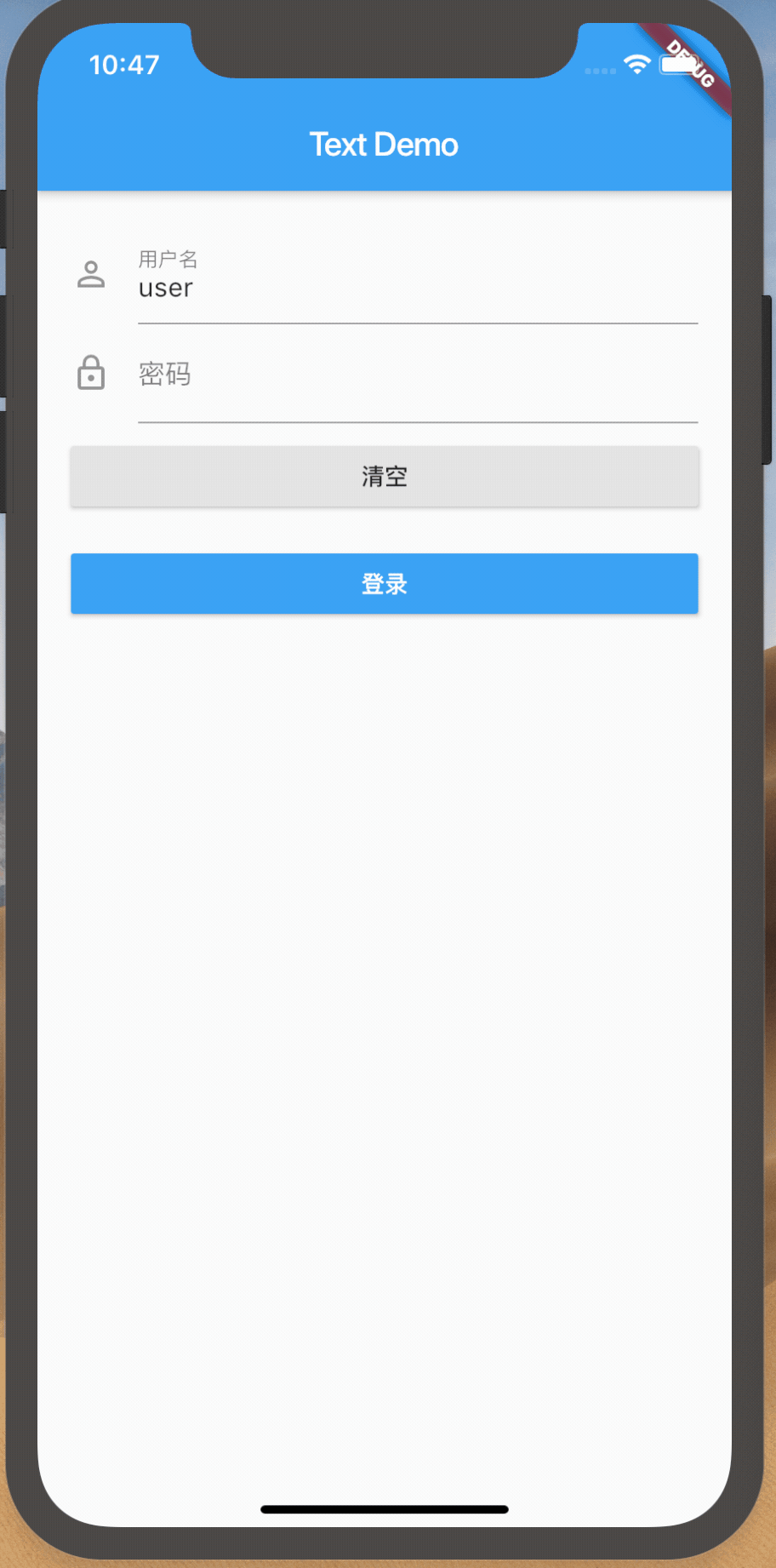
示例
下面是一个用户登录表单,满足以下条件:
- 用户名不为空
- 密码长度大于6位
- 可清空
import 'package:flutter/material.dart';

class FormDemo extends StatelessWidget{
  final _formKey = GlobalKey<FormState>();

  @override
  Widget build(BuildContext context) {
    return Form(
      key: _formKey,
      autovalidate: false,
      onChanged: (){
        print('change');
      },
      child: Padding(
        padding:const EdgeInsets.all(20.0),
        child: Column(
          crossAxisAlignment: CrossAxisAlignment.center,
          children: <Widget>[
            TextFormField(
              decoration: InputDecoration(
                icon: Icon(Icons.person_outline),
                labelText: '用户名'
              ),
              validator: (value) {
                return value.isEmpty ? '用户名不能为空' : null;
              },
              onSaved: (data){
                print('save:$data');
              },
              initialValue: 'user',
              autovalidate: false,
              enabled: true,
            ),
            TextFormField(
              decoration: InputDecoration(
                icon:Icon(Icons.lock_outline),
                labelText: '密码',
              ),
              obscureText: true,
              validator: (value){
                if (value.isEmpty) {
                  return '密码不能为空';
                }
                if (value.length <= 6) {
                  return '密码不能低于6位';
                }
                return null;
              },
            ),
            Padding(
                padding: const EdgeInsets.symmetric(vertical: 8.0),
                child: Row(
                  children: <Widget>[
                    Expanded(
                      child: RaisedButton(
                        onPressed: () {
                          _formKey.currentState.reset();
                        },
                        child: Text('清空'),
                      ),
                    )
                  ],
                )
            ),
            Padding(
              padding: const EdgeInsets.symmetric(vertical: 8.0),
              child: Row(
                children: <Widget>[
                  Expanded(
                    child: RaisedButton(
                      color: Theme.of(context).primaryColor,
                      textColor: Colors.white,
                      onPressed: () {
                        if (_formKey.currentState.validate()) {
                          // Process data.
                        }
                      },
                      child: Text('登录'),
                    ),
                  )
                ],
              )
            ),
          ],
        ),
      )
    );
  }
}


 783
783


 被折叠的 条评论
为什么被折叠?
被折叠的 条评论
为什么被折叠?
 到【灌水乐园】发言


