


前言:哈喽,大家好,今天给大家分享html+css 绚丽效果!并提供具体代码帮助大家深入理解,彻底掌握!创作不易,如果能帮助到大家或者给大家一些灵感和启发,欢迎收藏+关注哦 💕
文章目录
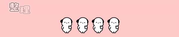
效果

原理解析
1.这个效果看着是添加一个橘黄色的弧形背景,其实是移动了上面的白色背景元素,橘黄色的背景一直存在。每个按钮元素是由button、button:before、span共3部分组成,如下图。

1.1 button是最外层的。

1.2 button:before是中间层的,倾斜30度,并添加一个过渡动画transition。

1.3 span是文字,在最上层。用来显示按钮的文字。

1.4 按钮组成关系。

2.当按钮上有鼠标时,hover效果触发,运行transition过渡动画效果。

/*当hover时*/
.butRBg:hover::before {
  transform: translate3d(100%, 0, 0);
}
注: 虽然这里只有 transform: translate3d(100%, 0, 0);一句代码,这句代码其实是2个意思,
1 .沿着x轴移动100%
2 .重置 transform: skew(30deg);
3.具体的变换参数,直接看代码,可以一键复制,查看效果
上代码,可以直接复制使用
目录

html
<!DOCTYPE html>
<html lang="en">
<head>
    <meta charset="UTF-8">
    <meta http-equiv="X-UA-Compatible" content="IE=edge">
    <meta name="viewport" content="width=device-width, initial-scale=1.0">
    <title>html+css 实现hover右遮罩按钮</title>
    <link rel="stylesheet" href="./style.css">
</head>
<body>
<div class="container">
    <h1 style="text-align: center;color:#fff;margin-bottom: 50px;padding-top: 50px; text-shadow: 0 3px 3px #4c6ed3;">
        html+css 实现hover右遮罩按钮</h1>

    <div class="wrapper">
        <button class="butdef butRBg"><span>求点赞</span></button>
        <button class="butdef butRBg"><span>求关注</span></button>
        <button class="butdef butRBg"><span>求收藏</span></button>
        <button class="butdef butRBg"><span>求转发</span></button>
    </div>
</div>

</body>
</html>
css
*
{
  margin: 0;
  padding: 0;
  box-sizing: border-box;
}
:root
{
  --btn-bg-color:#fff;
  --font-color-black: #000;
  --btn-bg-color-hover: #FF5833;
}
.container{
  min-height: 100vh;
  background-color: #0e1538;
}
.wrapper{
  display: flex;
  flex-direction: column;
  align-items: center;
  gap:40px;
}

.butdef {
  pointer-events: auto;
  cursor: pointer;
  background: var(--btn-bg-color);
  border: none;
  padding: 15px 30px;
  margin: 0;
  font-family: inherit;
  font-size: inherit;
  position: relative;
  display: inline-block;
}

.butdef::before,
.butdef::after {
  position: absolute;
  top: 0;
  left: 0;
  width: 100%;
  height: 100%;
}

.butRBg {
  text-transform: uppercase;
  letter-spacing: 0.05rem;
  font-weight: 700;
  font-size: 0.85rem;
  border-radius: 0.5rem;
  overflow: hidden;
  color: var(--font-color-black);
  background-color: var(--btn-bg-color-hover);
}

.butRBg span {
  position: relative;
}

.butRBg::before {
  content: '';
  background: var(--btn-bg-color);
  width: 120%;
  left: -10%;
  transform: skew(30deg);
  transition: transform 0.4s cubic-bezier(0.3, 1, 0.8, 1);
}
/*当hover时*/
.butRBg:hover::before {
  transform: translate3d(100%, 0, 0);
}
到此这篇文章就介绍到这了,更多精彩内容请关注本人以前的文章或继续浏览下面的文章,创作不易,如果能帮助到大家,希望大家多多支持宝码香车~💕
更多专栏订阅推荐:
👍 html+css+js 绚丽效果
💕 vue
✈️ Electron
⭐️ js
📝 字符串
✍️ 时间对象(Date())操作


 285
285

 被折叠的 条评论
为什么被折叠?
被折叠的 条评论
为什么被折叠?
 到【灌水乐园】发言


